M Capital
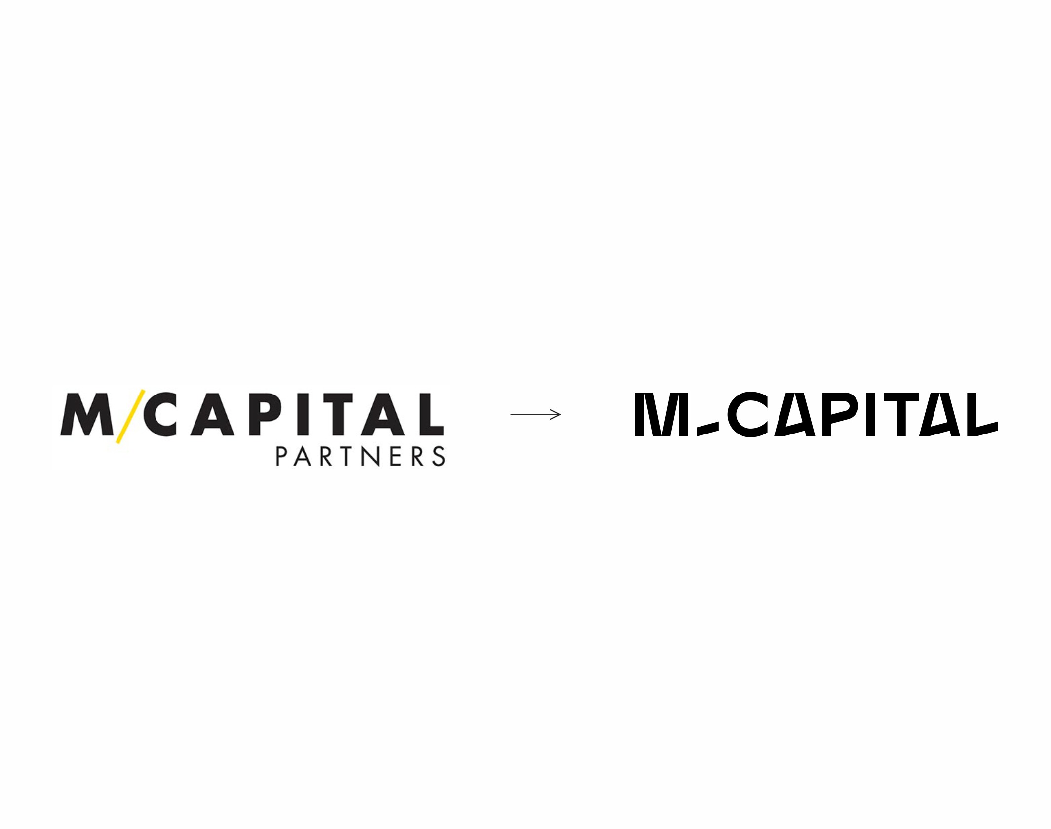
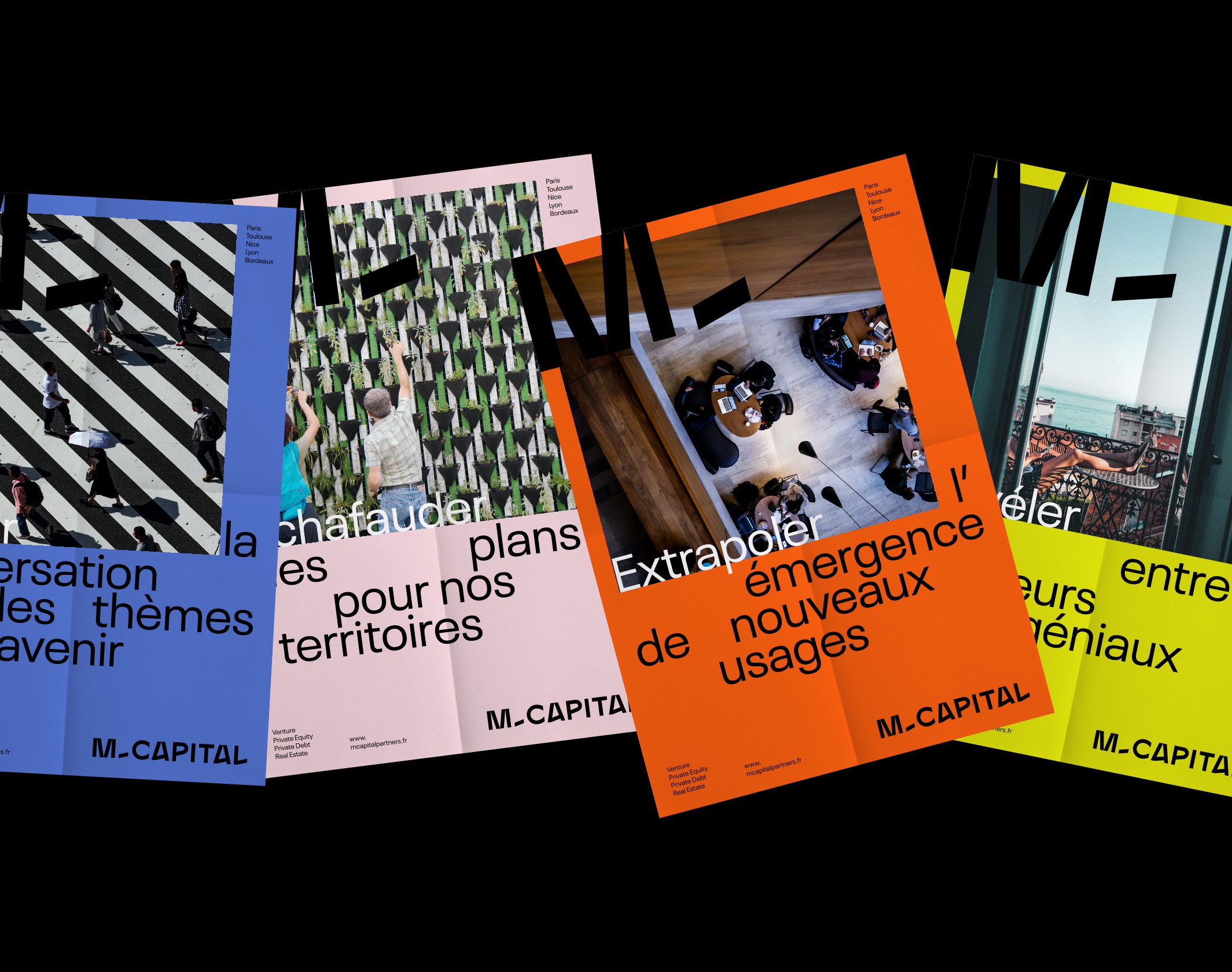
M Capital redefined its visual identity with a bold, vibrant design that reflects its status as a leading, innovative player in European finance.
An independent private equity, real estate and private debt company, M Capital has, since its creation in 2002, grown to become one of Europe’s top 300 growth companies (Financial Time Fast 500). With more than €510 million in assets under management on behalf of major institutional investors and more than 27,000 private investors, we have become one of France’s leading private investors. Located mainly in Toulouse and Paris, it is also a brand that defines itself as “chic and accessible”, “rock and benevolent”, and cultivates a particular state of mind in the financial sphere, both serious and respected, free and even impertinent. This atypical and recognized company, involved in particular in the reflection on the major topics of the future and the city of tomorrow, mandated us in 2019 to completely rethink its visual identity.
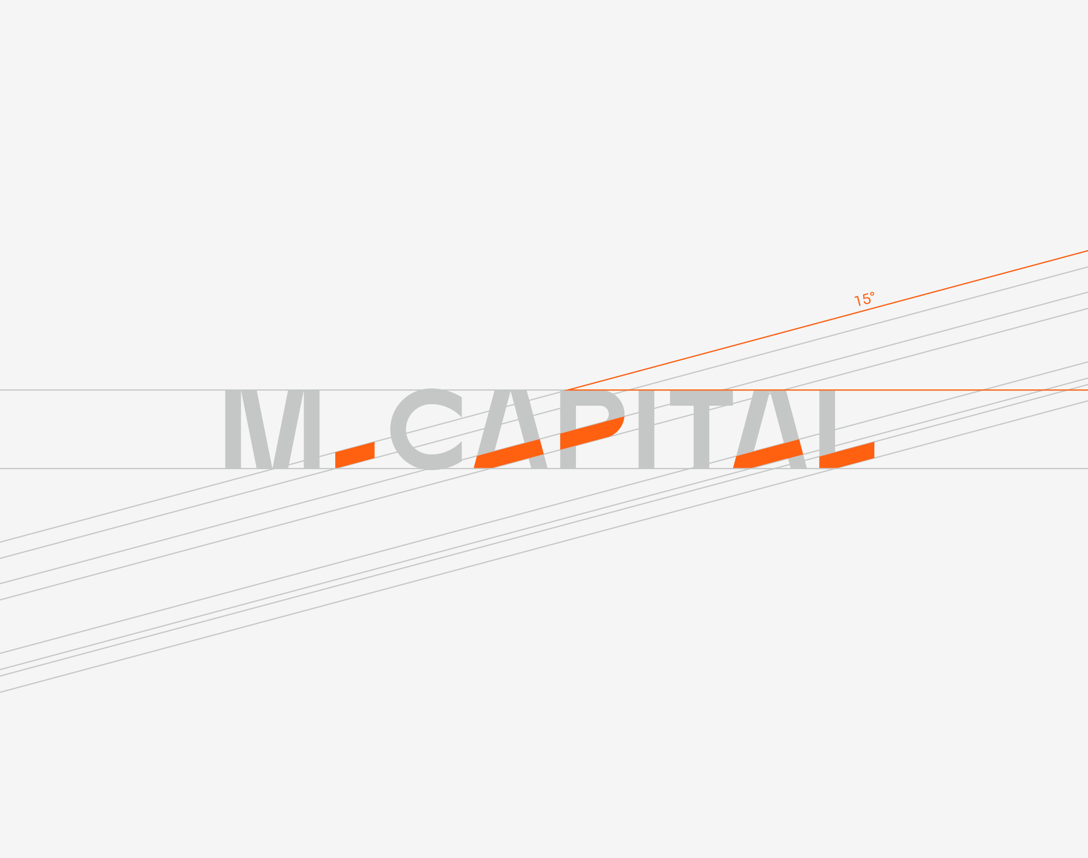
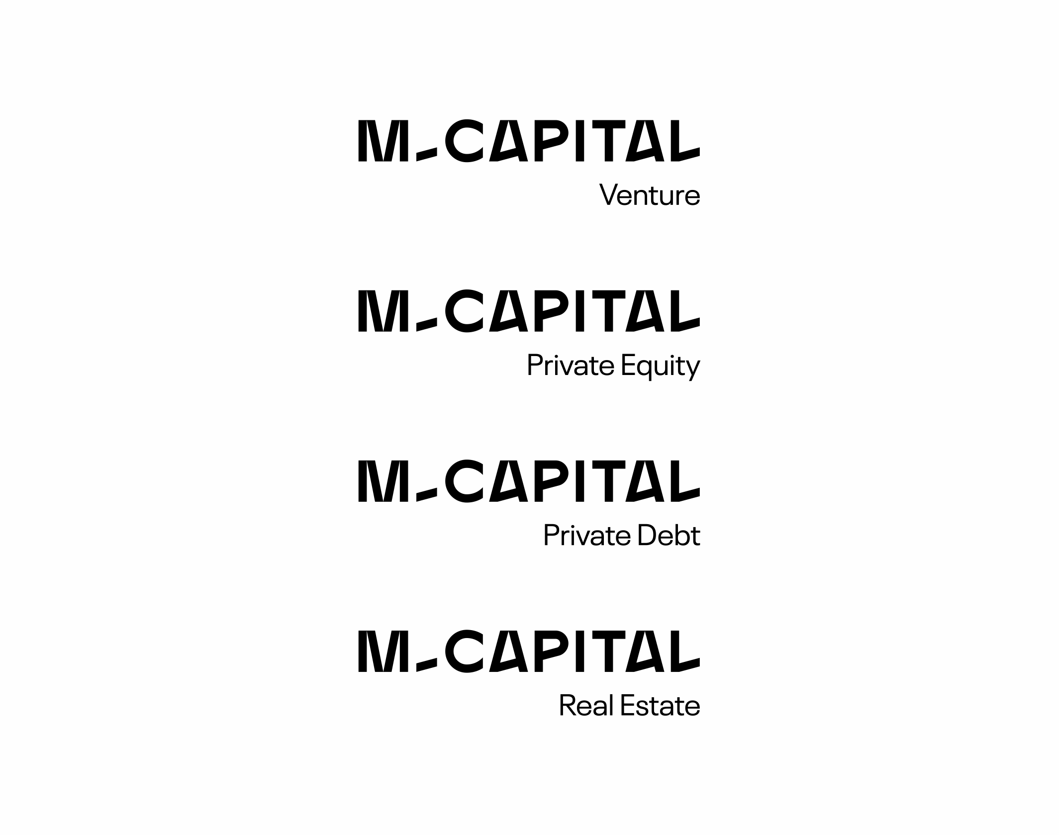
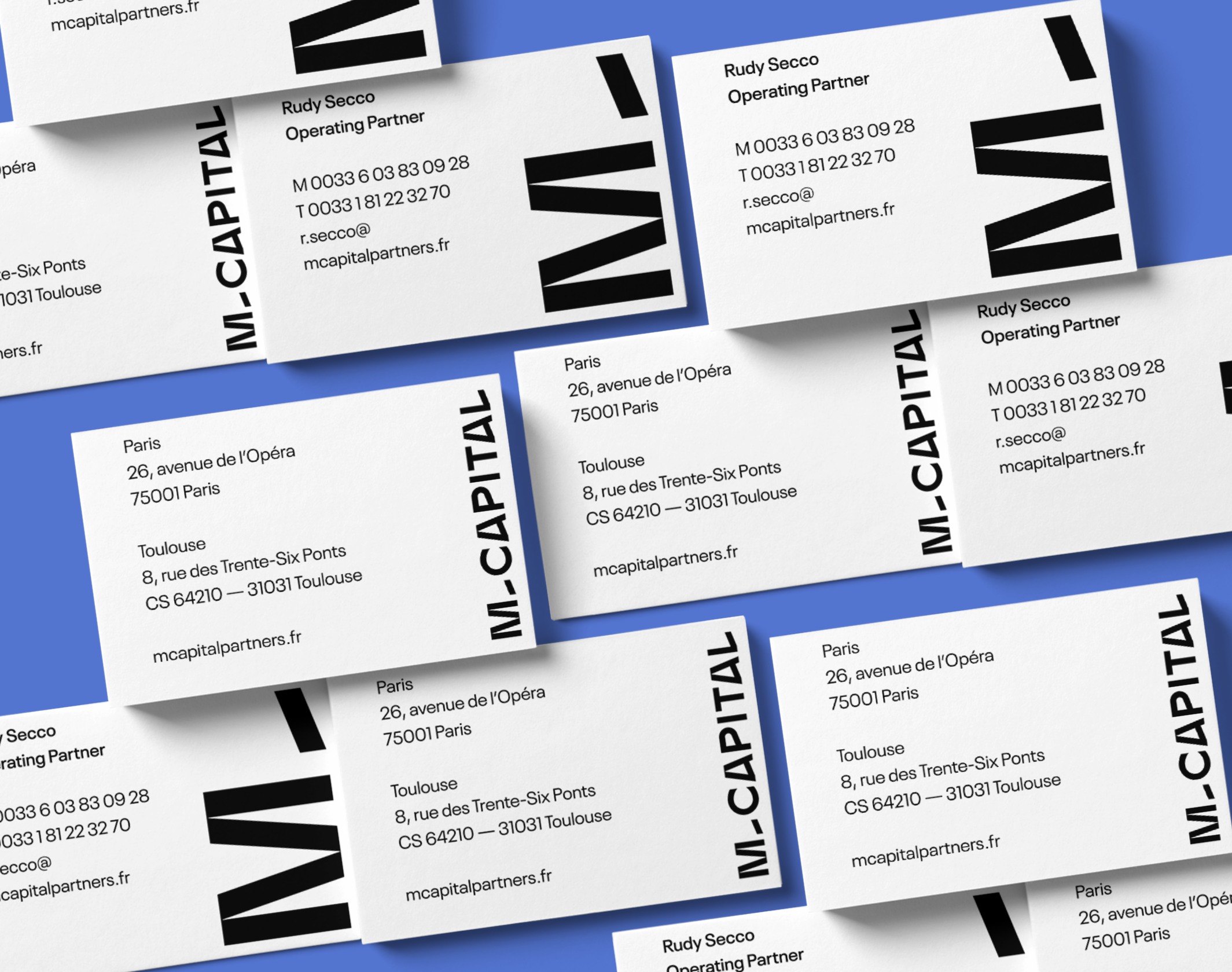
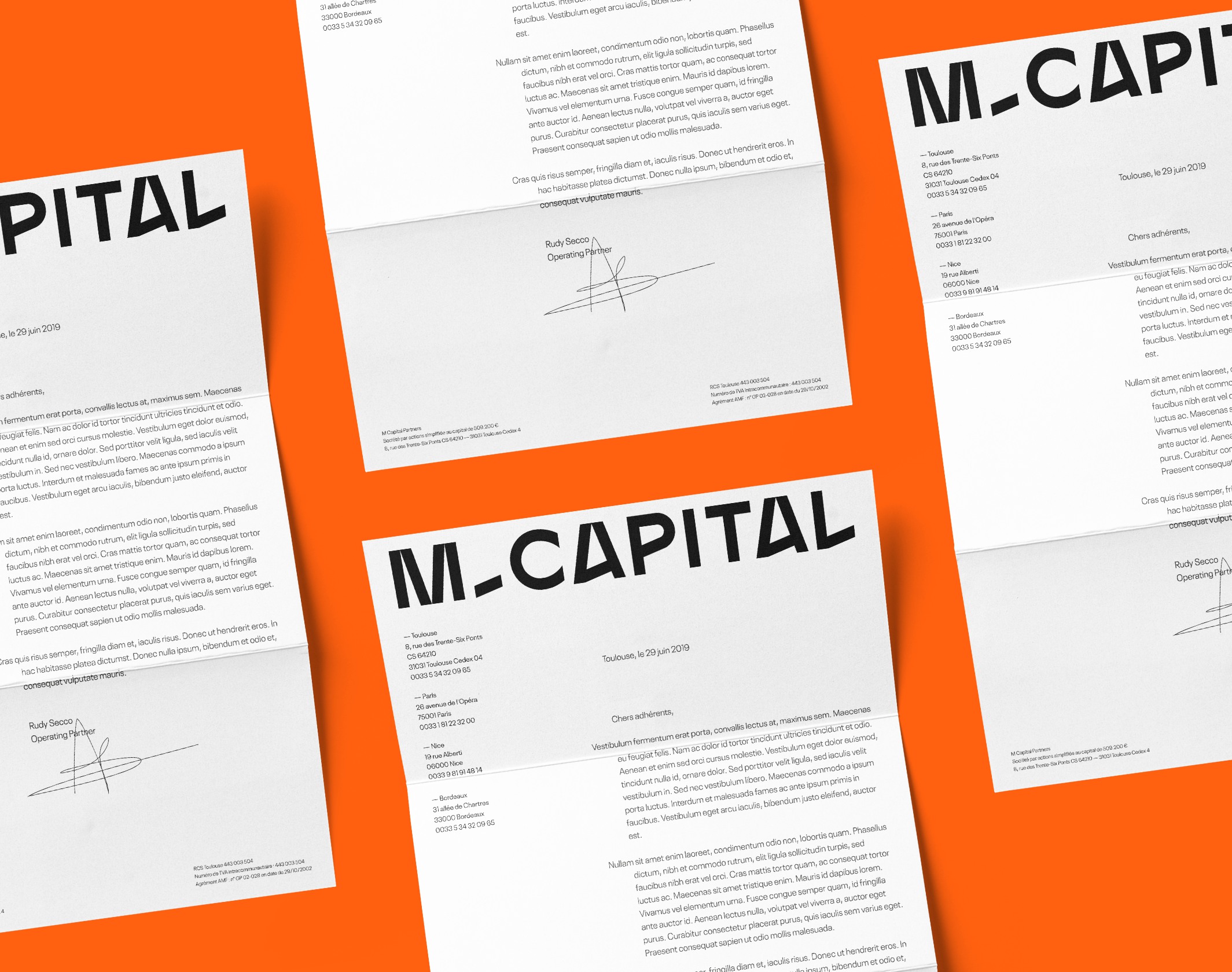
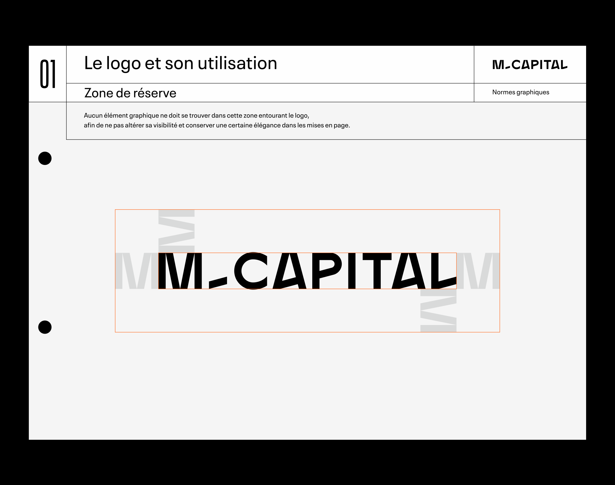
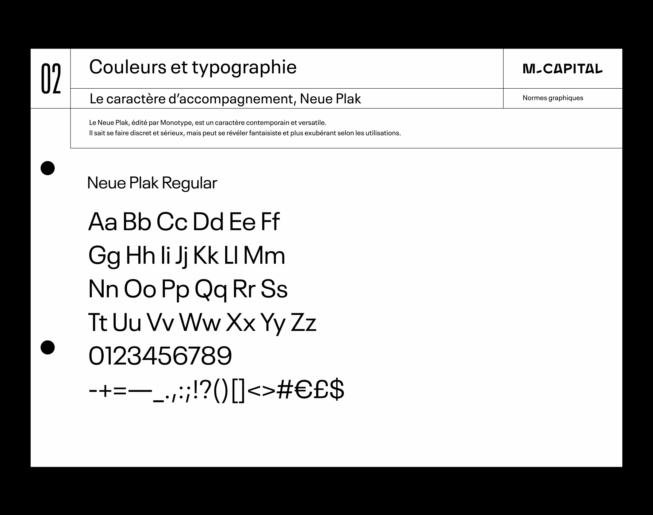
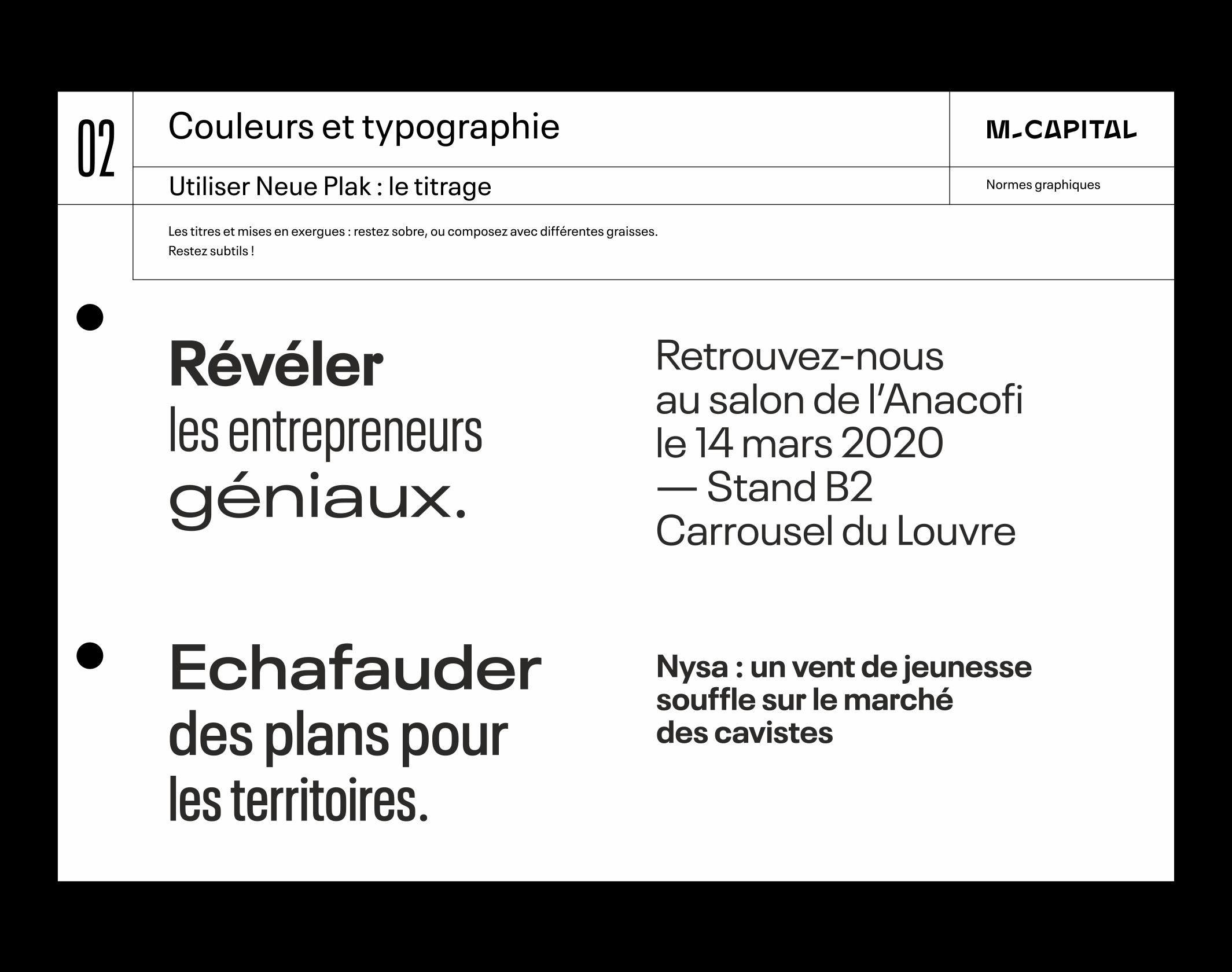
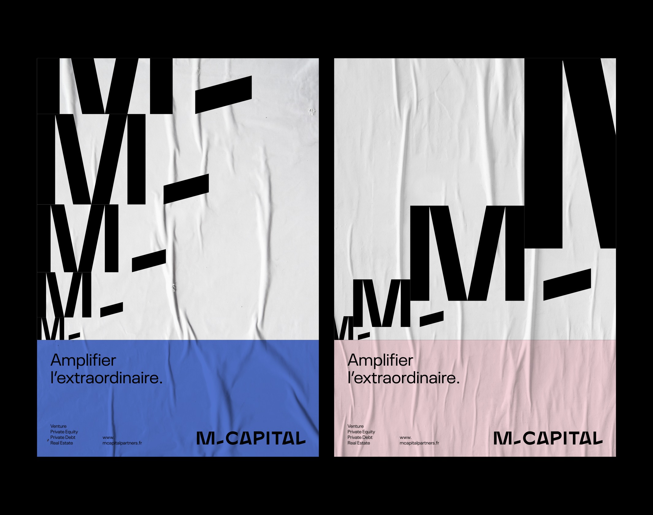
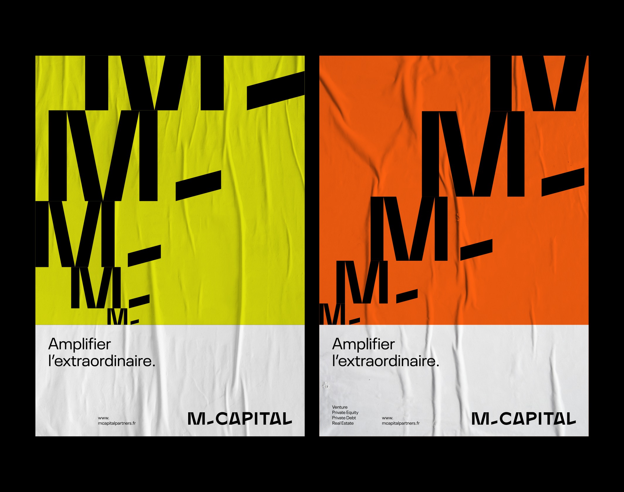
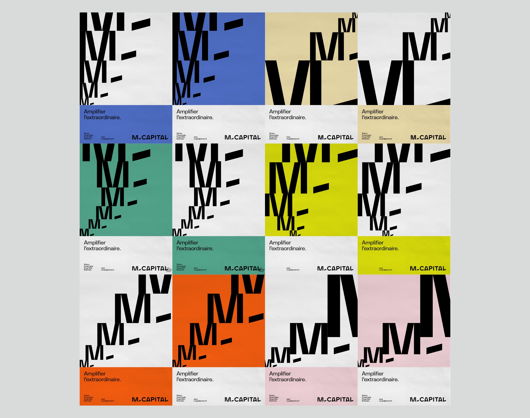
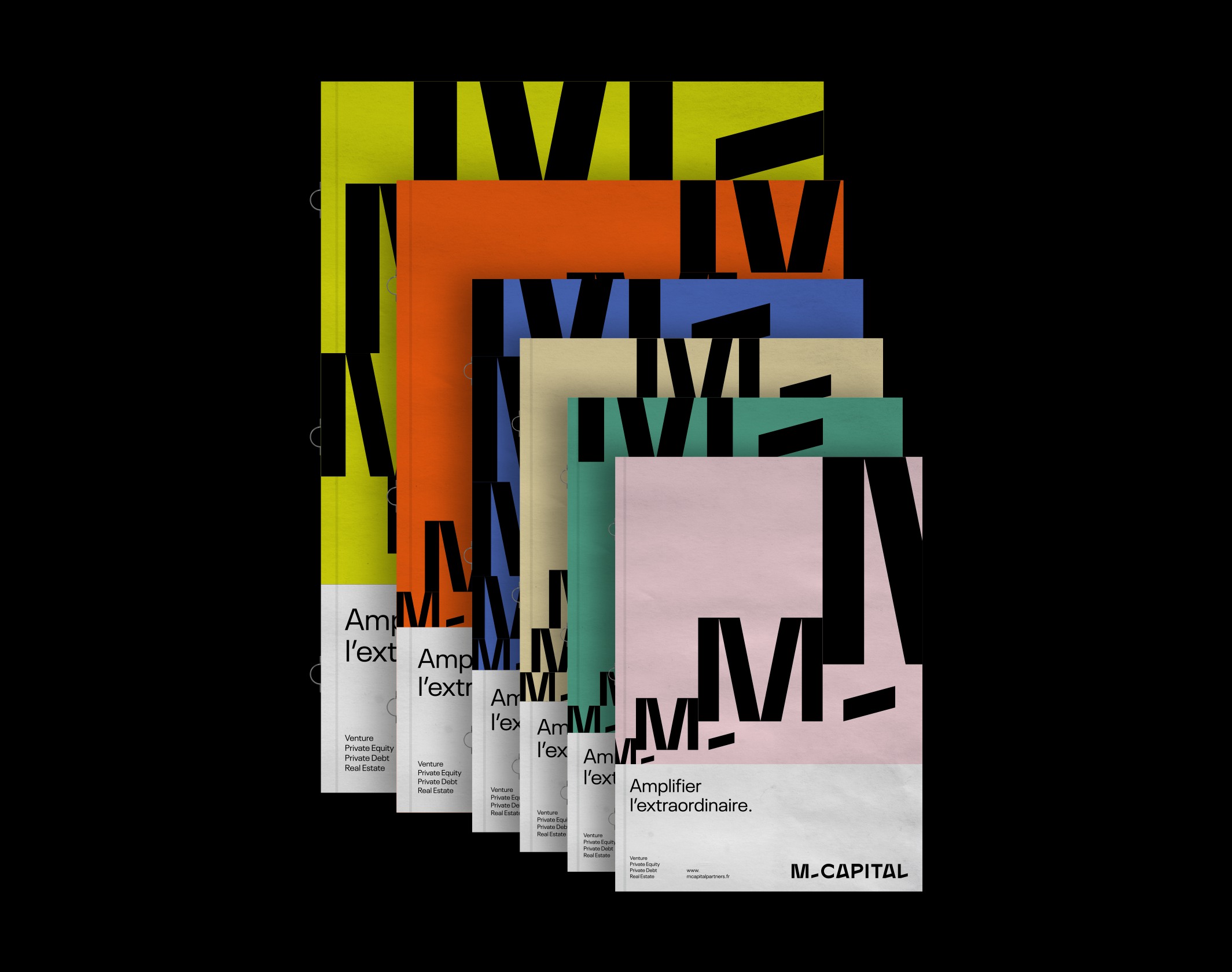
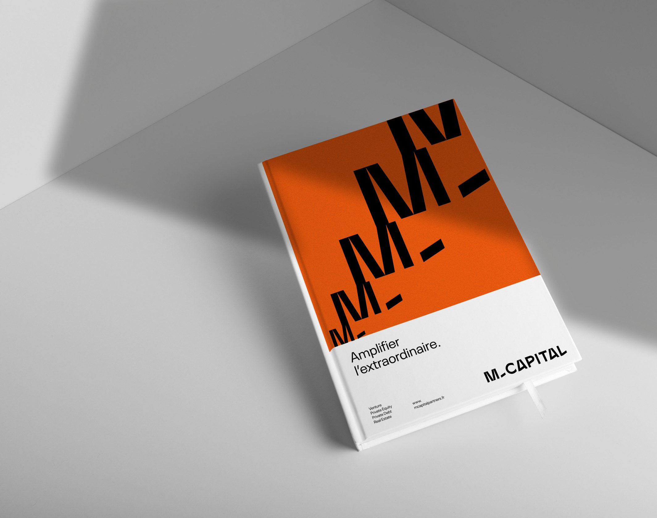
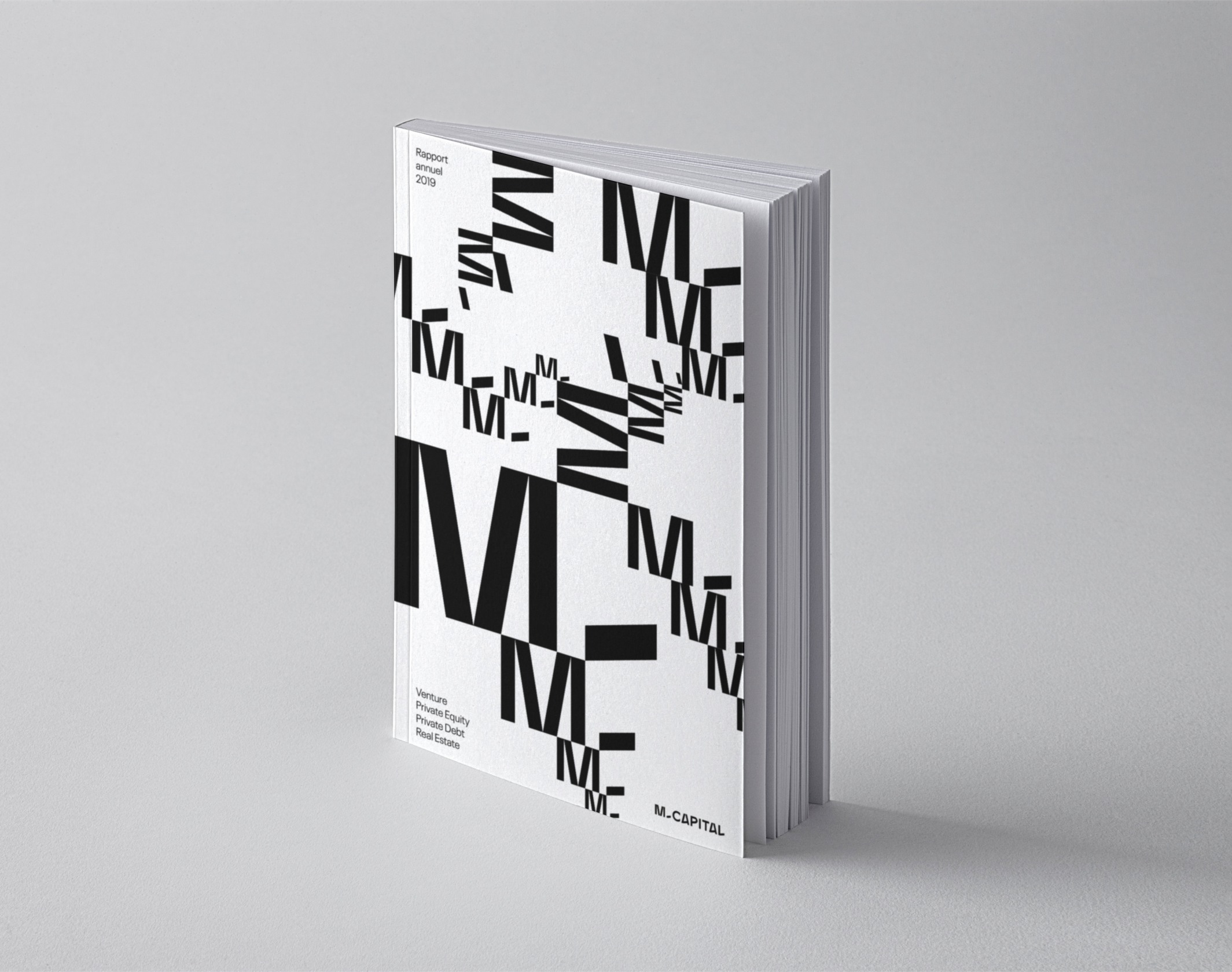
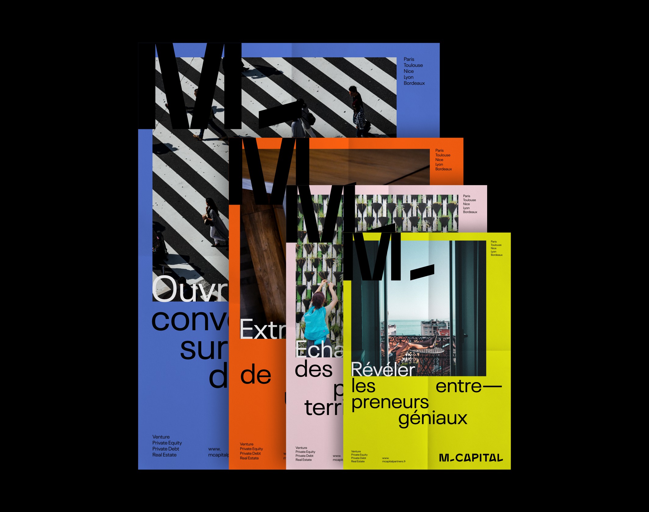
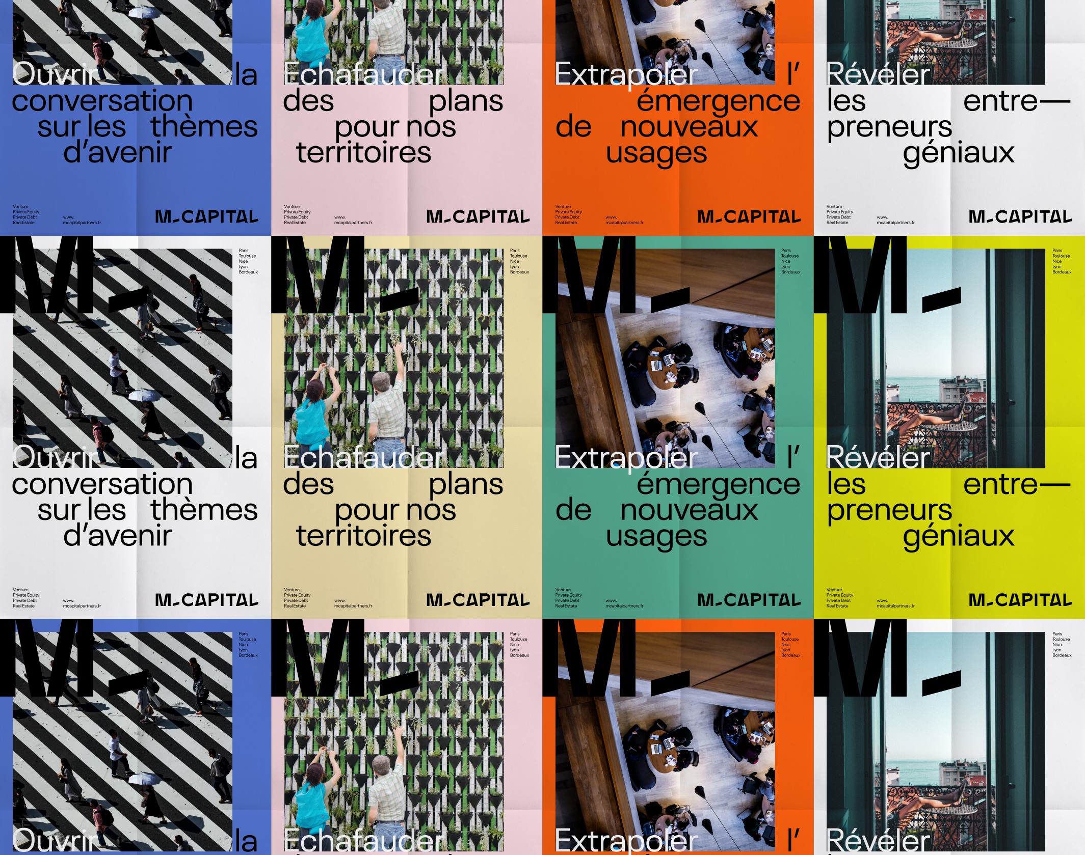
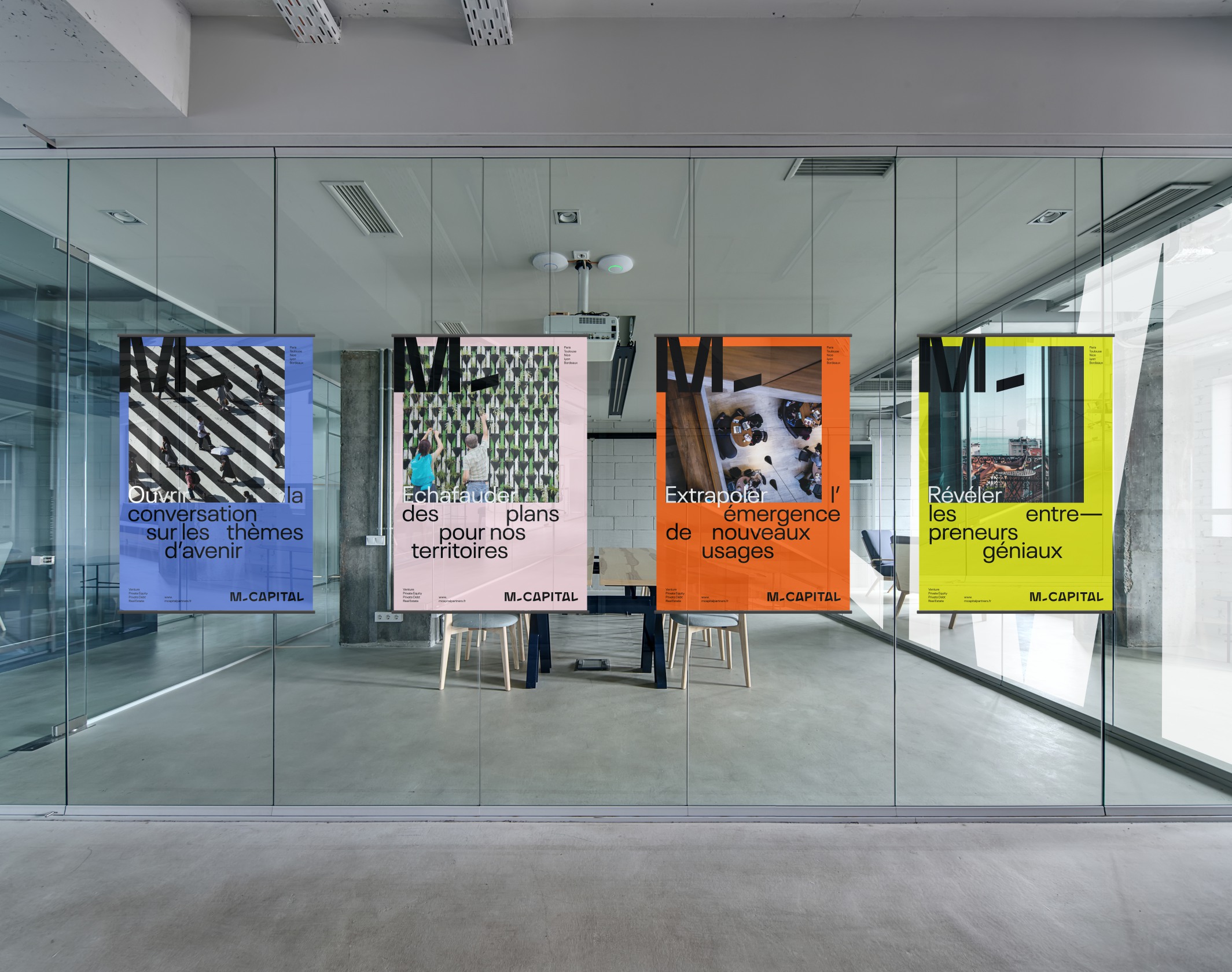
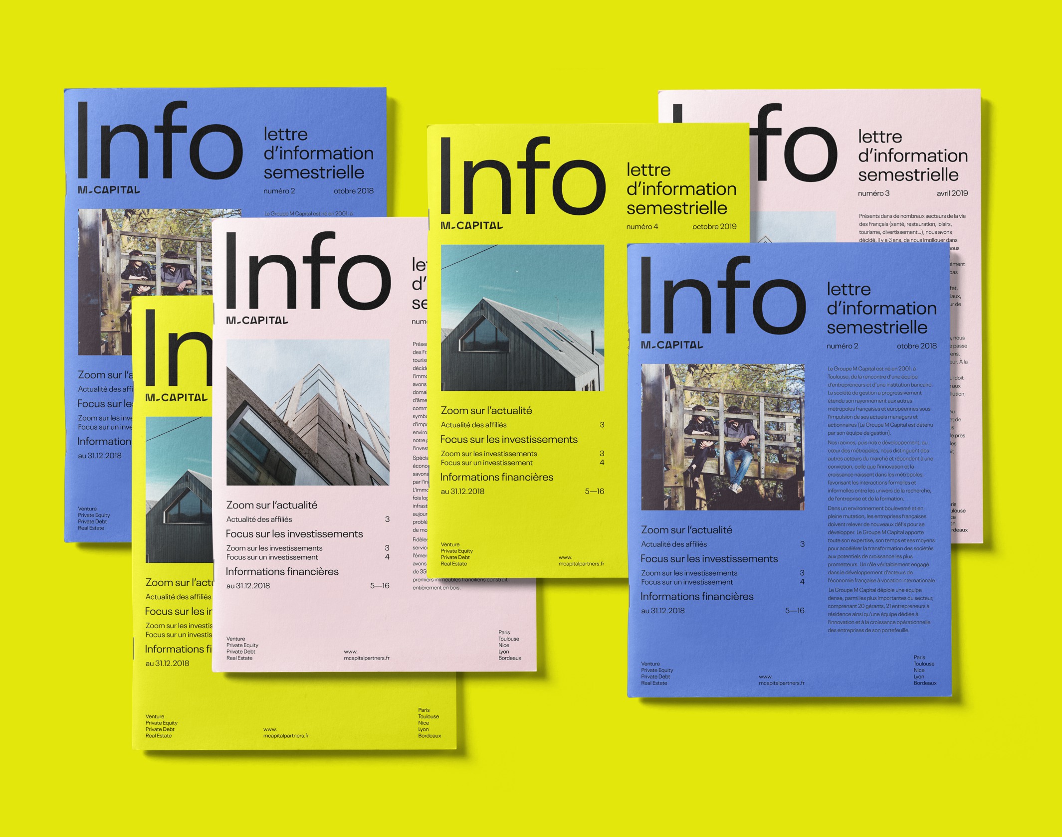
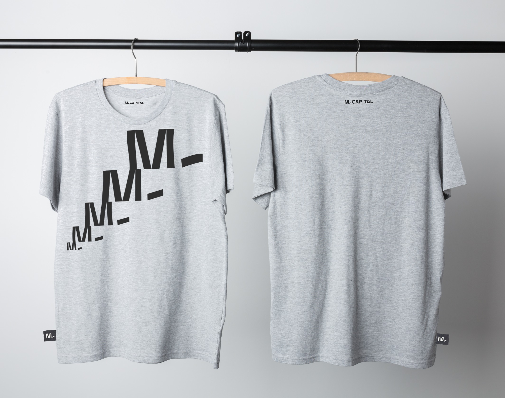
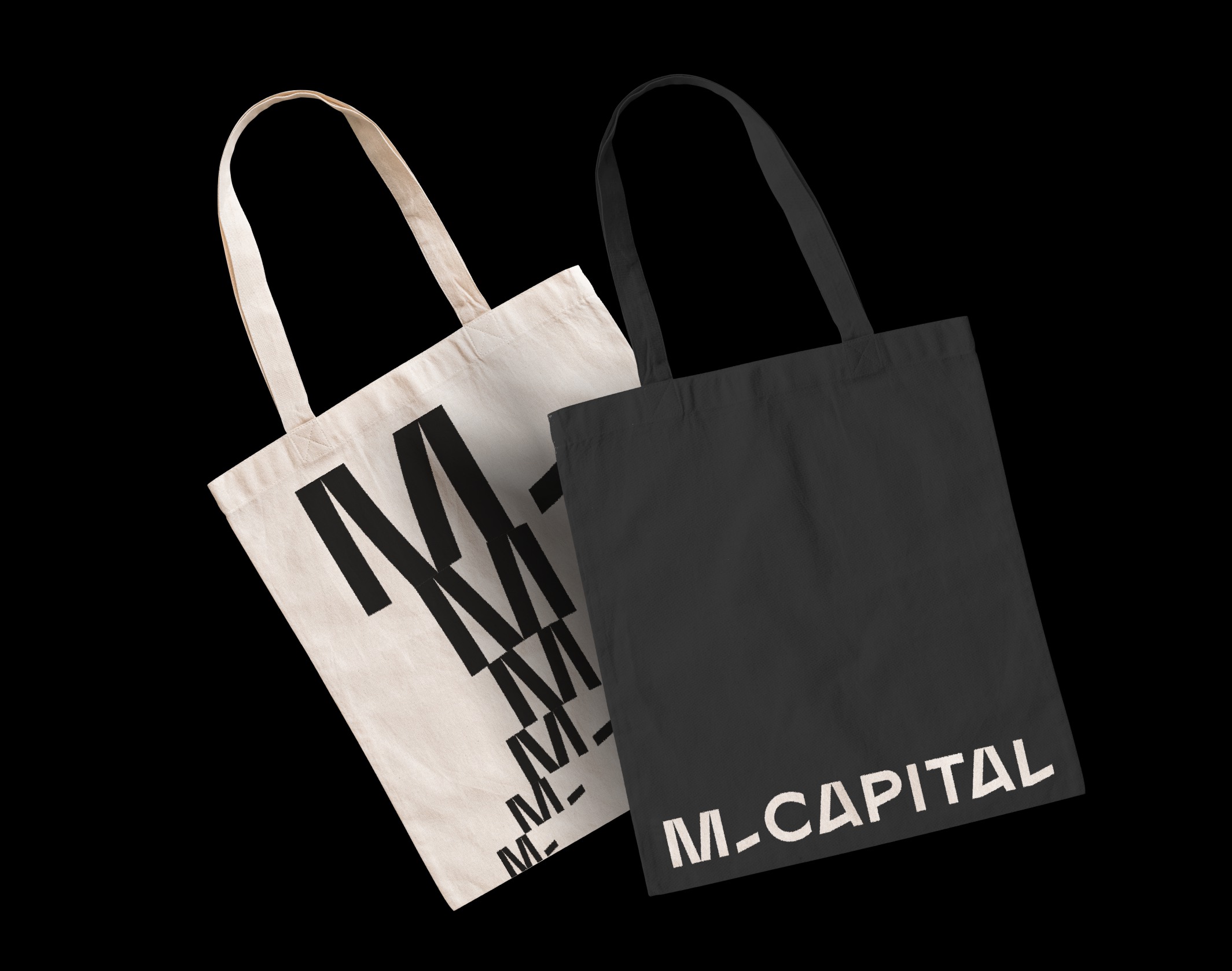
From the outset, we wanted to avoid conforming to the classic aesthetics of financial companies, while developing a solid and serious visual base. Our focus is on the mantra “Amplifying the extraordinary”, an emphatic and deliberately oversized promise, we have built a typographic identity imbued with clarity and radicality. The logo, a stable and structured typographical design, reveals some oddities that bring the right dose of singularity. A palette of bright colours makes it possible to offer strong contrasts on the different variations.
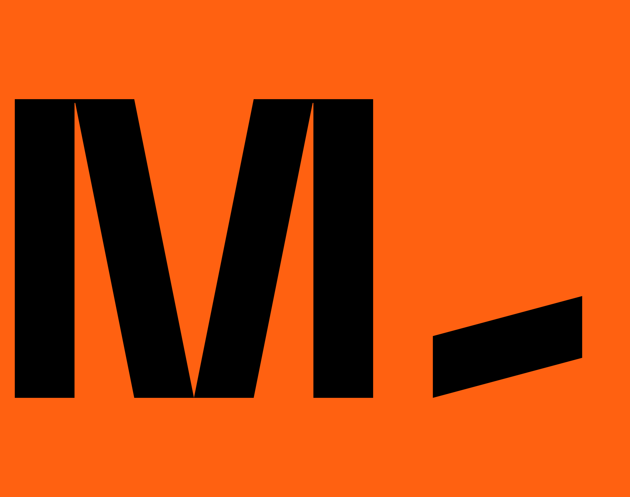
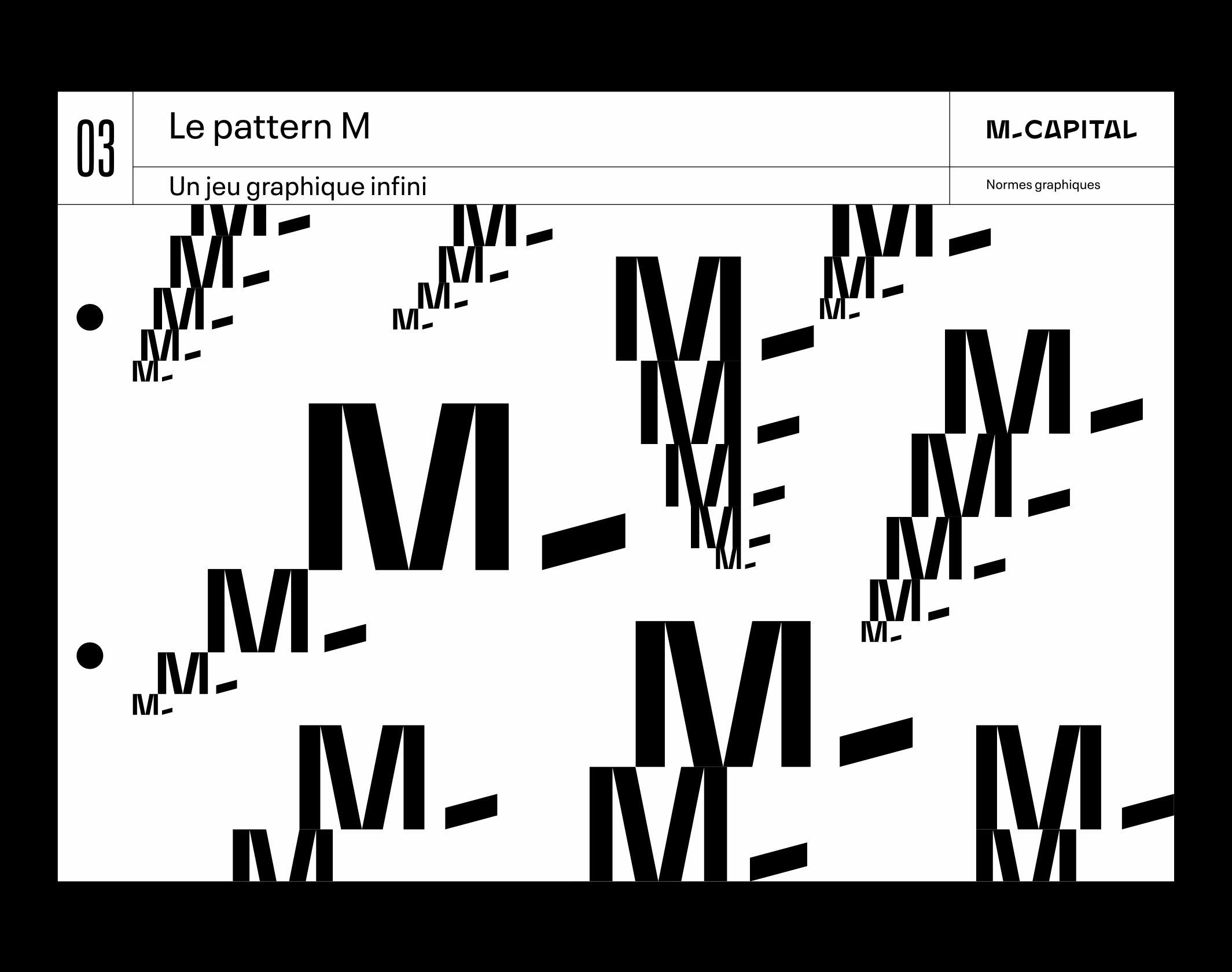
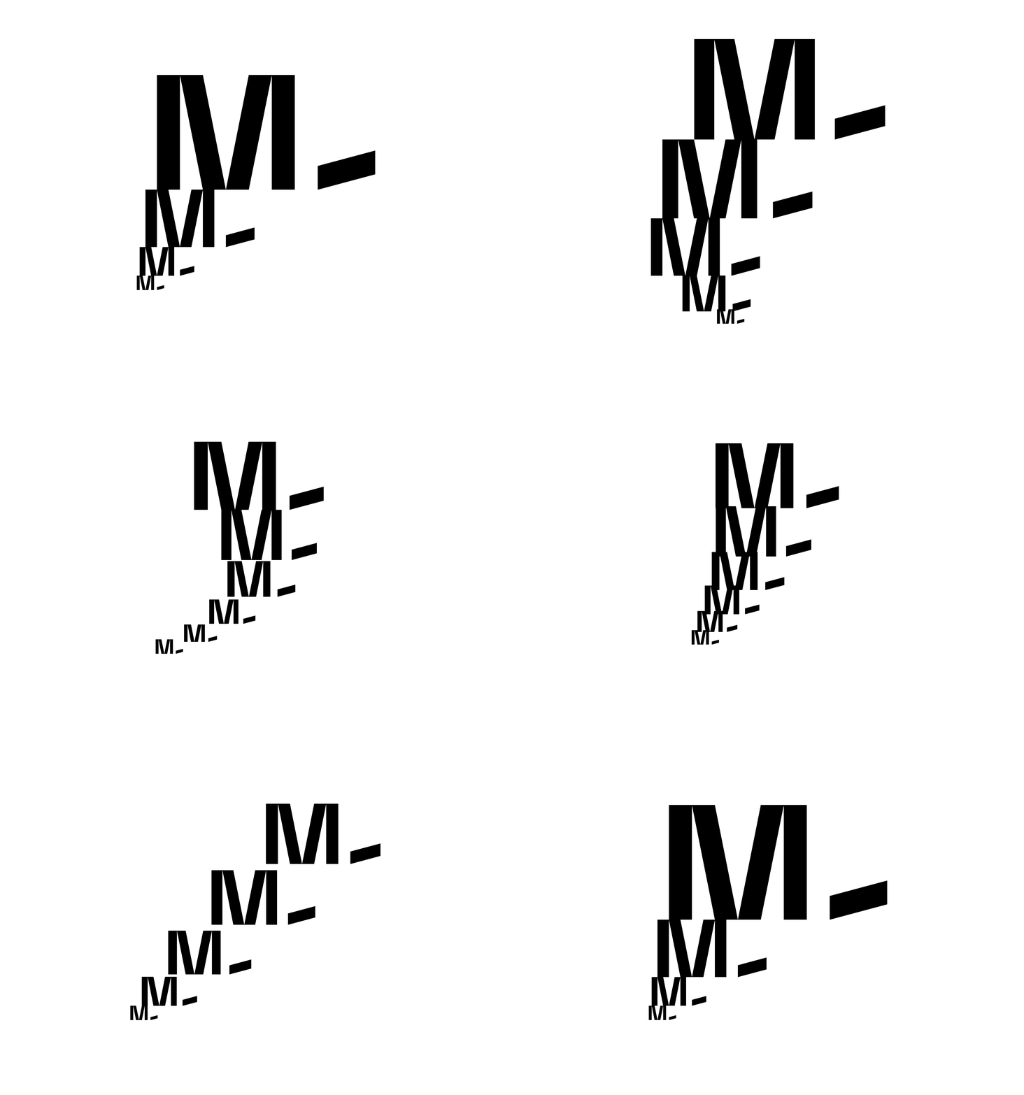
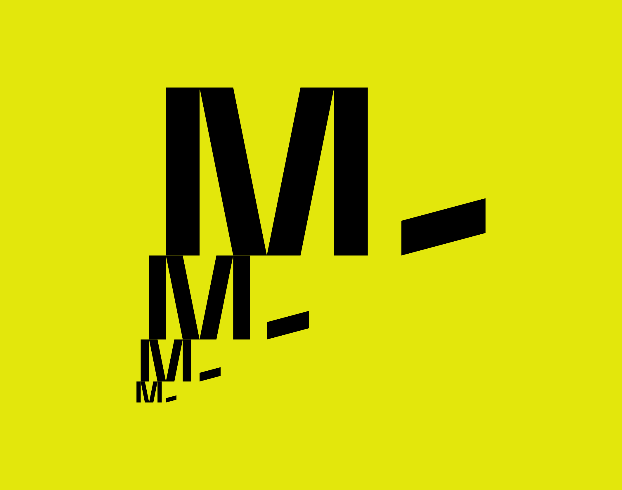
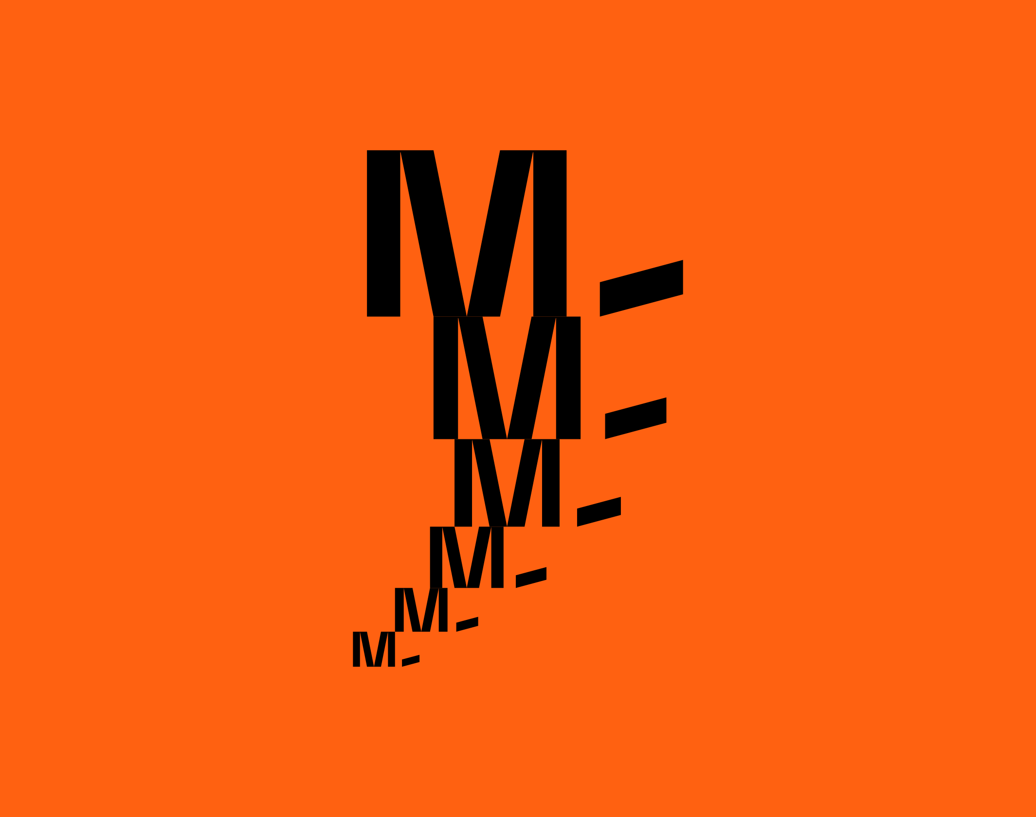
The visual imprint is then built around the monogram “M-“, which, through a play of scales, illustrates the promise of growth and progress. A construction game that allows you to create infinite graphic patterns and unify the various materials.
Further developments will be added to this case study shortly.
Publications
9
Viction:ary, Palette Mini-Series 2
Brand New, Review
Behance, Best of Behance
Communication Arts, Exhibit
Computer Arts
Creative Bloq, Review
We And The Color, Featured
Disciplines
Brand strategy
Visual identity
Motion design
Signage
Typography
Branding
Naming / copywriting
Editorial design
Web design
