Bel-Air Fine Art
Bel-Air Fine Art redefined its visual identity to elevate its status as a premier contemporary art gallery group across Europe, uniting its locations with elegance.
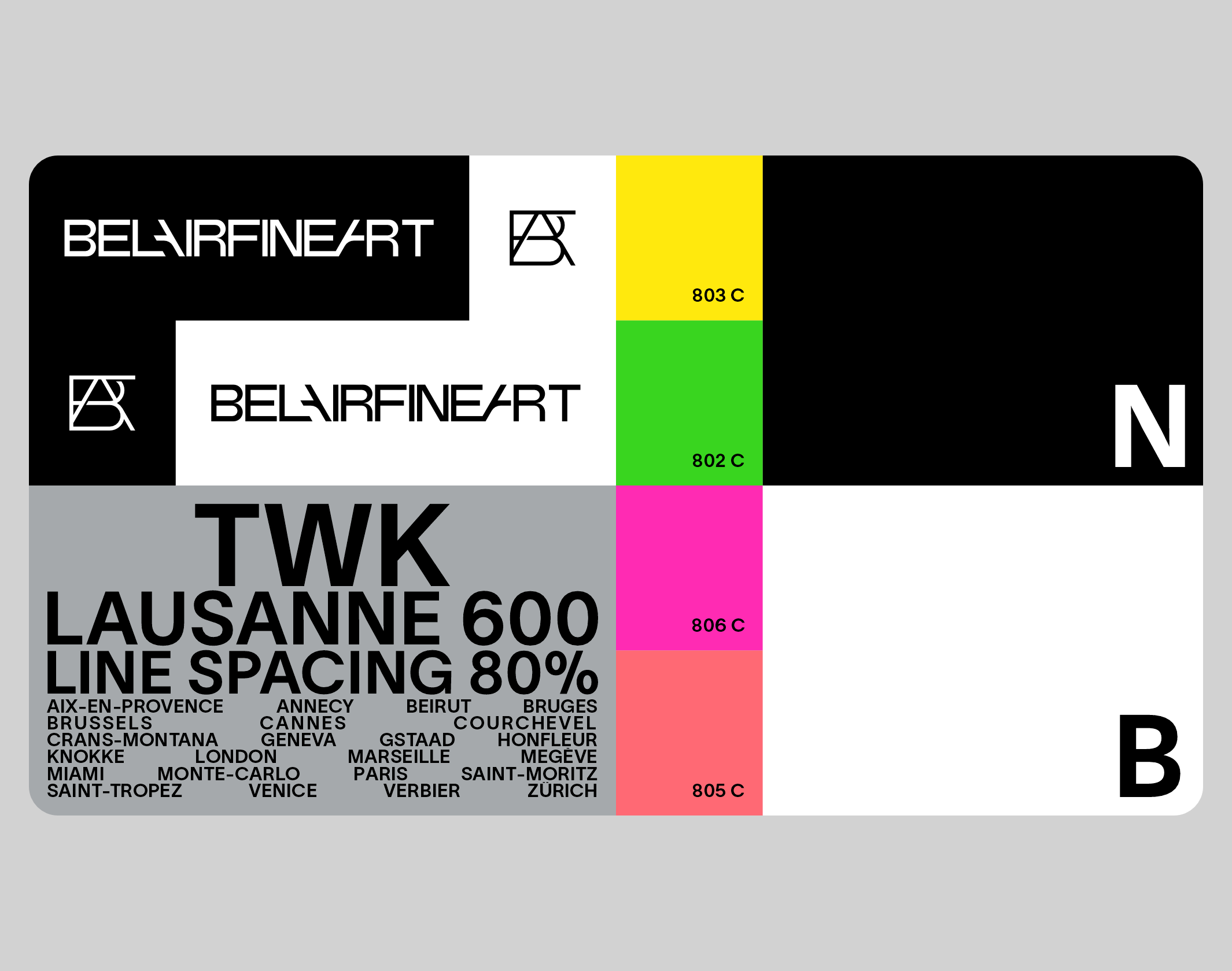
Since its creation in 2004 by François Chabanian – art dealer, gallerist and collector – Bel-Air Fine Art has become one of Europe’s leading contemporary art gallery groups, with over 25 locations. After Geneva, new prestigious locations were opened in Switzerland, in Crans-Montana, Verbier, Gstaad, Lausanne and Saint-Moritz. The group continued to expand in Europe, in Paris (Place des Vosges, Rivoli and now Montmartre and Le Royal Monceau), London, Saint-Tropez, Cannes, Aix-en-Provence, Courchevel, Megève, Venice (San Marco and Dorsoduro), Forte dei Marmi, Knokke-le-Zoute (Belgium) and more recently Monte-Carlo, Honfleur, Bruges and Annecy. François and Grégory Chabanian are at the helm of the company, championing major movements such as Post-Pop Art, Optical Art, Street Art and contemporary photography. Today, Bel-Air-Fine art is followed by 60,000 art lovers, including 15,000 collectors worldwide.
We were approached in 2023 to rethink the group’s visual identity. Working in close collaboration with the Bel-Air Fine Art teams, we designed a sensitive and sophisticated evolution, conceived to position the structure as a major art prescriber, while cohabiting flexibly with the art catalog. Our proposal confirms Bel-Air Fine Art’s move upmarket, and organizes the group’s numerous events (exhibitions, events, cocktails, gallery openings), while at the same time inserting strong visual markers into the landscape, linking all the galleries around distinctive graphic signs.
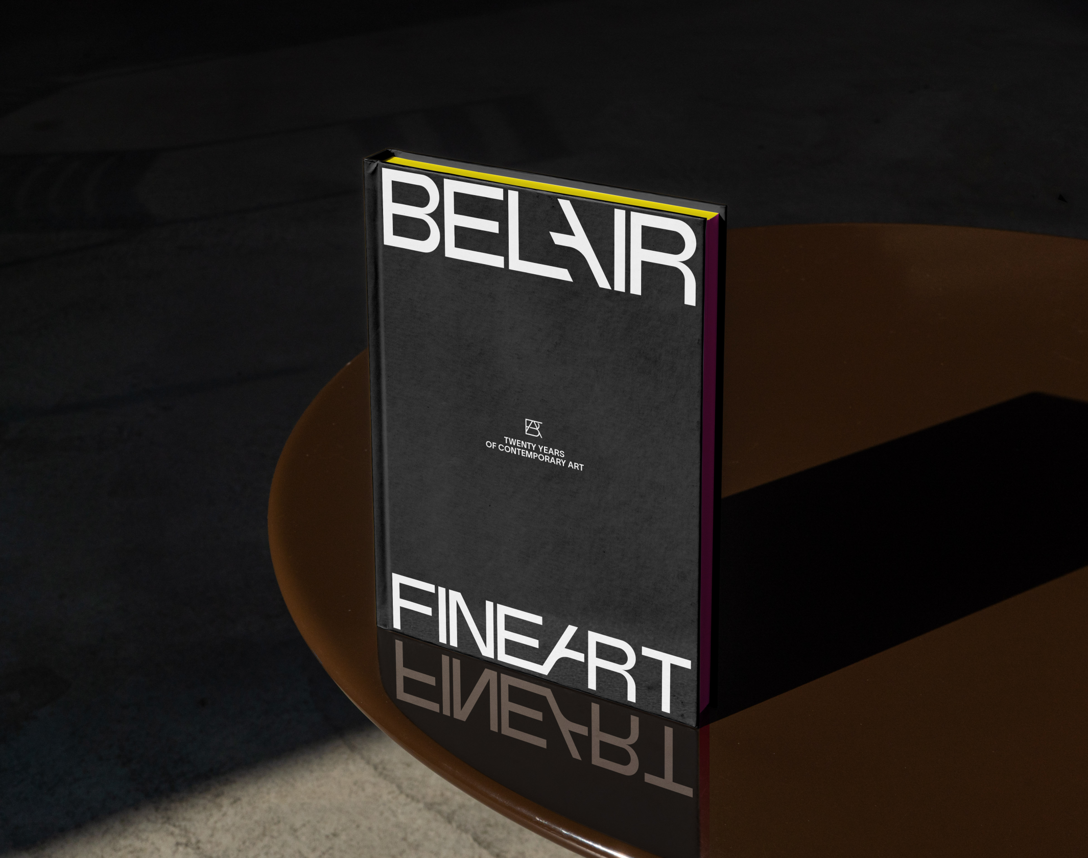
The new typographic logo, designed entirely for the occasion, revolves around an elegant, stable upper-case typeface. The 4 words of the name are once again linked, but a visual break is injected by playing on the “A”, which becomes the pivot of the brand. The monogram, a missing link in the previous visual identity, is a precious interlace of Bel-Air Fine Art’s initials, “BAFA”.
The visual territory revolves around simple ingredients, framed by a use that is both rigorous and free. Around a dominant black and white, punctuated by a few neon Pantones, we chose to use only one weight (600) of the Lausanne (Weltkern) typeface.
Posters, invitations, textiles, emailings, stationery and new gallery facades: we’re rolling out the new identity on a large scale. The new website and an anniversary book will be unveiled in 2024.
We were approached in 2023 to rethink the group’s visual identity. Working in close collaboration with the Bel-Air Fine Art teams, we designed a sensitive and sophisticated evolution, conceived to position the structure as a major art prescriber, while cohabiting flexibly with the art catalog. Our proposal confirms Bel-Air Fine Art’s move upmarket, and organizes the group’s numerous events (exhibitions, events, cocktails, gallery openings), while at the same time inserting strong visual markers into the landscape, linking all the galleries around distinctive graphic signs.
The new typographic logo, designed entirely for the occasion, revolves around an elegant, stable upper-case typeface. The 4 words of the name are once again linked, but a visual break is injected by playing on the “A”, which becomes the pivot of the brand. The monogram, a missing link in the previous visual identity, is a precious interlace of Bel-Air Fine Art’s initials, “BAFA”.
The visual territory revolves around simple ingredients, framed by a use that is both rigorous and free. Around a dominant black and white, punctuated by a few neon Pantones, we chose to use only one weight (600) of the Lausanne (Weltkern) typeface.
Posters, invitations, textiles, emailings, stationery and new gallery facades: we’re rolling out the new identity on a large scale. The new website and an anniversary book will be unveiled in 2024.
Disciplines
Brand strategy
Visual identity
Motion design
Signage
Typography
Branding
Naming / copywriting
Editorial design
Web design