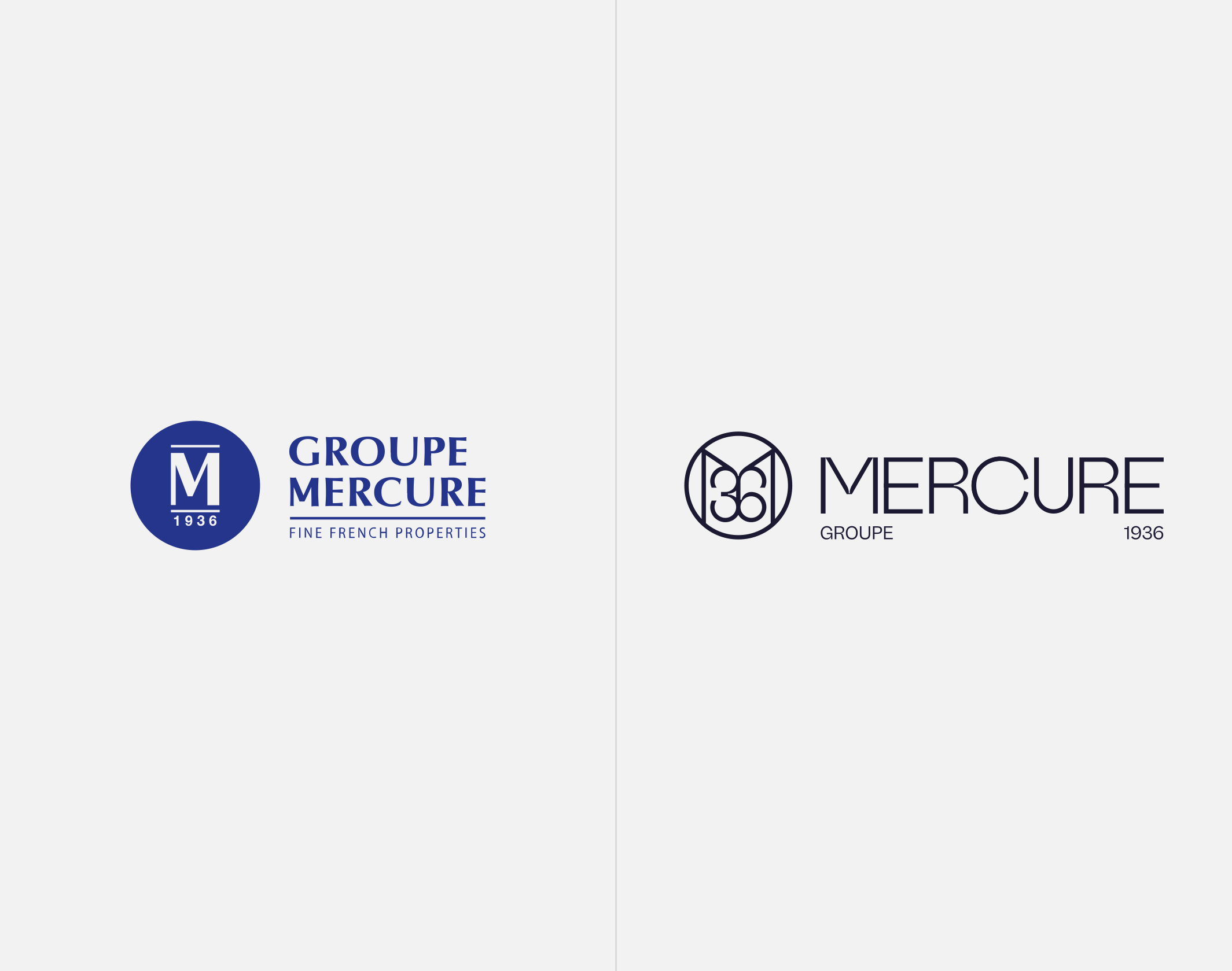
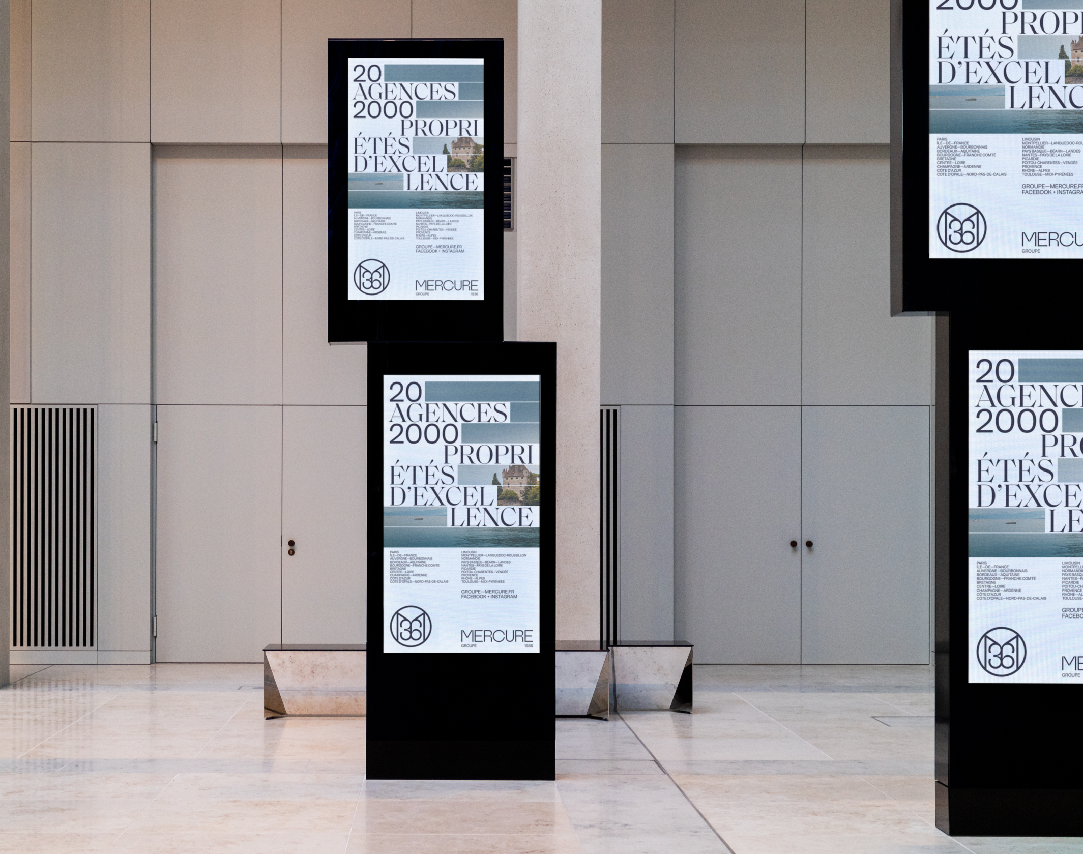
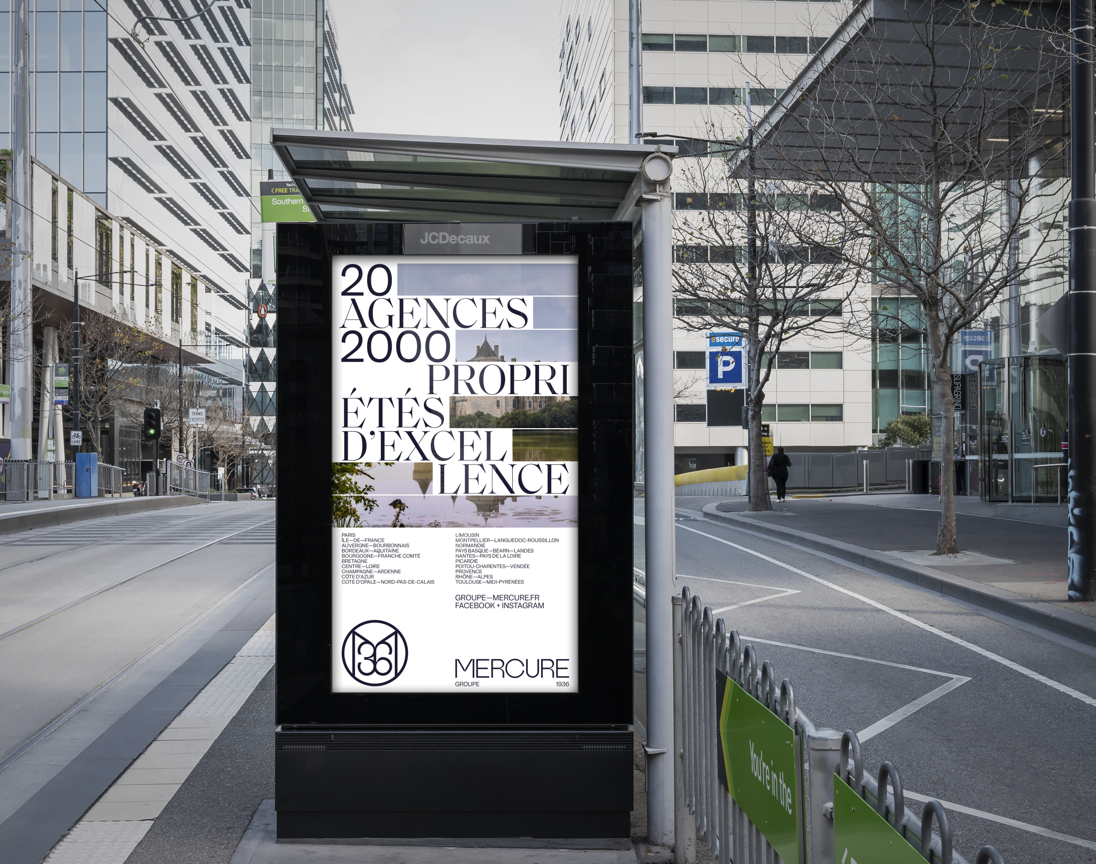
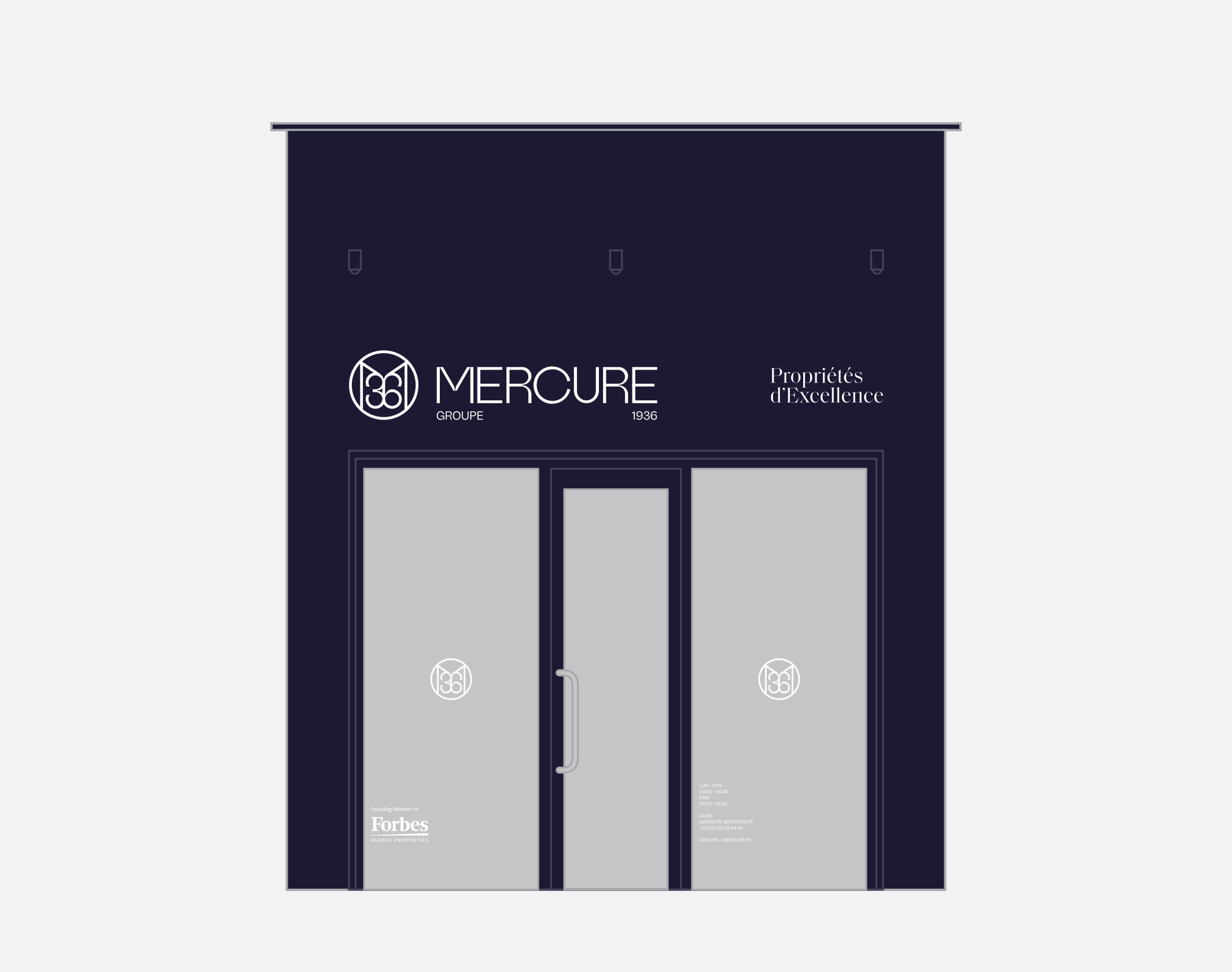
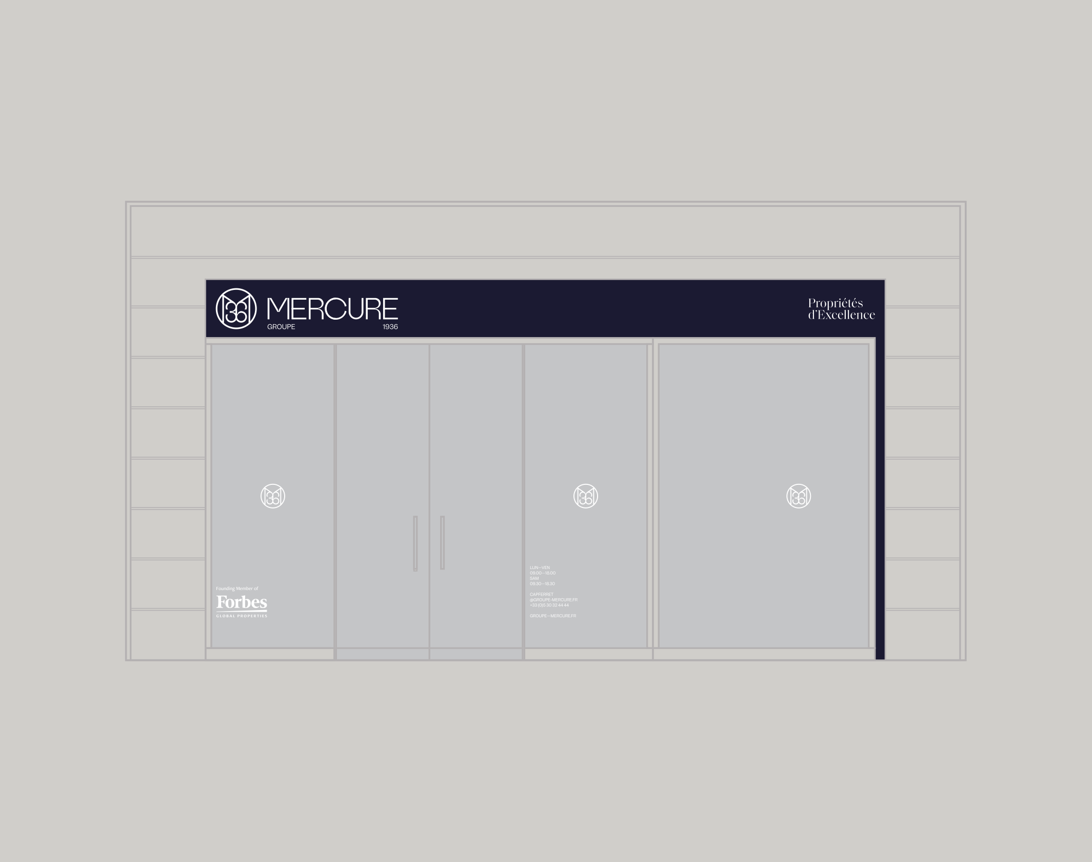
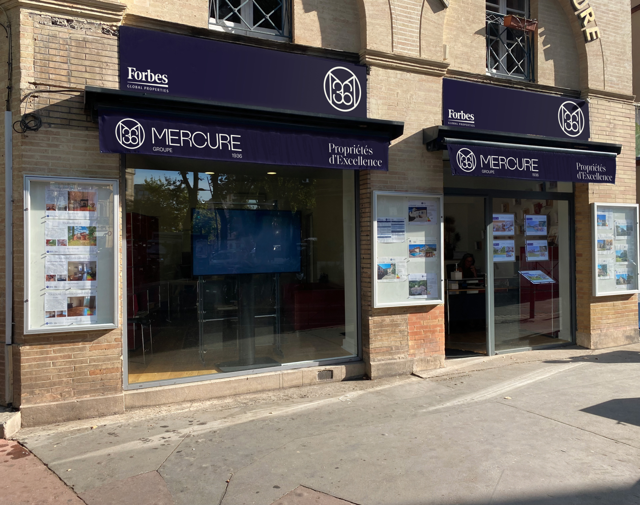
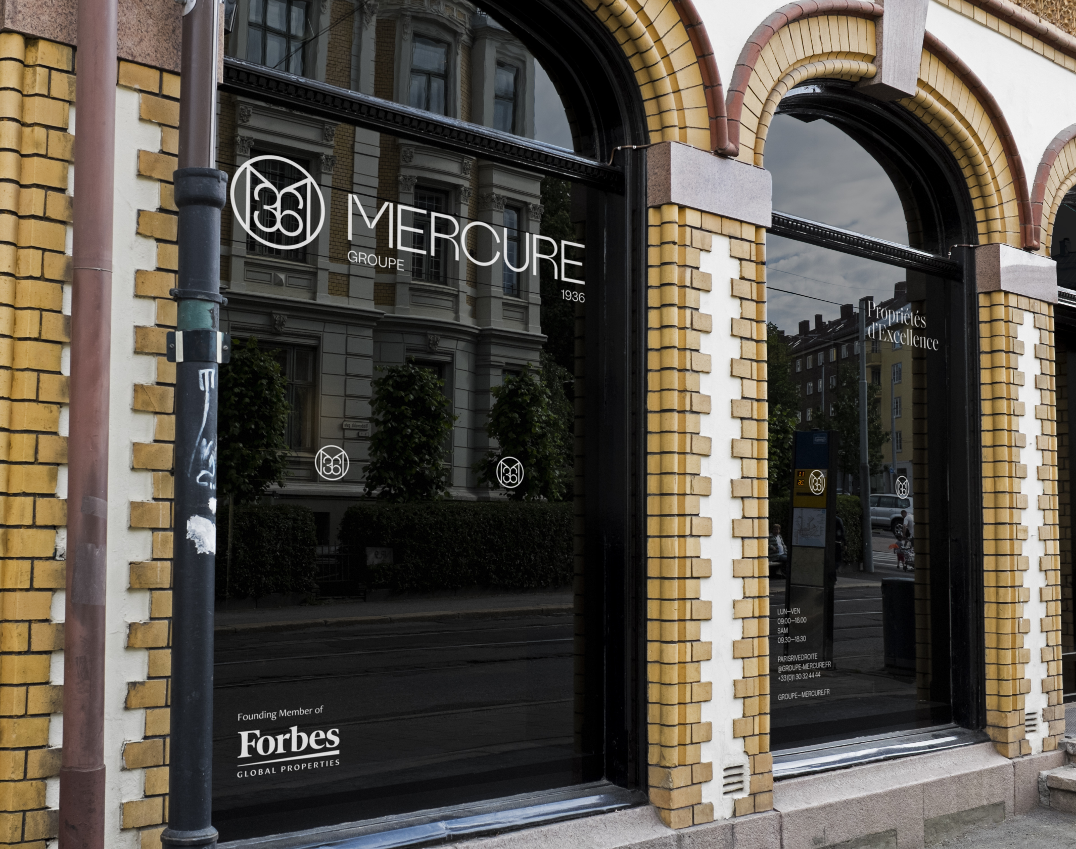
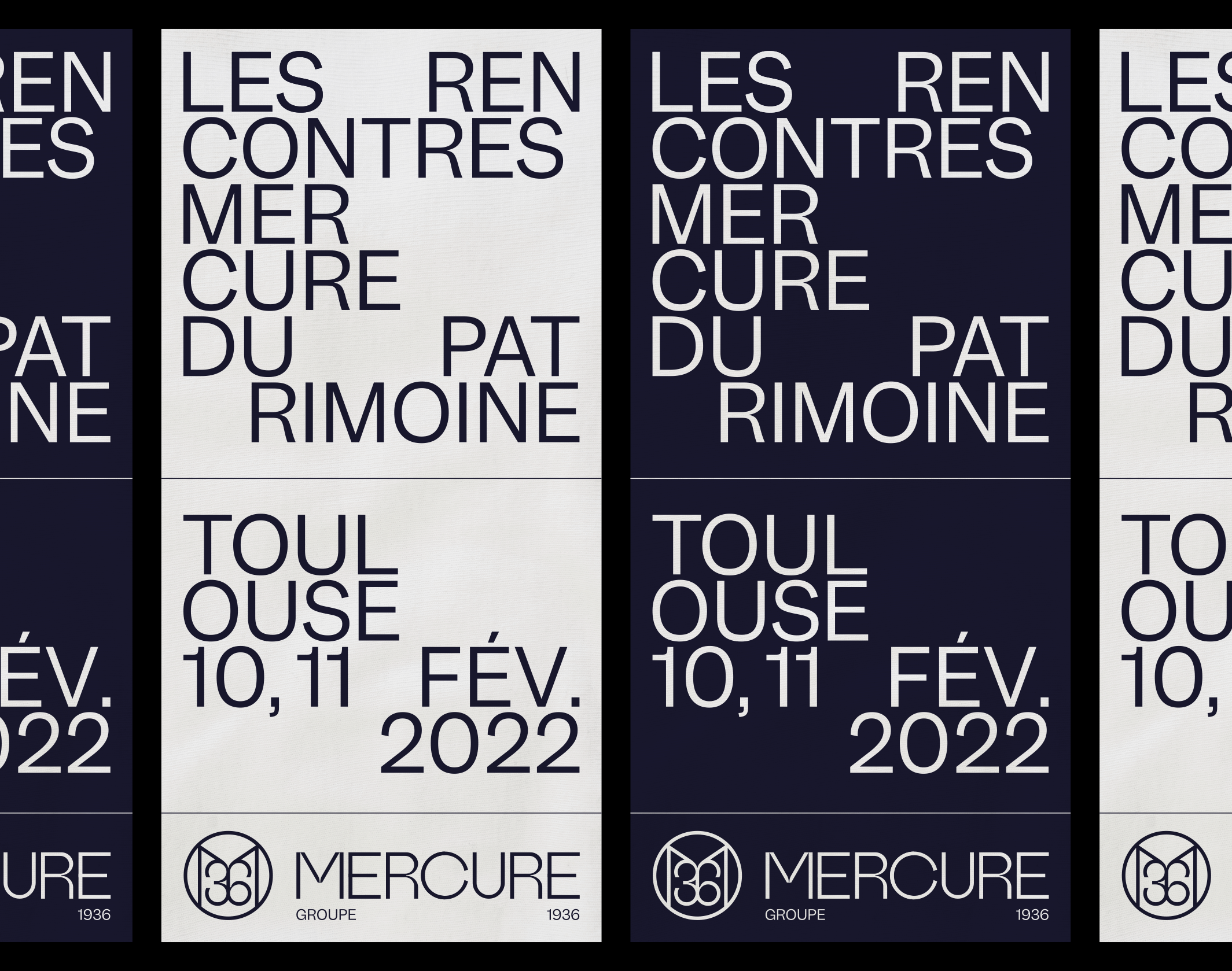
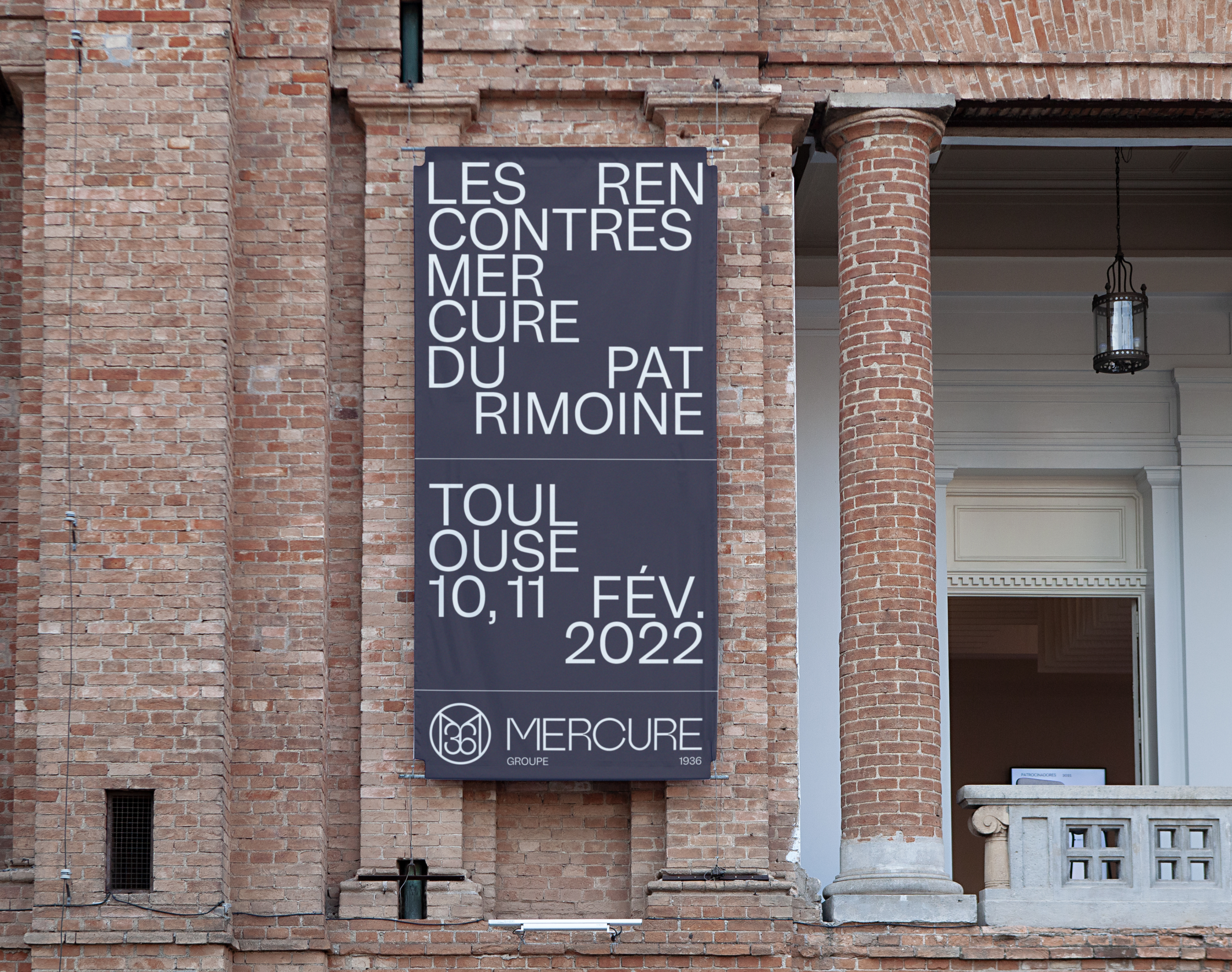
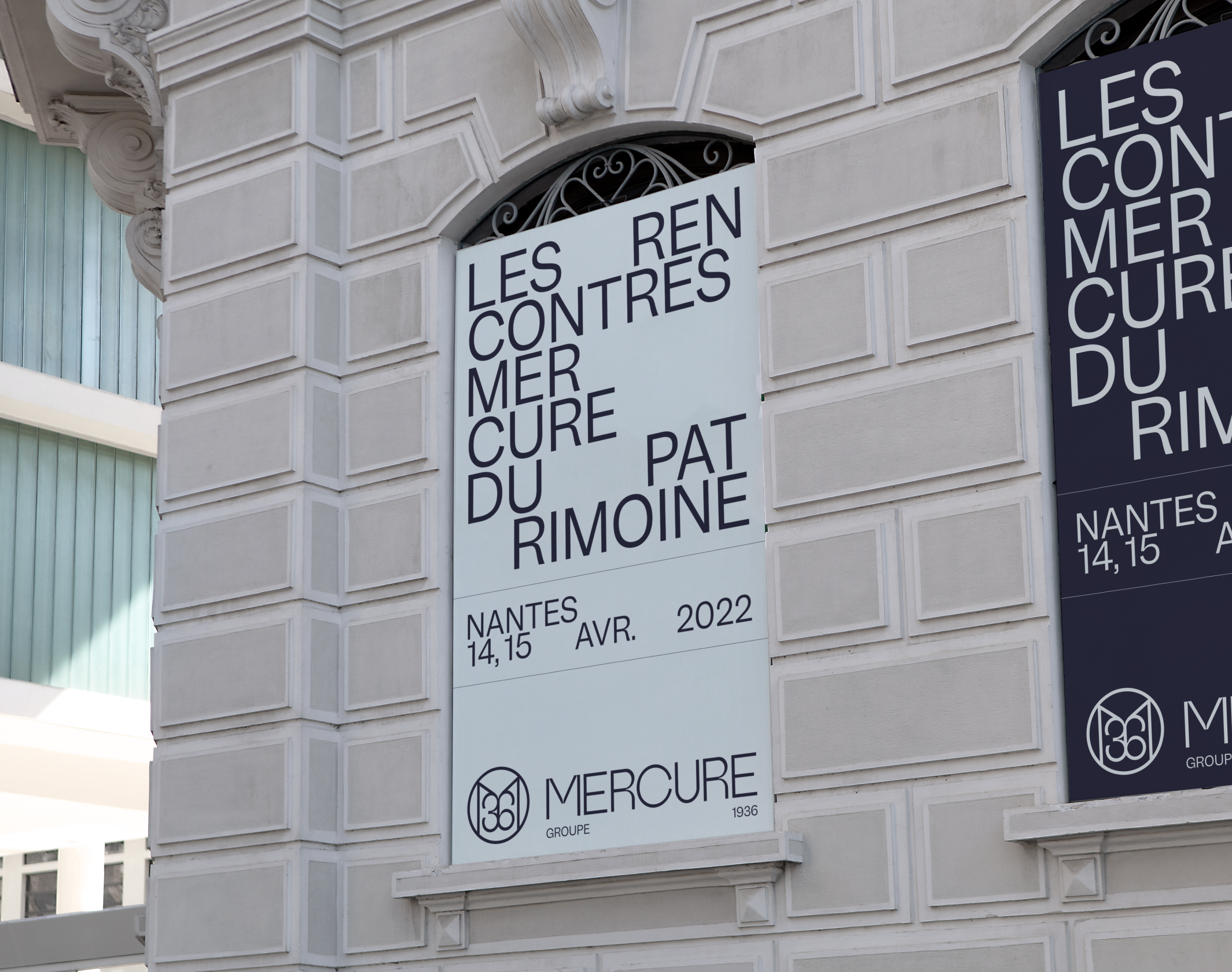
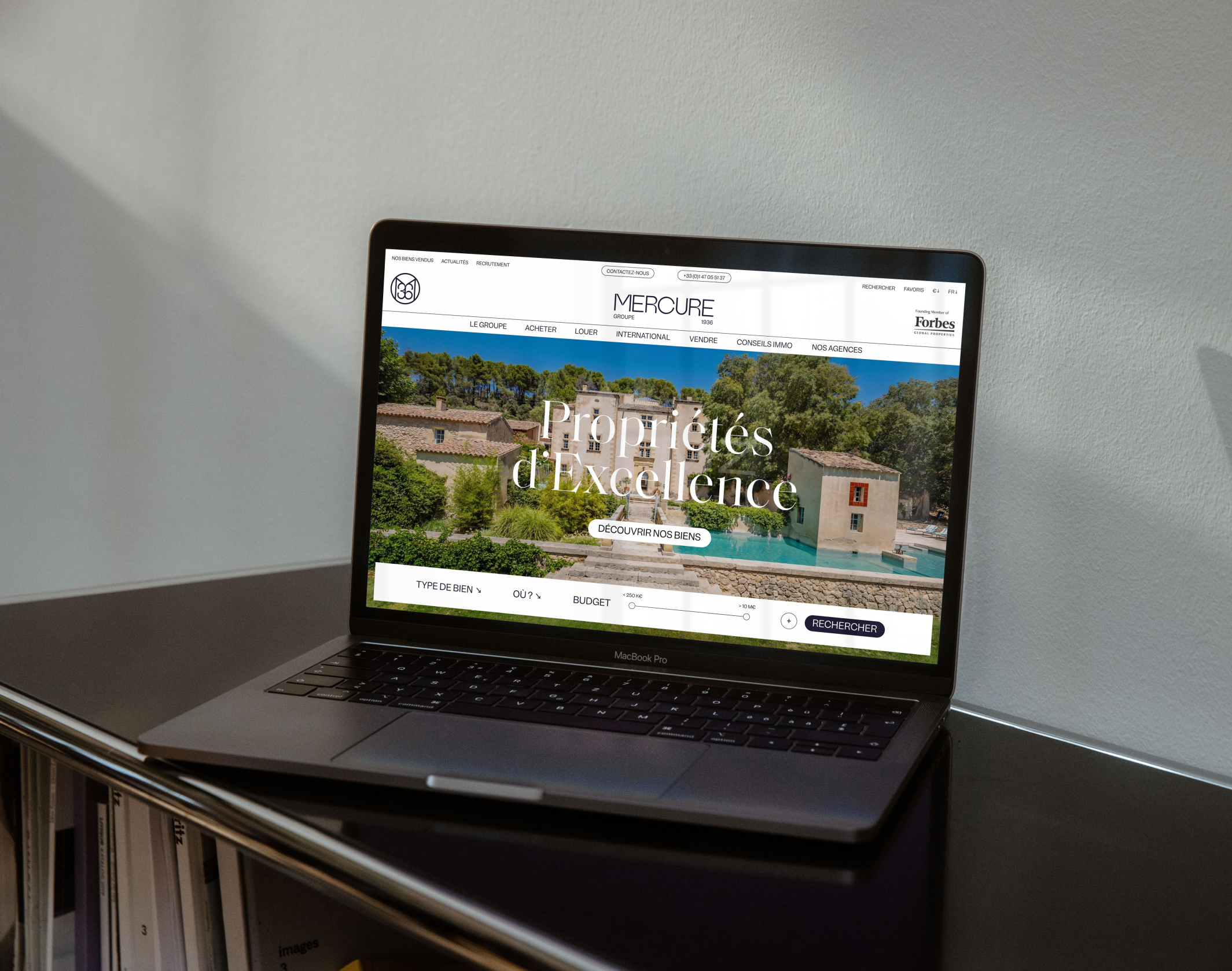
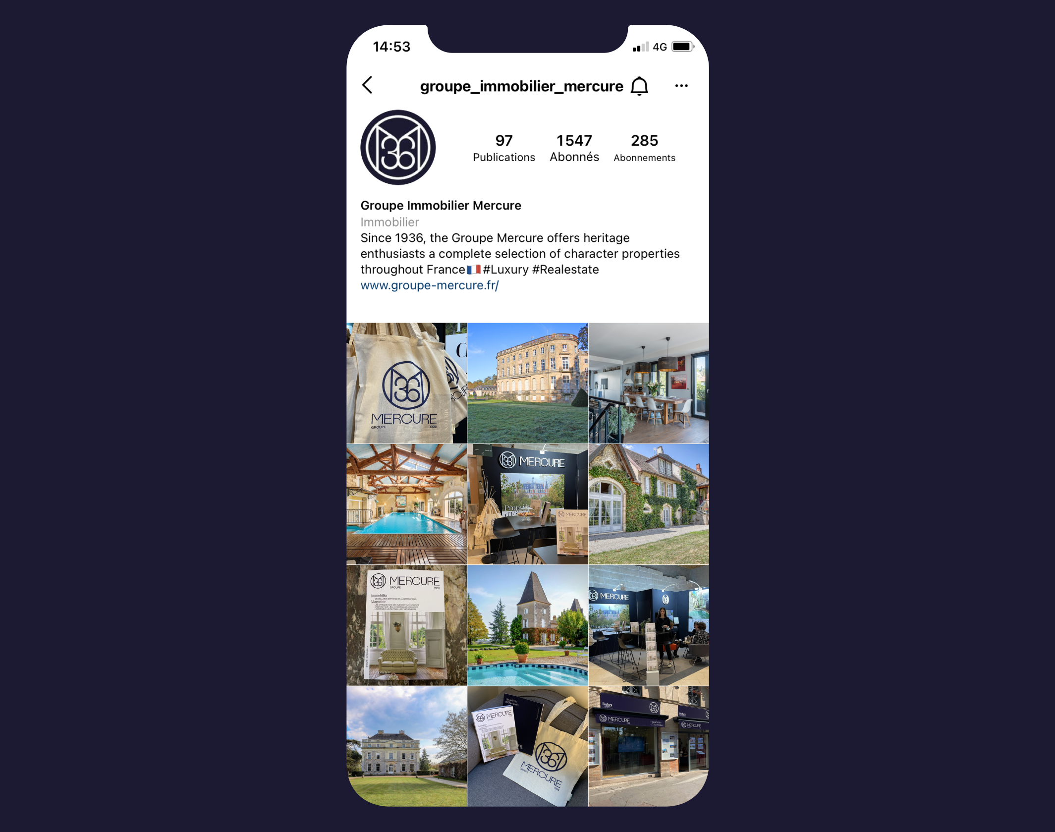
Groupe Mercure – Forbes Global Properties was created in 1936 and is one of the top 4 French real estate networks dedicated to the luxury market, with more than 2,000 character properties for sale in 20 agencies spread across the country. Moreover, it is the undisputed leader in the niche market of castle sales, concentrating more than 80% of the French inventory. In the spring of 2021, the group’s top management asked our studio to completely rethink the brand’s graphic identity, as well as its signature and visual system.
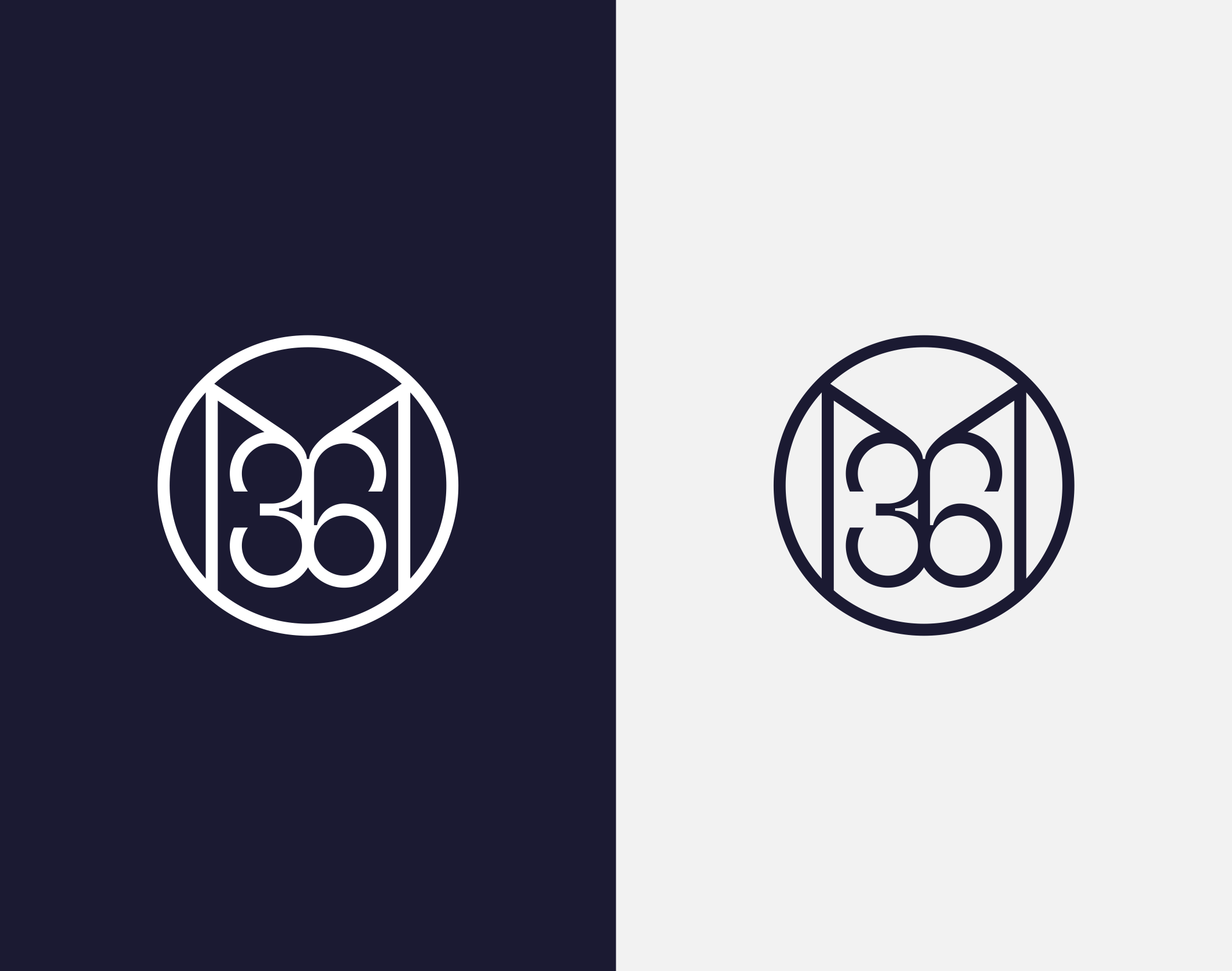
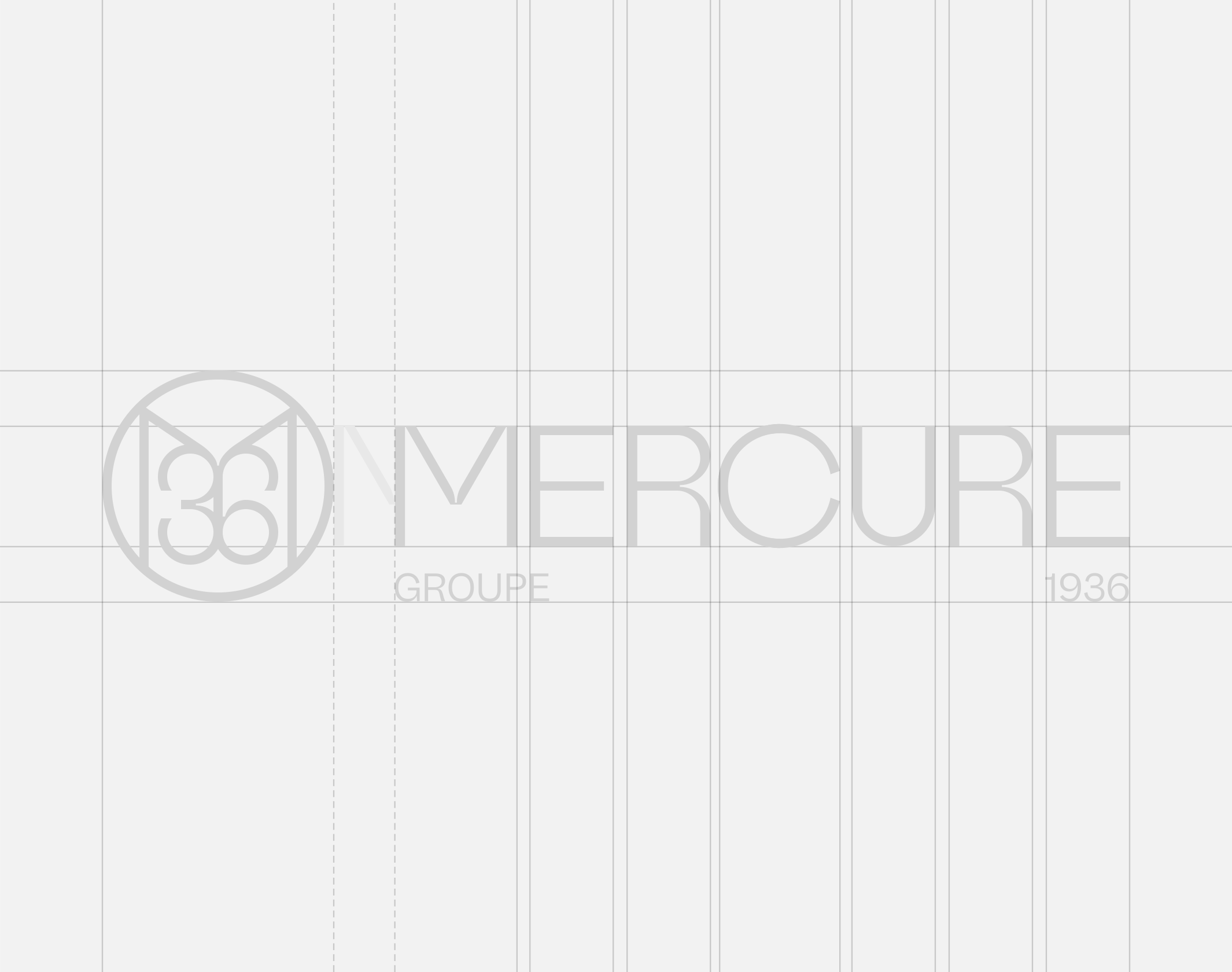
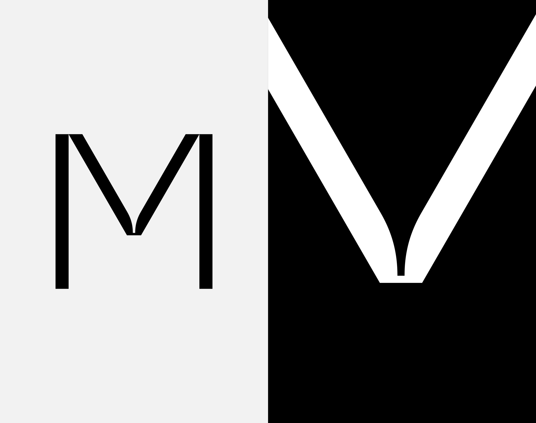
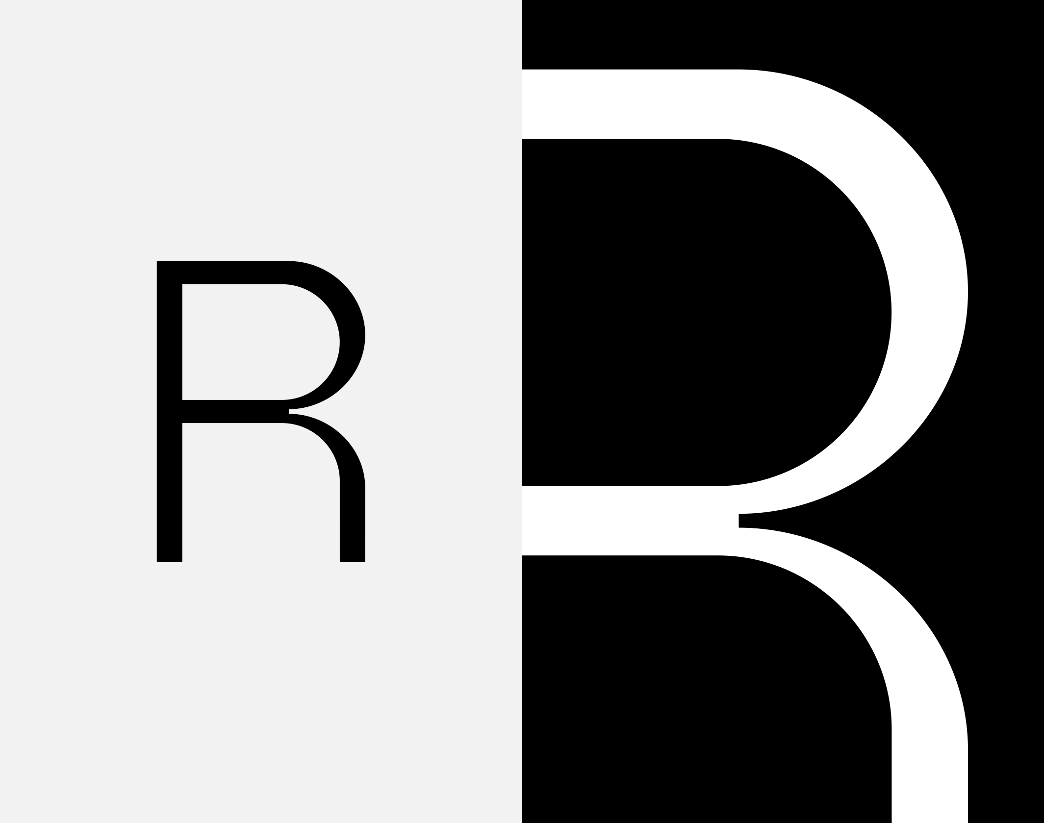
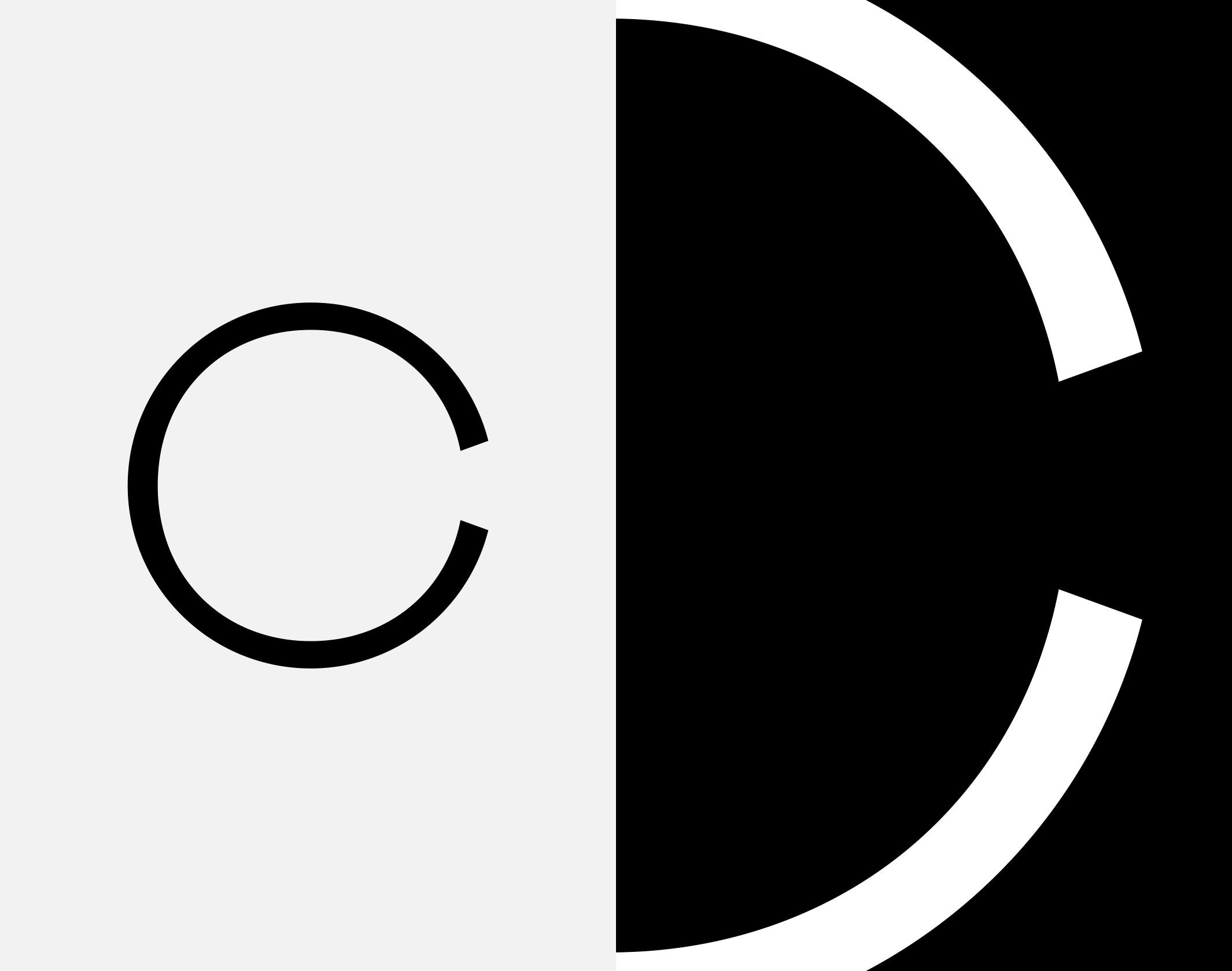
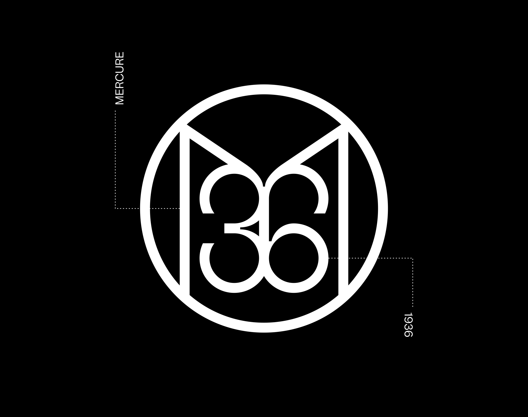
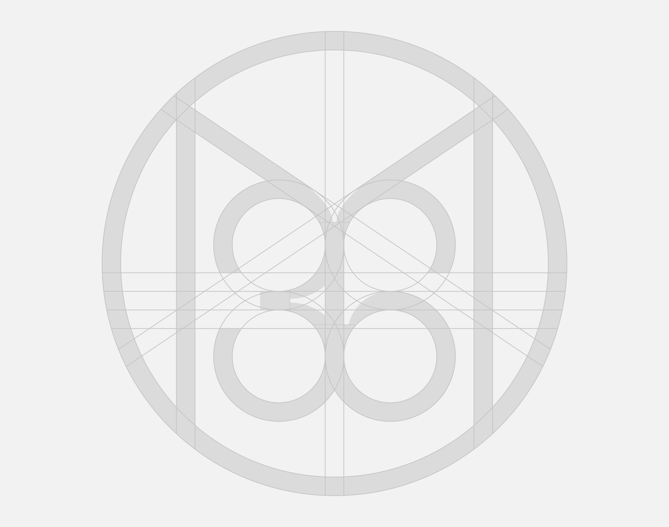
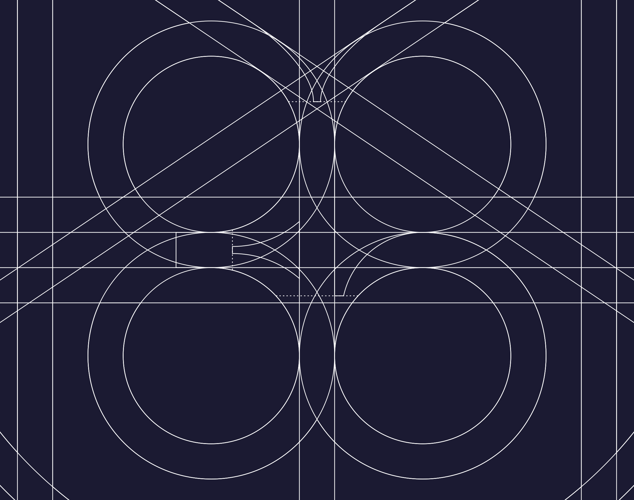
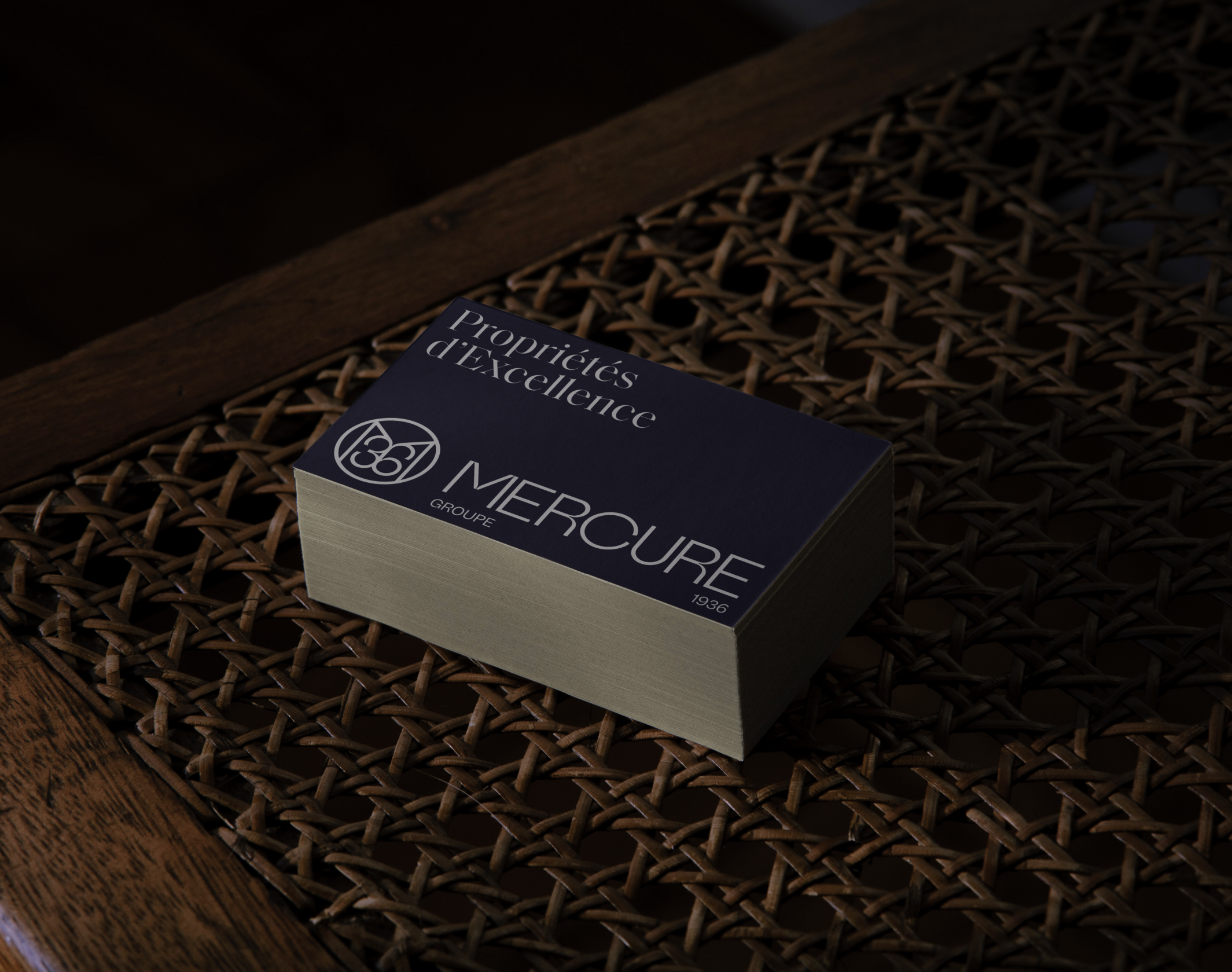
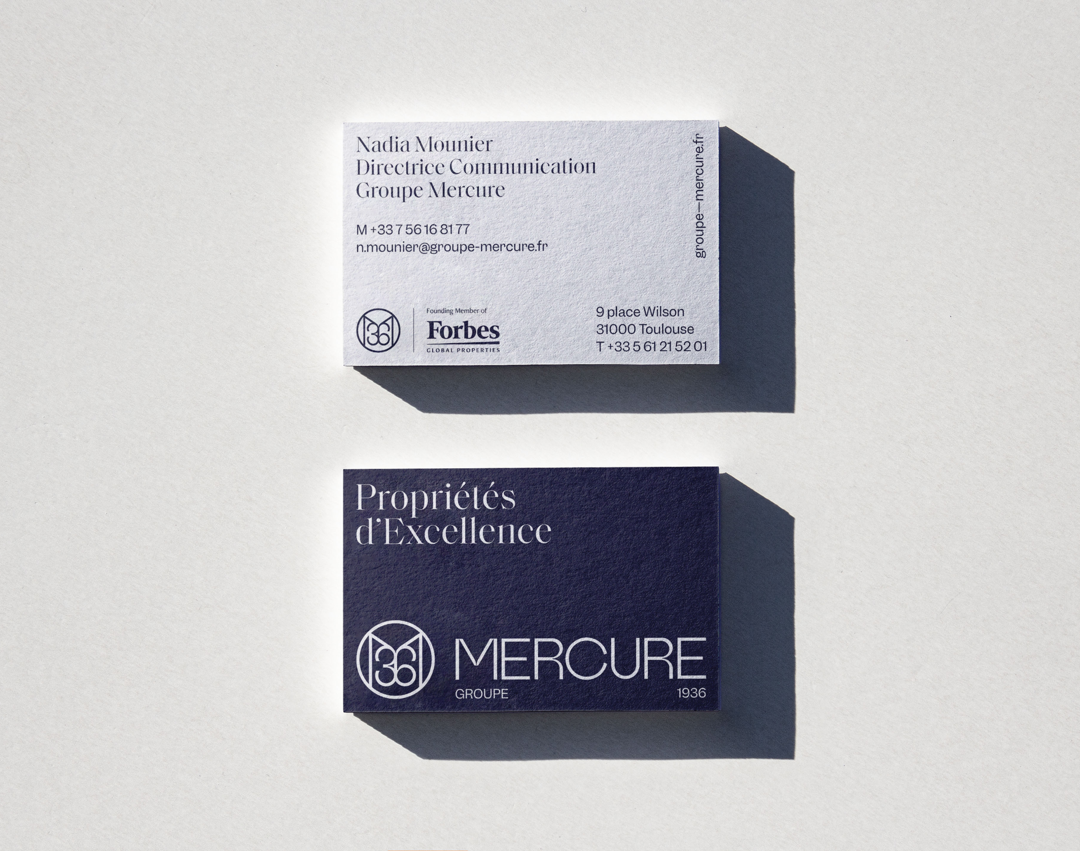
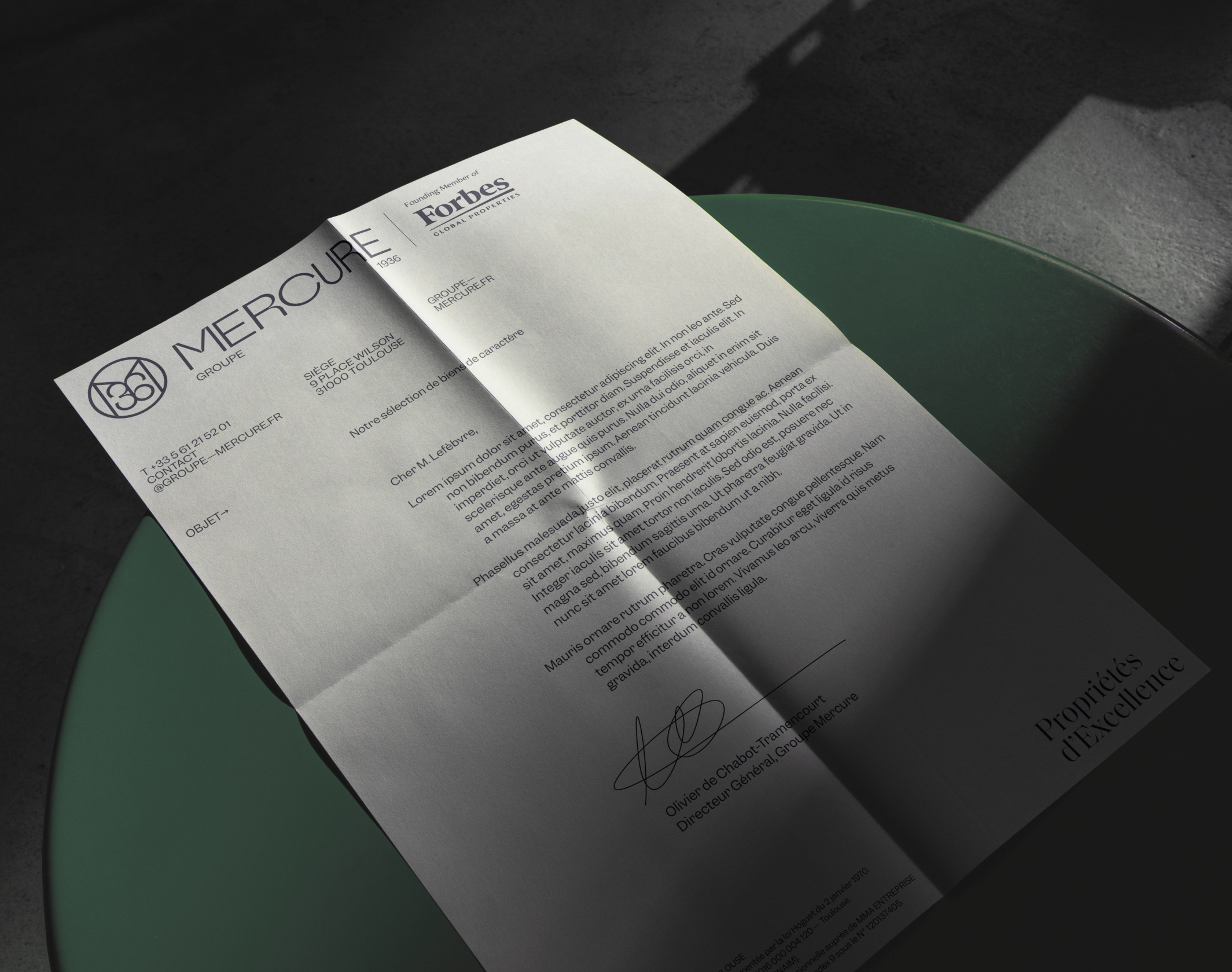
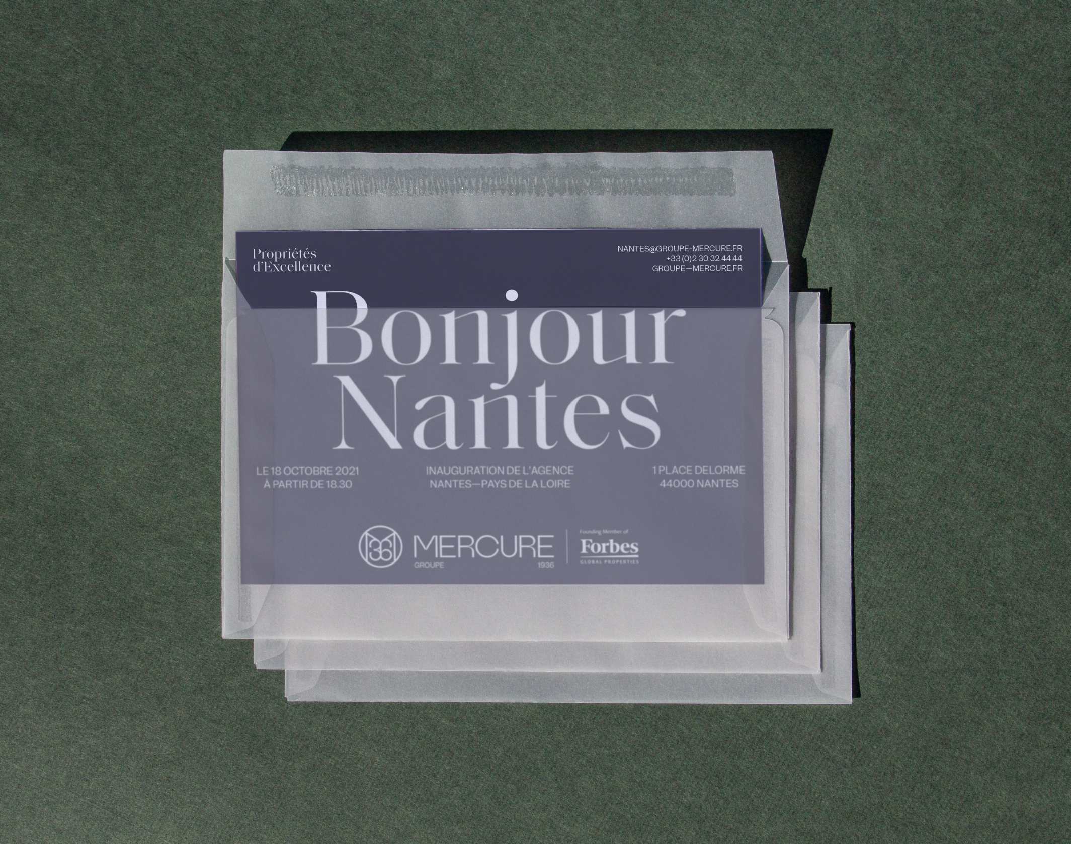
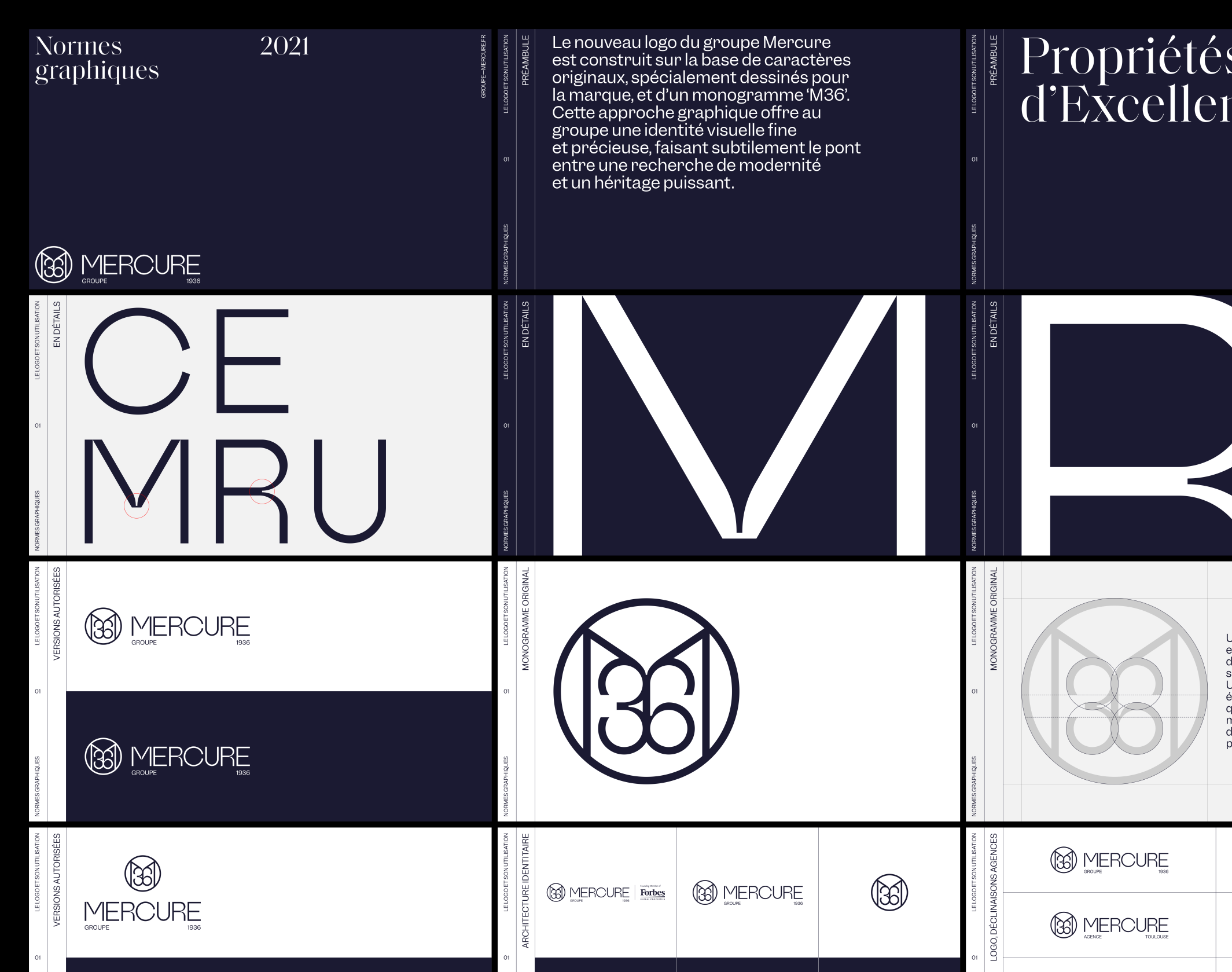
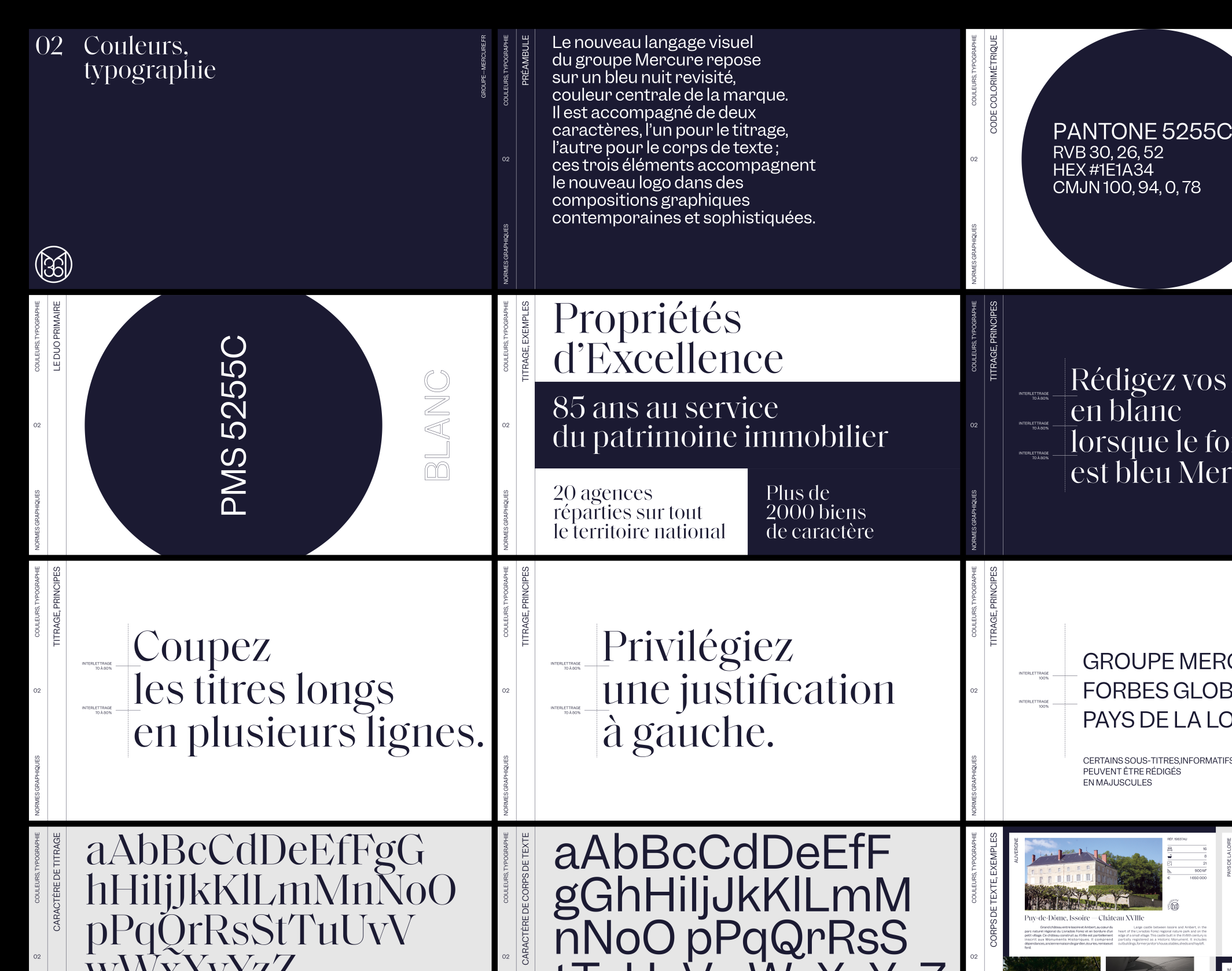
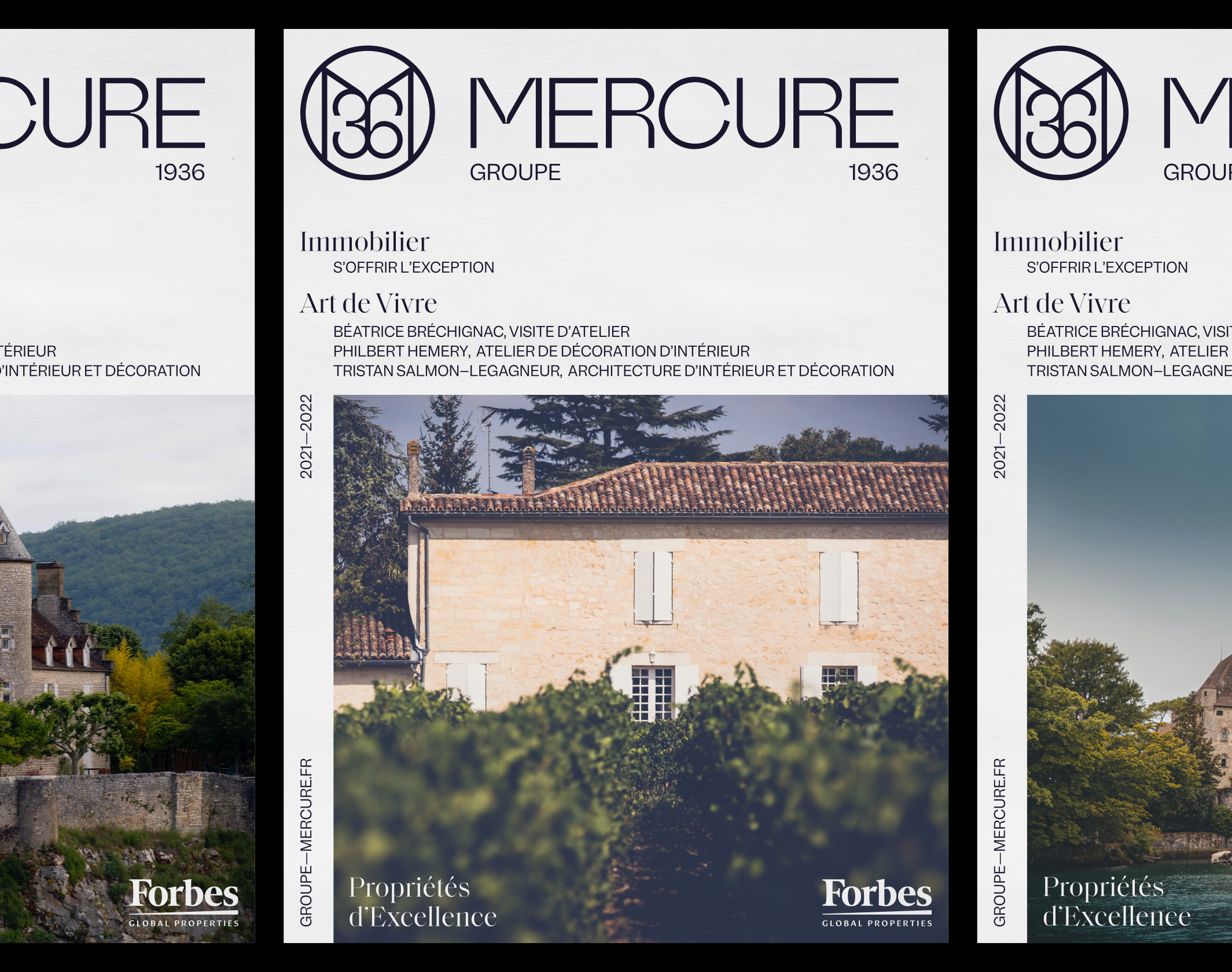
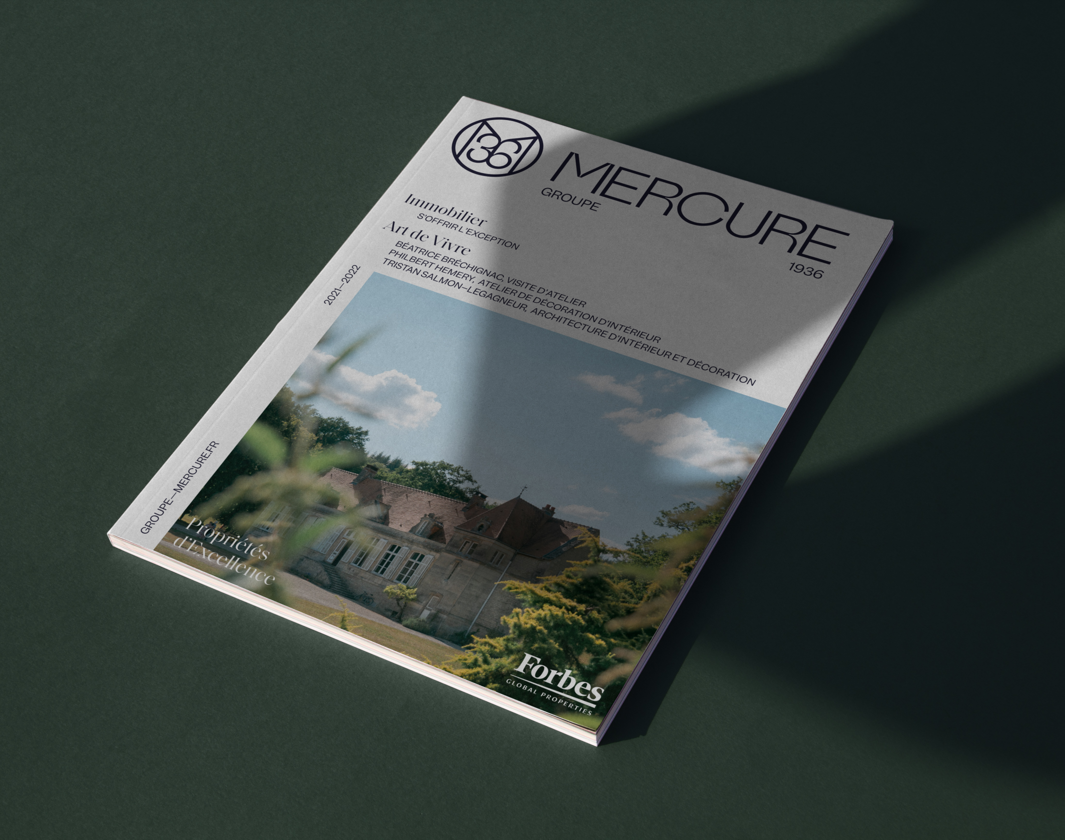
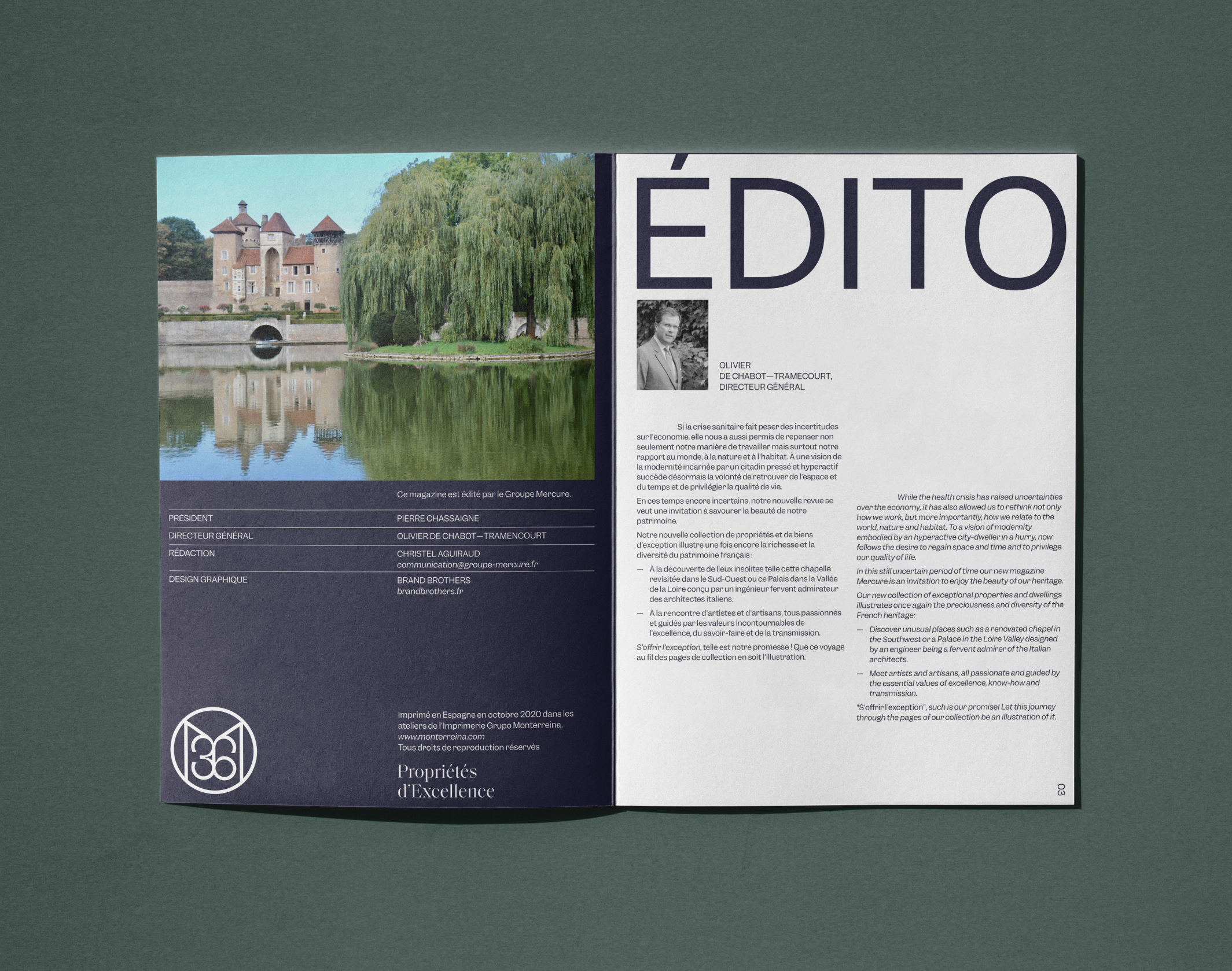
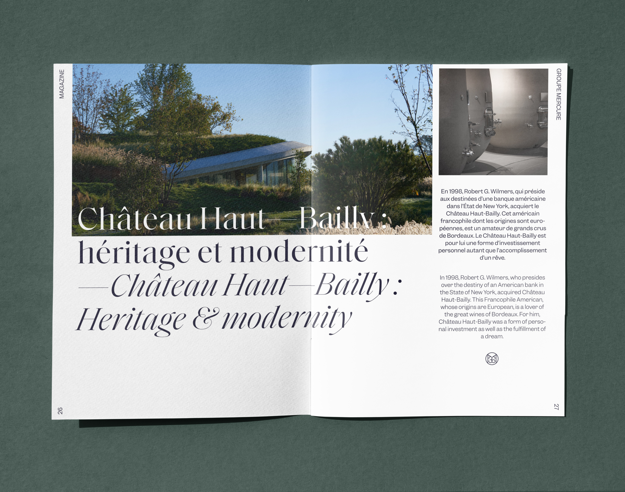
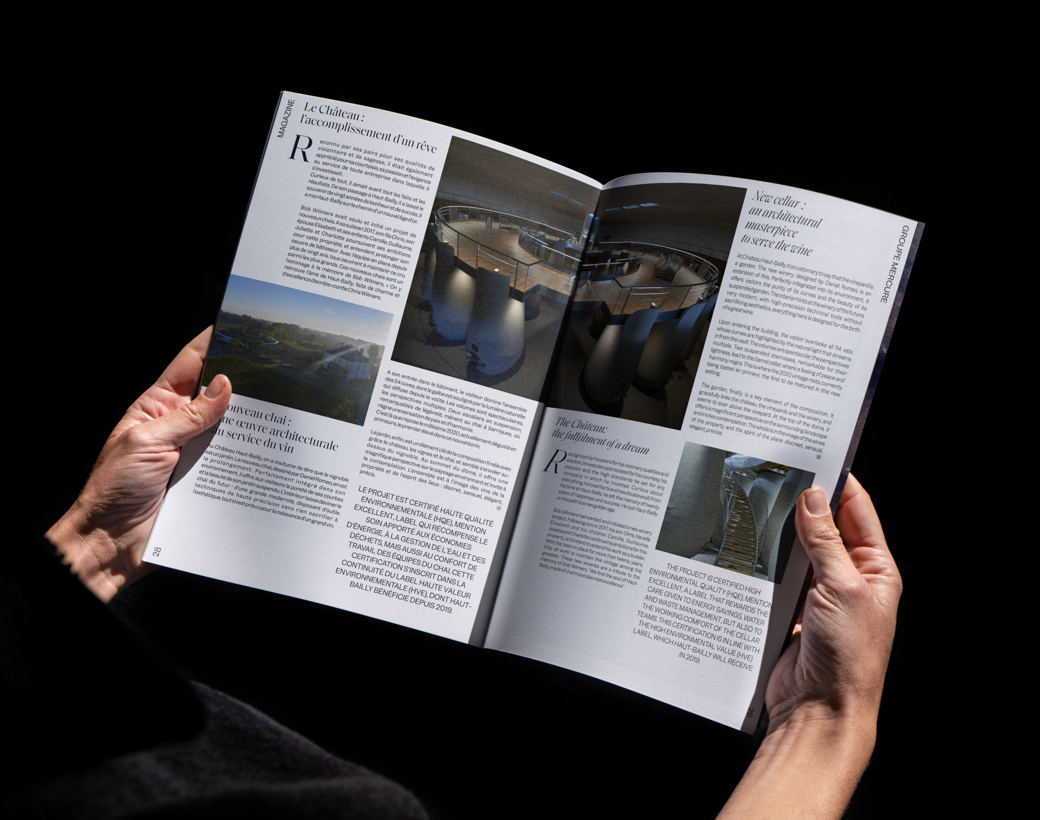
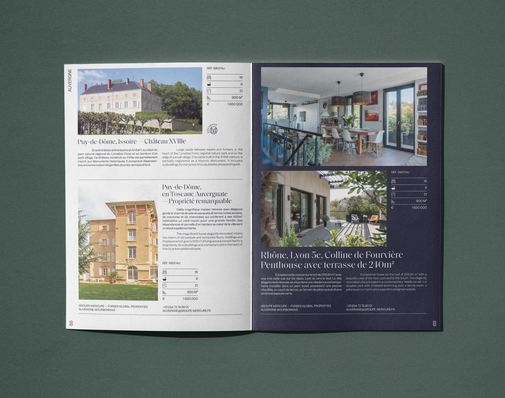
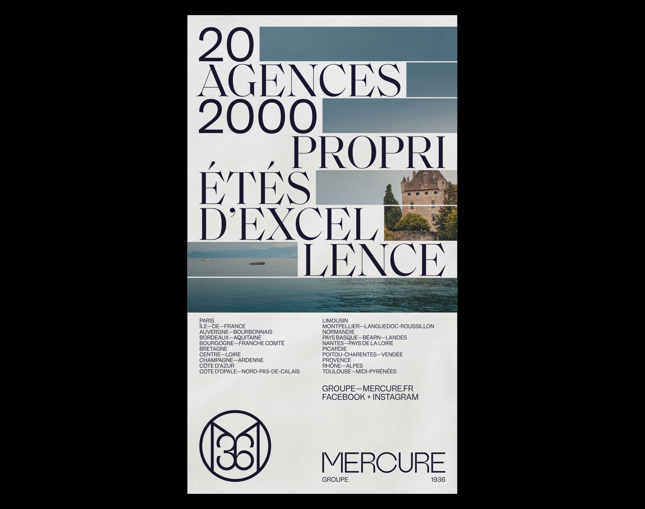
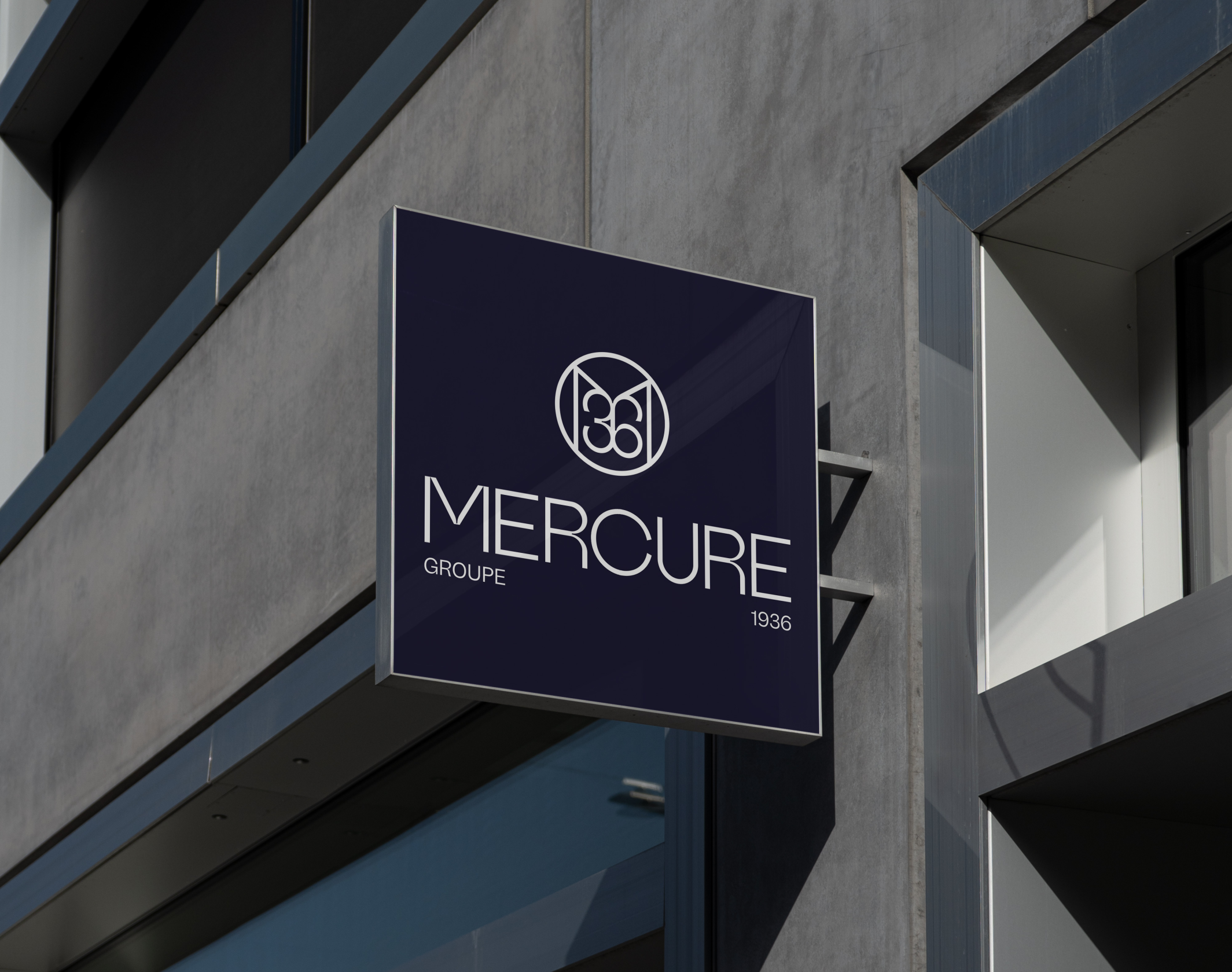
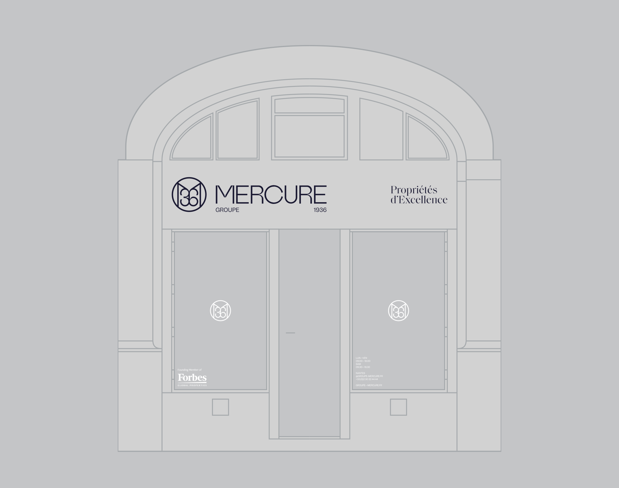
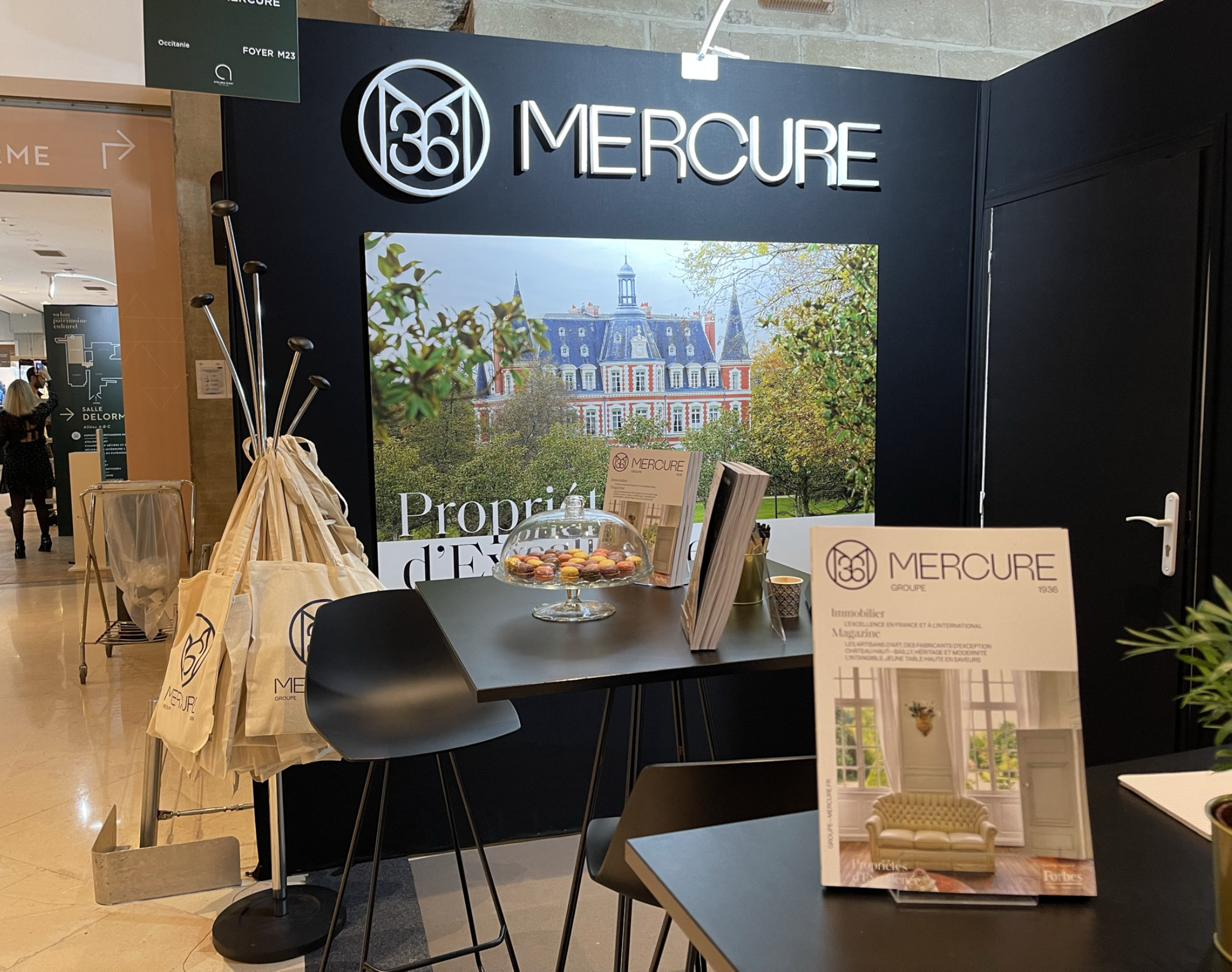
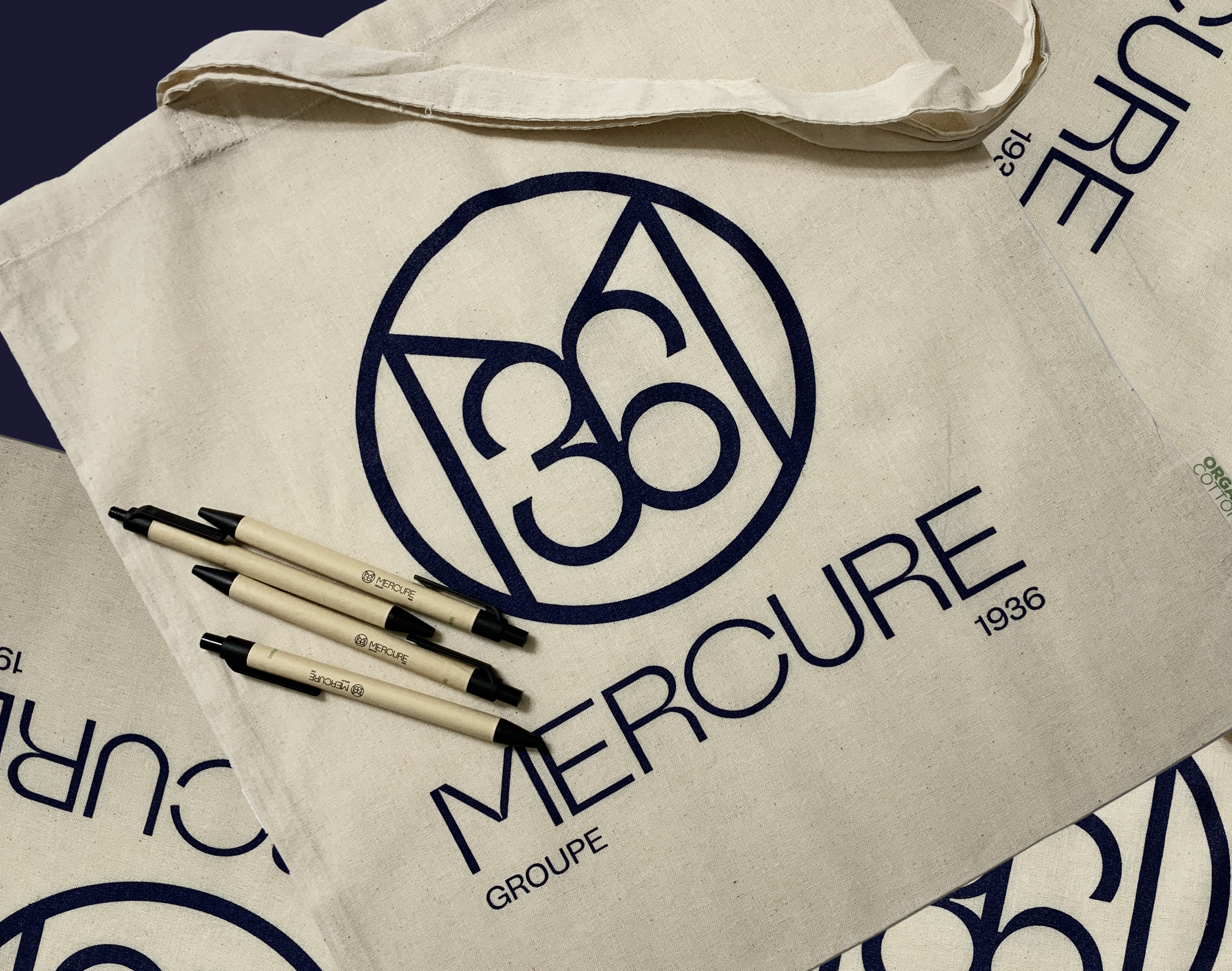
The brand’s traditional heritage and the environment in which its teams work oblige us to navigate in a highly codified environment. At the same time, our desire – as well as that of the management – was to take Groupe Mercure towards graphic standards that would allow it to be remembered and to impose a style over the long term. Thus, the new logo is composed of a thin and structured lettering, with optical subtleties that enhance its natural elegance. It is complemented by a monogram “M36” whose characters form a symmetrical interlace that evokes French refinement or a wrought iron gate. This unique approach anchors the brand’s longevity at the heart of the graphic identity. We then developed the group’s entire visual environment, from its signature (“Properties of Excellence”) to the complete graphic standards, including the design of the annual magazine. The reveal of the new branding took place in Paris in October 2021 at the Salon du Patrimoine.
The brand’s traditional heritage and the environment in which its teams work oblige us to navigate in a highly codified environment. At the same time, our desire – as well as that of the management – was to take Groupe Mercure towards graphic standards that would allow it to be remembered and to impose a style over the long term. Thus, the new logo is composed of a thin and structured lettering, with optical subtleties that enhance its natural elegance. It is complemented by a monogram “M36” whose characters form a symmetrical interlace that evokes French refinement or a wrought iron gate. This unique approach anchors the brand’s longevity at the heart of the graphic identity. We then developed the group’s entire visual environment, from its signature (“Properties of Excellence”) to the complete graphic standards, including the design of the annual magazine. The reveal of the new branding took place in Paris in October 2021 at the Salon du Patrimoine.
Disciplines
Brand strategy
Visual identity
Motion design
Signage
Typography
Branding
Naming / copywriting
Editorial design
Web design
