Helectic
Helectic redefined its brand with a modern identity and a new showroom, blending high-end electrical solutions with a fresh narrative and visual style.
Helectic, formerly TSEE, is a leading distributor of high-end electrical equipment in Paris, specializing in switches, lighting and heating. A family-run business based in Boulogne-Billancourt (92), Helectic opened a new showroom in 2024, rethinking the company’s name, positioning and graphic identity. Founded in 2001, Helectic offers over 100 brands and more than 3,000 references, mainly in the high-end hotel and restaurant sectors, but also in prestige real estate.
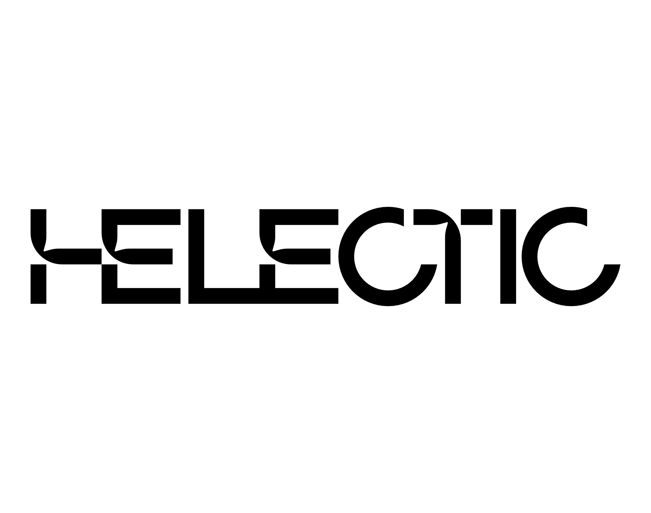
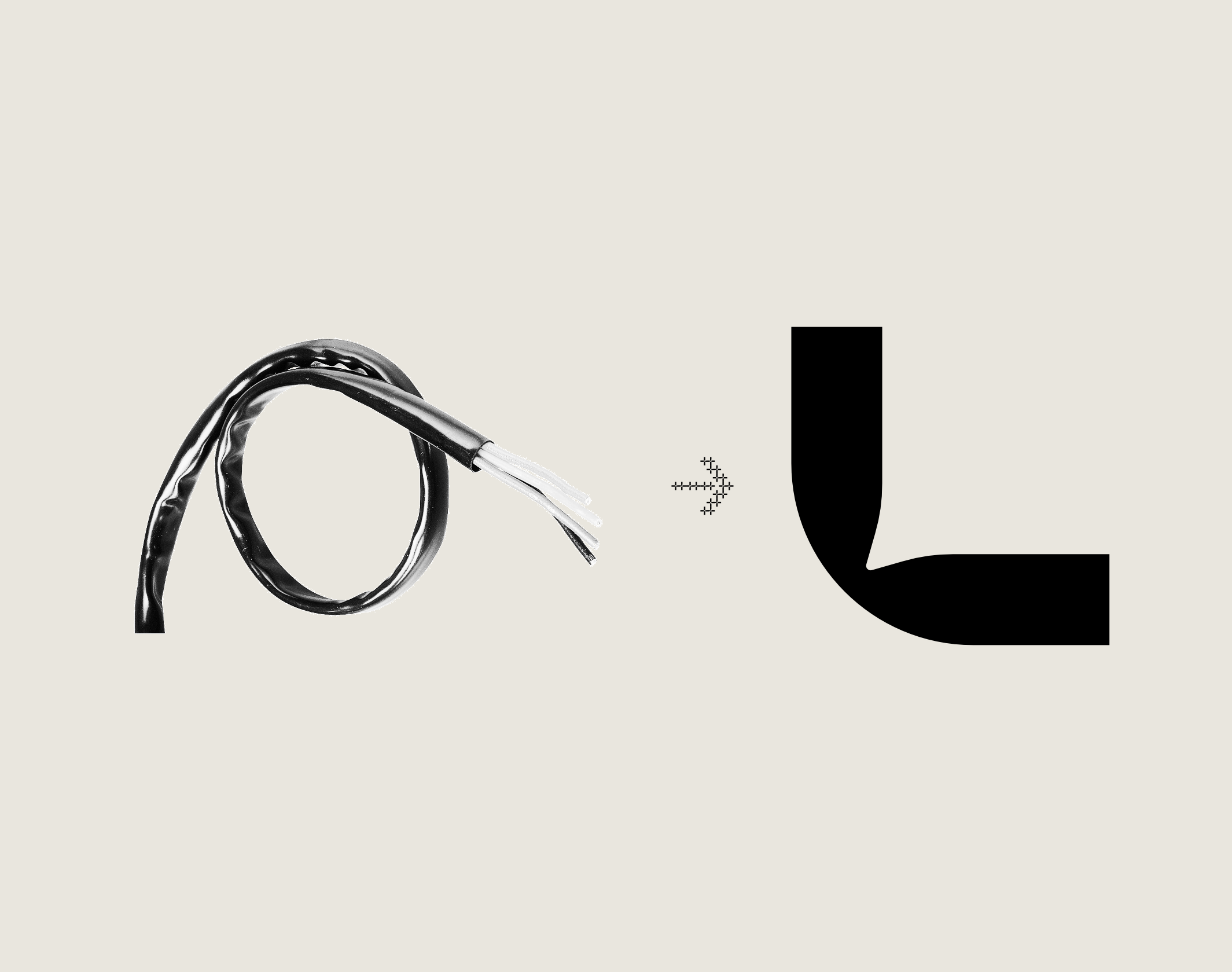
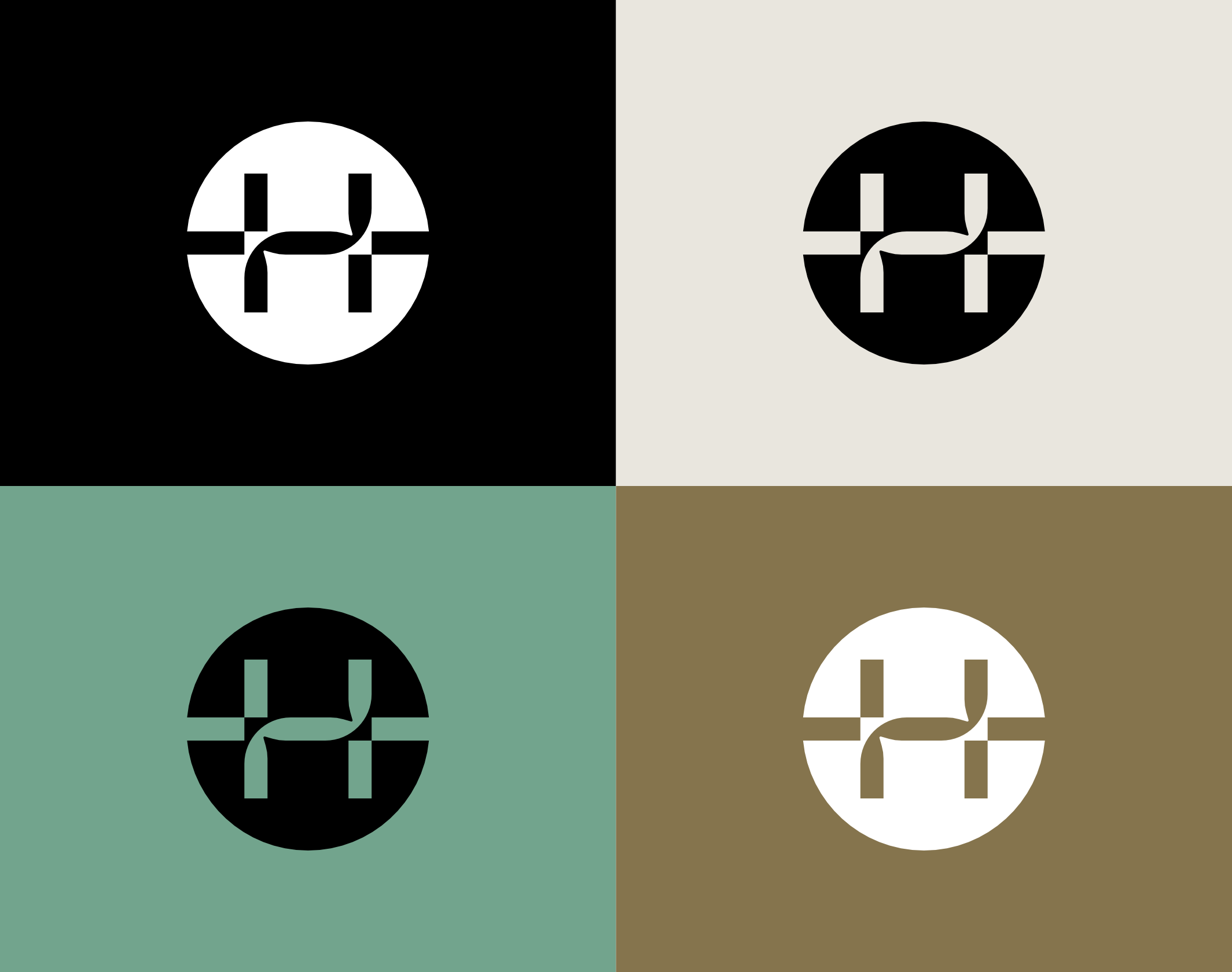
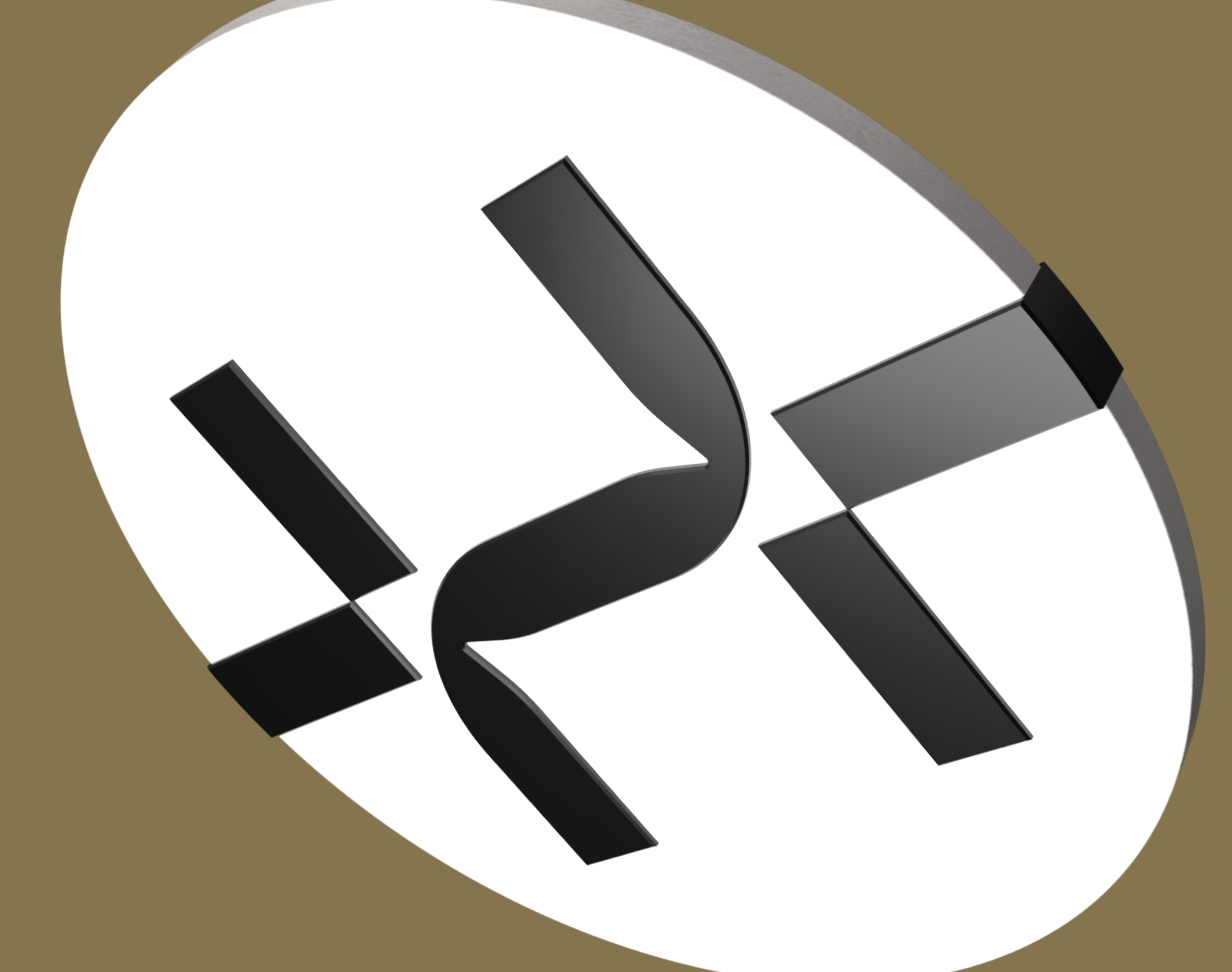
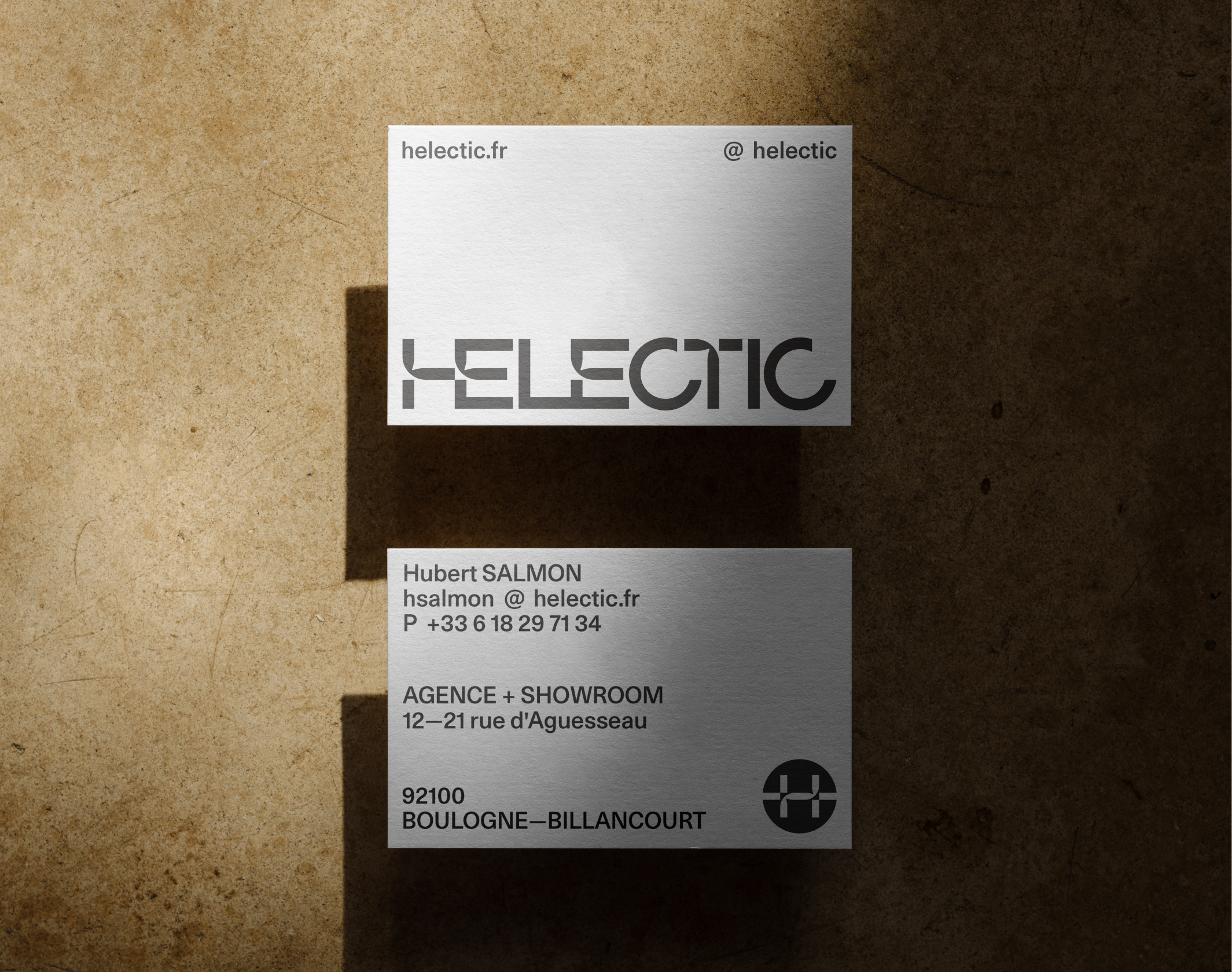
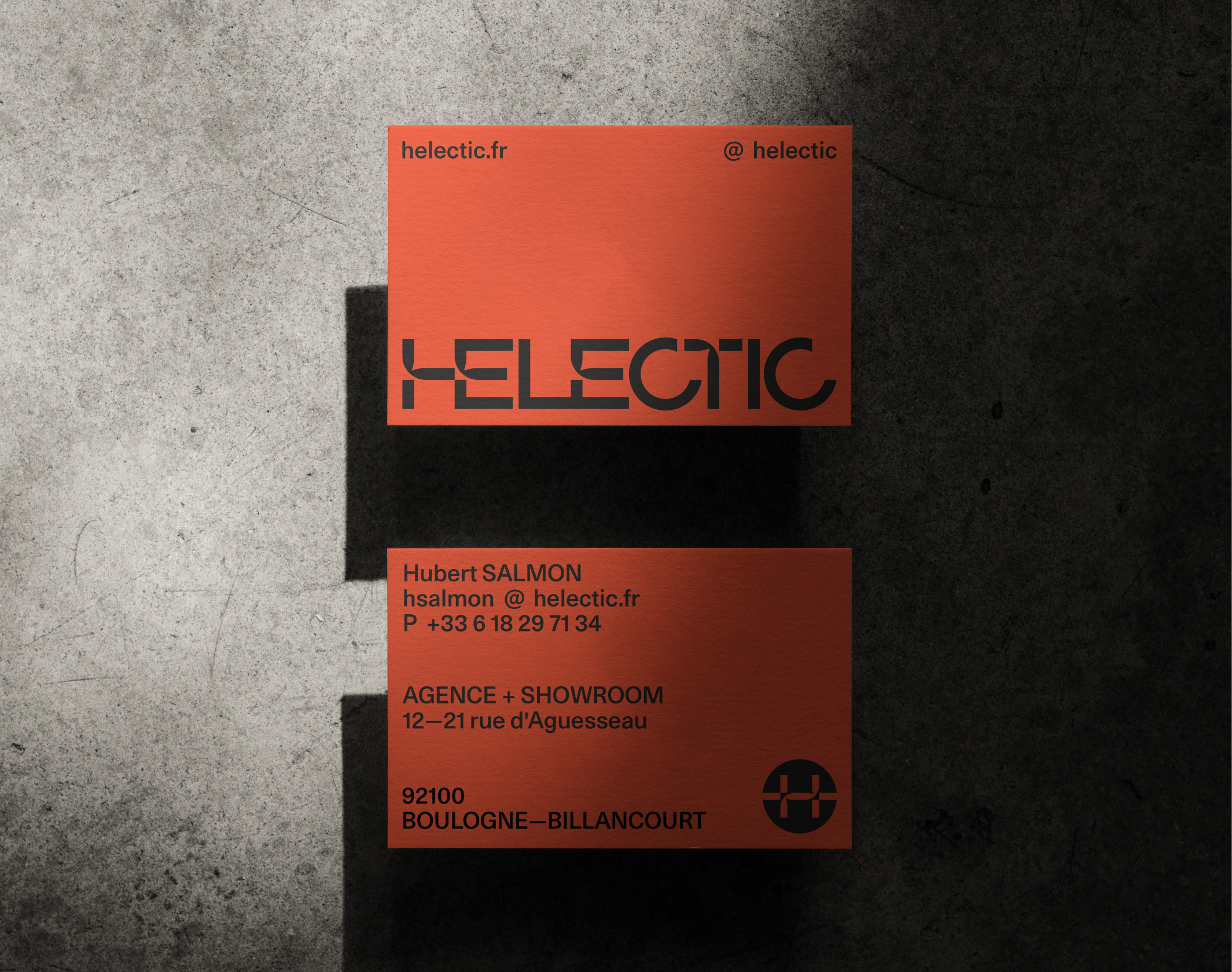
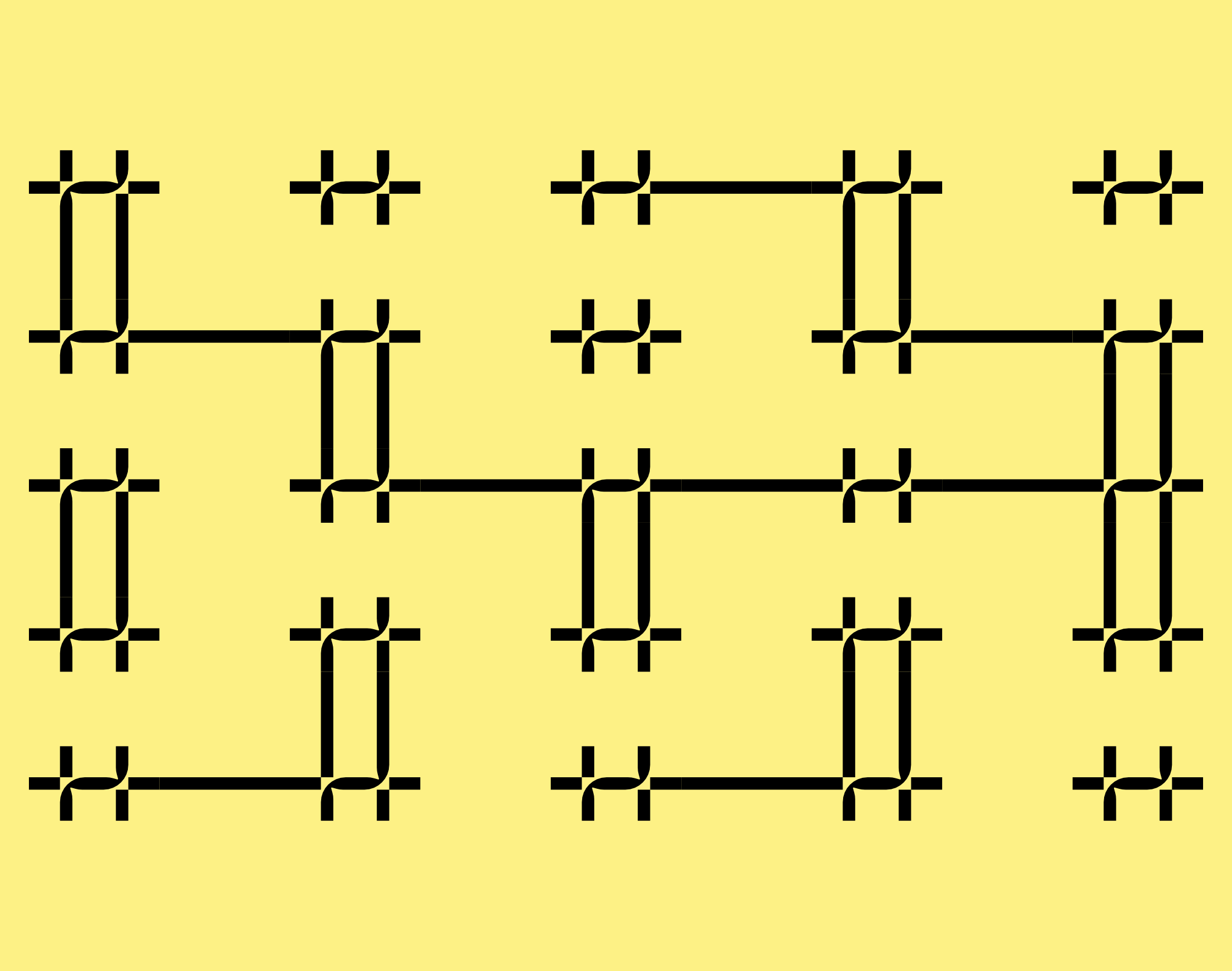
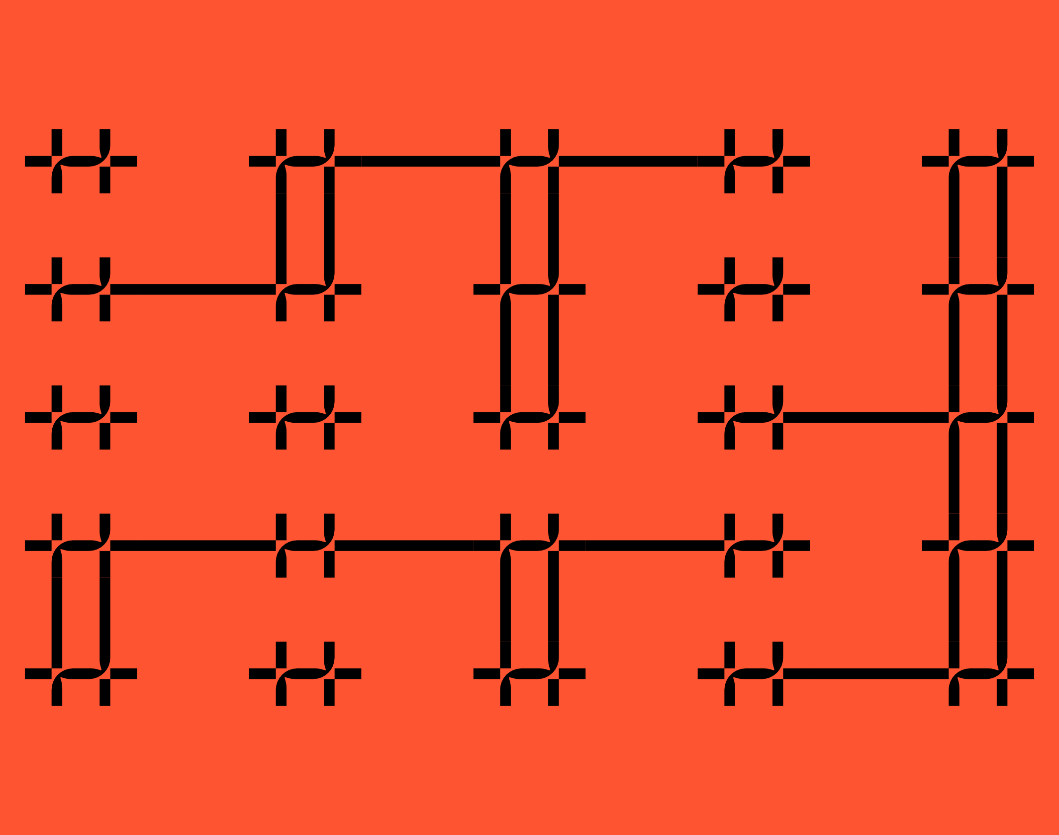
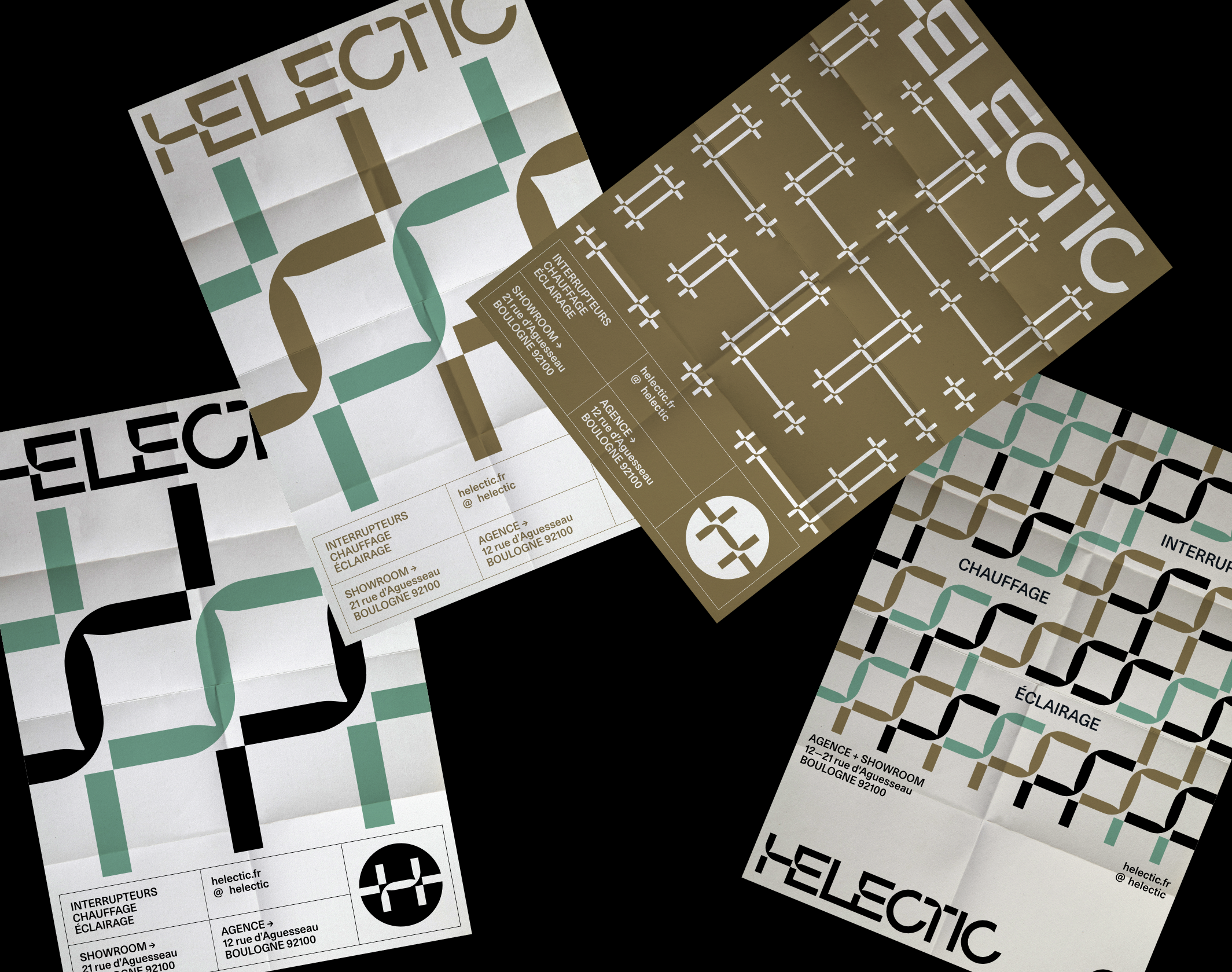
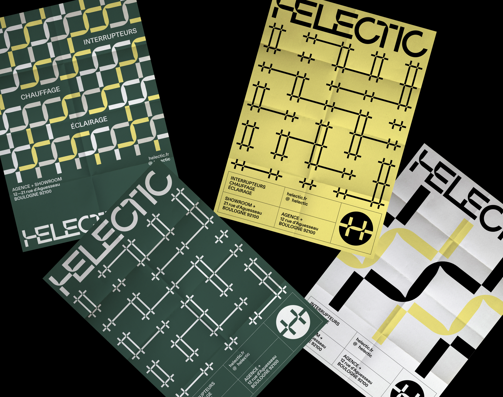
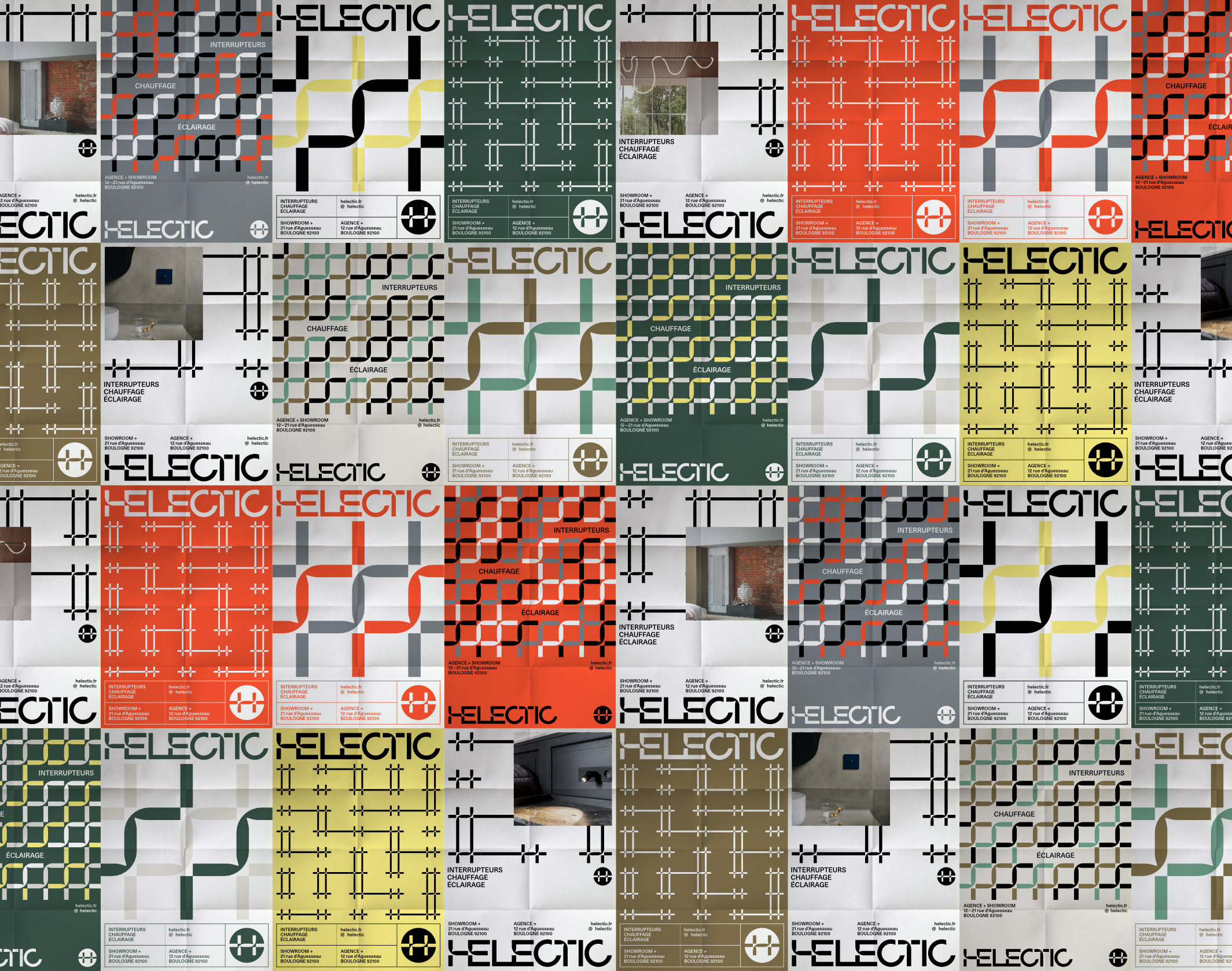
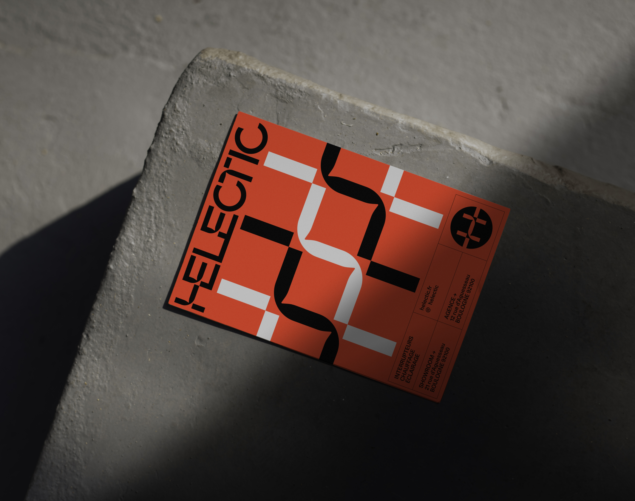
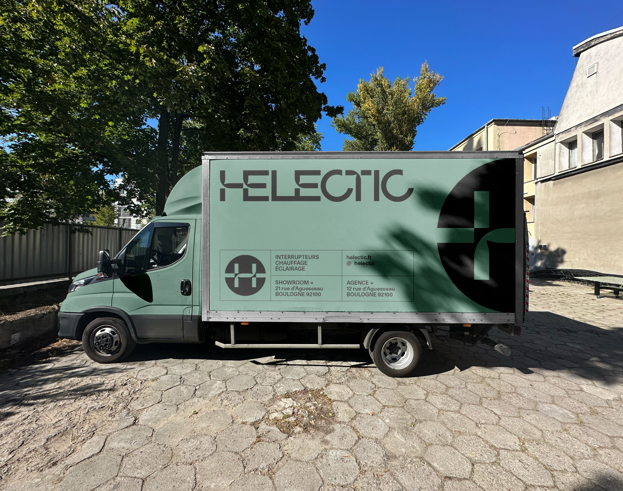
We were approached to rework the brand’s positioning and give it a clearer narrative axis, which led to the creation of a new name, Helectic; this modern, rhythmic neologism is based on the English words “hectic” and “electric”. The graphic identity we came up with revolves around an in-house typogram, made up of unexpected links between typefaces, with certain angles twisted to resemble rubber cables. A symbol based on the letter H completes the scheme, recalling the path of cables.
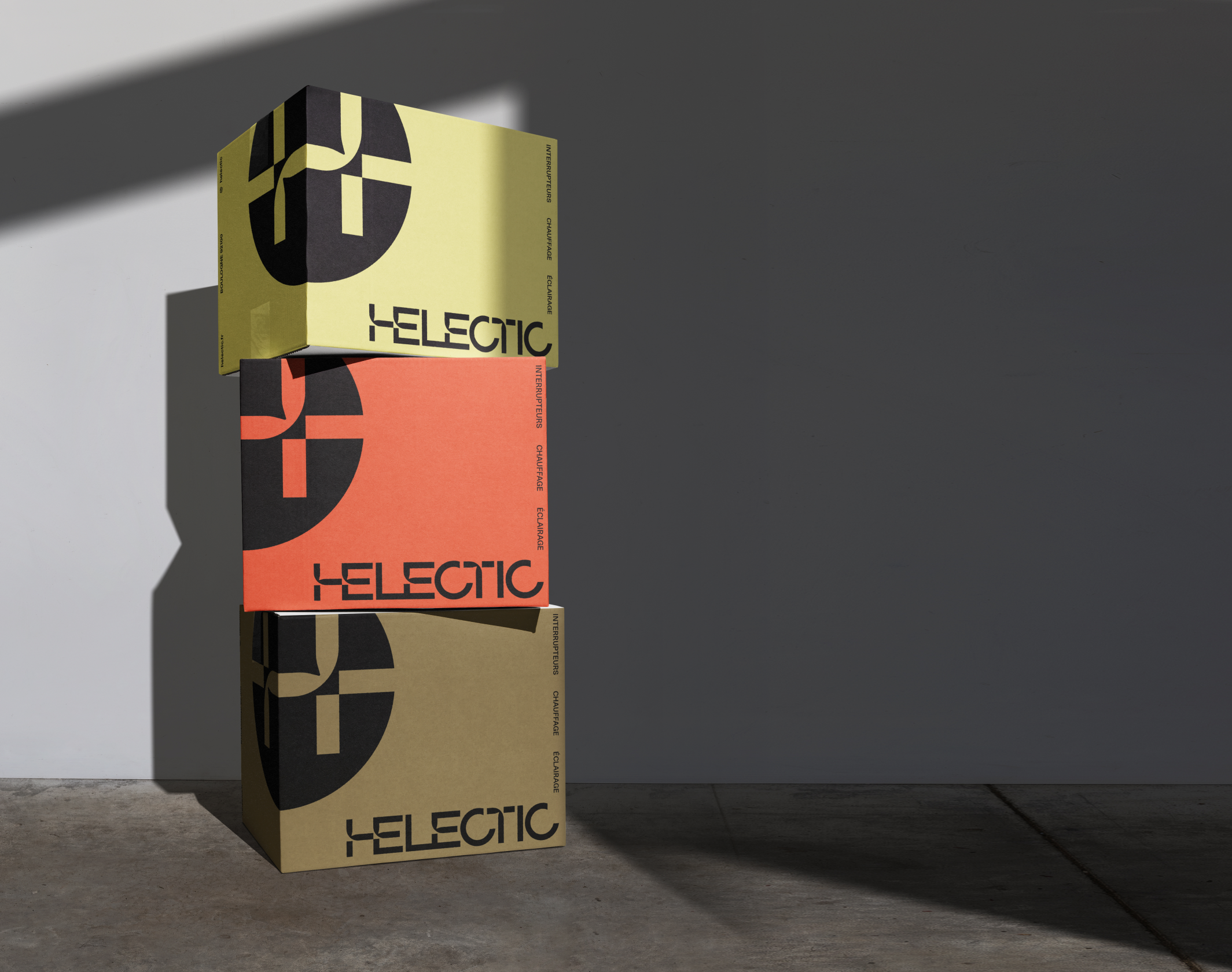
A minimalist, evolving graphic system offers numerous possibilities for expression, adapting to different media and occasions. The connection between the logo, always assertive and visible, and the various visual variations, is obvious, and weaves a strong bond across all variations. The first graphic applications have been visible since this summer, and the new showroom in Boulonnais proudly displays the logo we created, while we await further developments.
Disciplines
Brand strategy
Visual identity
Motion design
Signage
Typography
Branding
Naming / copywriting
Editorial design
Web design
