Apocope
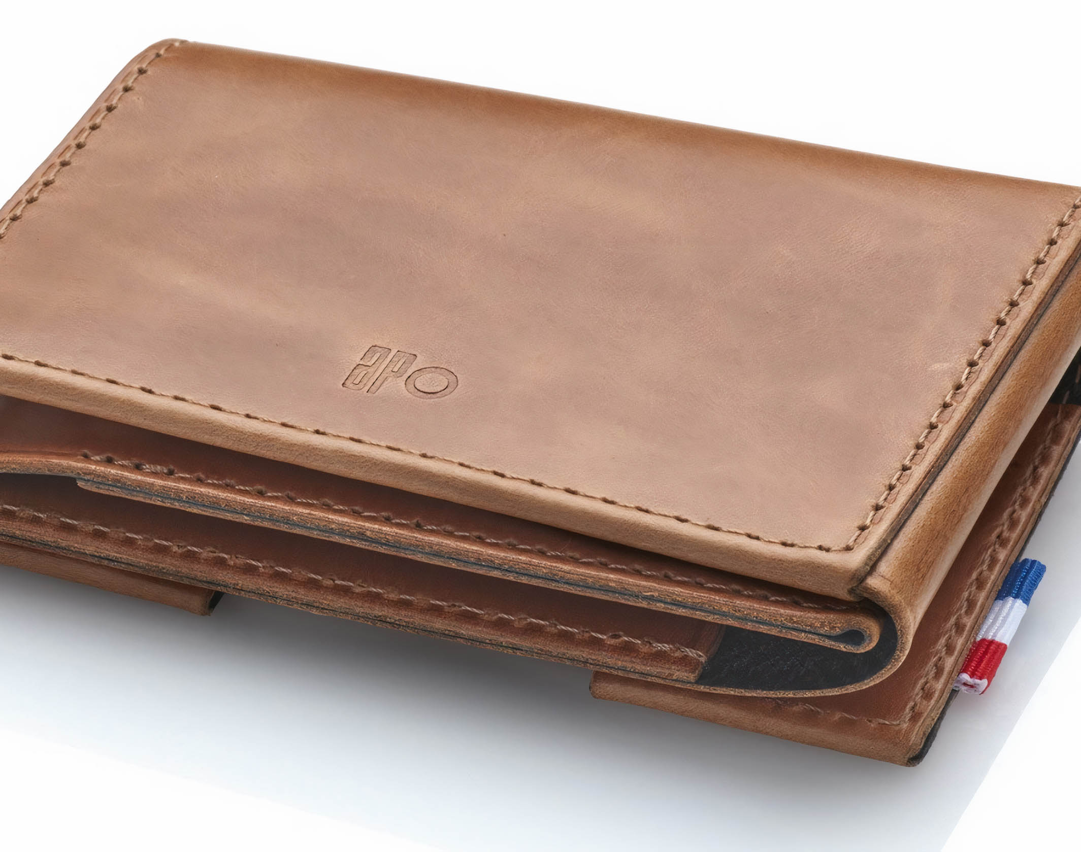
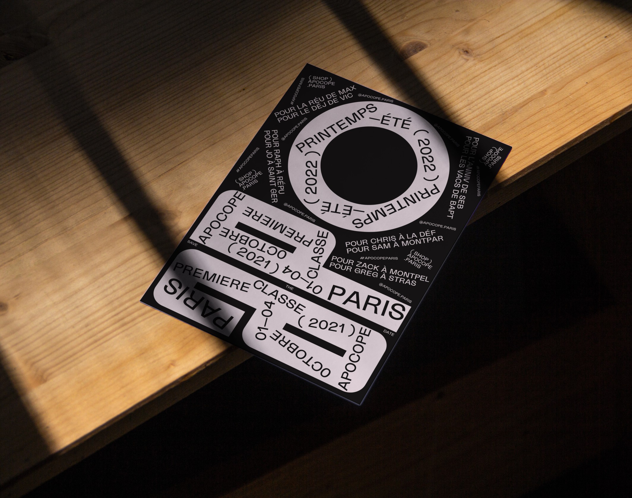
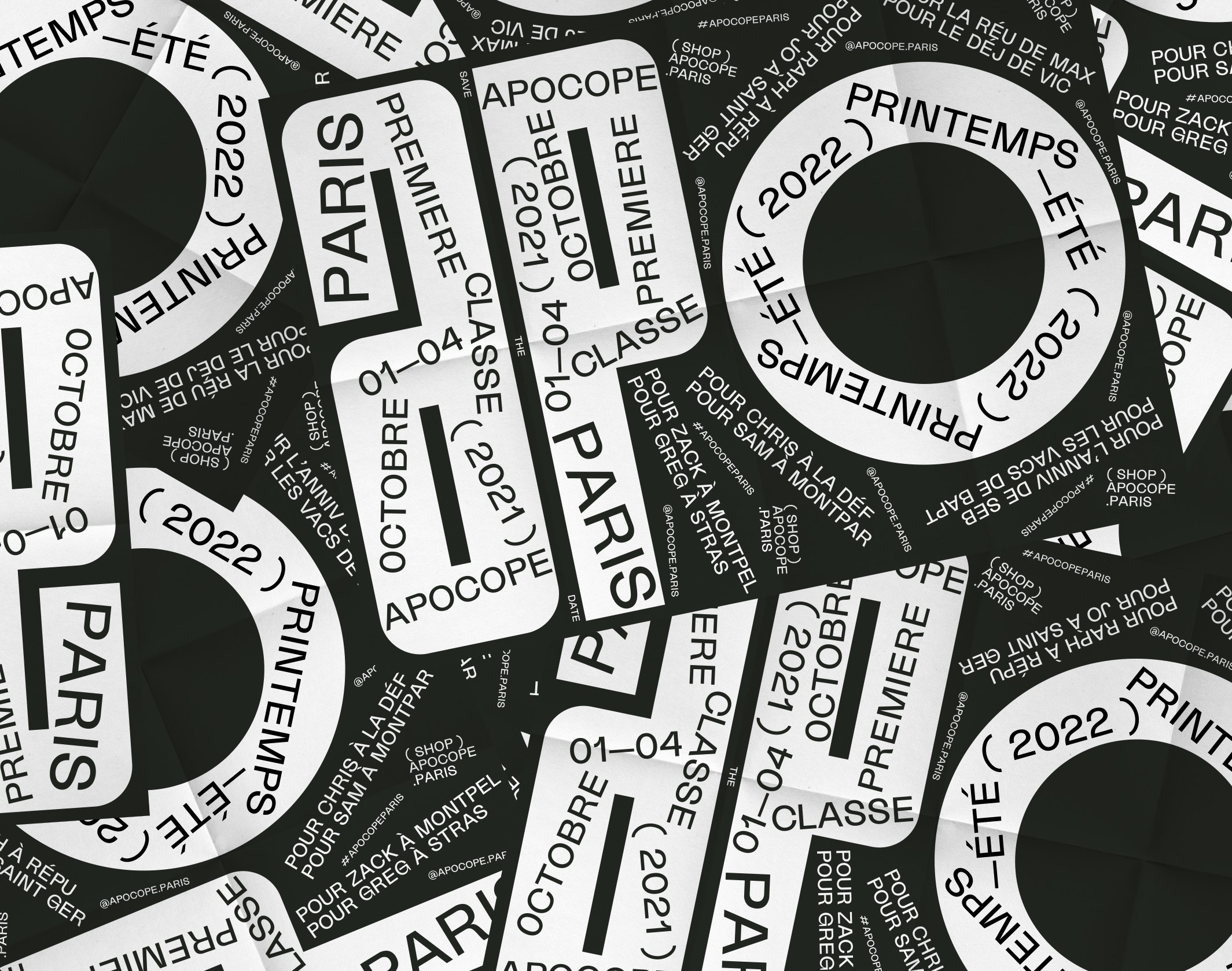
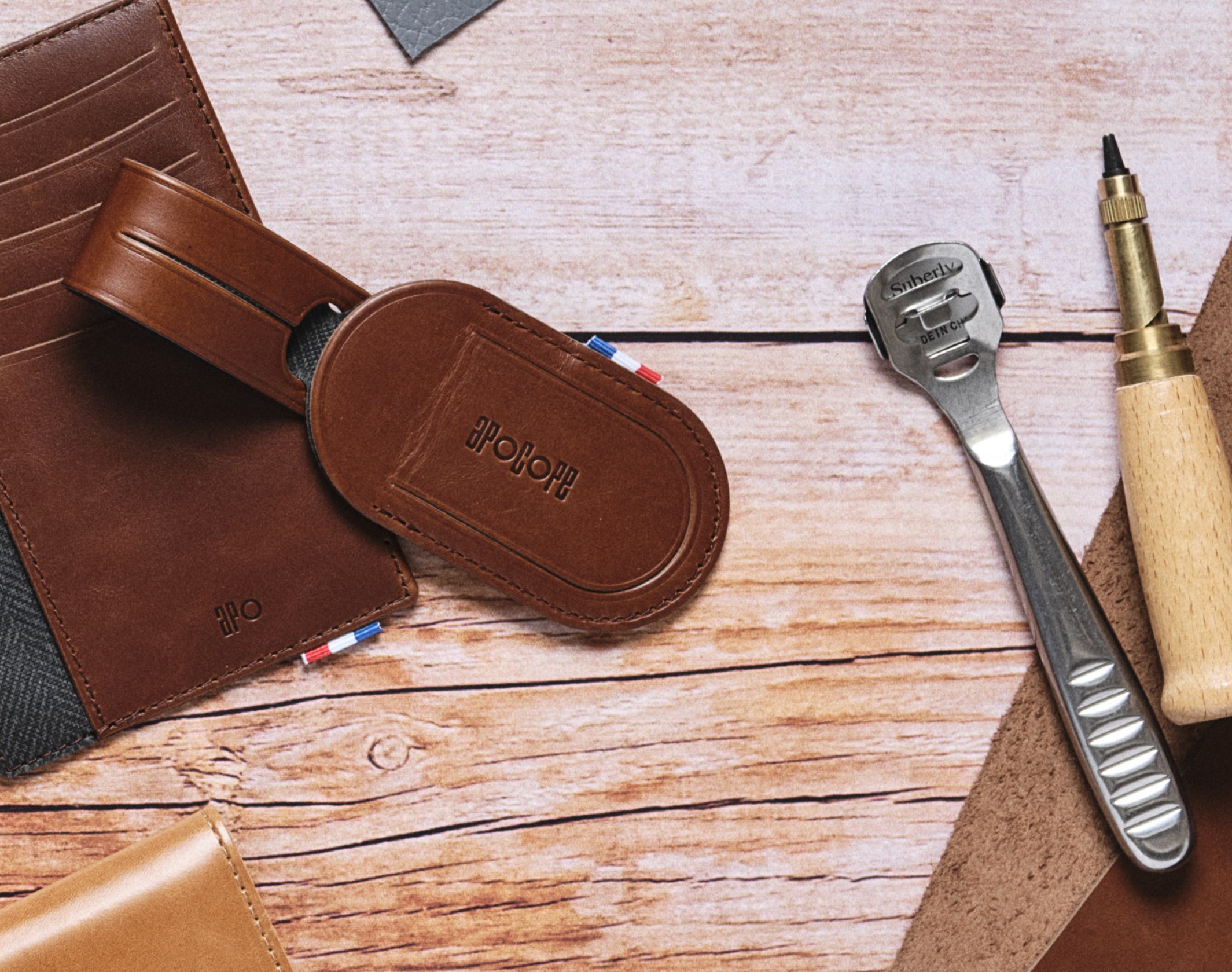
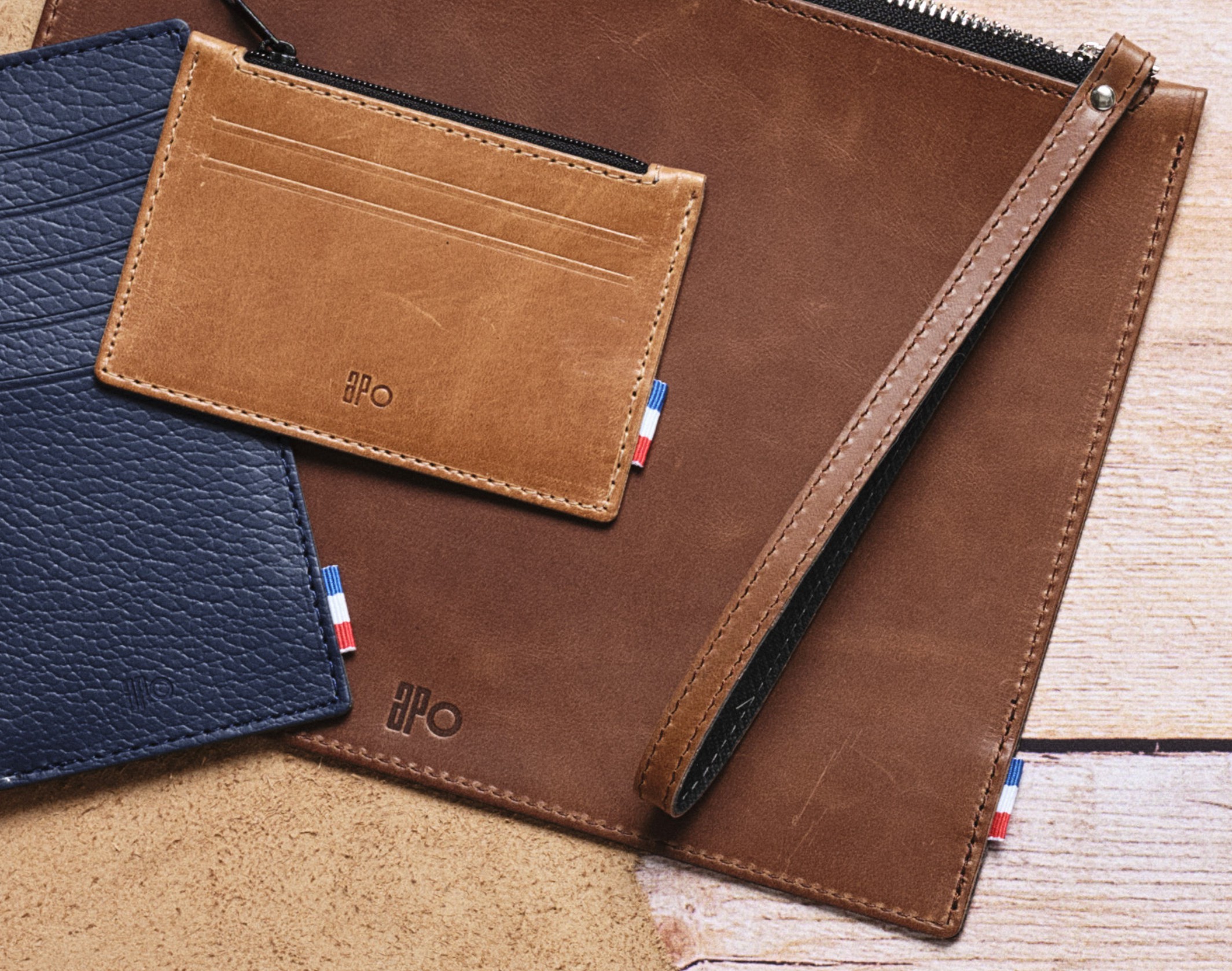
Apocope fuses minimalist design with French urban culture, creating a distinctive identity for men's leather goods through dynamic typography.
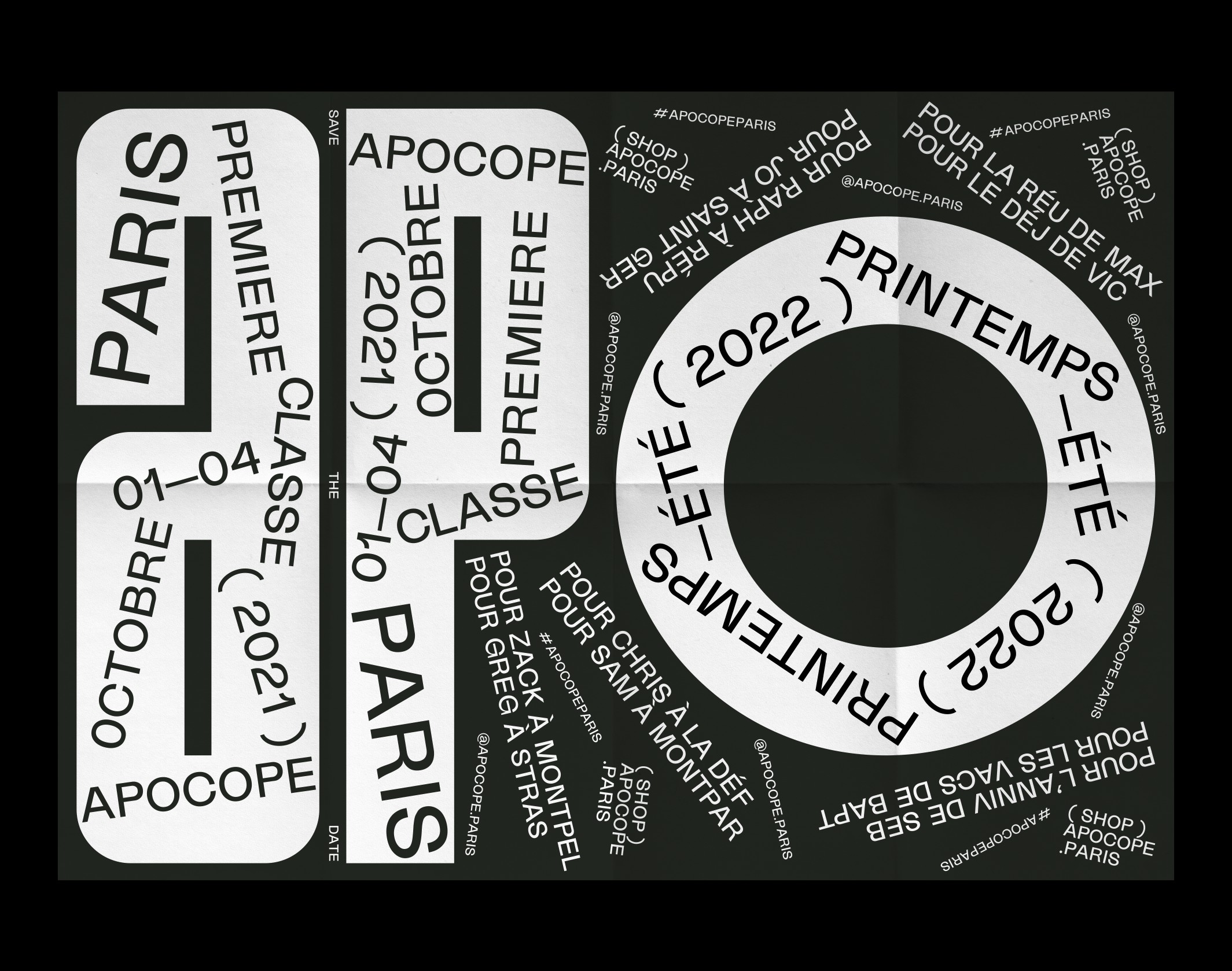
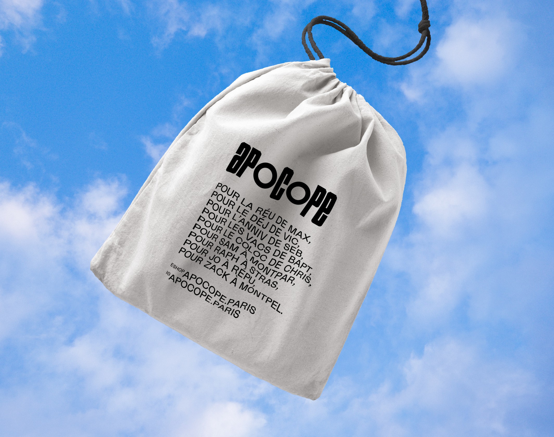
“Apocope”, from the Greek apokoptian, is a figure of speech that is characterized by the abbreviation of a complete word, keeping only the first syllables. Repu, Mat, Capu, Montpel, Stras… . The French love to speak in apocopes, it is a strong marker of French culture and urban style. This attitude is also a reflection of our active lives, always on the move, where we seek to shorten to save time. This practicality resonates with the primary function of the leather goods and their usefulness to the man who wears them.
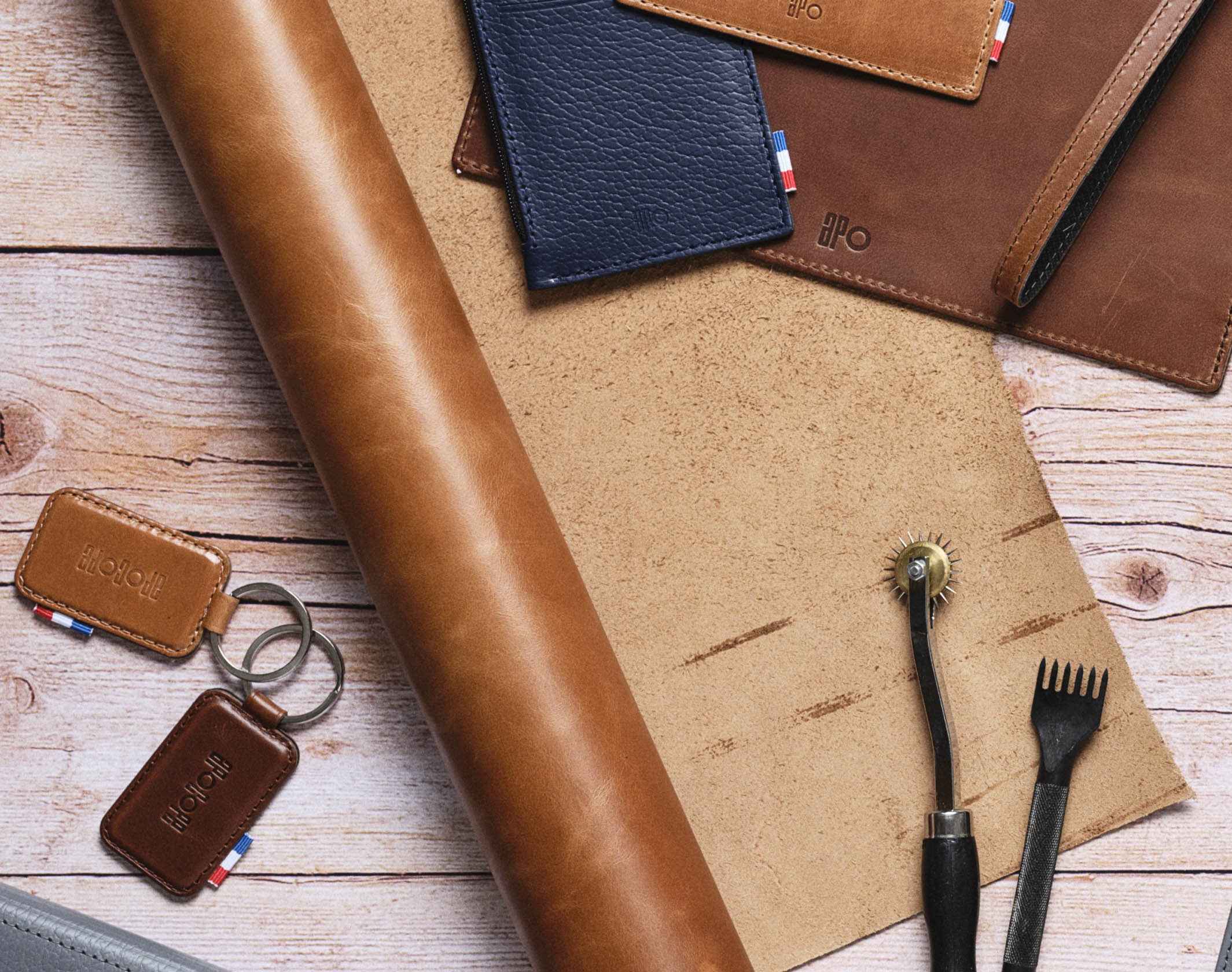
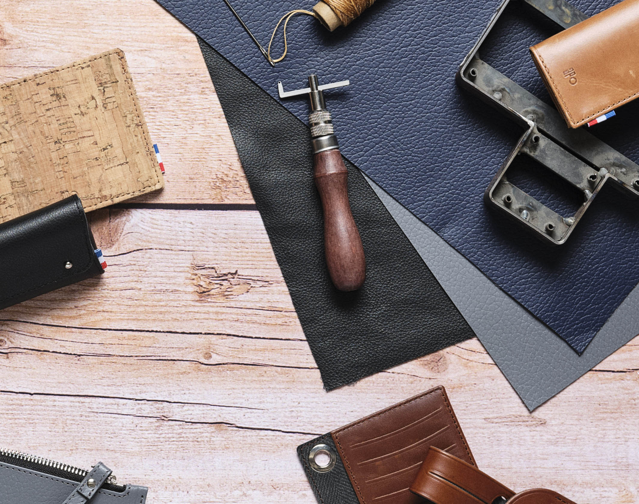
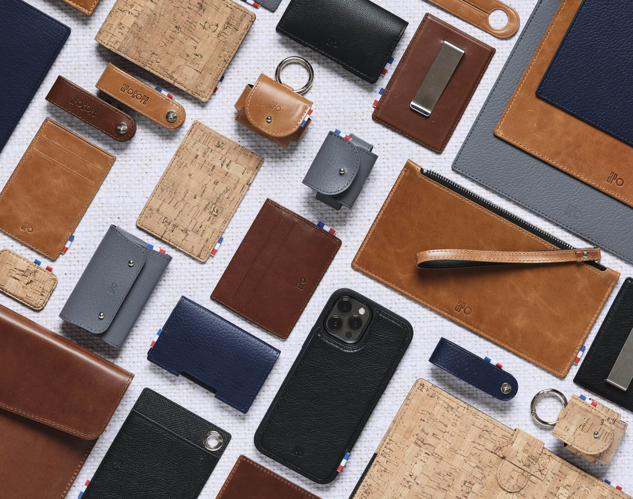
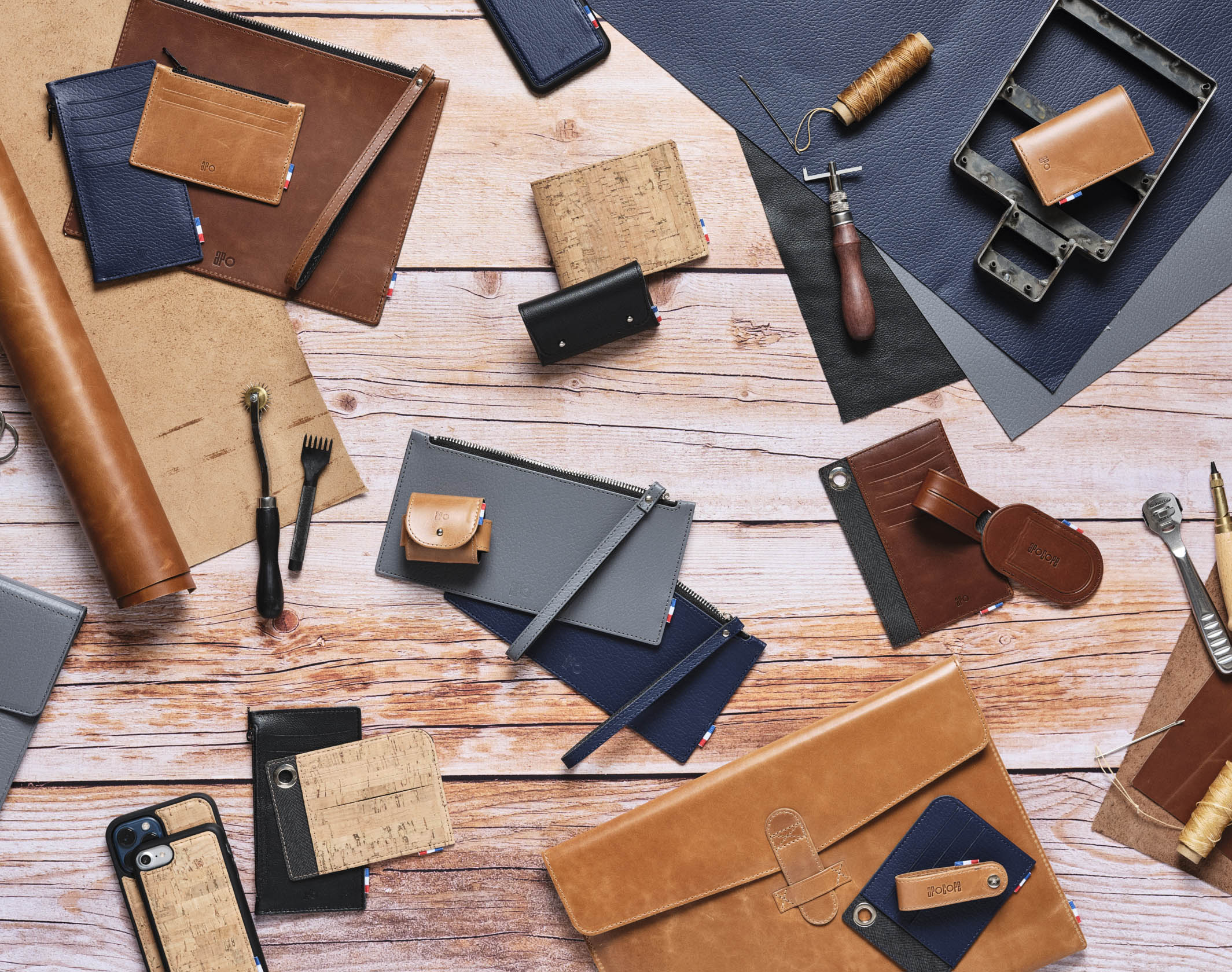
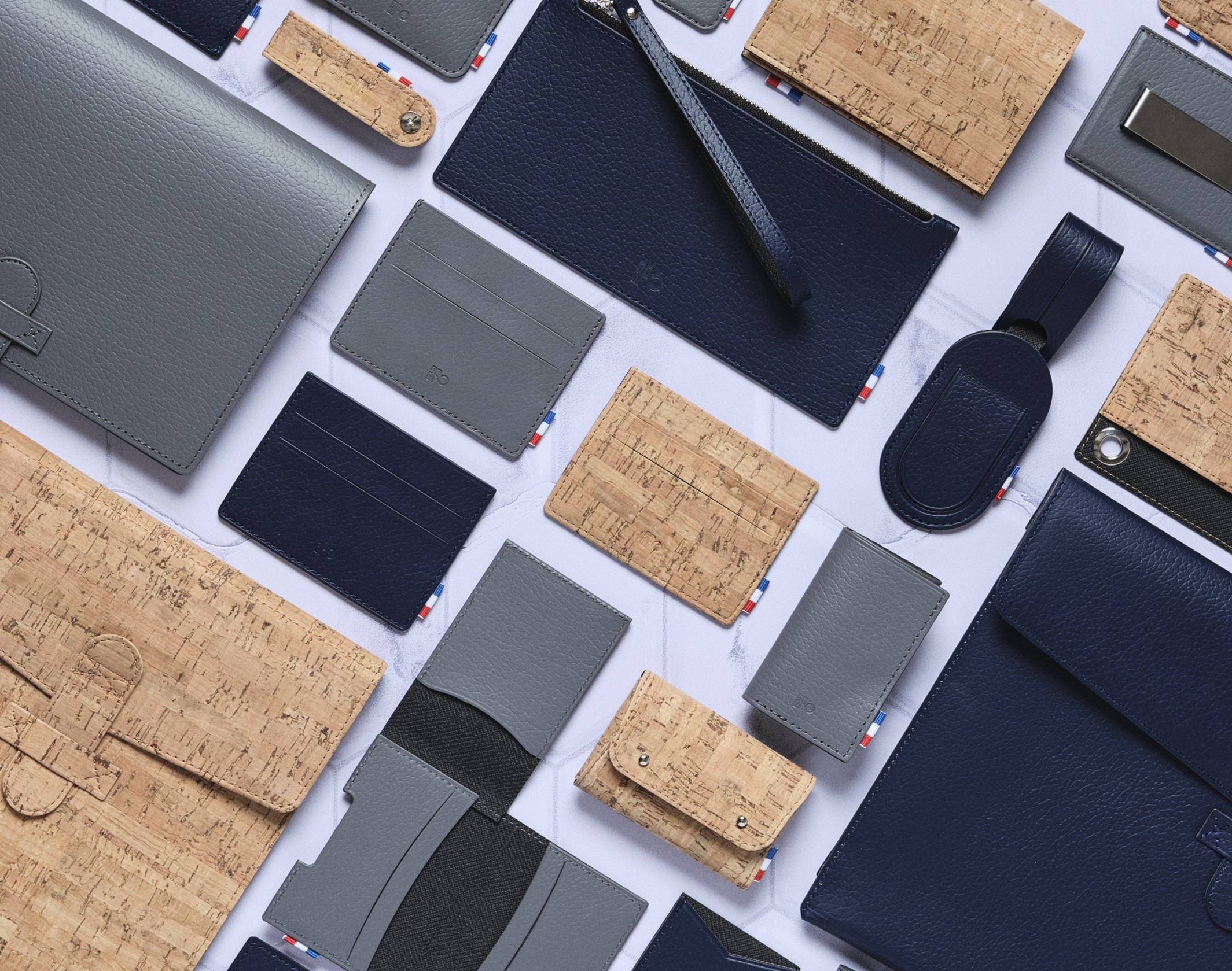
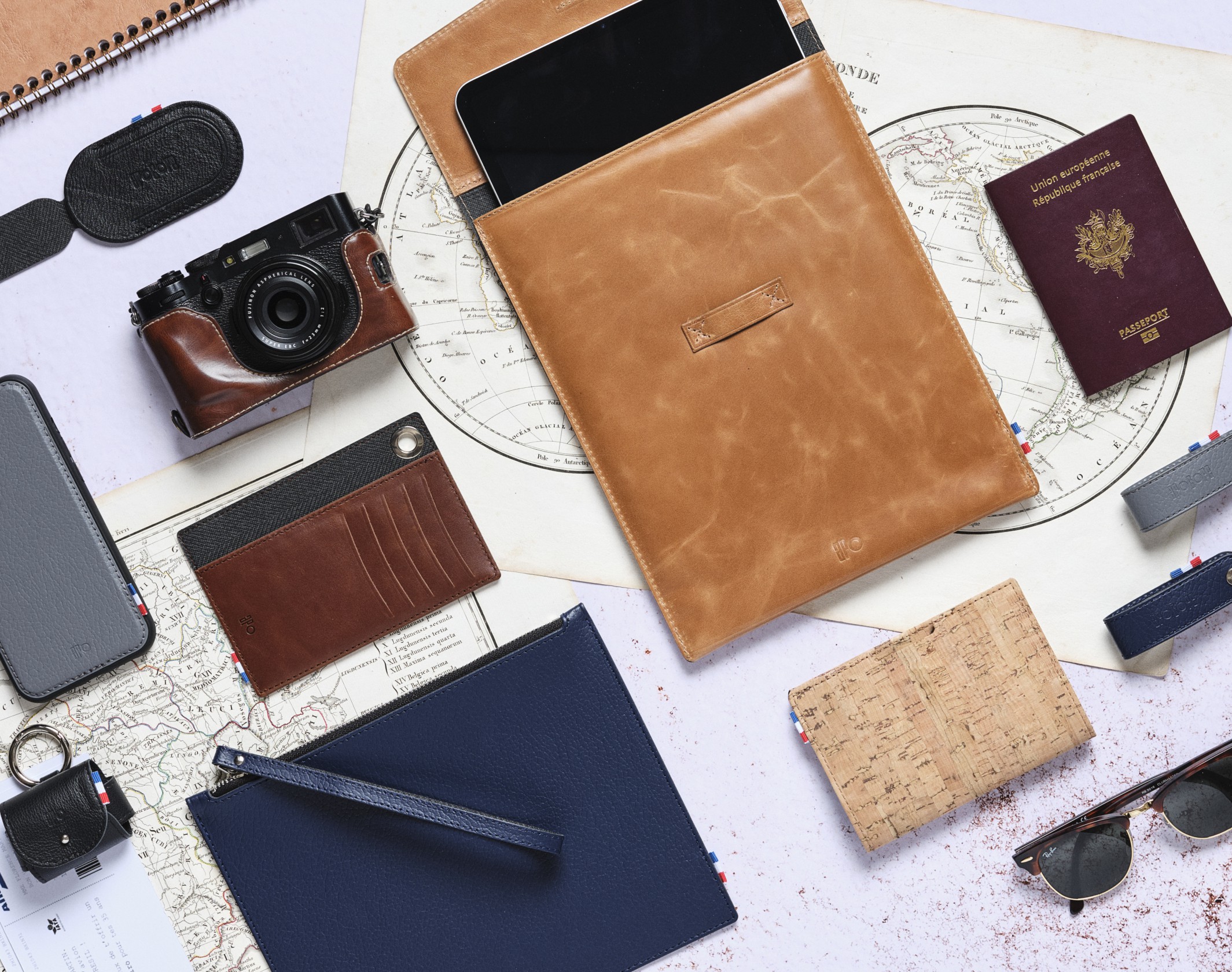
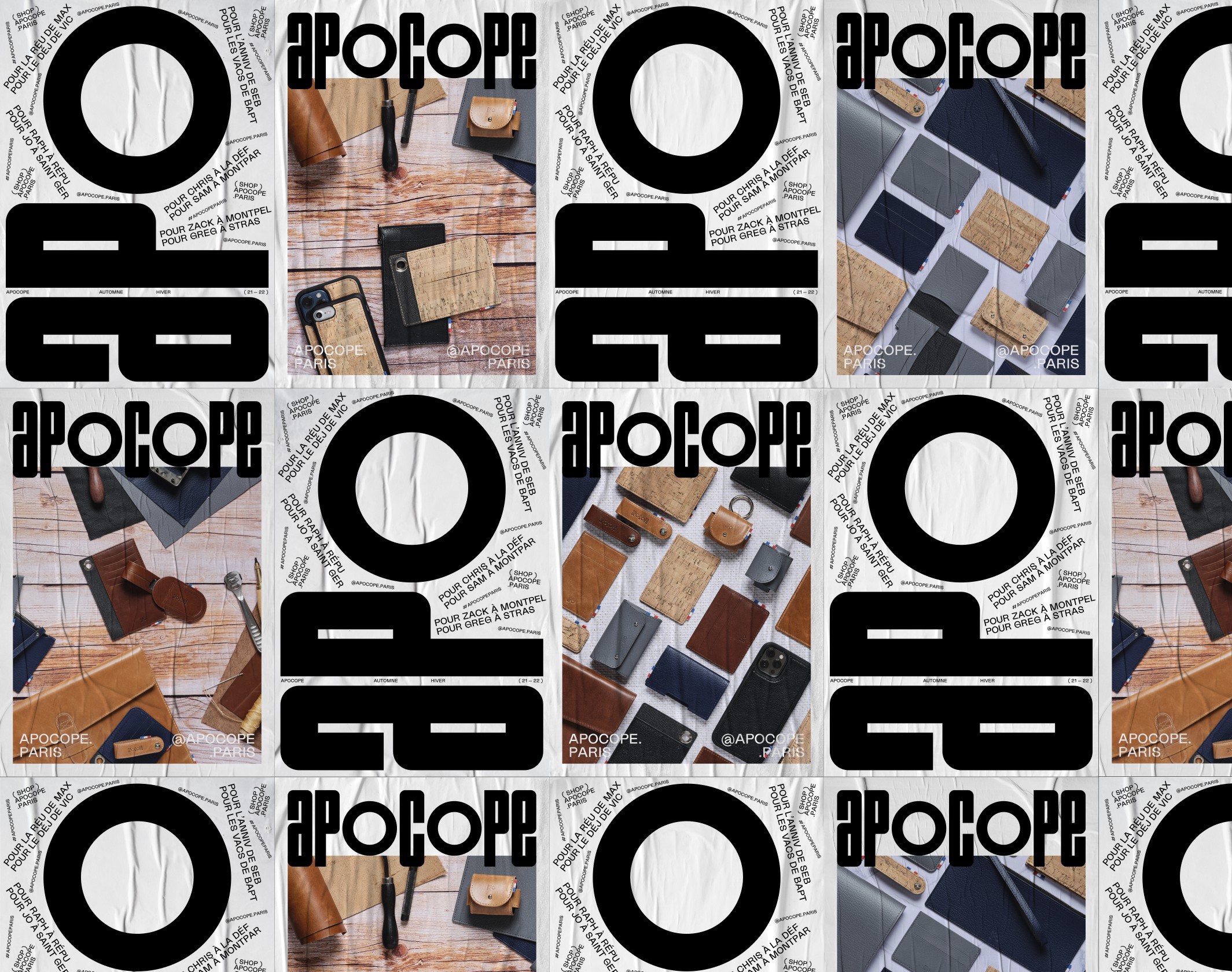
Apocope was launched in 2021 in Paris and focuses on men’s leather goods, with a focus on materials and their provenance, all combined with a minimalist and precise design, imagined in the brand’s Parisian workshop.
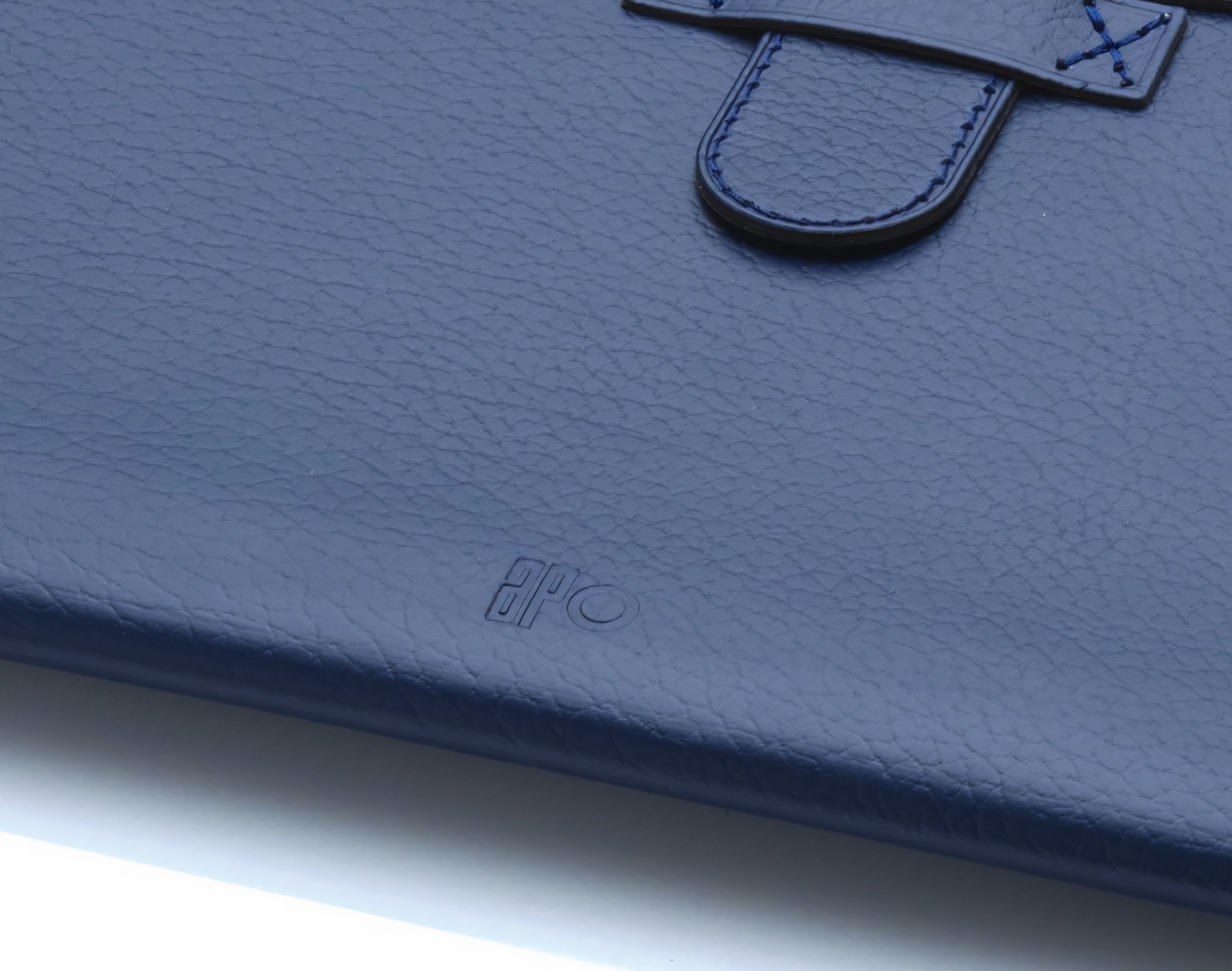
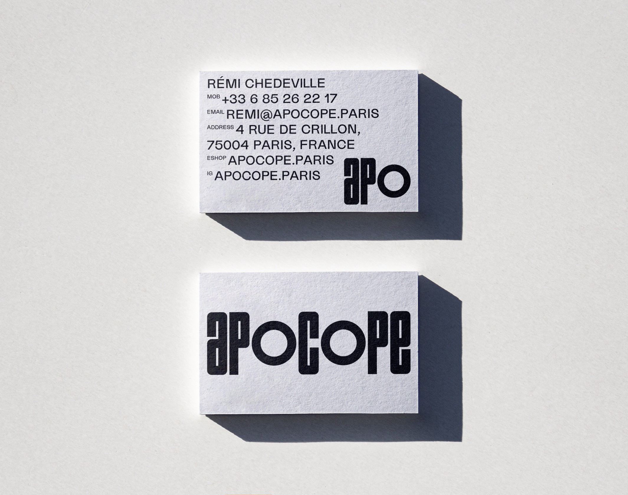
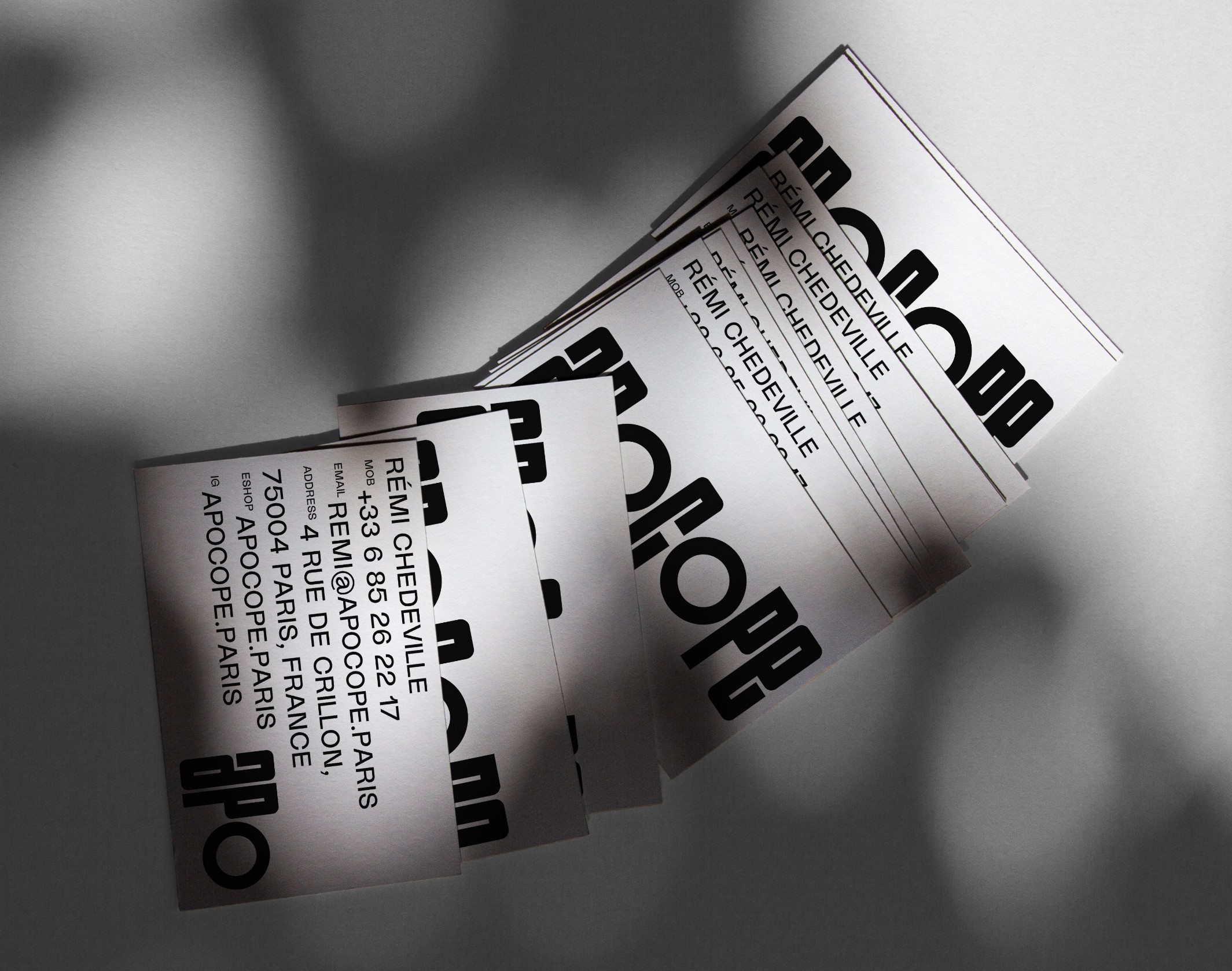
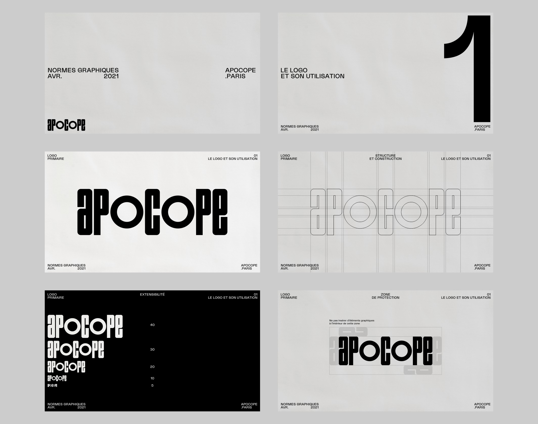
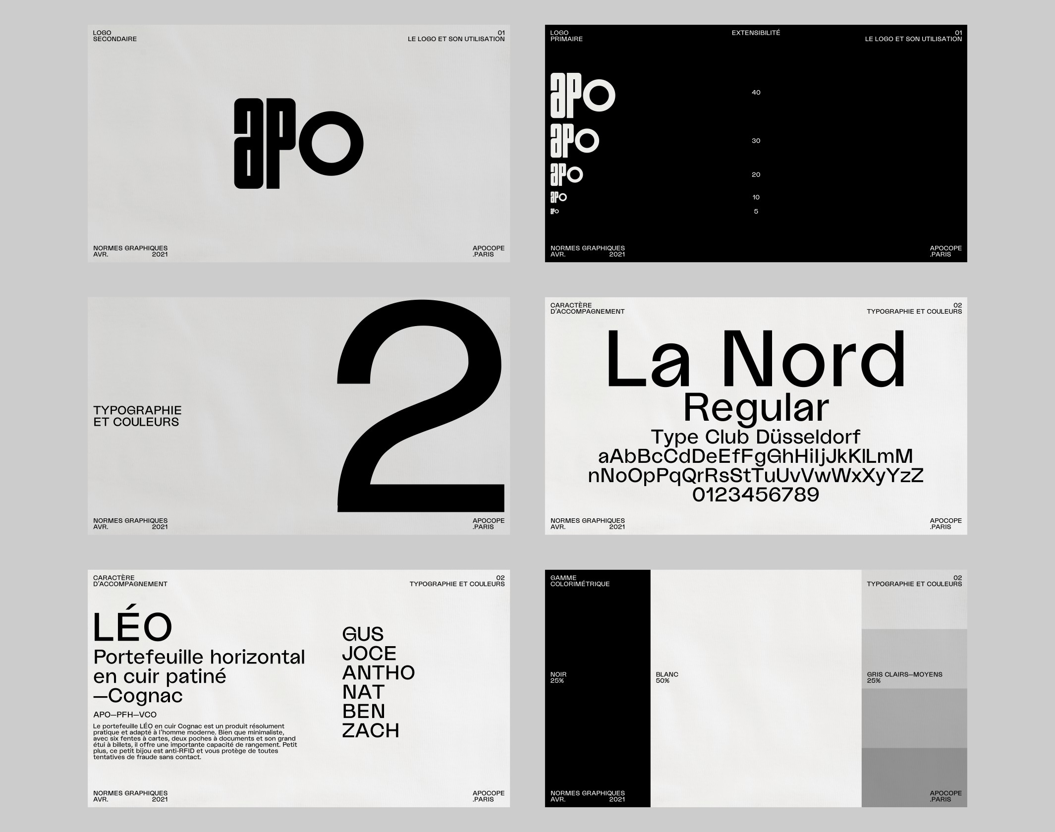
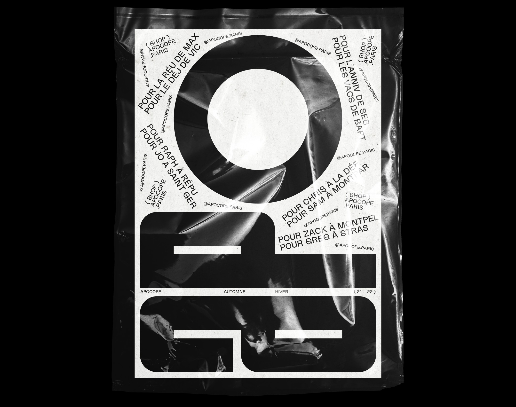
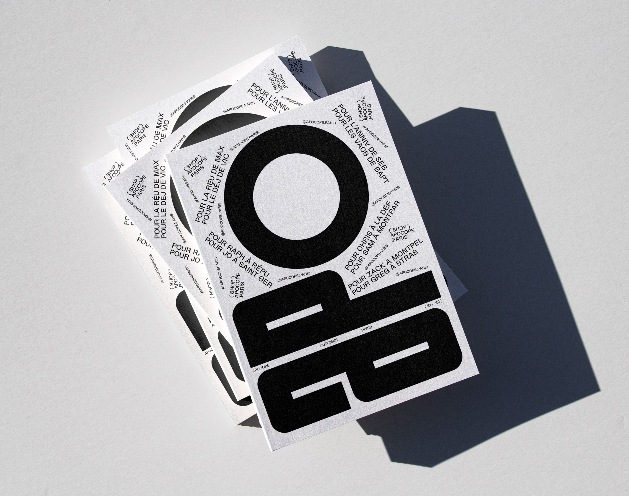
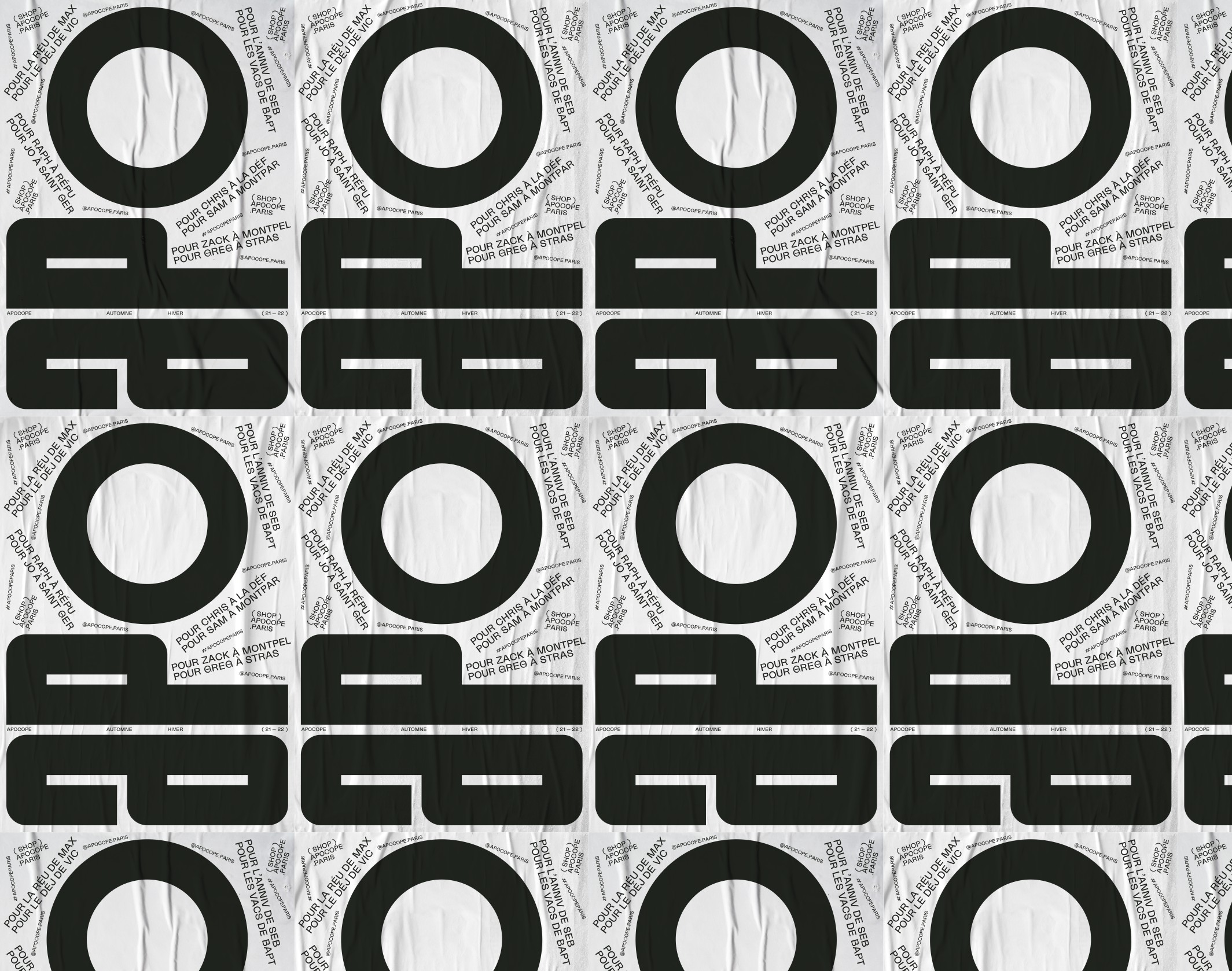
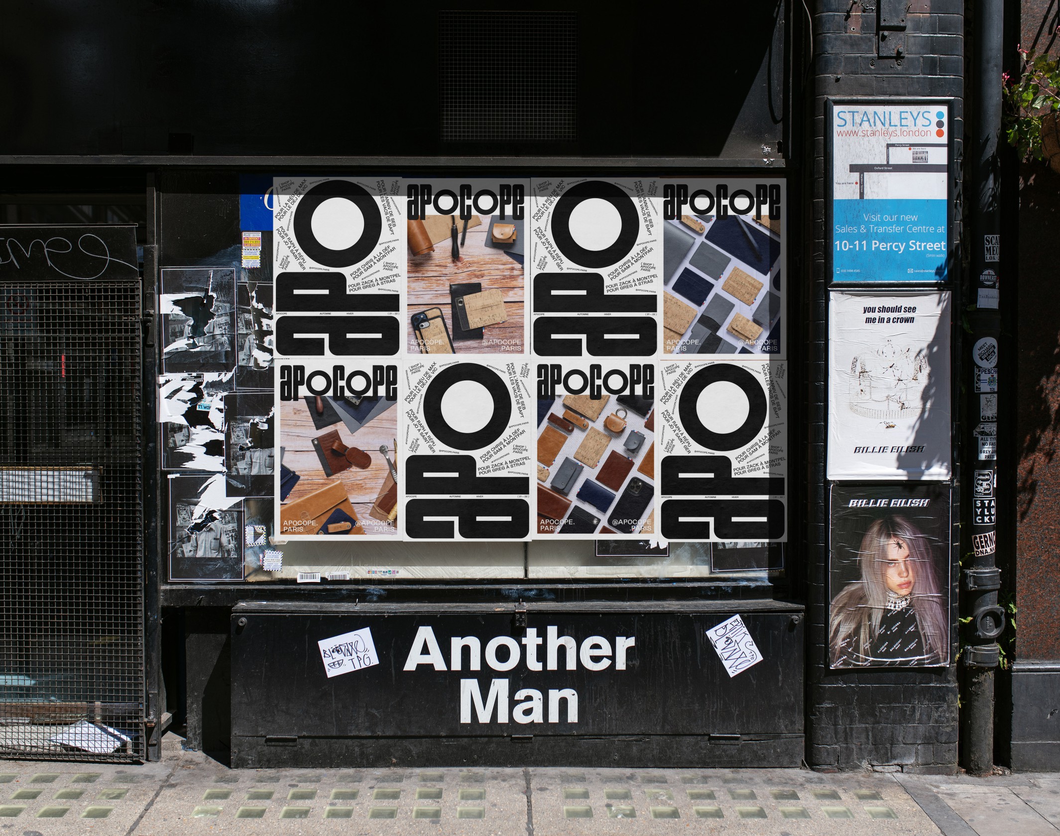
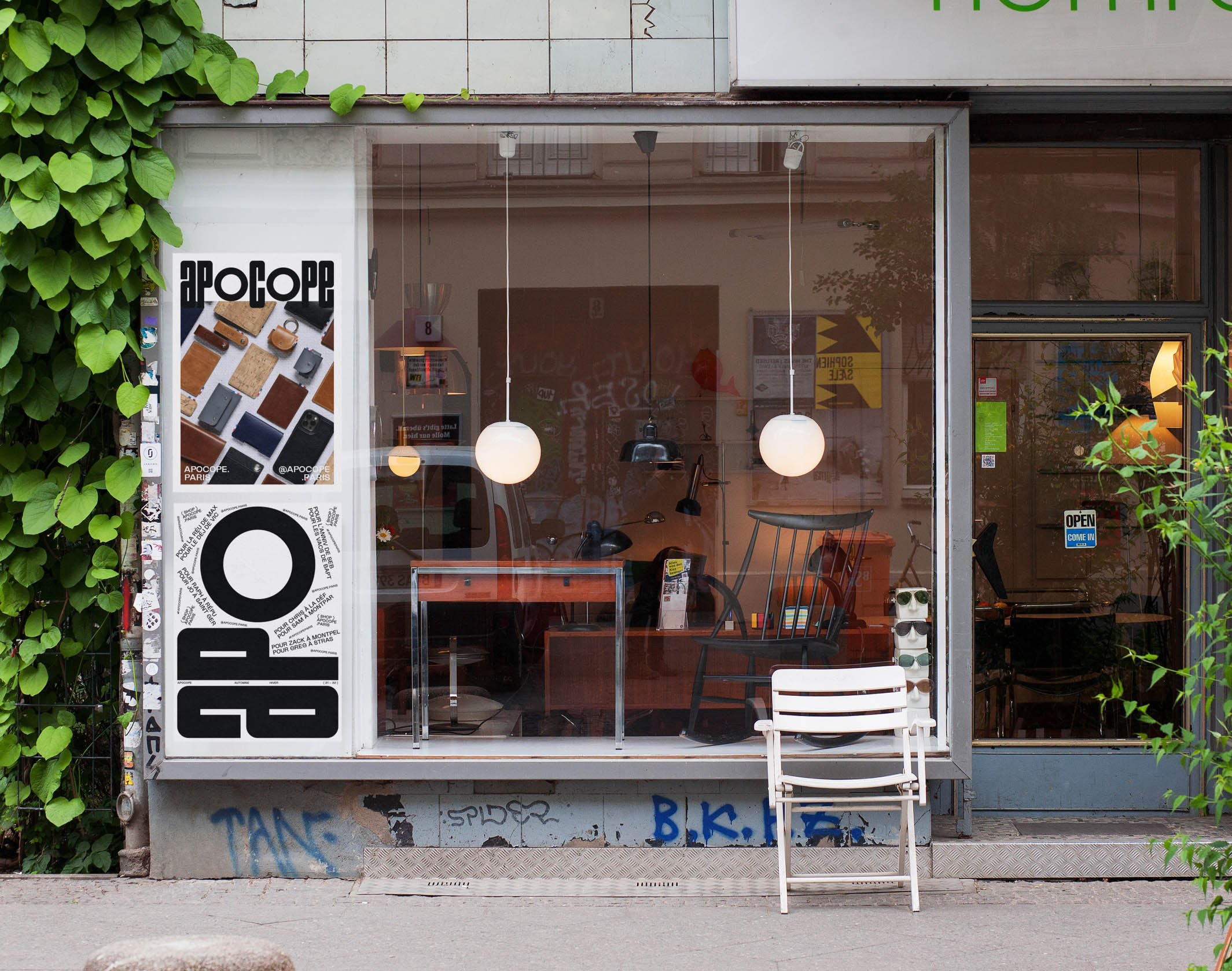
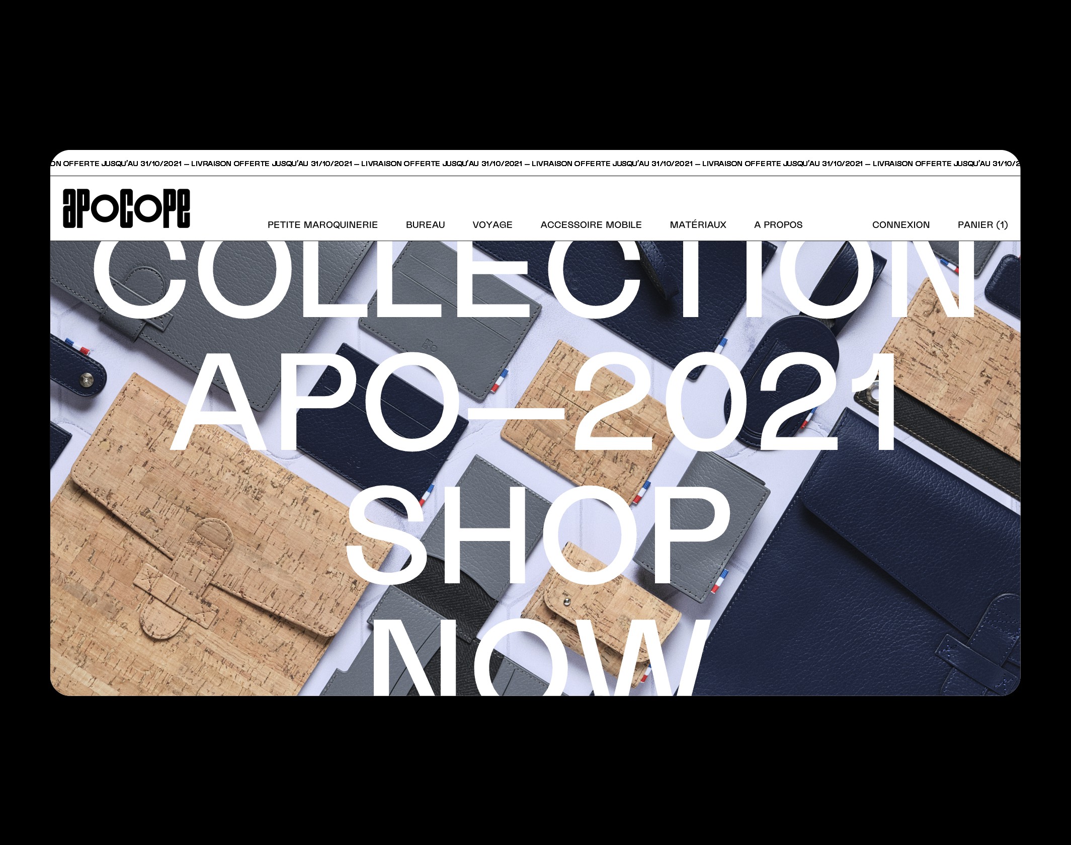
Brand Brothers was commissioned to create the graphic identity; thus, based on an in-house typogram, strong and rhythmic, our work is articulated around typographic compositions, sometimes pure, sometimes maximalist. The monogram, Apo (the apocope of Apocope!) becomes a pivot around which the messages are composed and decomposed.
Publications
13
It's Nice That, Review
Print Magazine, Review
Viction:ary, From Type to Logo
Brand New, Review
Behance, Best of Behance
Mindsparkle Mag, Review
PAGE Online, Typografie
Page Magazine, Issue 11.21
The Brand Identity, Featured
Visuelle, Review
Disciplines
Brand strategy
Visual identity
Motion design
Signage
Typography
Branding
Naming / copywriting
Editorial design
Web design
