Yoteq
Yoteq is the very first network of connected terminals, which distributes physical books with the possibility of return. The innovative concept is articulated around dispensing columns, each containing nearly 300 books and comic strips, searchable directly on site or remotely, and which make it possible to deliver and take back the items with great simplicity.
Our creative proposal is oriented towards the materialization of bridges between culture and digital uses. Yoteq’s primary vocation being to take the book to places of transit and to simplify its acquisition, we have chosen to go beyond the classic graphic territory of literature and the world of publishing, to offer a visual identity based on simplicity of use, innovation, diversity and access to culture.
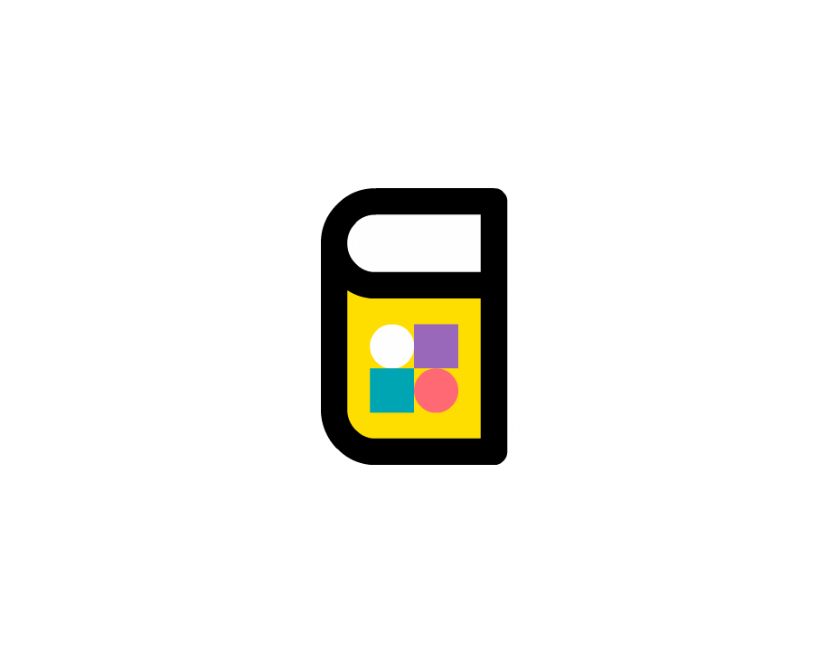
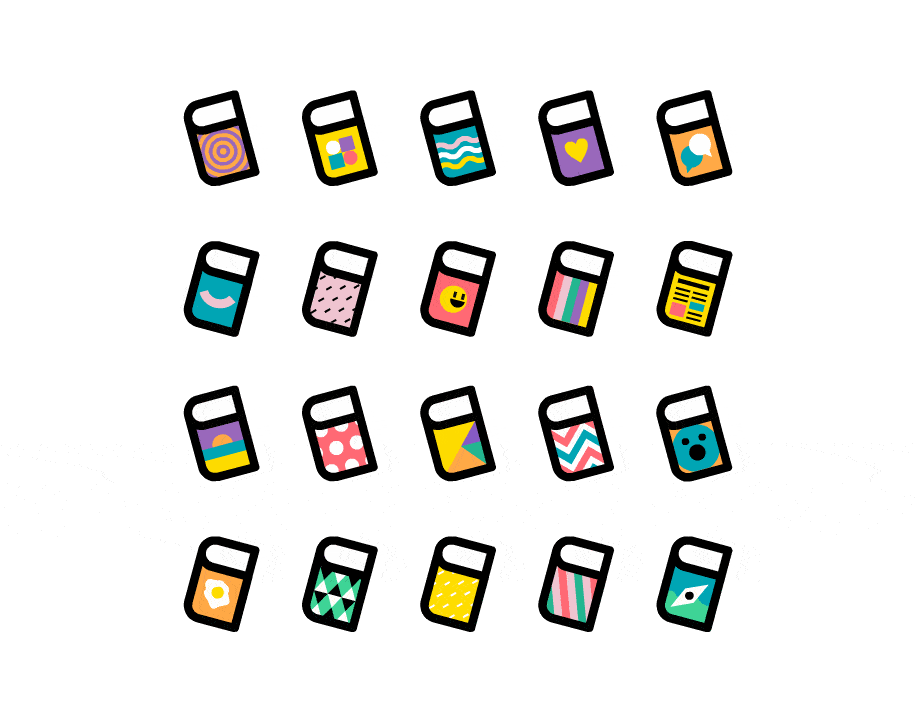
The symbol mixes the edge of a book with an arrow describing a circular route, symbolizing the availability of the book to the public at the very heart of urban flows, but also the possibility of return. We have developed an evolutionary graphic language based on the diversity of literary styles, the renewed pleasure of reading and movement, through bright colours and thick lines. We dressed the terminal in collaboration with product designer Pierre Charrié, designed the brand’s editorial materials, the website and structured the branding for the official launch of Yoteq, which took place at the Paris 2018 Book Fair.
In partnership with the SNCF, the first columns will be deployed in 5 stations in Paris and the inner suburbs before the end of 2018.
Disciplines