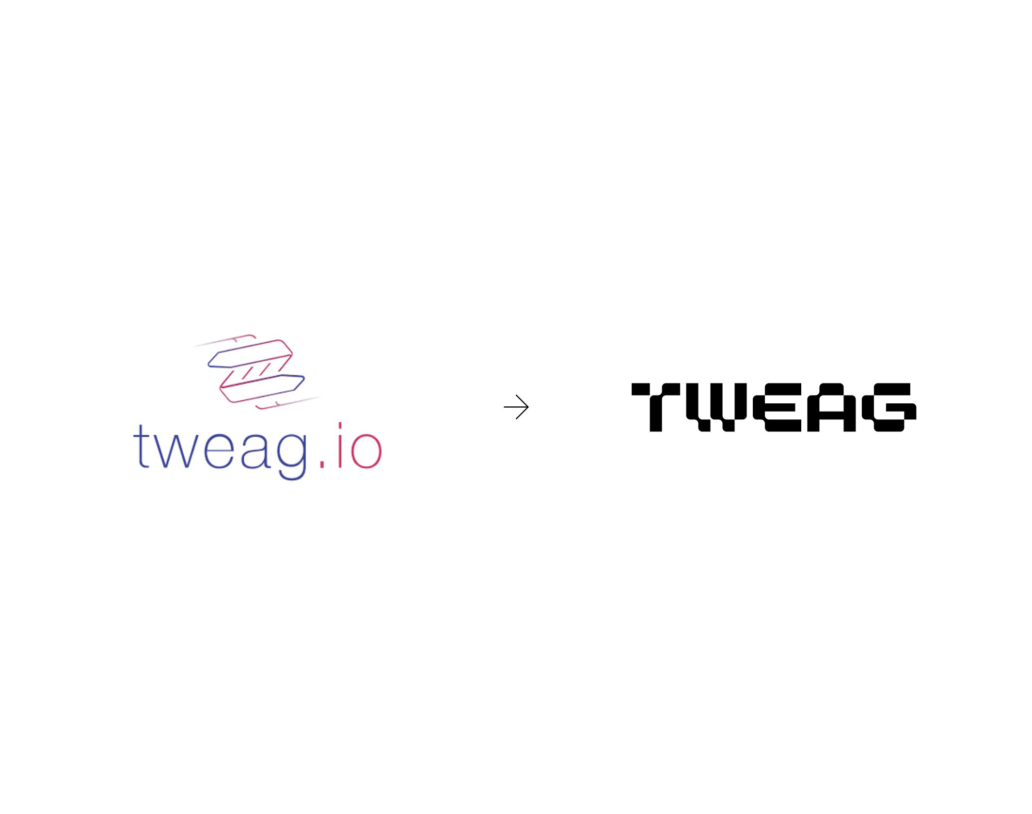
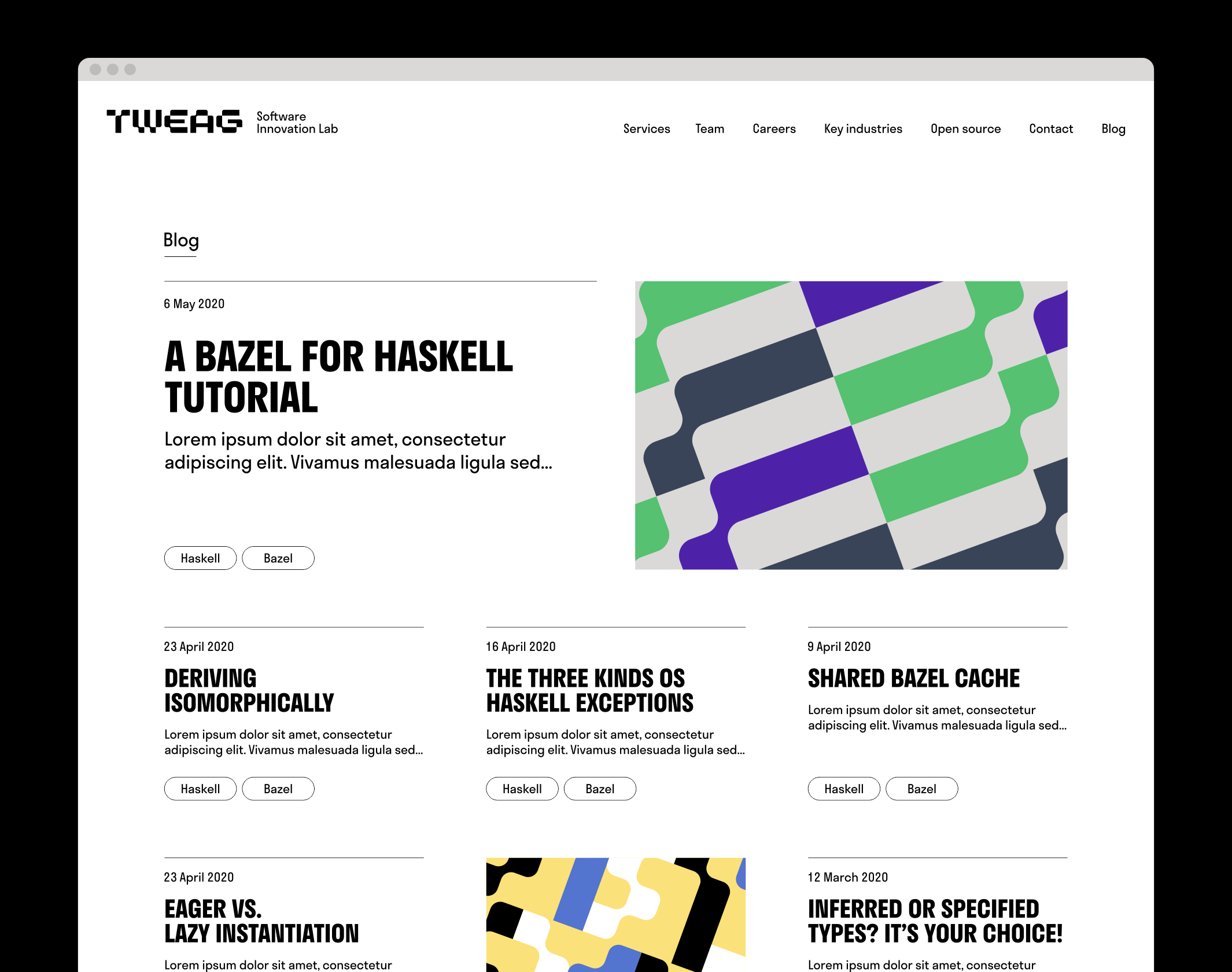
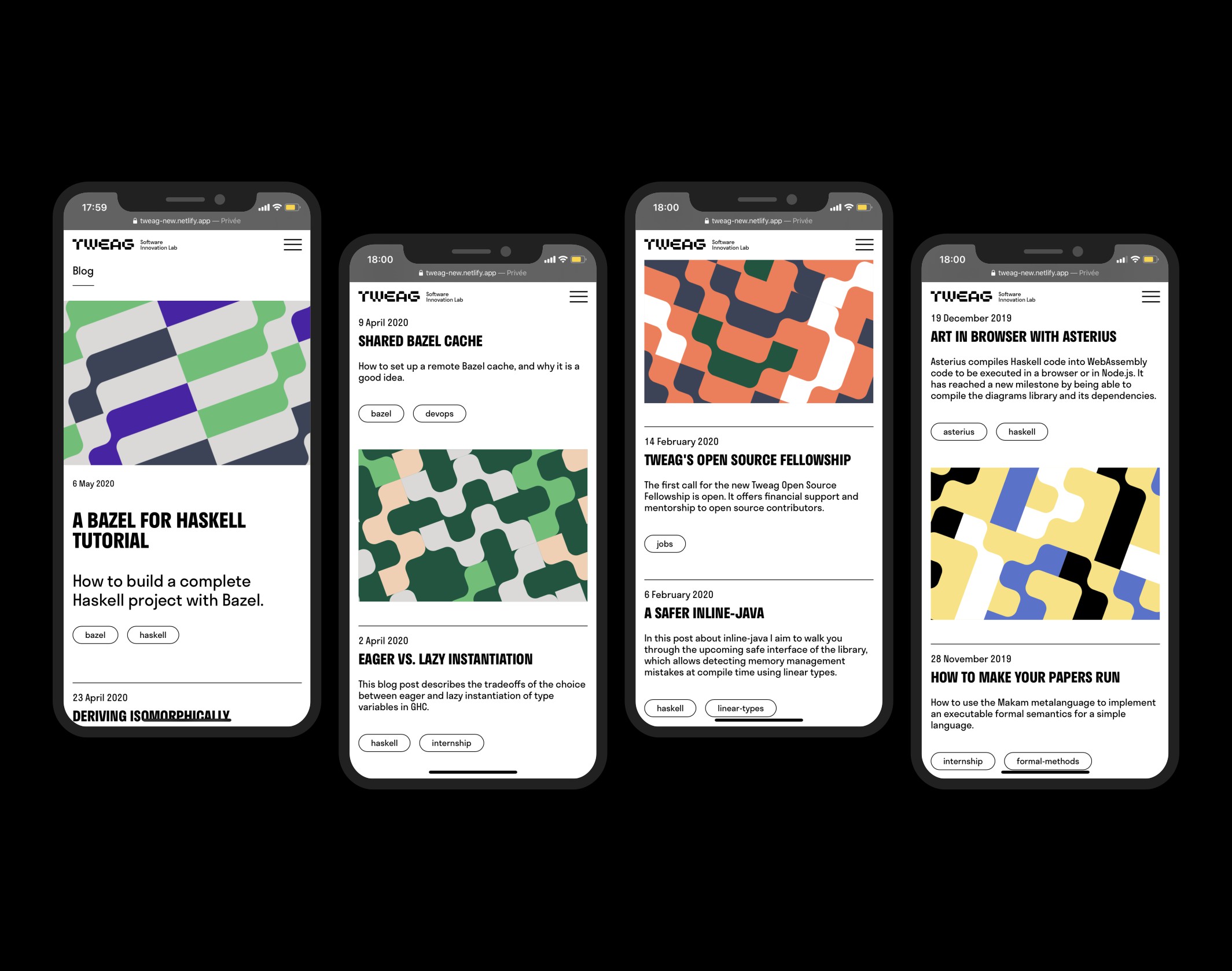
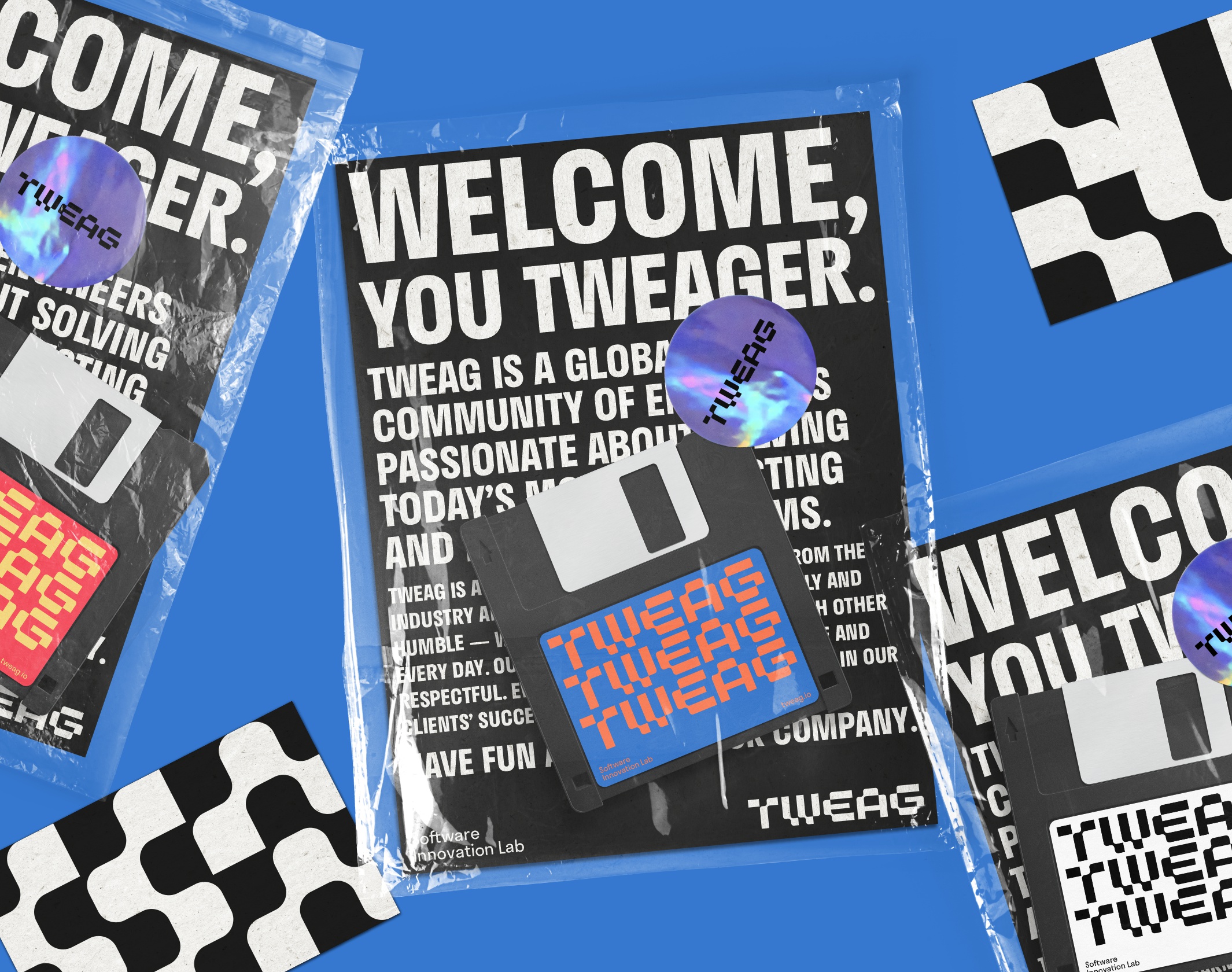
Tweag defines itself as a Software Innovation Lab, that enables well-funded deep tech startups to quickly scale their engineering performance and execute on high-risk, high-reward projects with confidence. Created in 2013 in Paris, the company is based on a team of several dozen engineers, spread over four continents, among the world’s top experts in machine learning, modeling, natural language processing, blockchain, smart contract, programming tools and languages and distributed computing. Recognized within several communities (Haskell, Bazel, Nix) and very involved in the Open Source ecosystem, Tweag approached Brand Brothers to completely redesign its graphic identity and website, based on a new positioning realized by Punchy (Portland, Oregon).
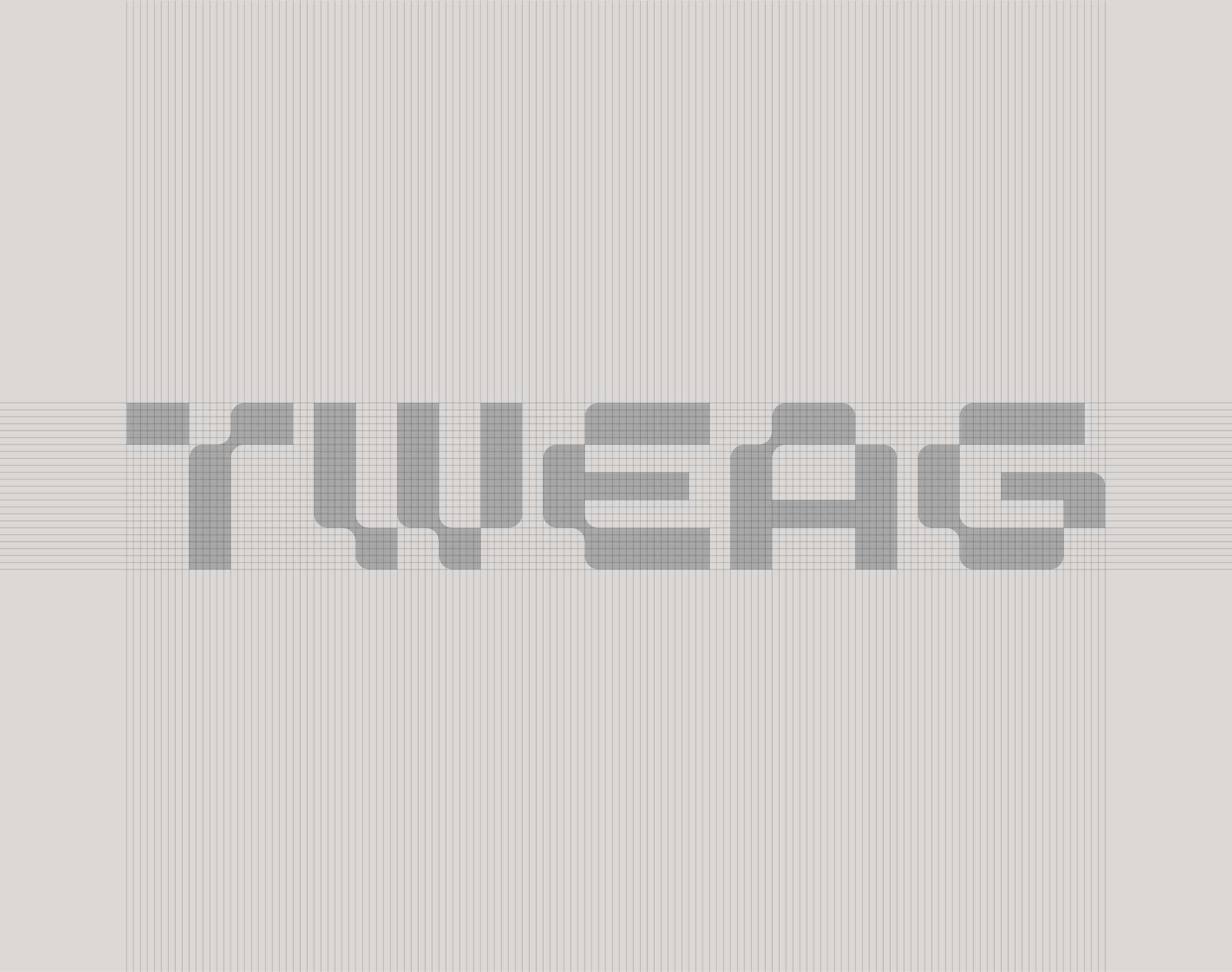
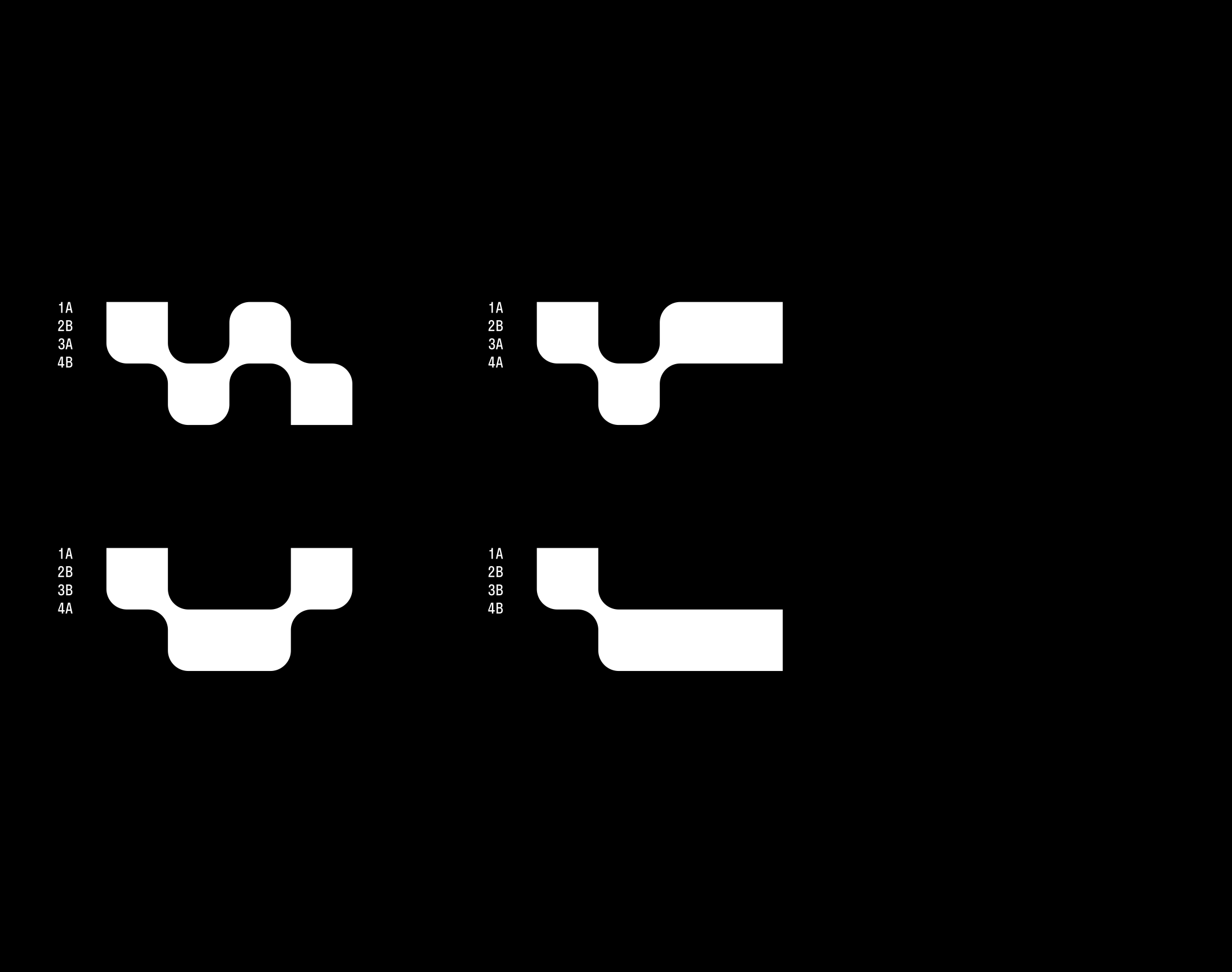
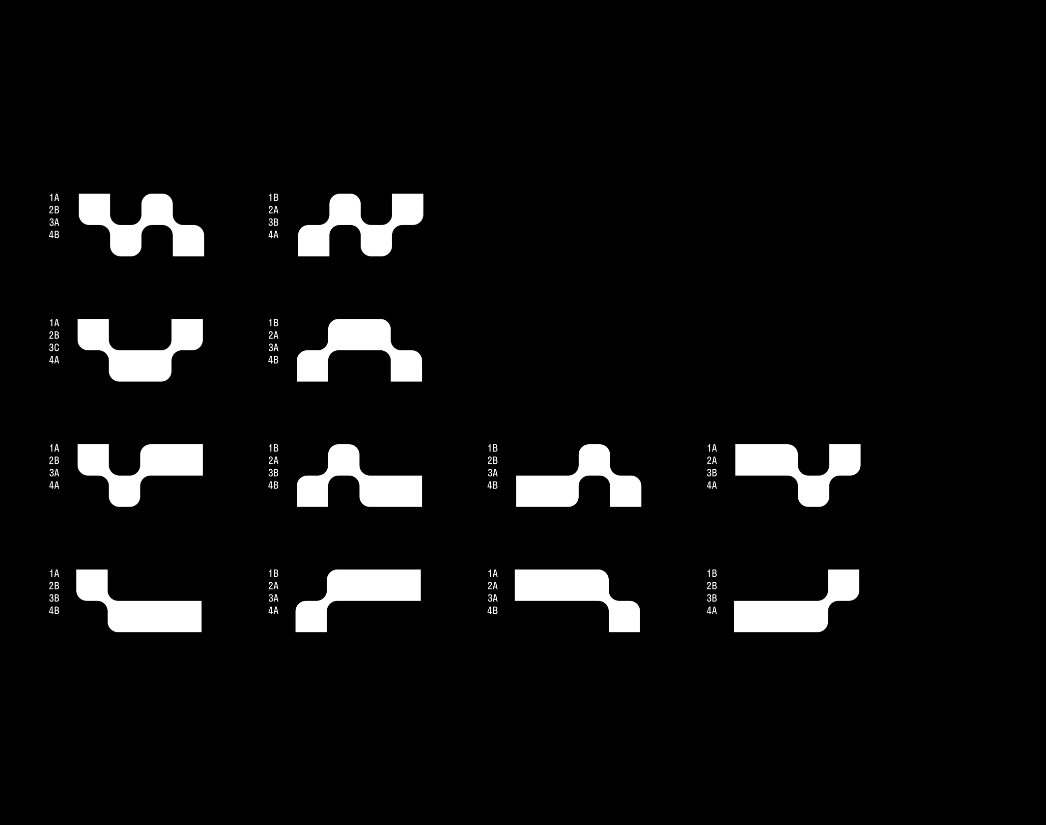
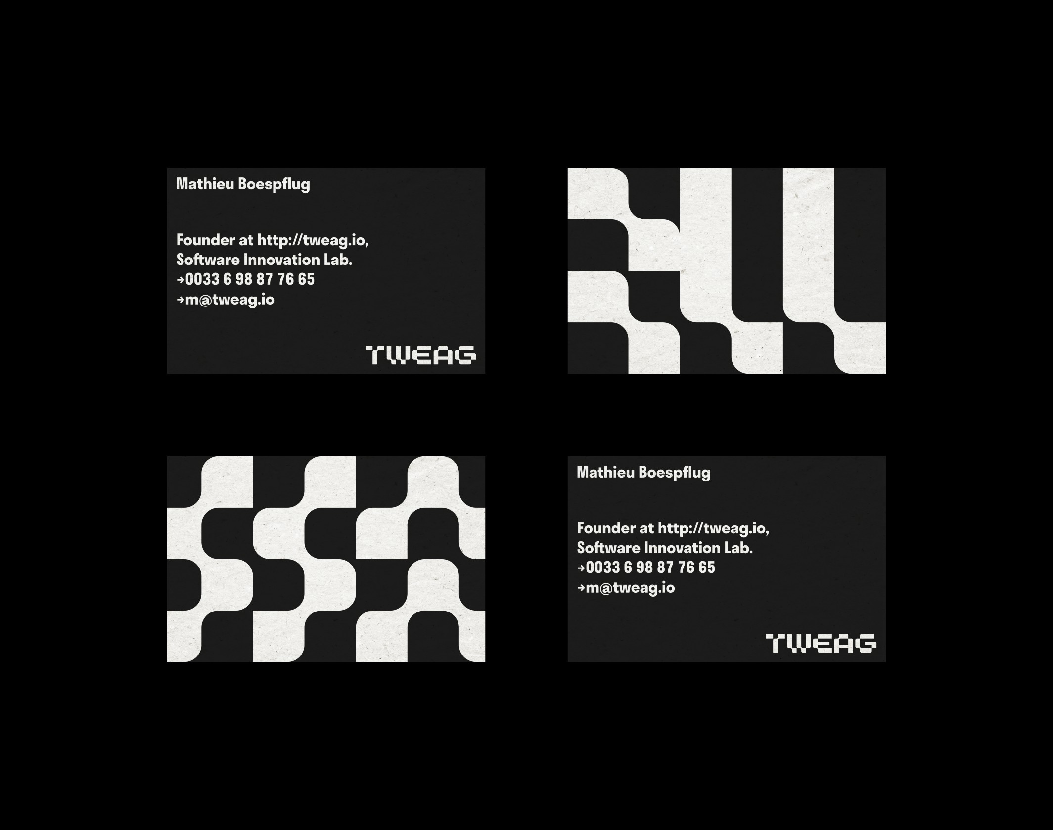
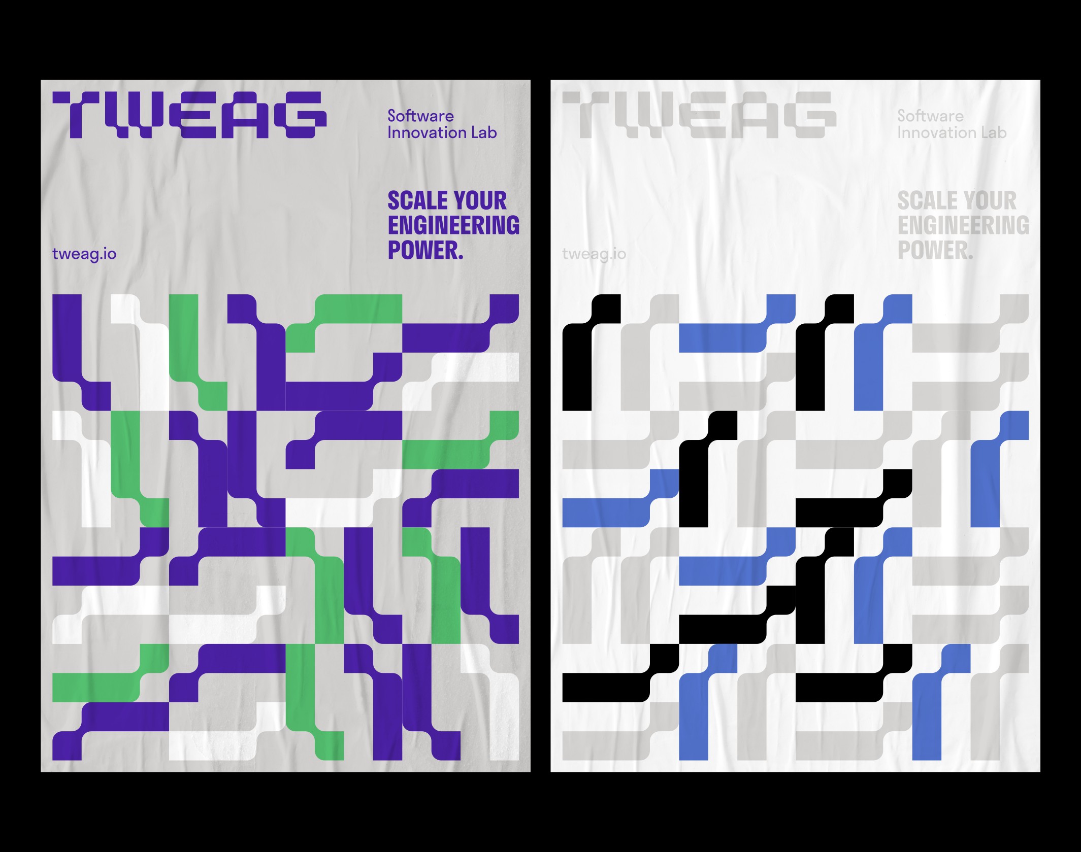
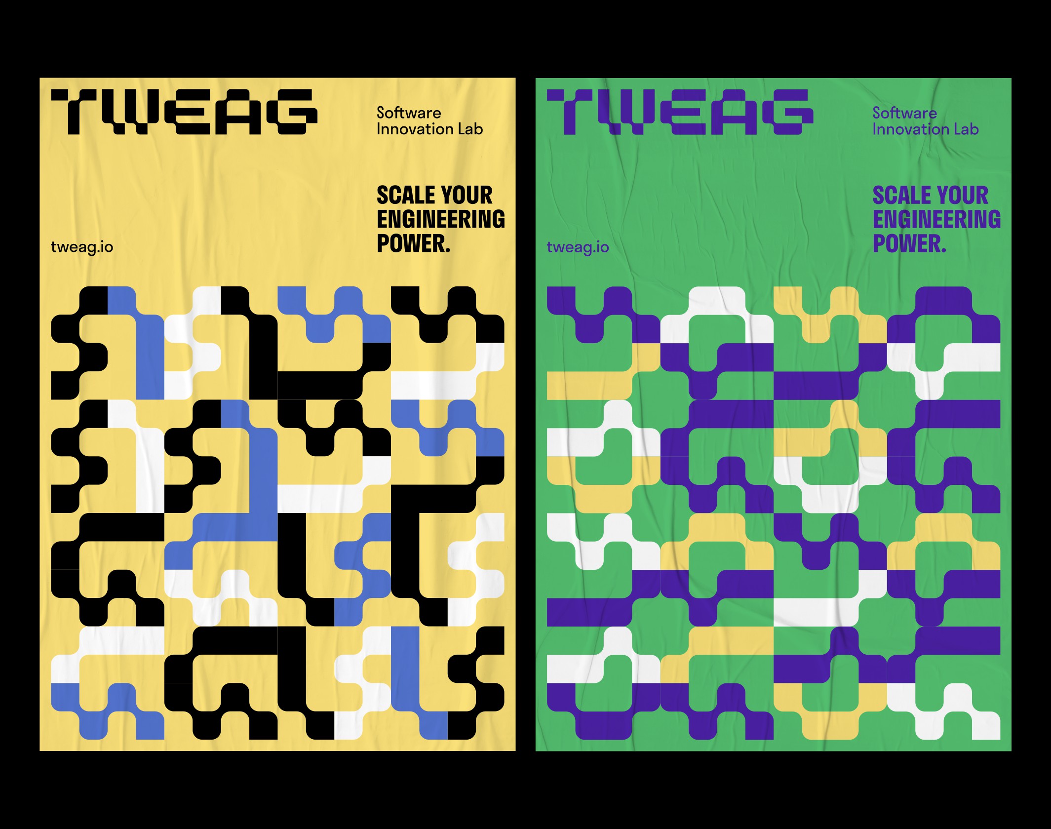
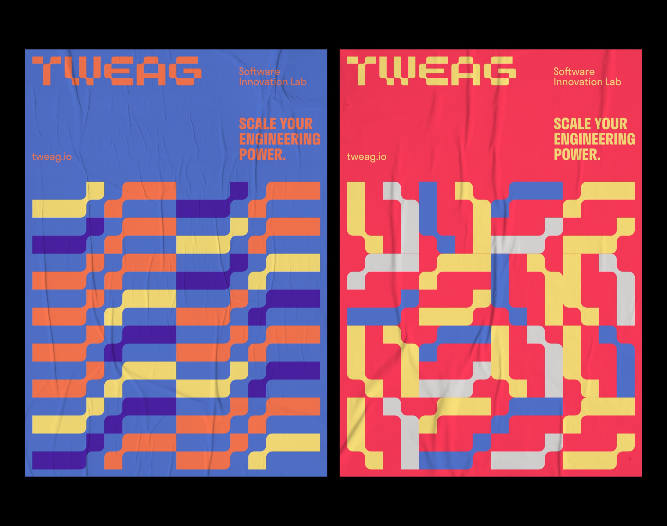
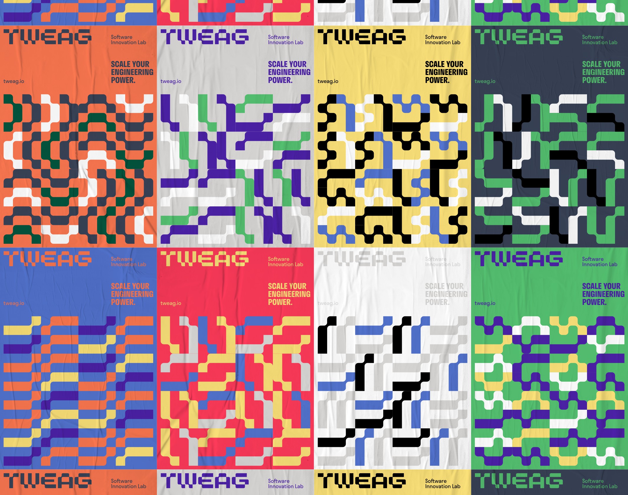
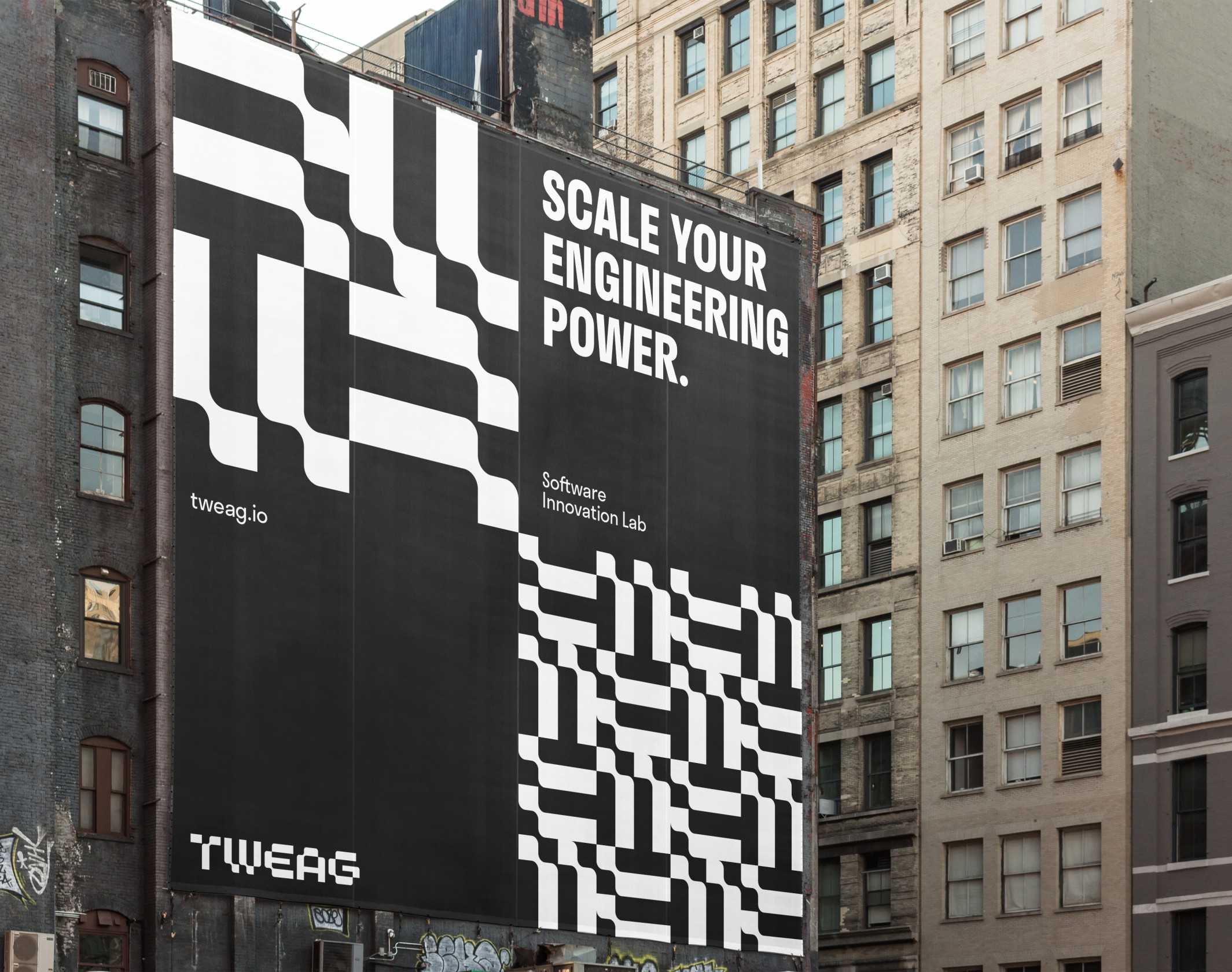
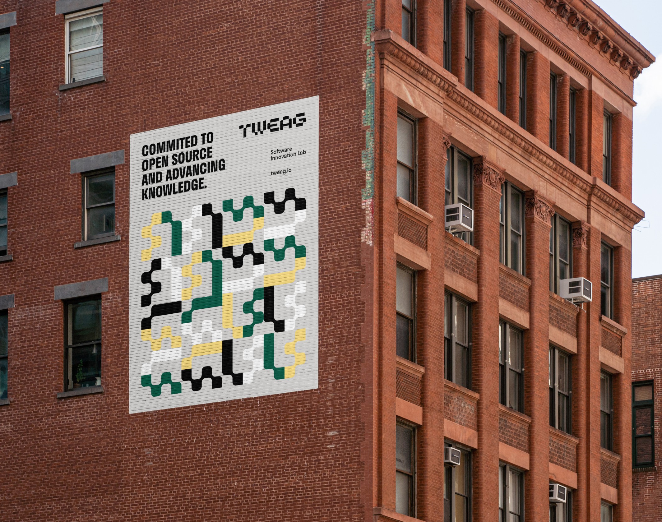
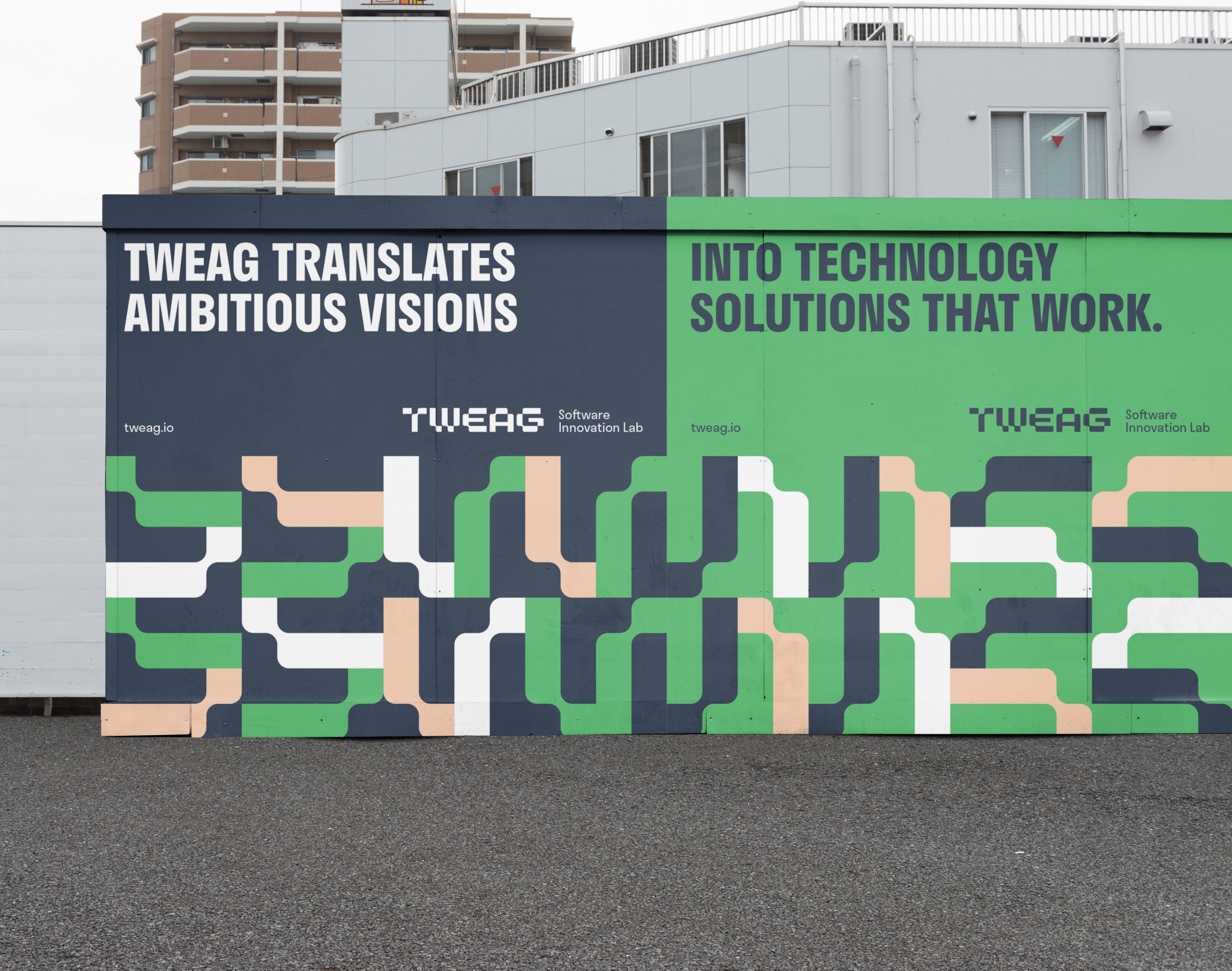
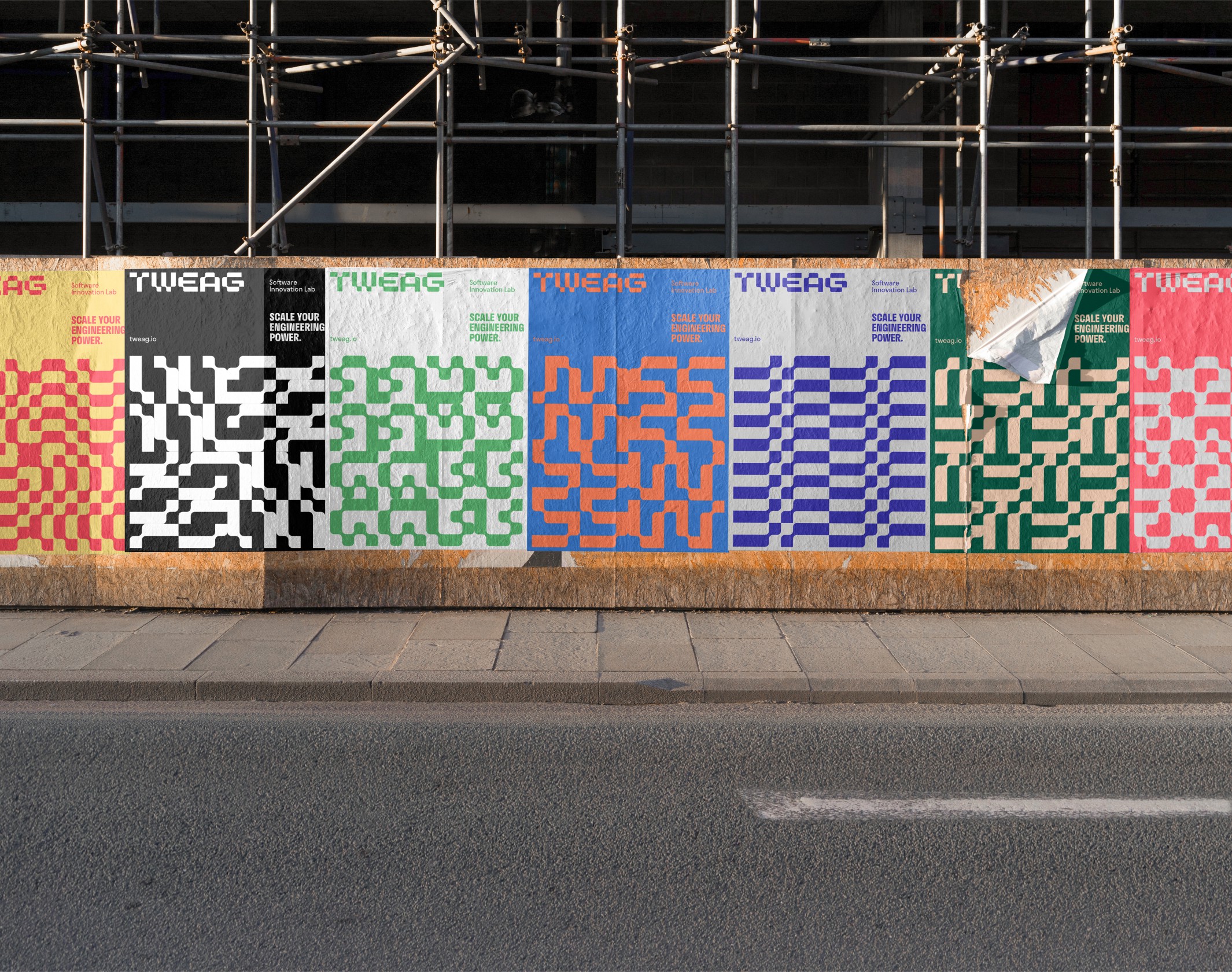
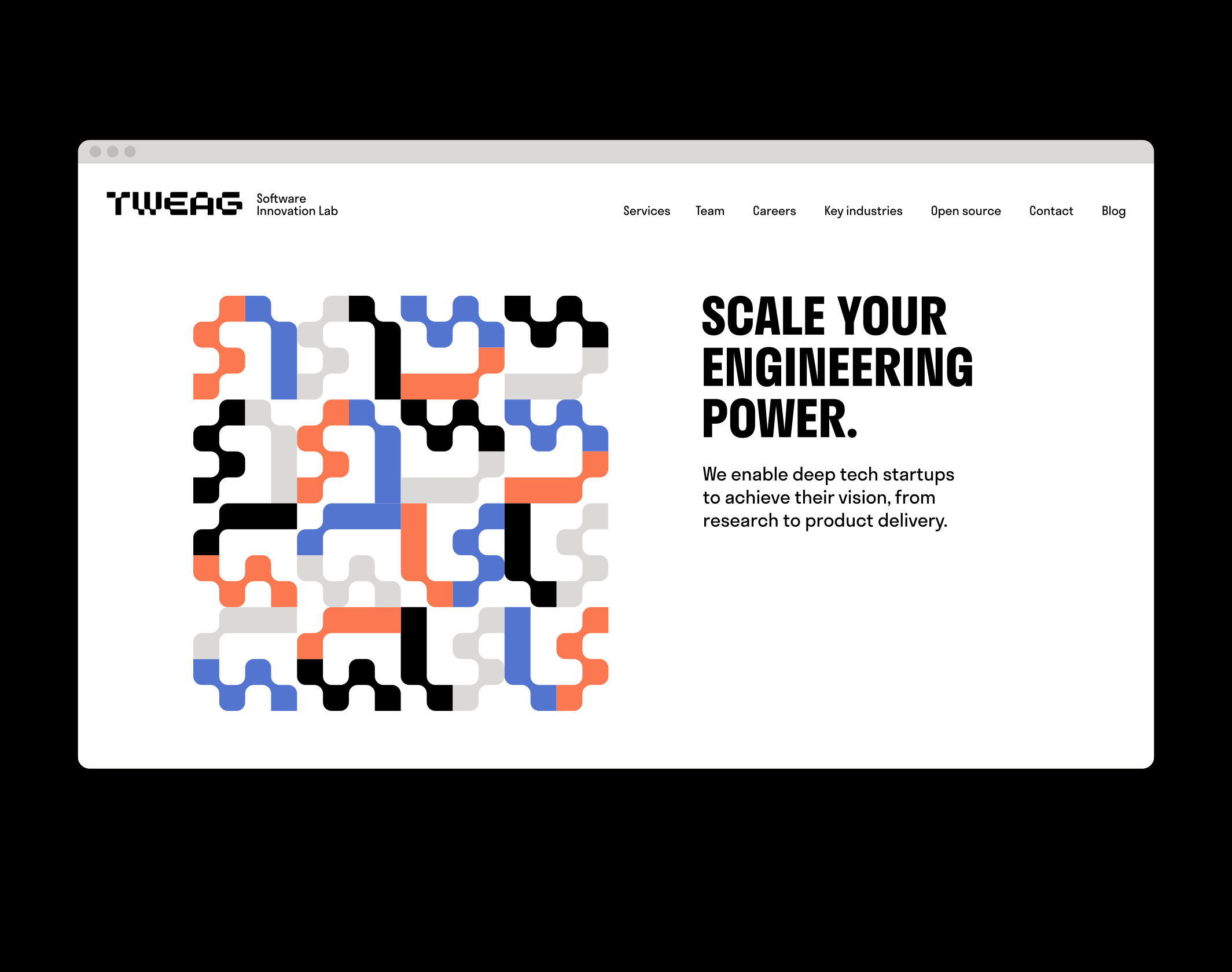
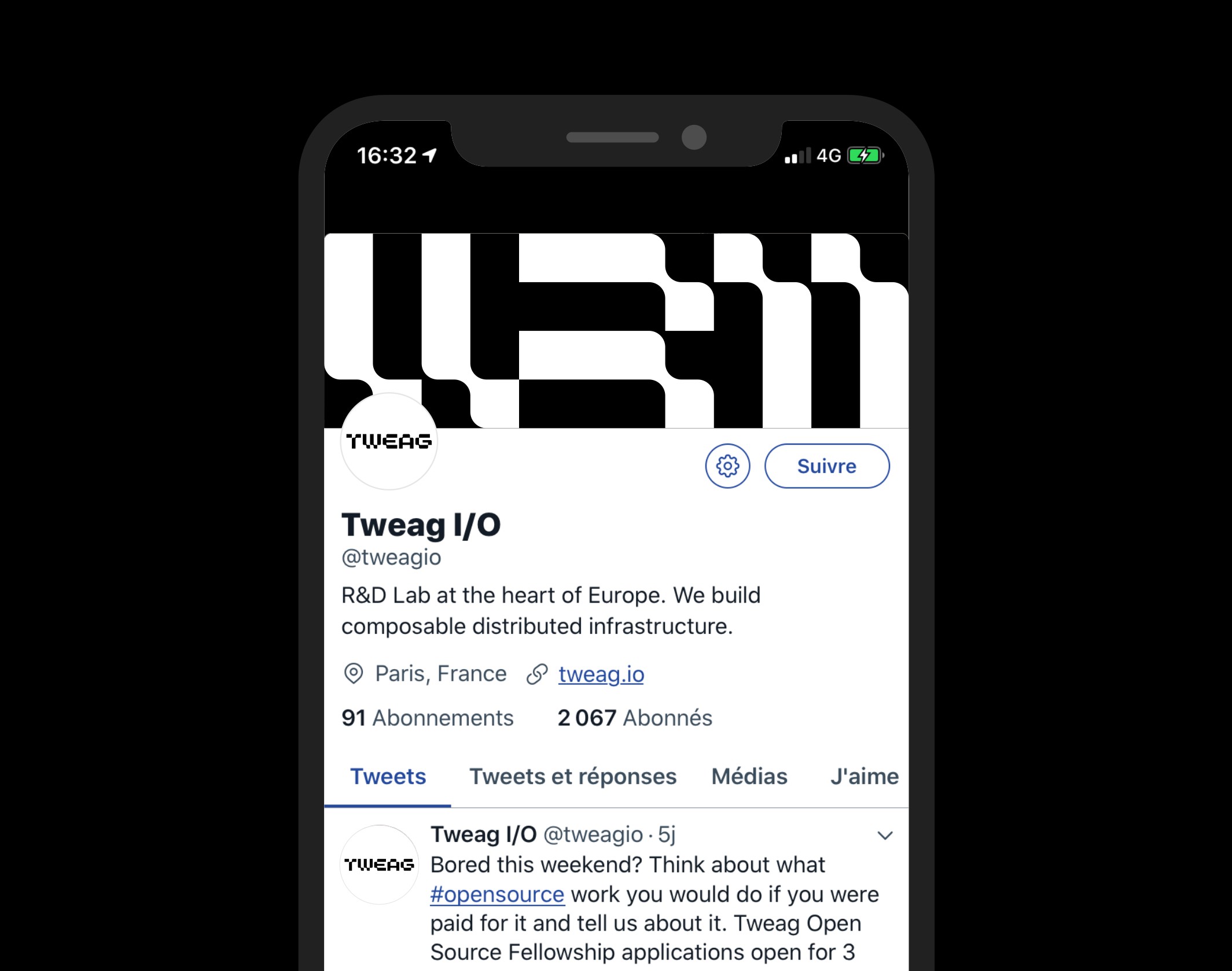
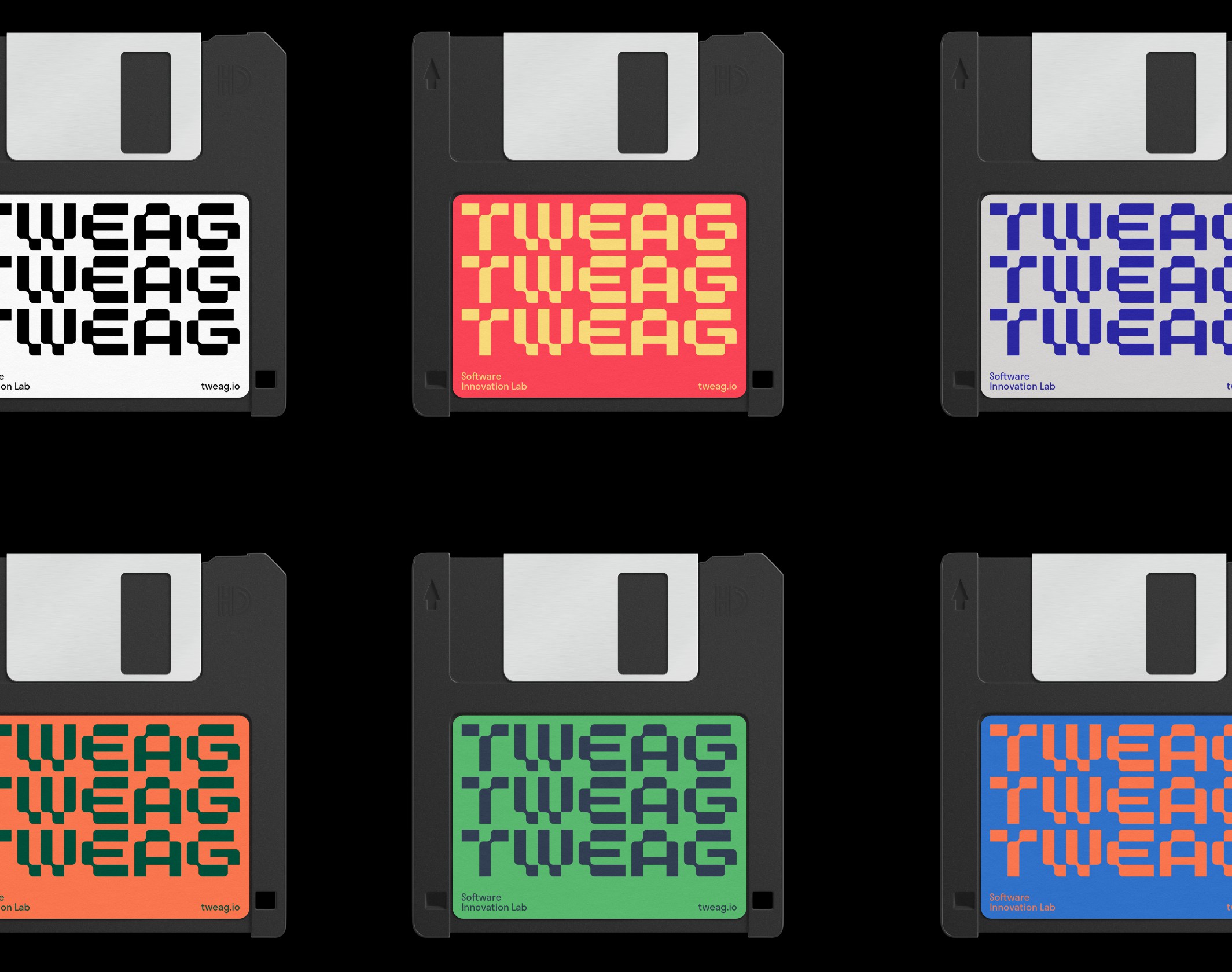
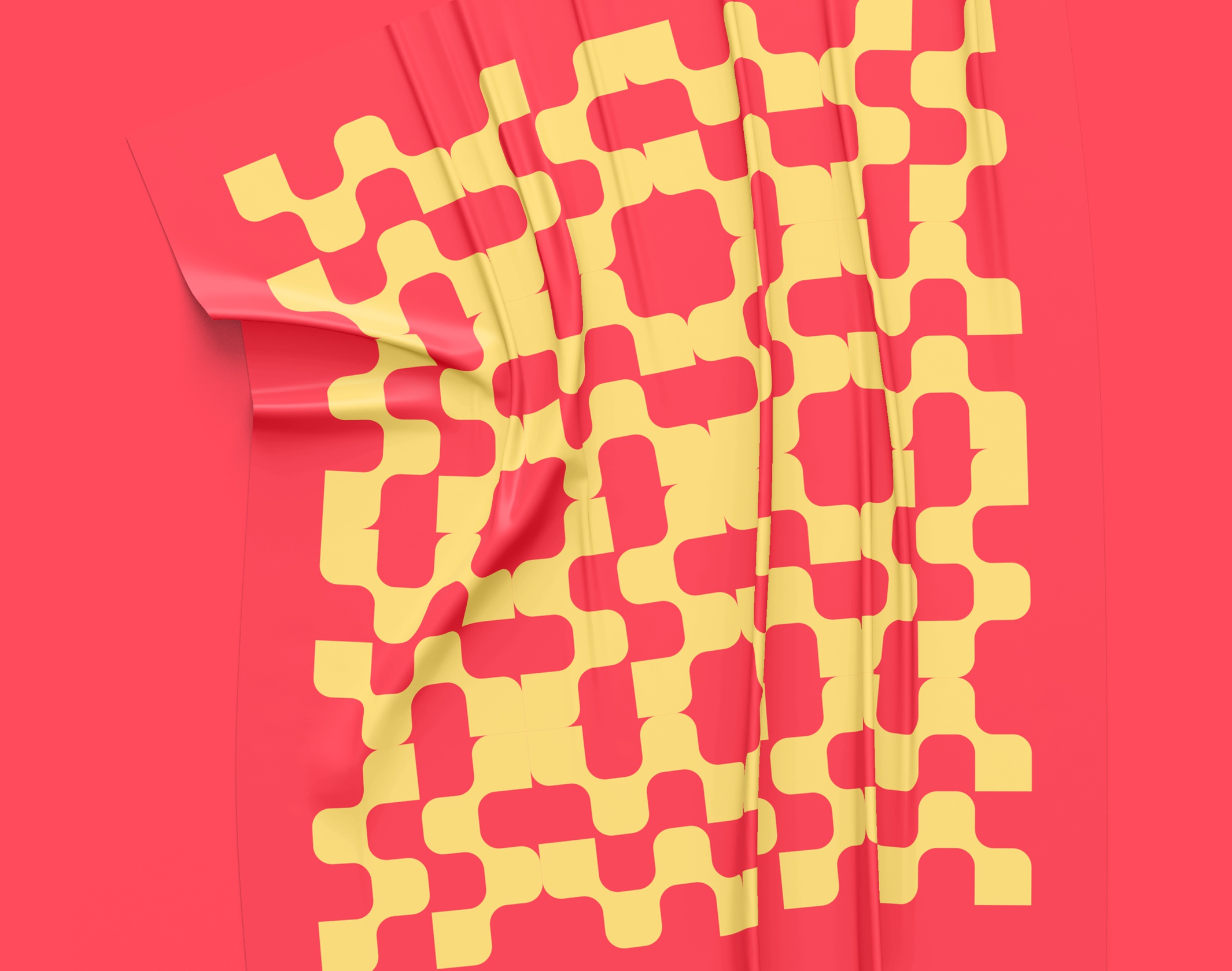
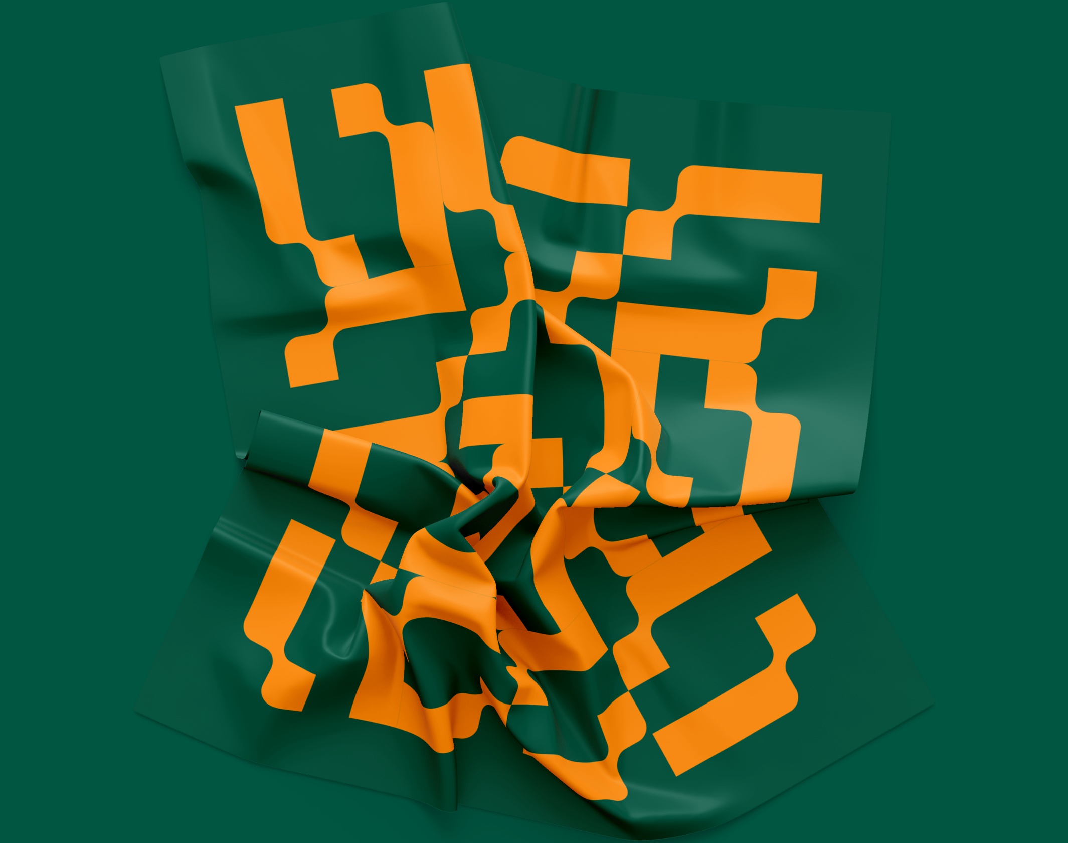
The new Tweag visual identity is designed as a modular and combinatorial graphic system. Based on a bespoke character design, the Tweag logo is a raw and bold typogram that plays on curves as well as straight lines, filled areas and blanks. A simple but statutory visual marker, like a contemporary reinvention of tech imagery.
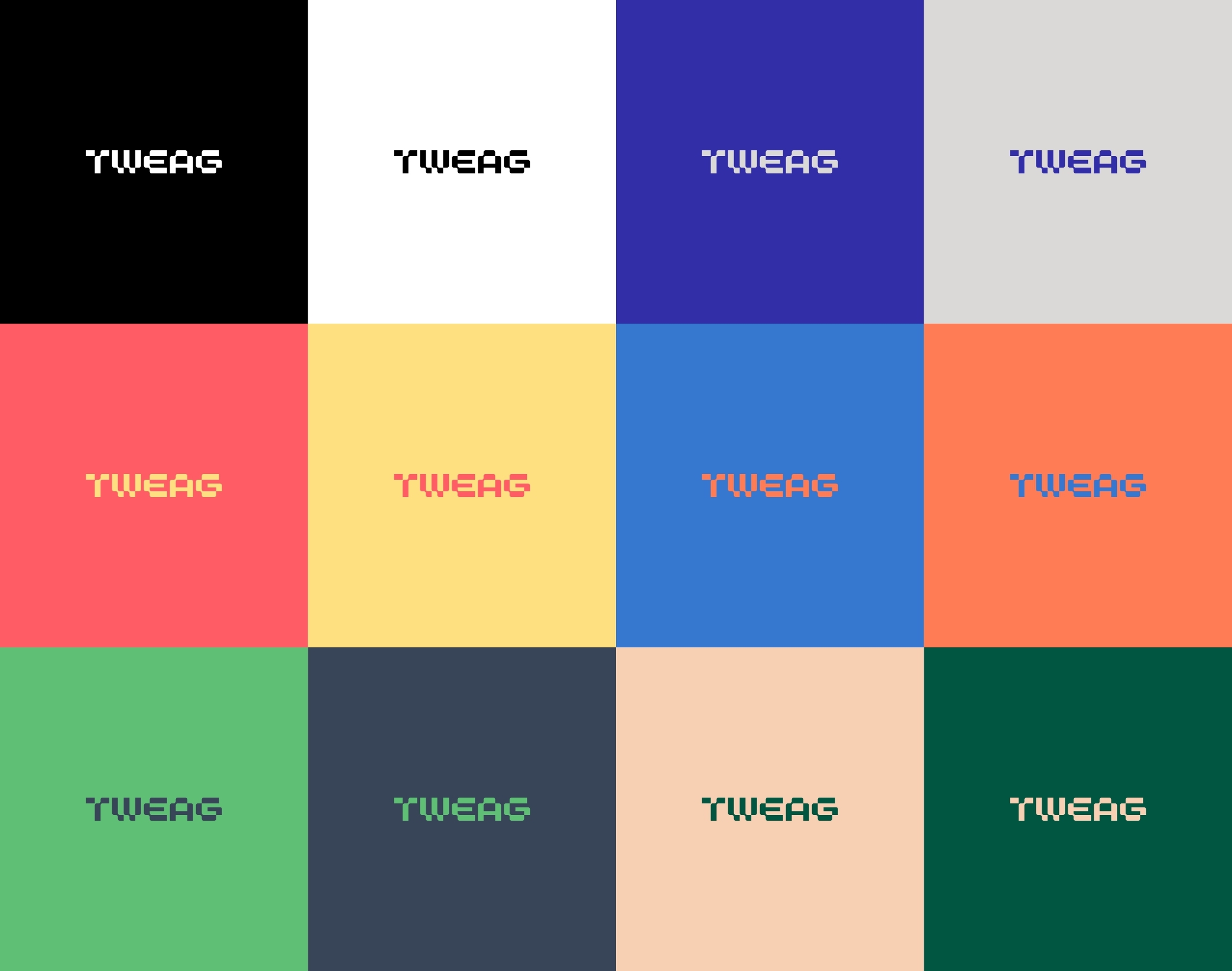
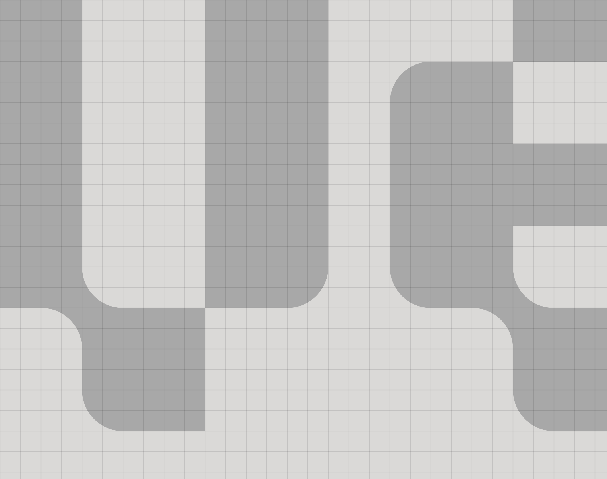
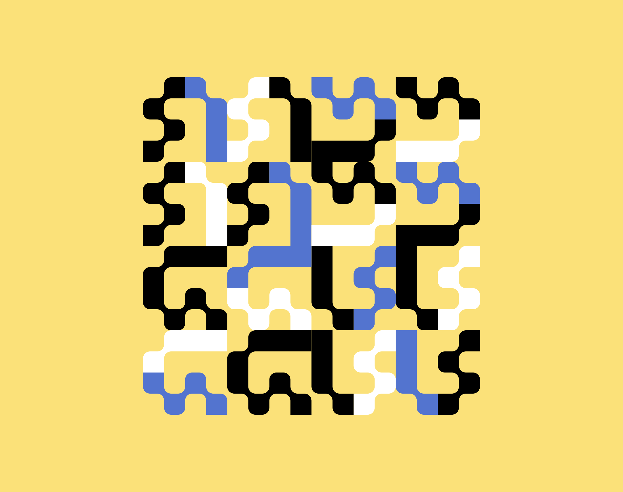
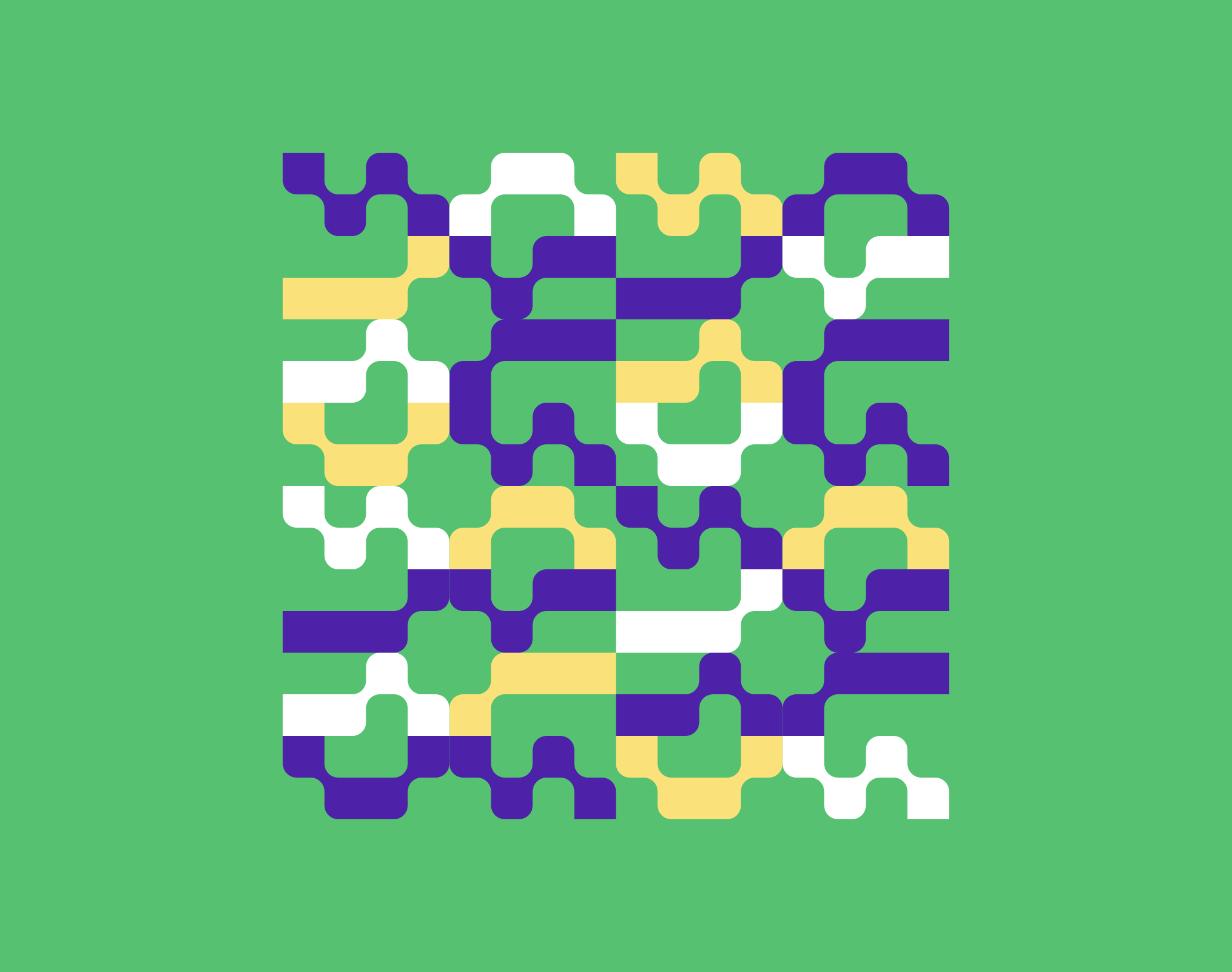
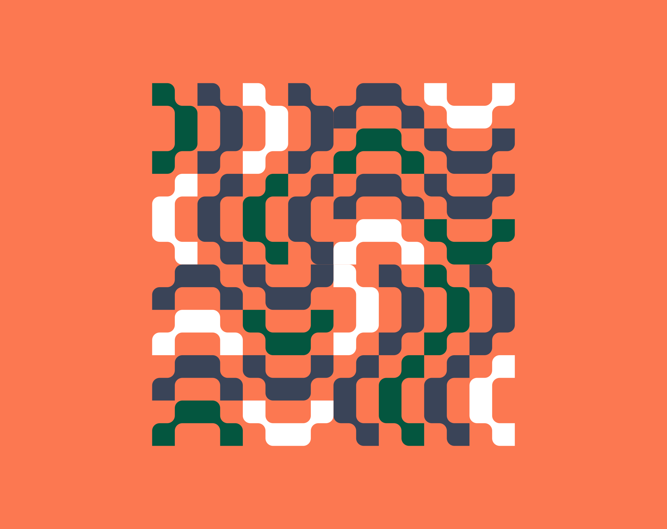
The visual system, derived entirely from the logo, is an infinite set of decomposable and recomposable elements that create a rich and easily identifiable visual grammar. It echoes the Tweag method and their way of conceiving software; the Tweag graphic language can be assembled, disassembled, and connected in every imaginable way.
Launched in May 2020, the new branding and website were received with some enthusiasm by the community.
A Tweag engineer: “The logo’s kind of epic (nerdy but also a little intimidating; I secretly want a T-shirt with it). Exciting stuff!”
Publications
9
Monotype Type Trends, Featured
Brand New, Review
Behance, Best of Behance
Mindsparkle Mag, Review
The Brand Identity, Featured
Inspofinds, Inspofinds Collection II
Disciplines
Brand strategy
Visual identity
Motion design
Signage
Typography
Branding
Naming / copywriting
Editorial design
Web design
