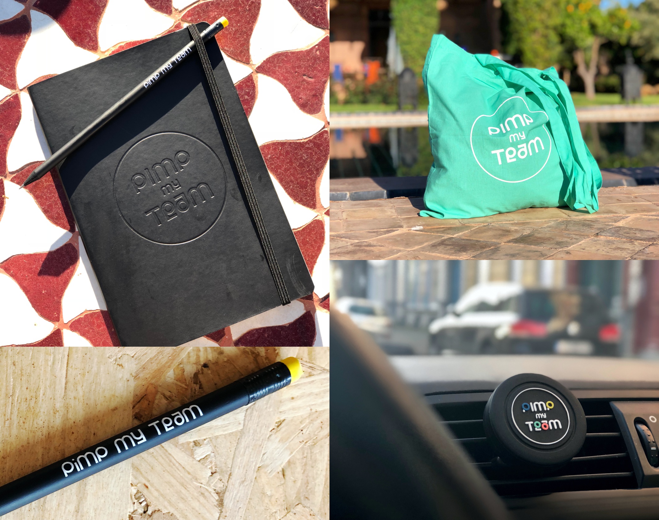
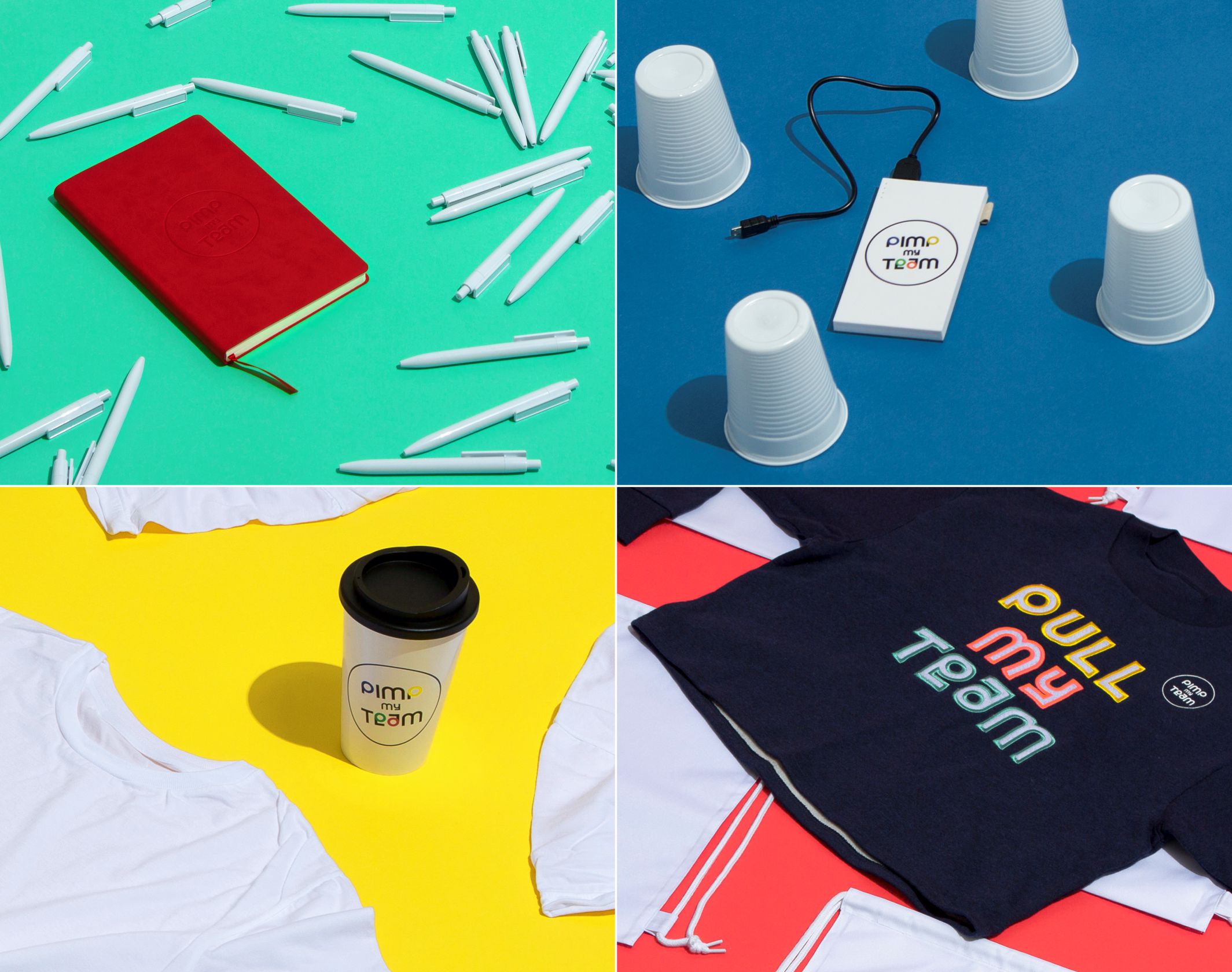
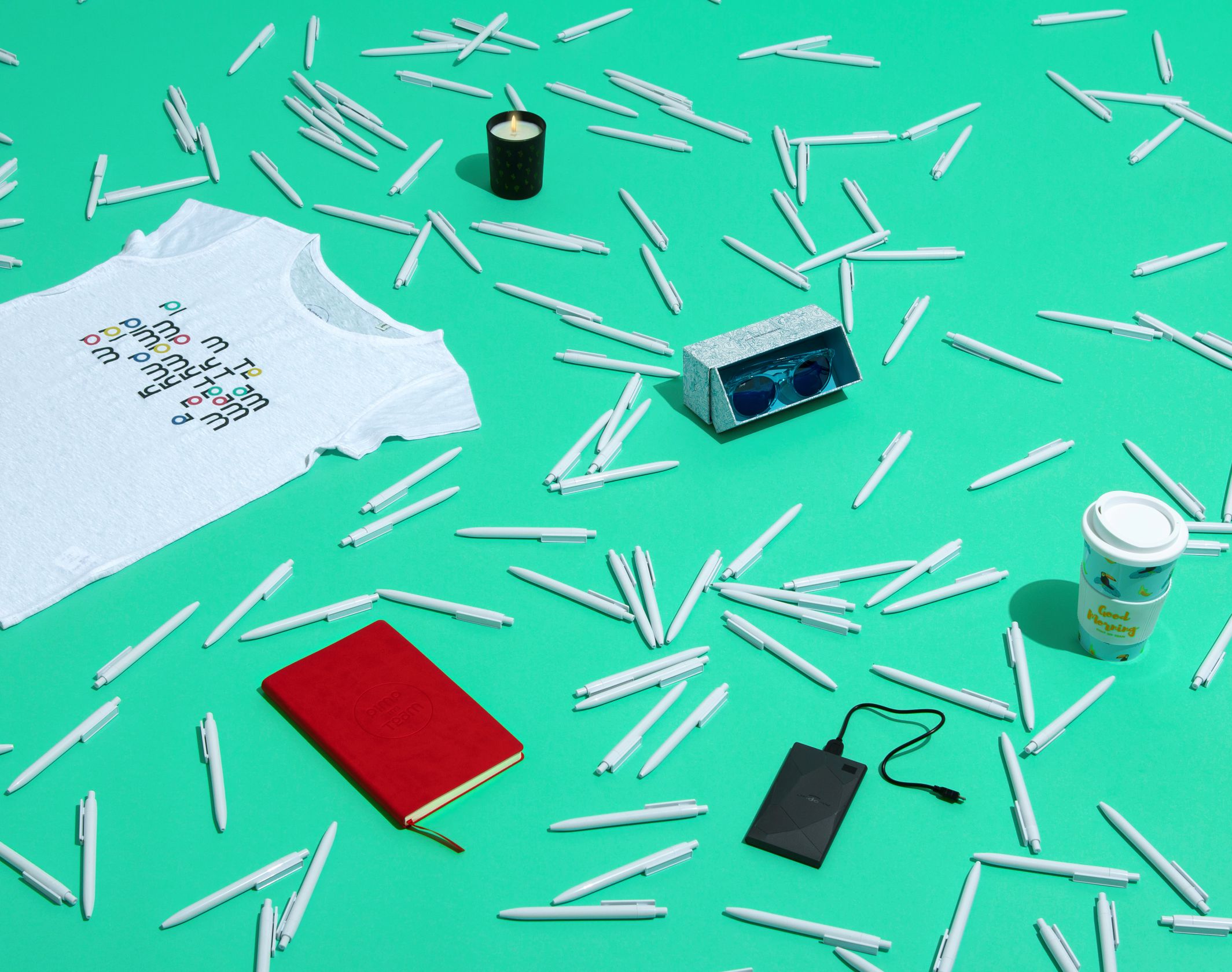
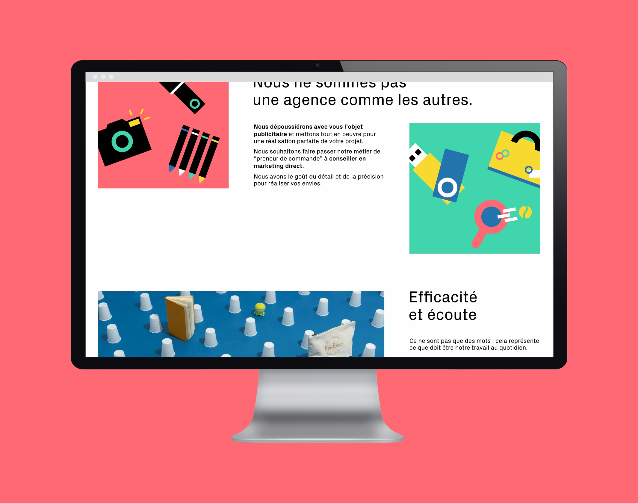
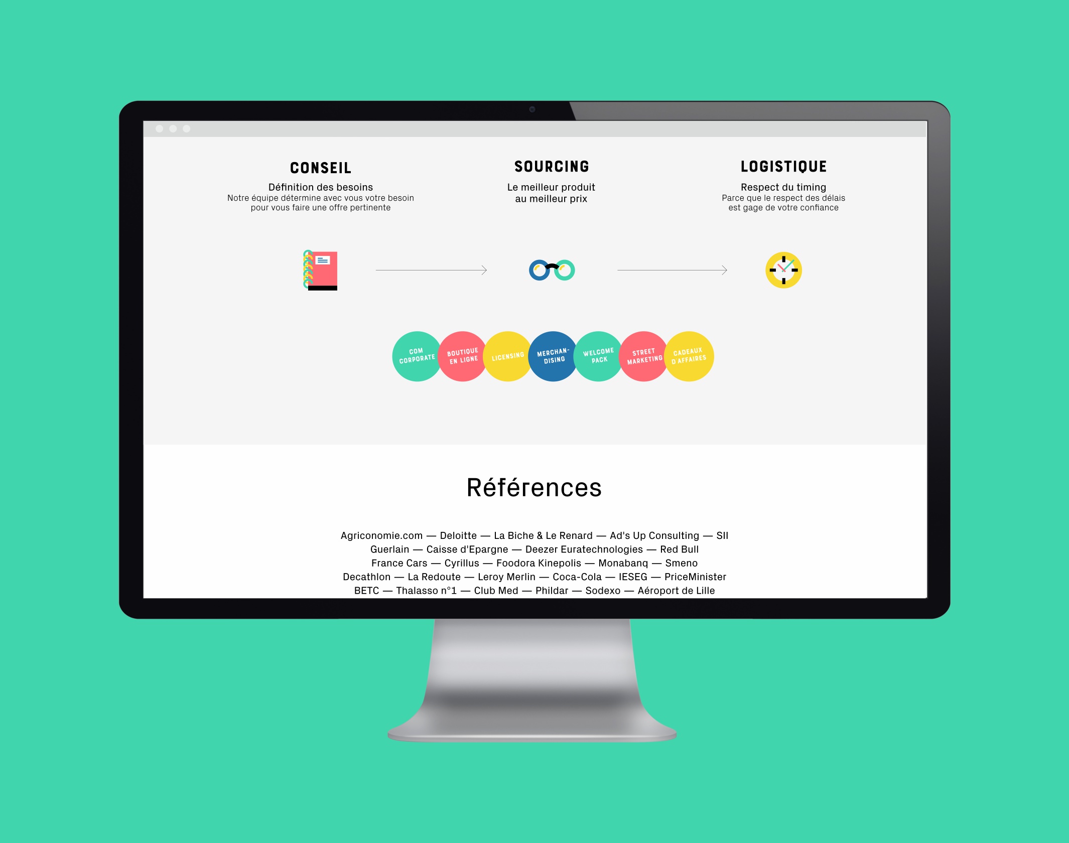
Pimp My Team’s ambition is to dust off communication through promotional items. Based in Lille, this young agency is already one of France’s leading players in promotional products. Their success can be attributed to an avant-garde mindset: a zero-defect requirement, an ability to propose solutions and go beyond their customers’ initial ideas. This approach to business has ensured their development to date without a hitch.
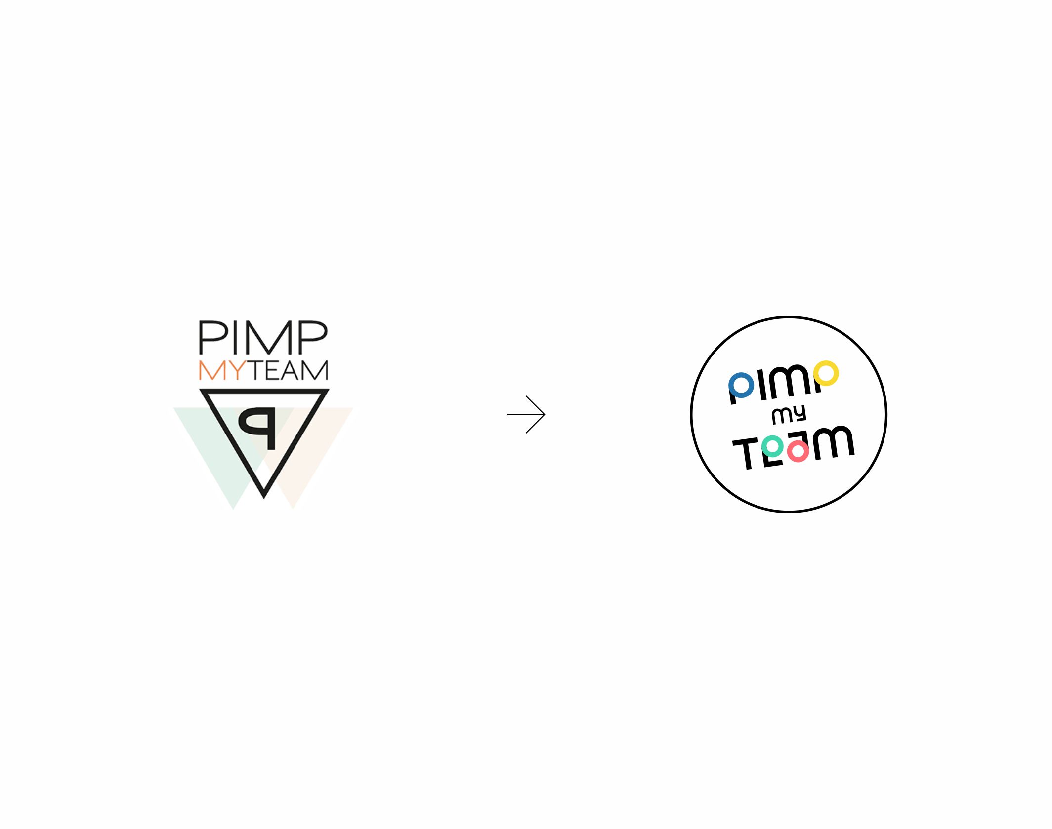
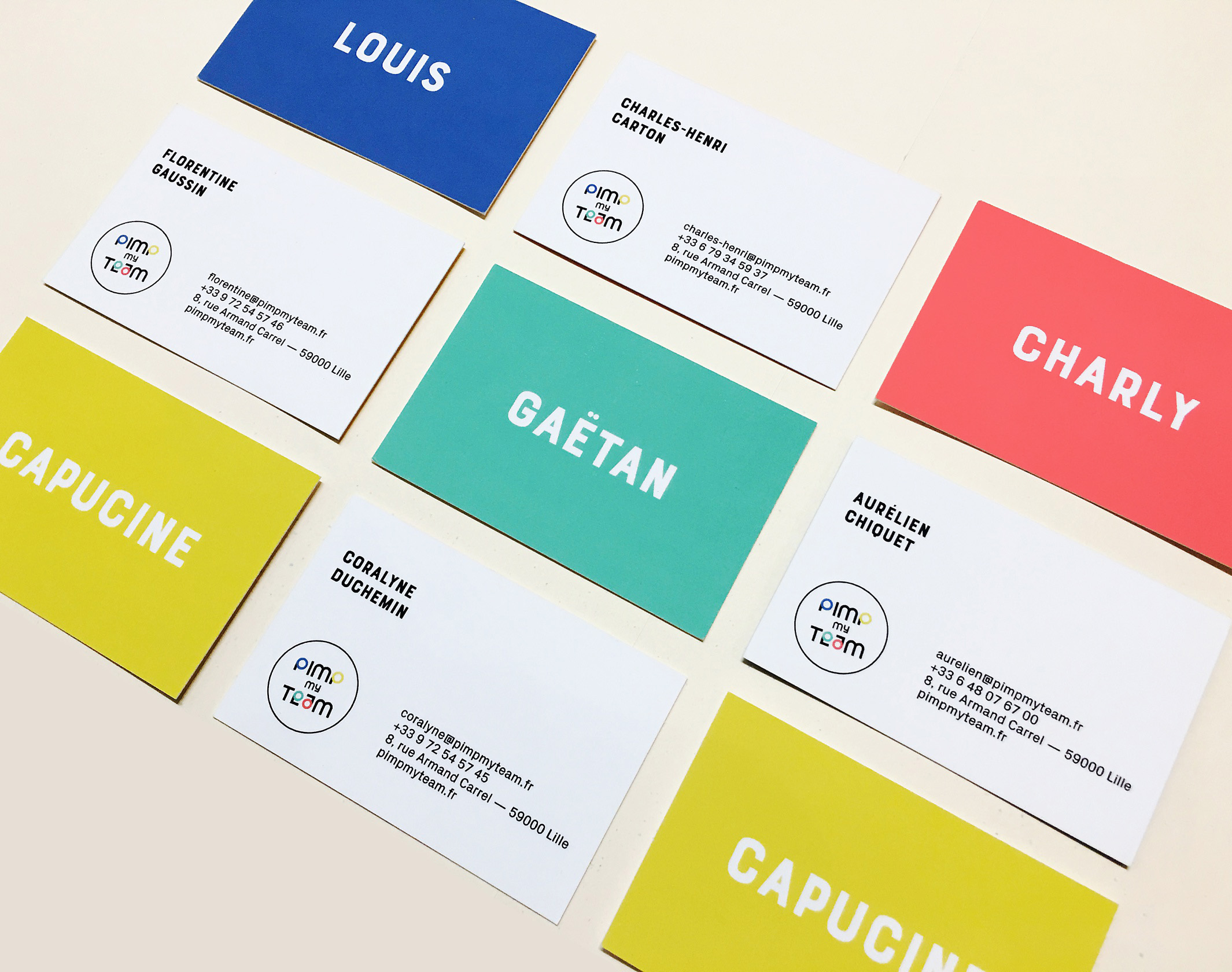
The team approached us to rethink a visual identity that had been conceived in an overly artisanal manner. We embraced this high-potential project to initiate a complete overhaul of the brand’s graphic and verbal territory.The new Pimp My Team identity is a raw, colorful and bold graphic object.
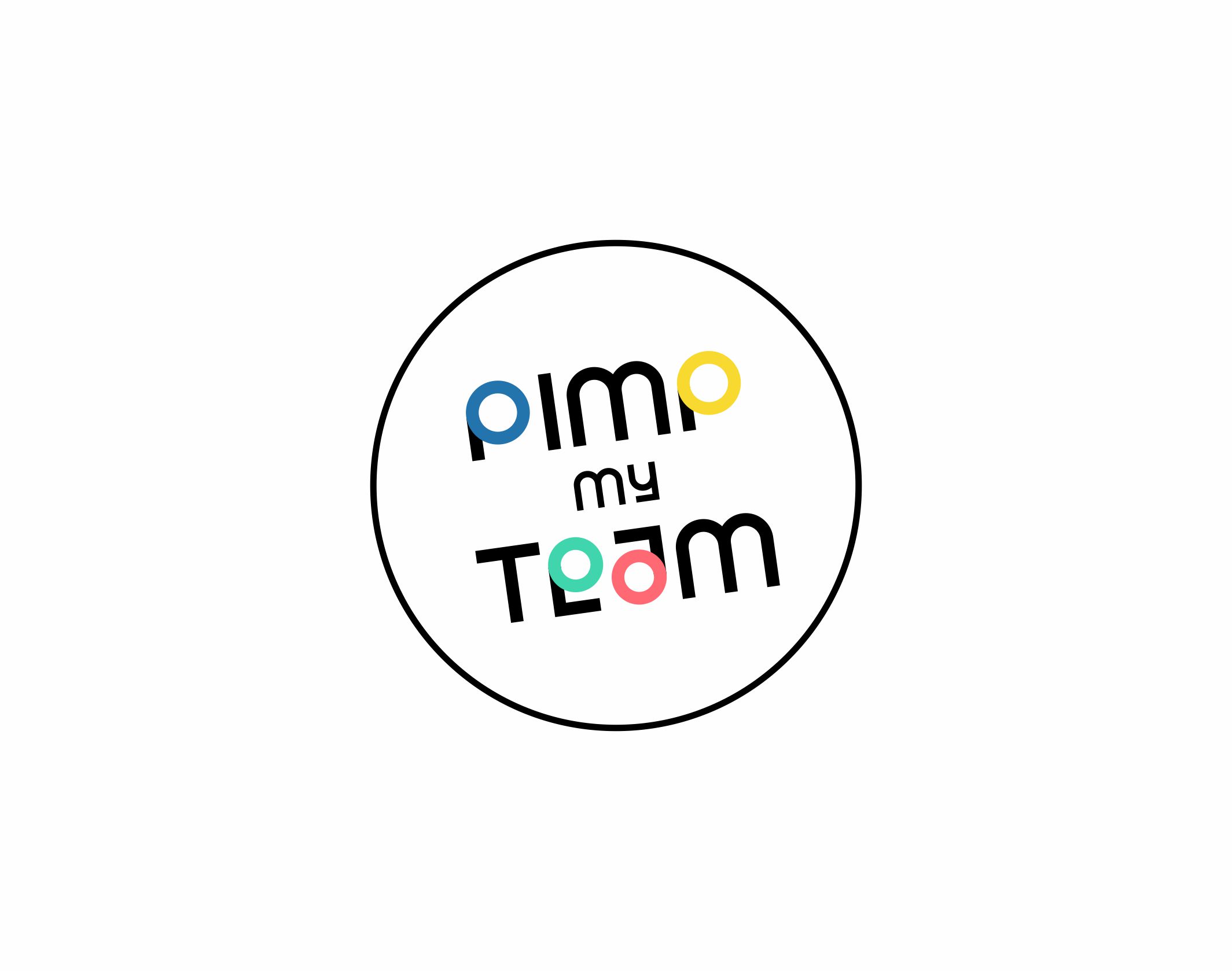
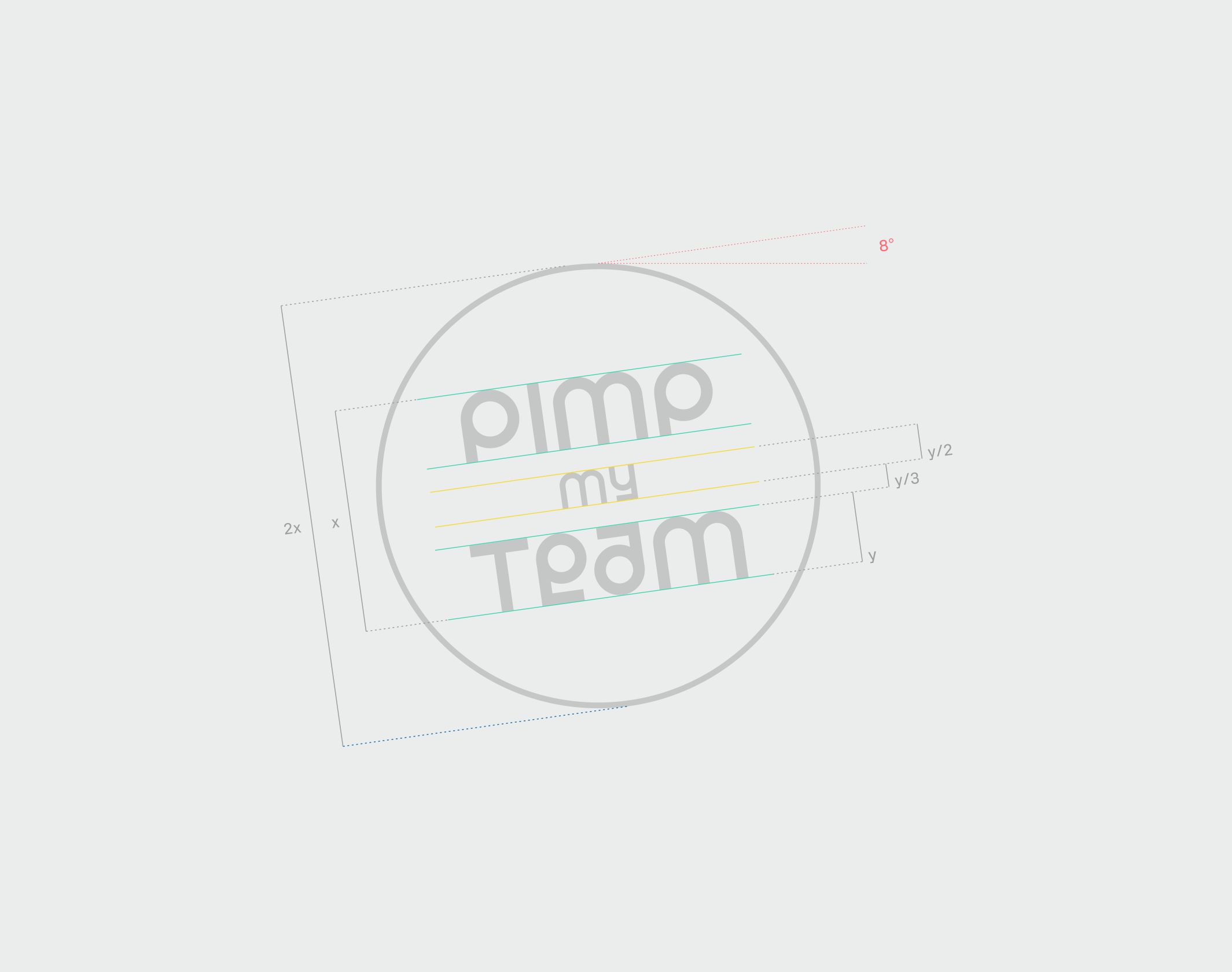
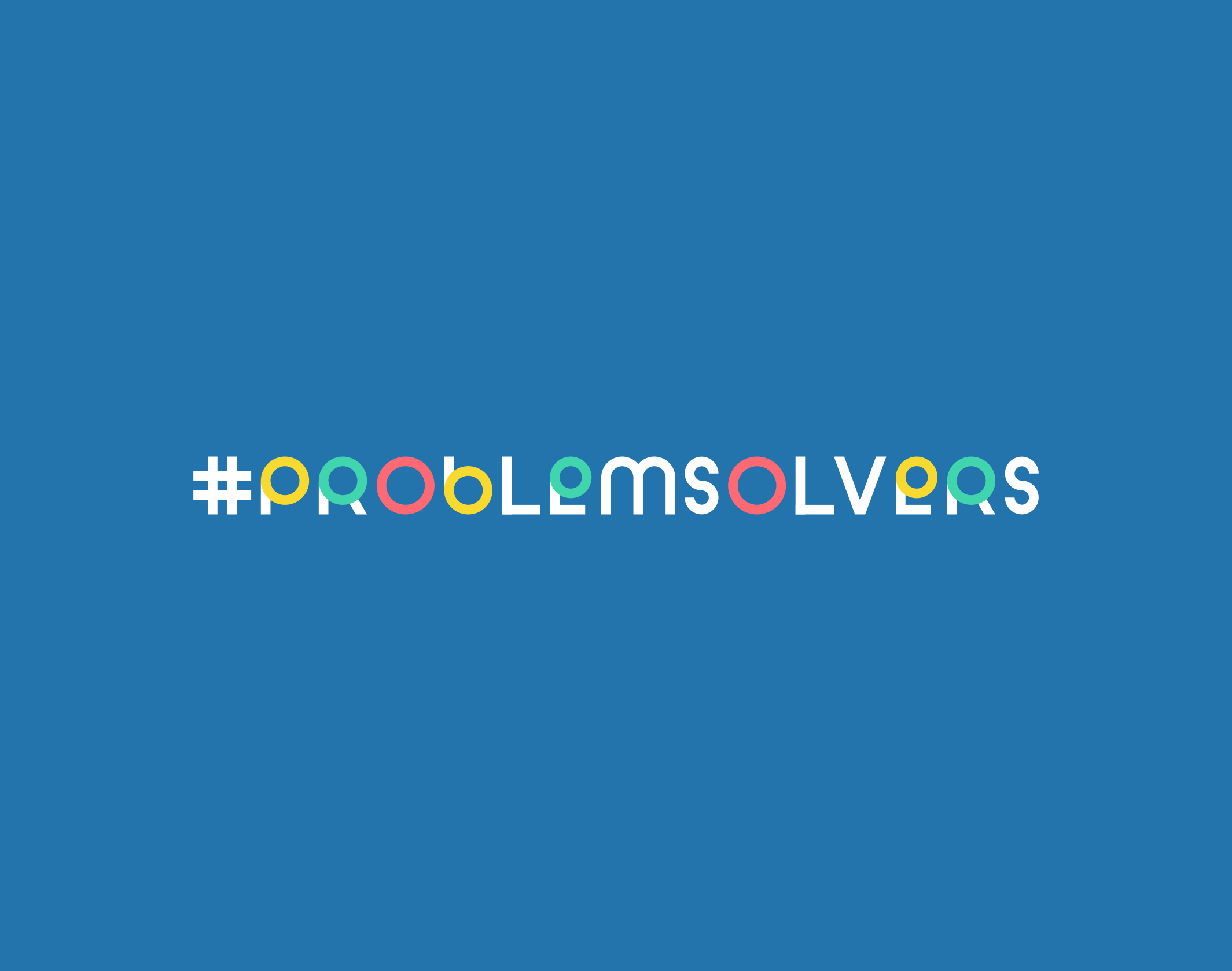
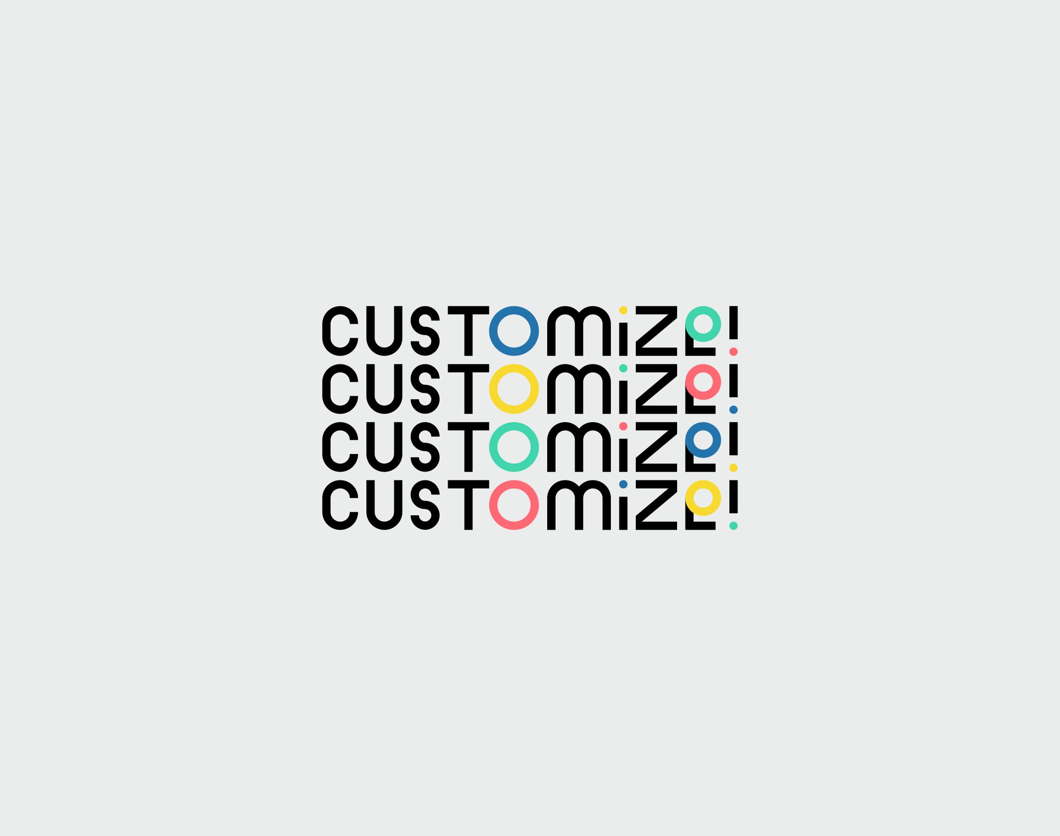
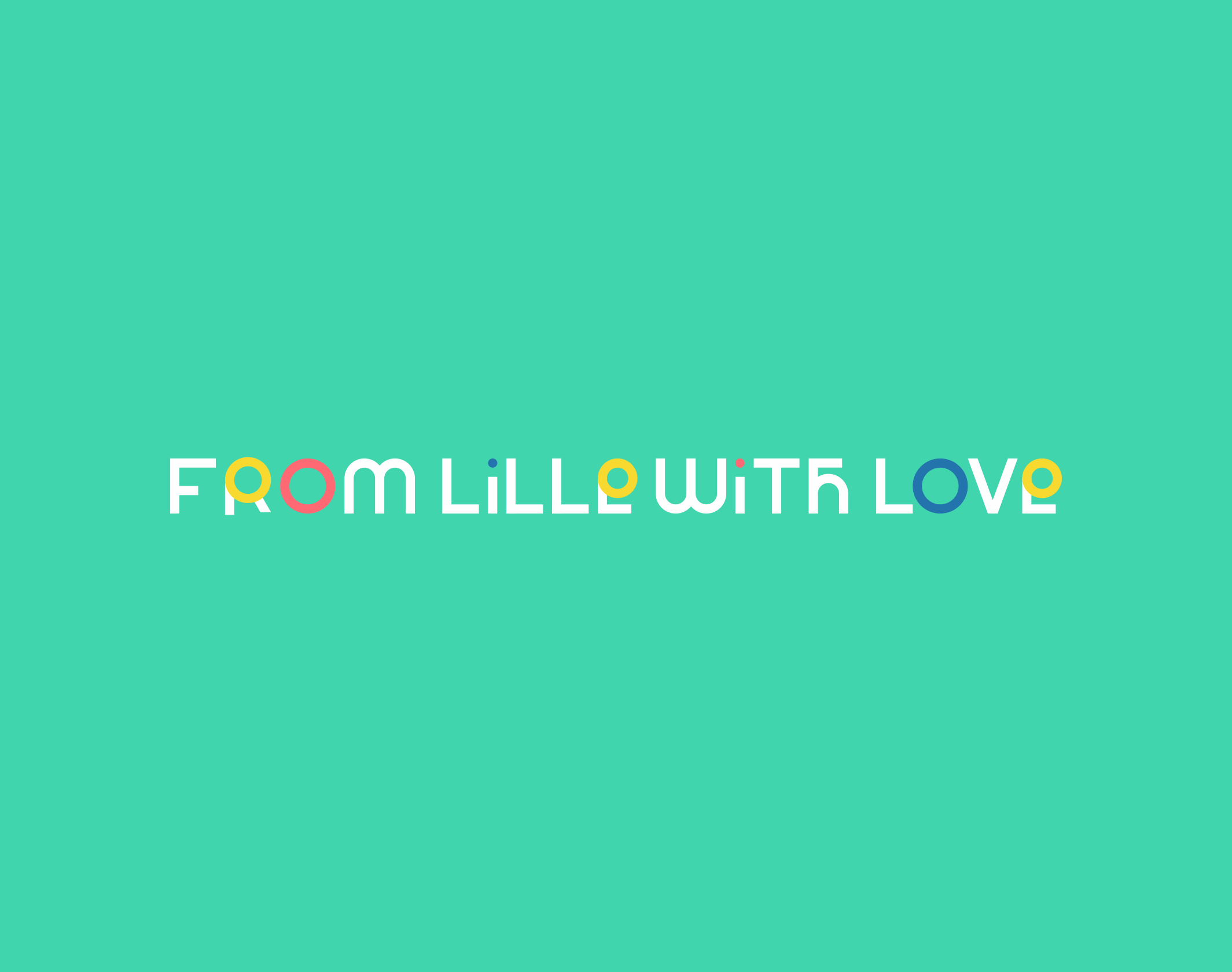
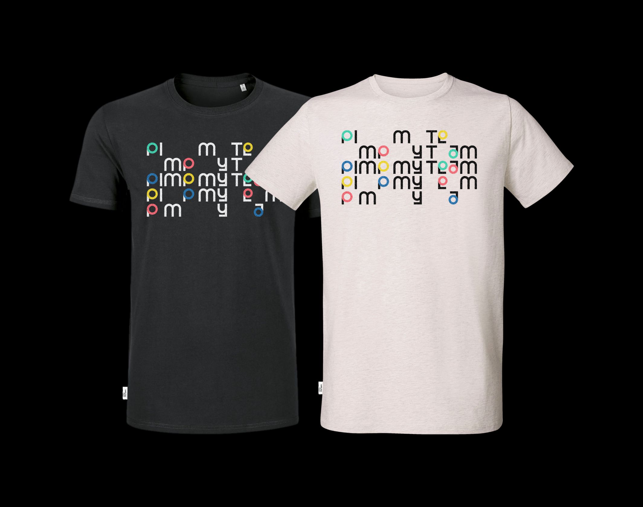
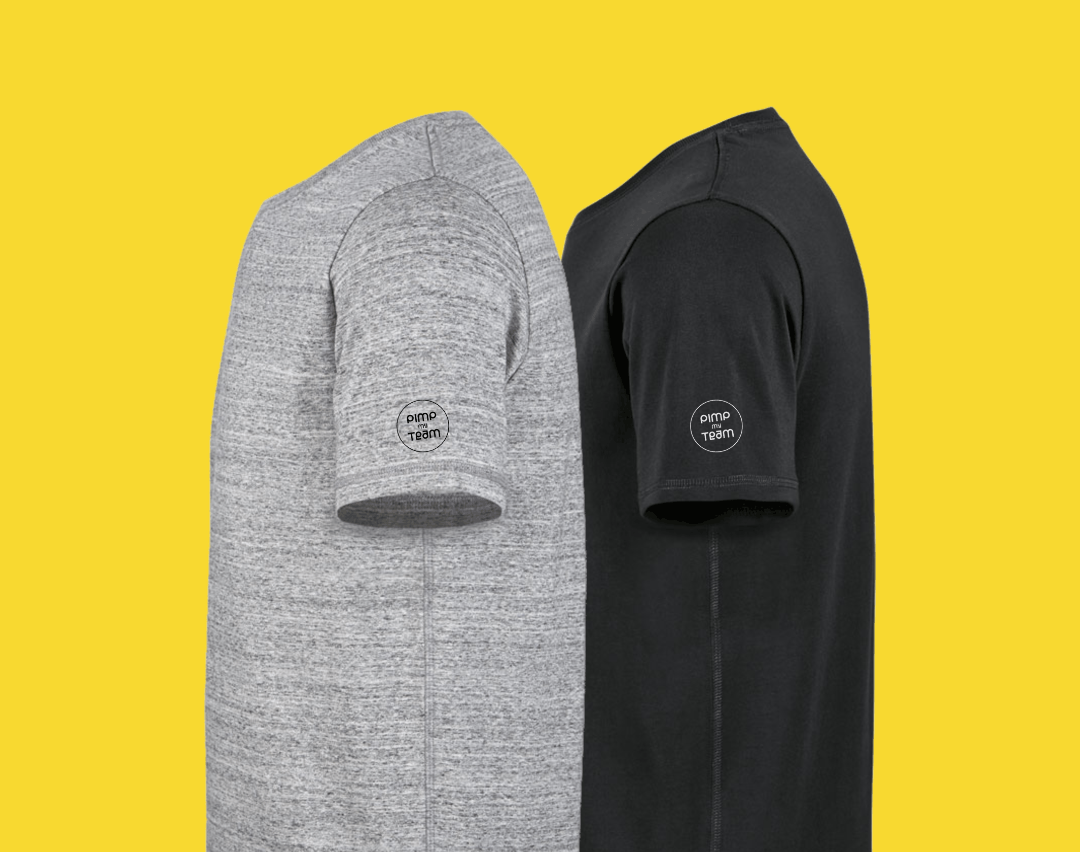
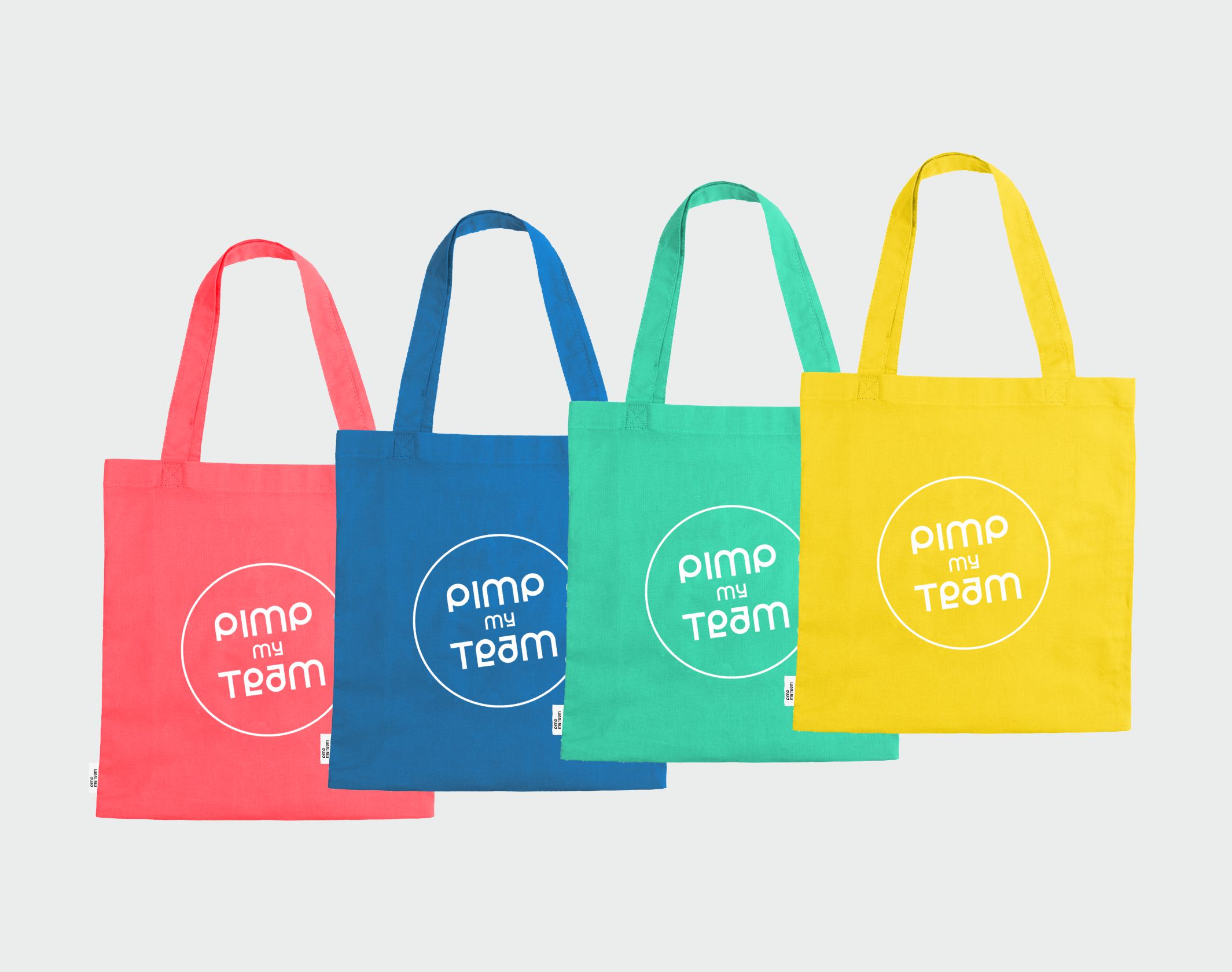
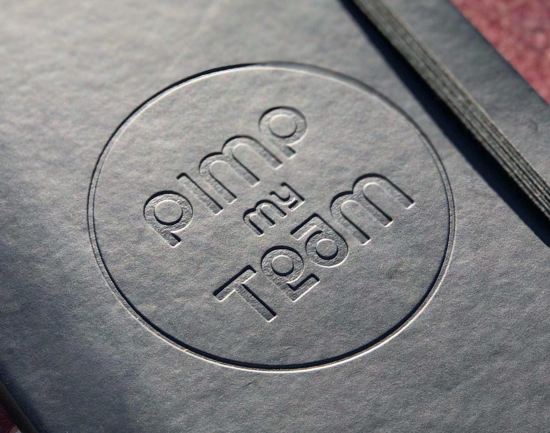
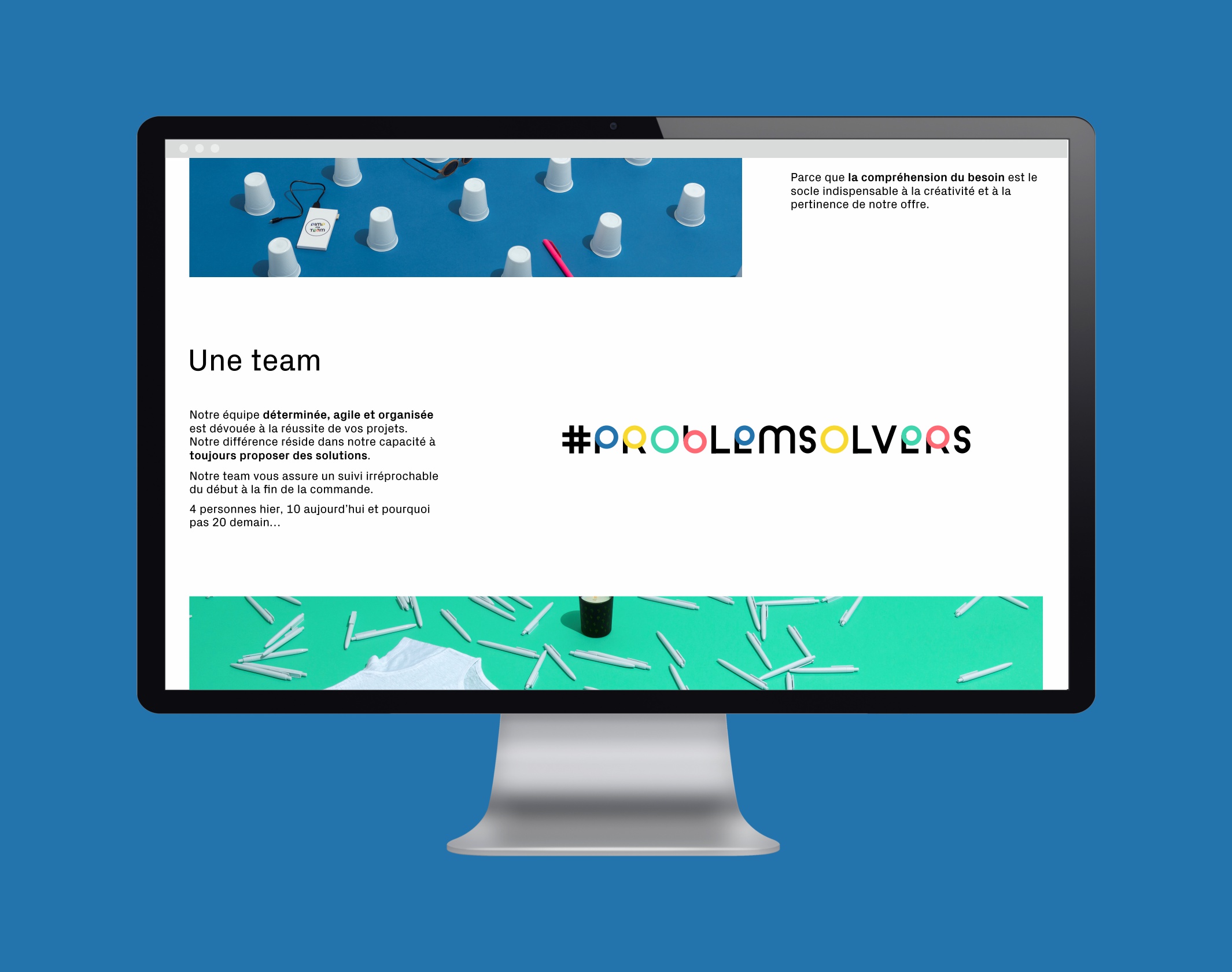
It expresses what the company is all about: a concentrate of clarity, joviality and rigor. An unexpected logo that breaks with convention, harmoniously blending strict right angles with soothing curves. It’s the seal that reassures and the curiosity that attracts, seriousness and pleasure. Like magnets, the colored circles flatter the eye and contrast with the radical black characters. They tell the story of the company’s promise: “pimp my type”, Pimp My Team!
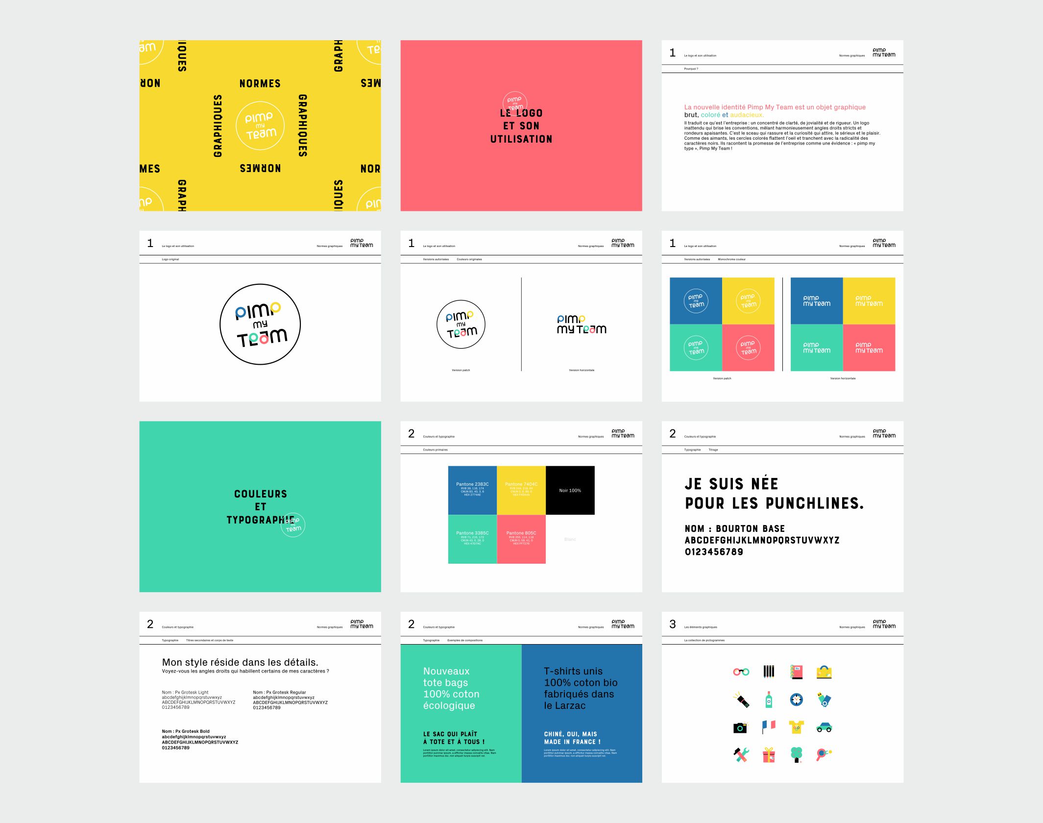
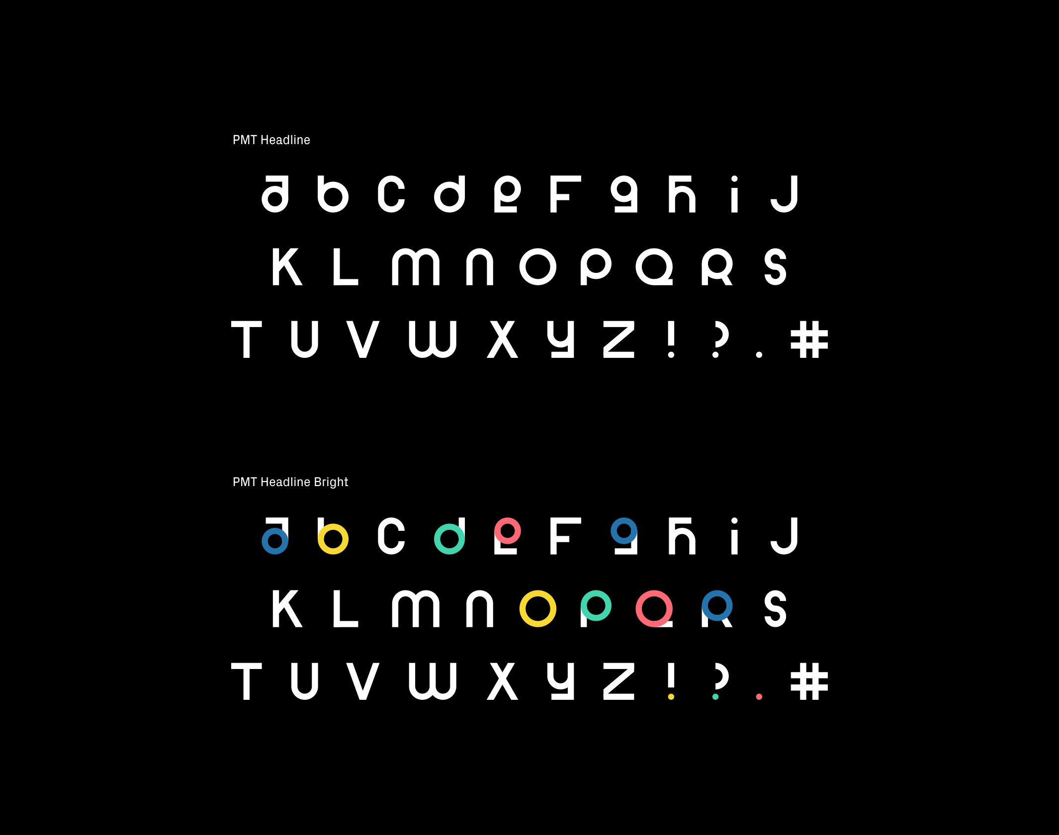
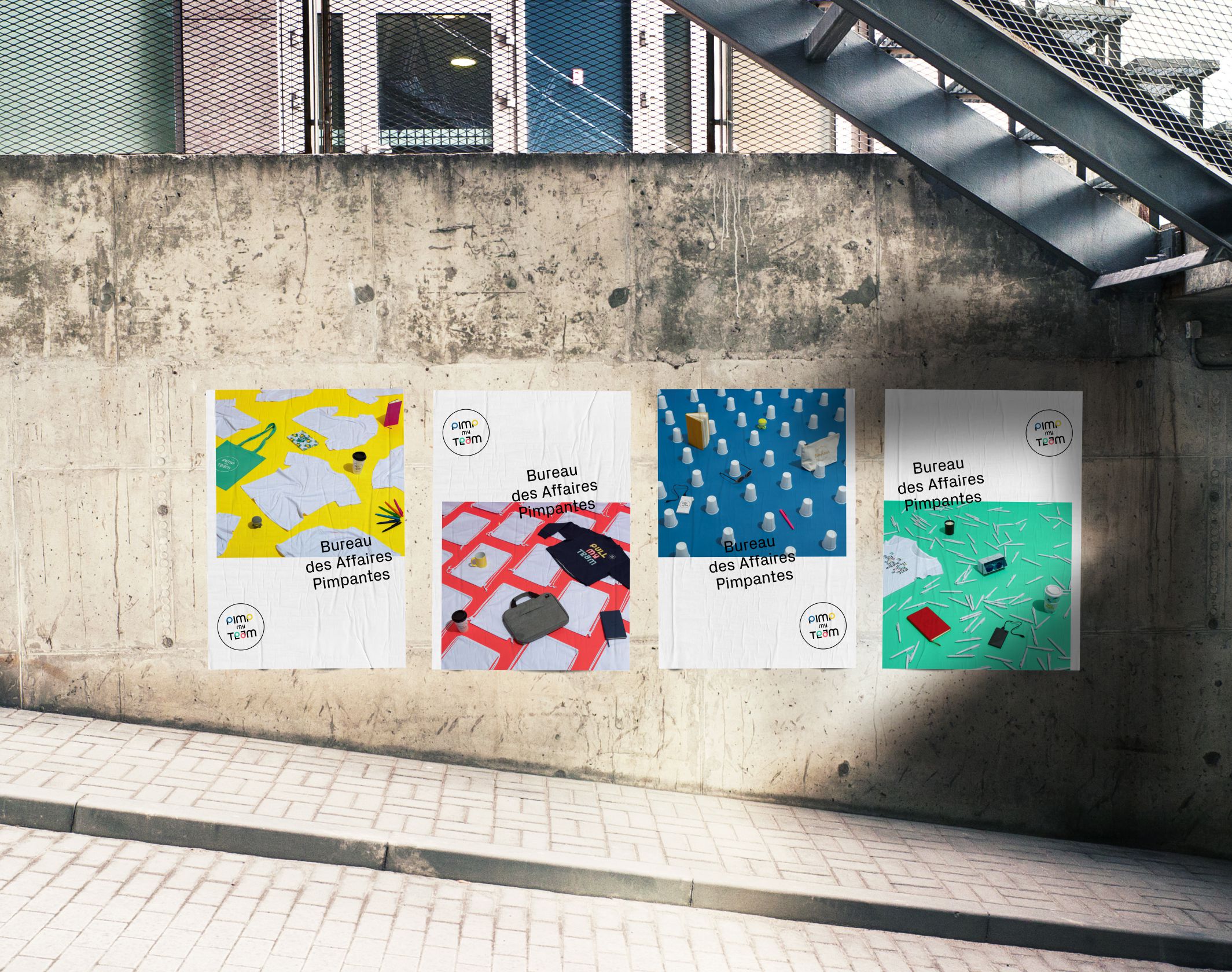
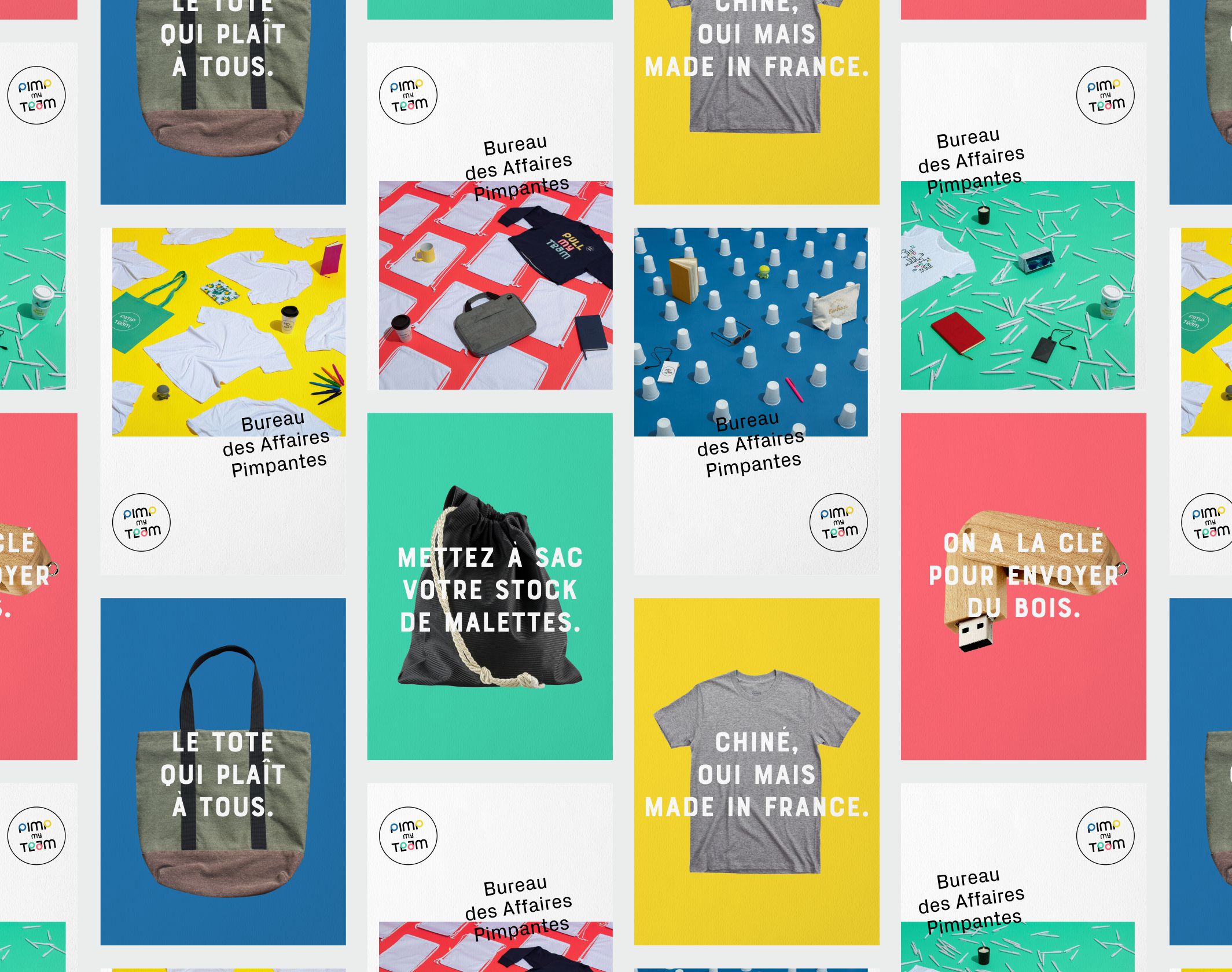
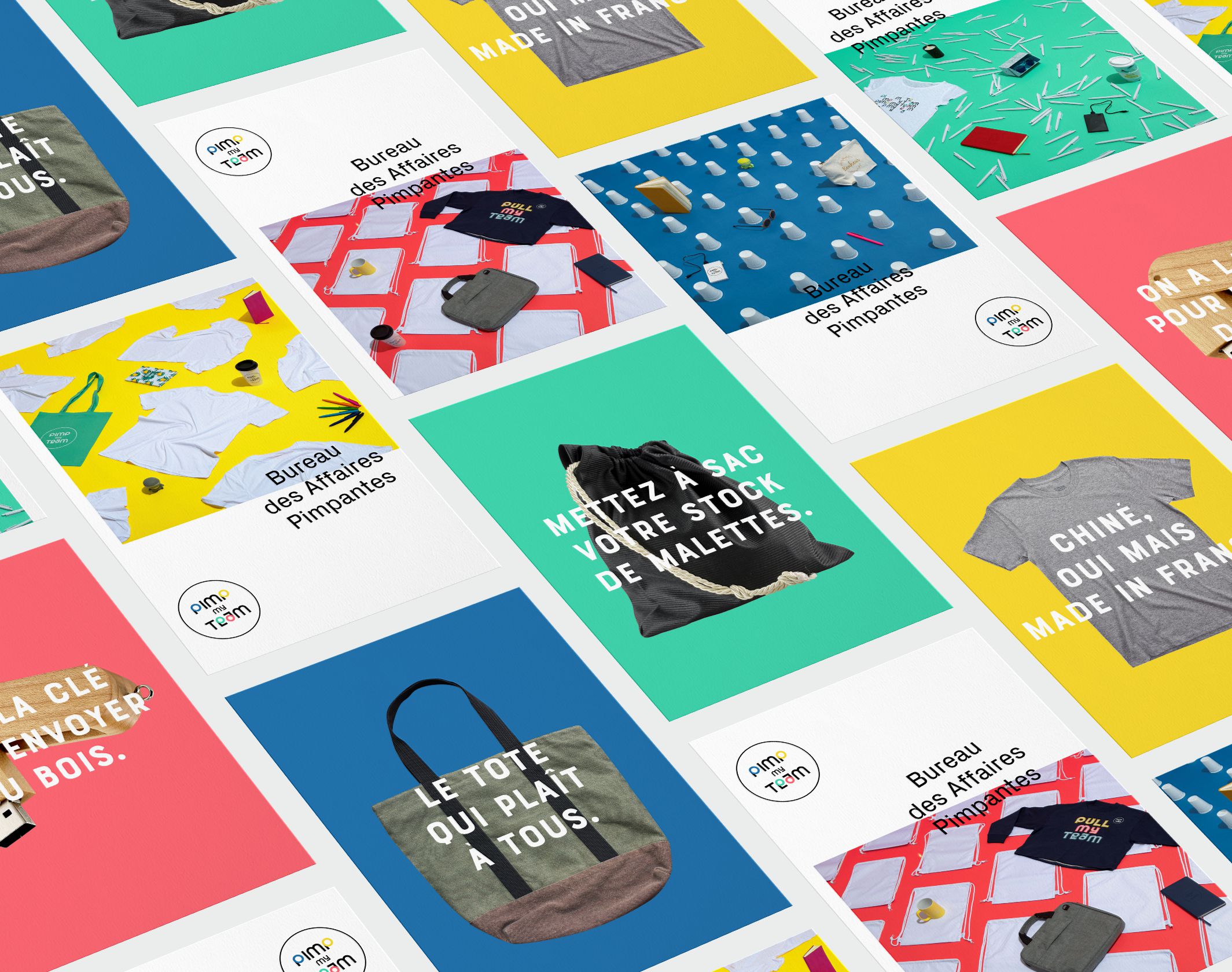
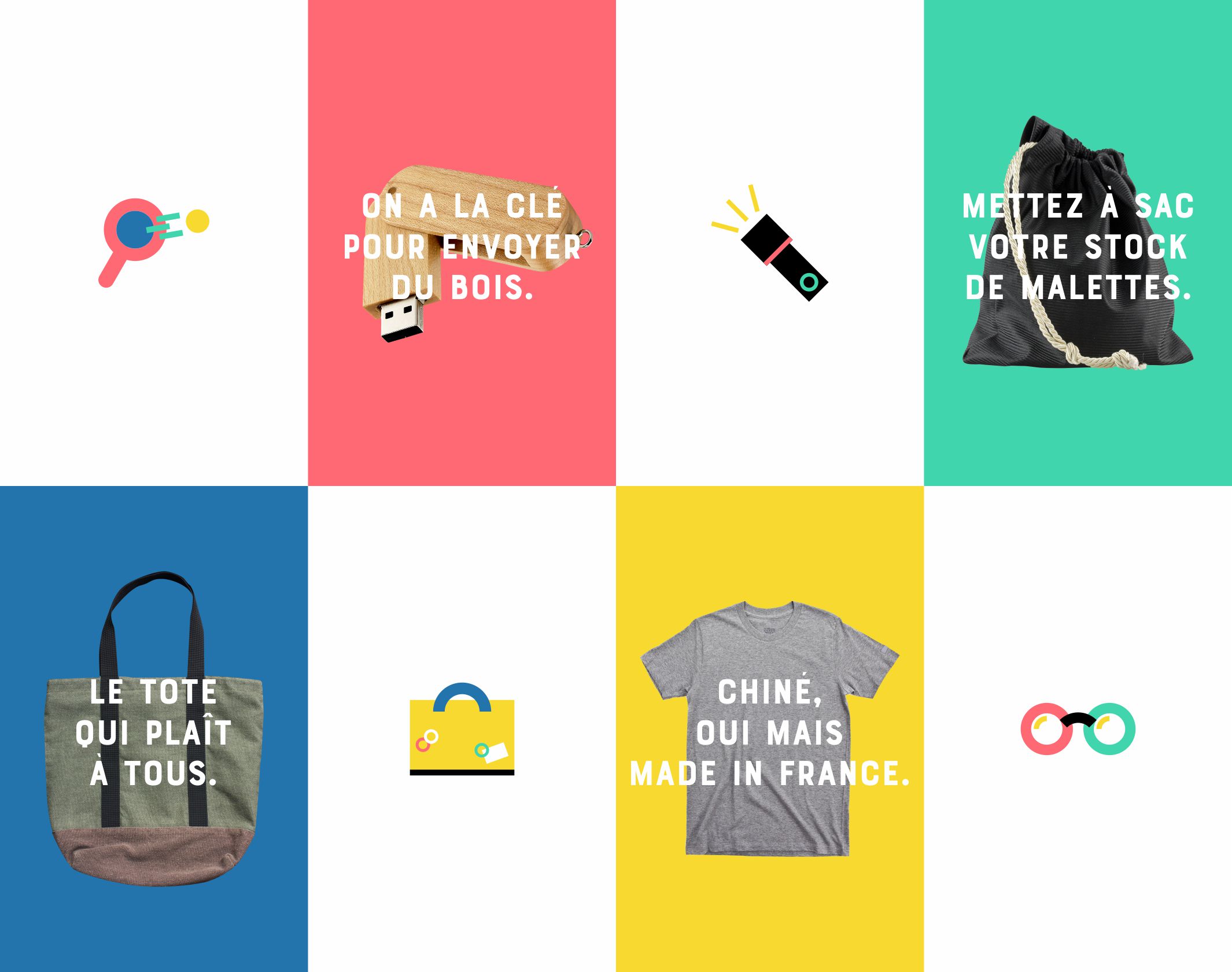
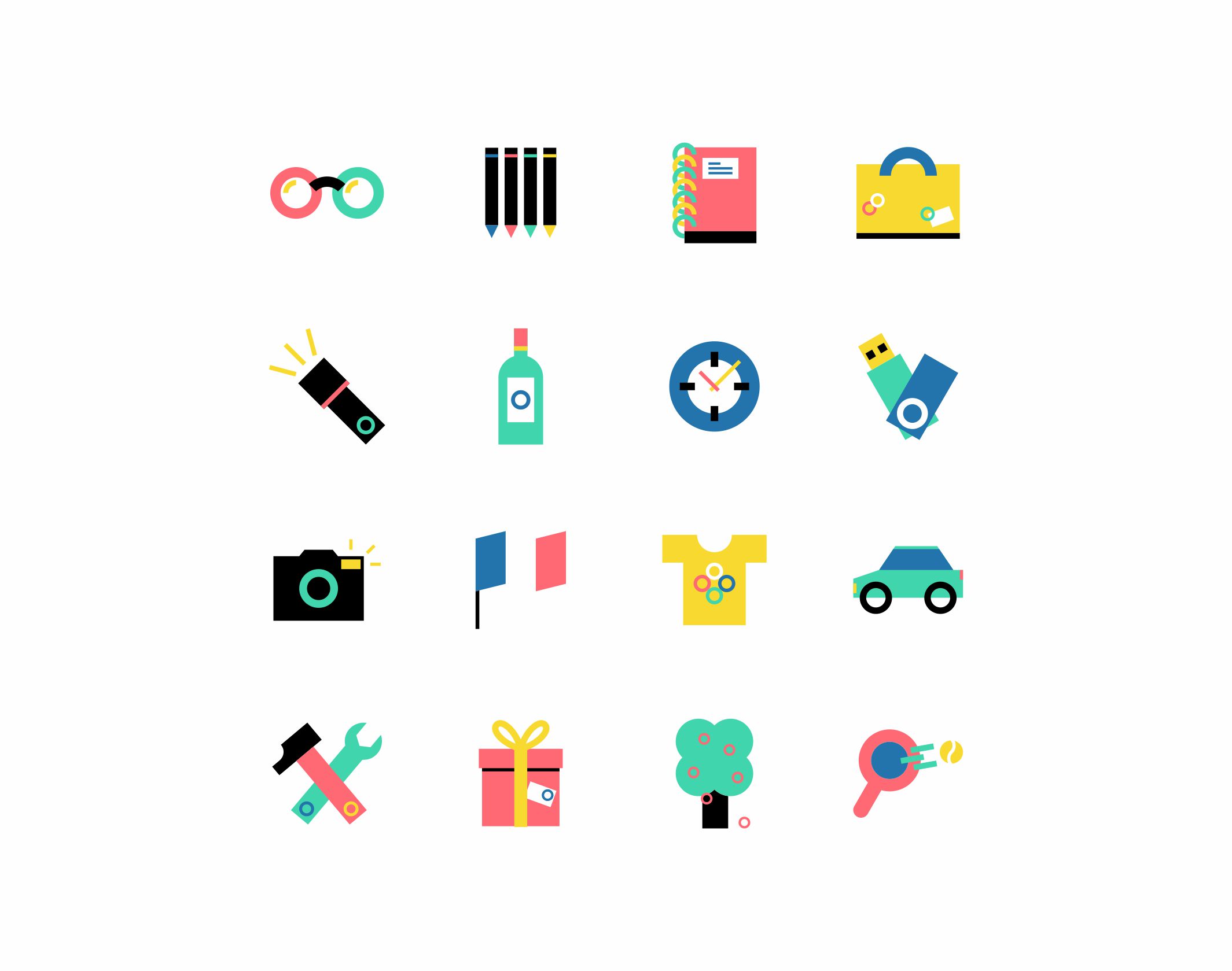
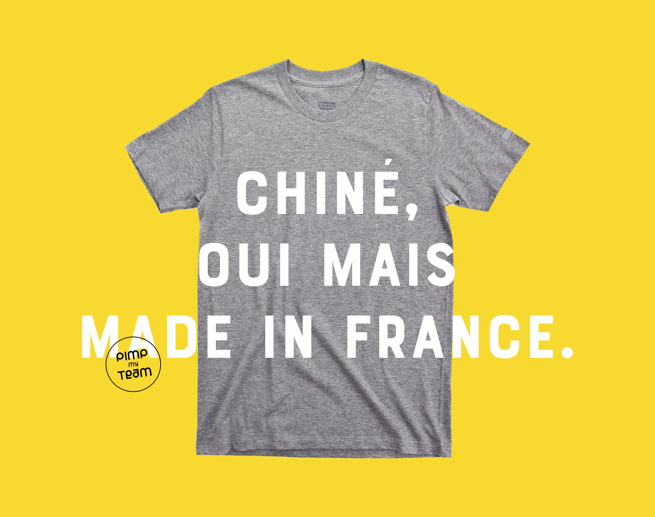
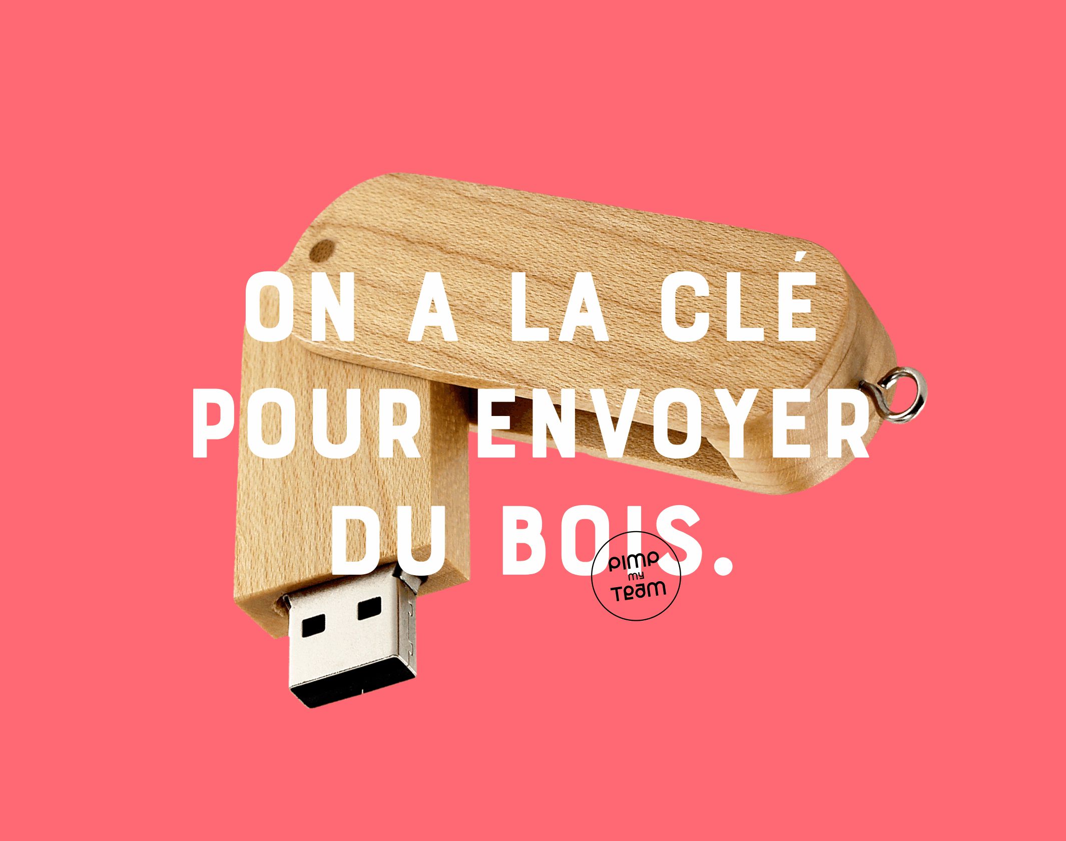
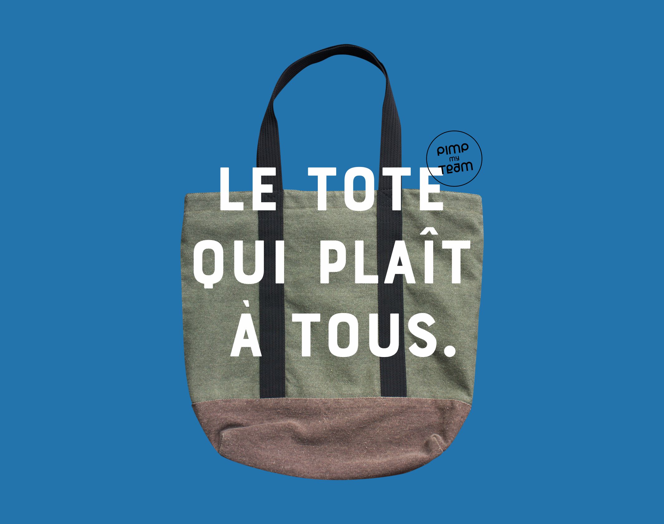
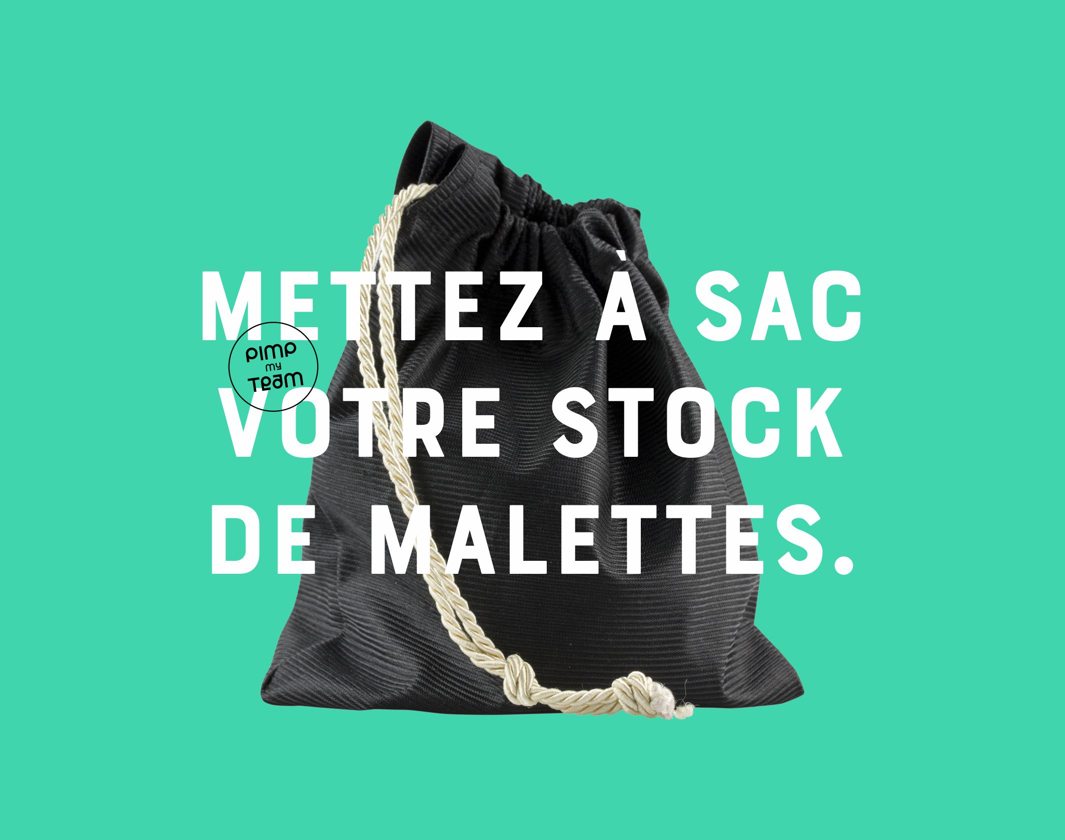
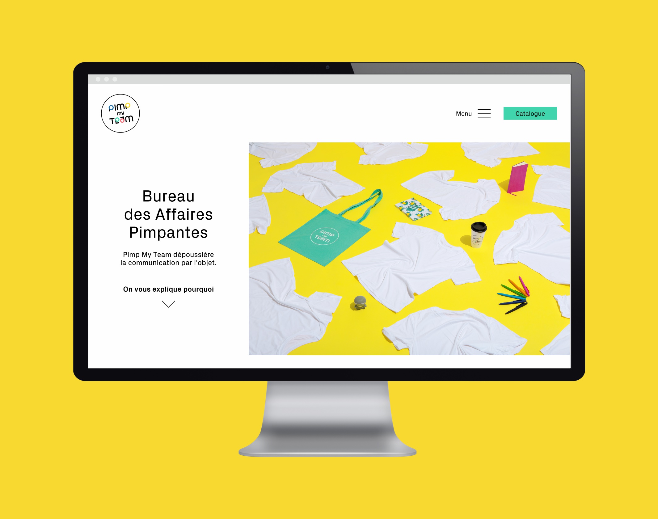
Based on the new logo, we developed Pimp My Team’s typographic, color, visual and verbal universe in unison, resulting in a branding that blends liveliness, confidence and humor. The typographic articulation, between the radicality of Px Grotesk and the impact of Bourton, complemented by the design of a complete alphabet based on the logo, allows us to vary the tone according to the media. The brand’s new baseline – Bureau des Affaires Pimpantes – along with a series of lively claims, decomplexes the approach to the business.
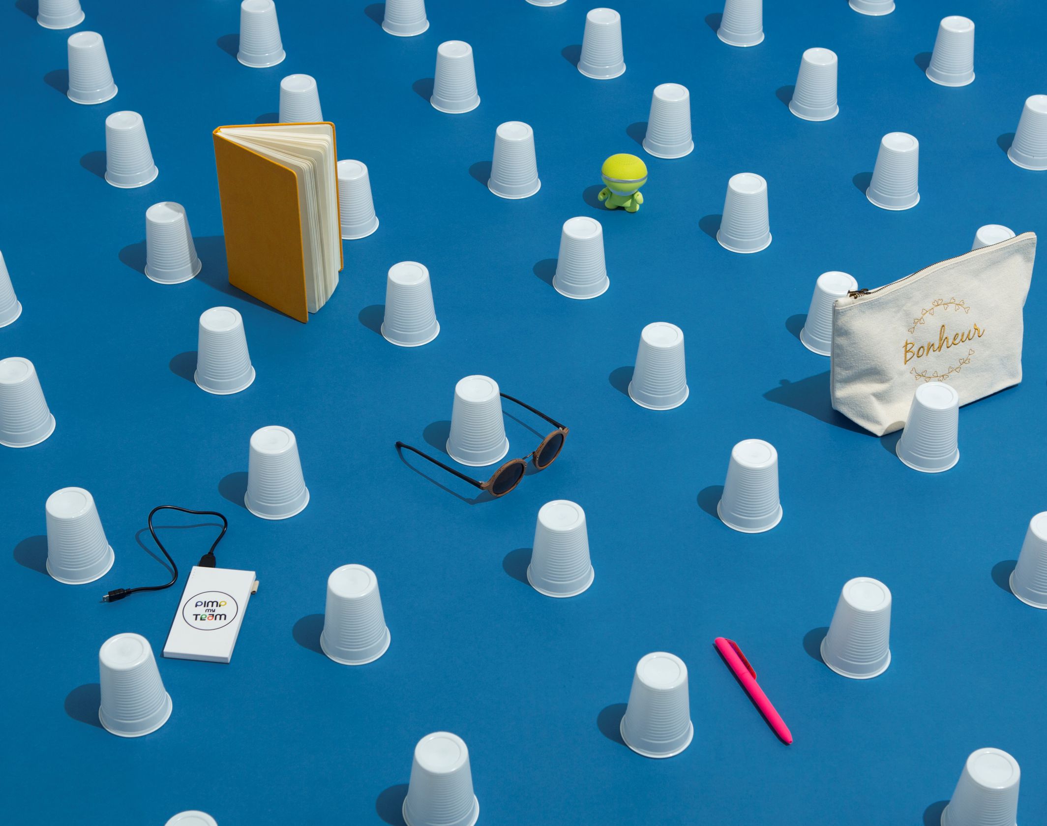
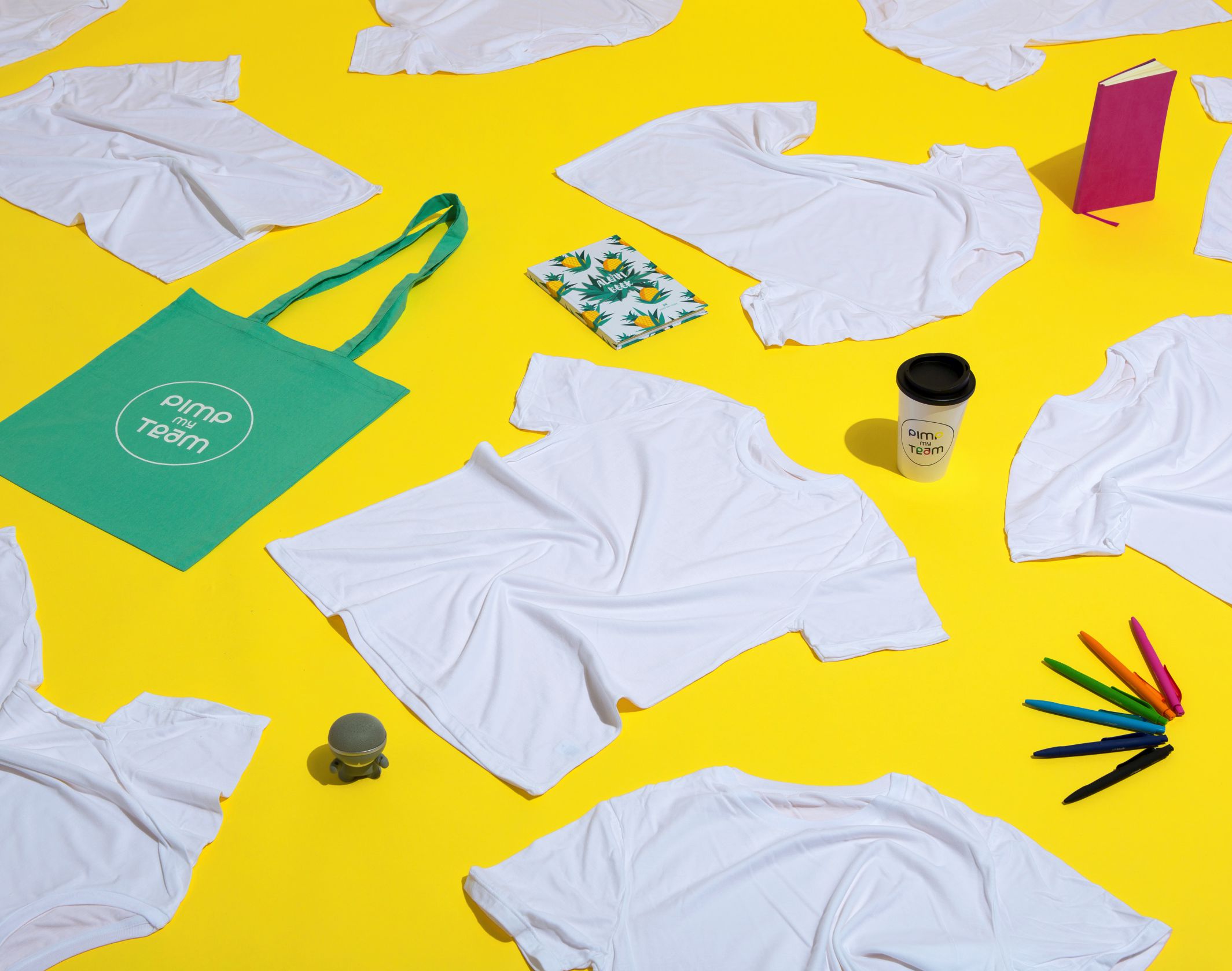
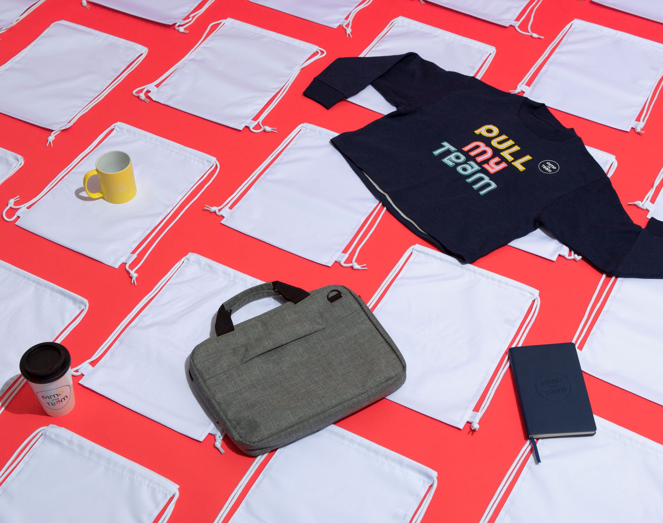
We also provided art direction and set design for the first photo campaign (by Sylvain Bardin), with bold, graphic compositions.
Disciplines
