Le Goût des Plantes
Le Goût des Plantes transforms urban plant sales into vibrant community events with a fresh graphic identity that celebrates nature's charm and accessibility
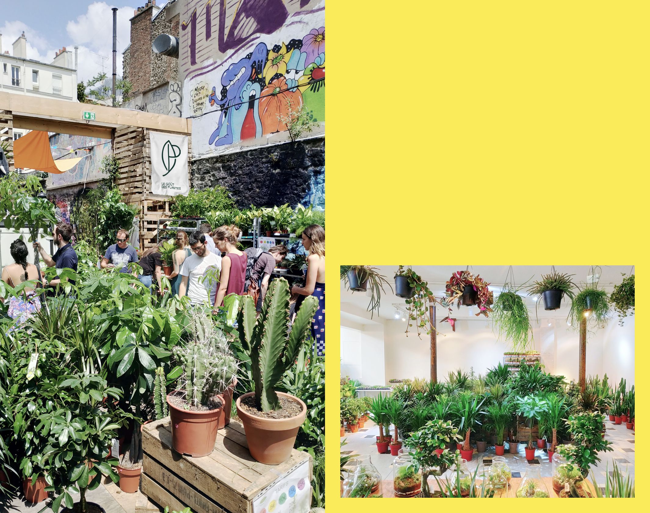
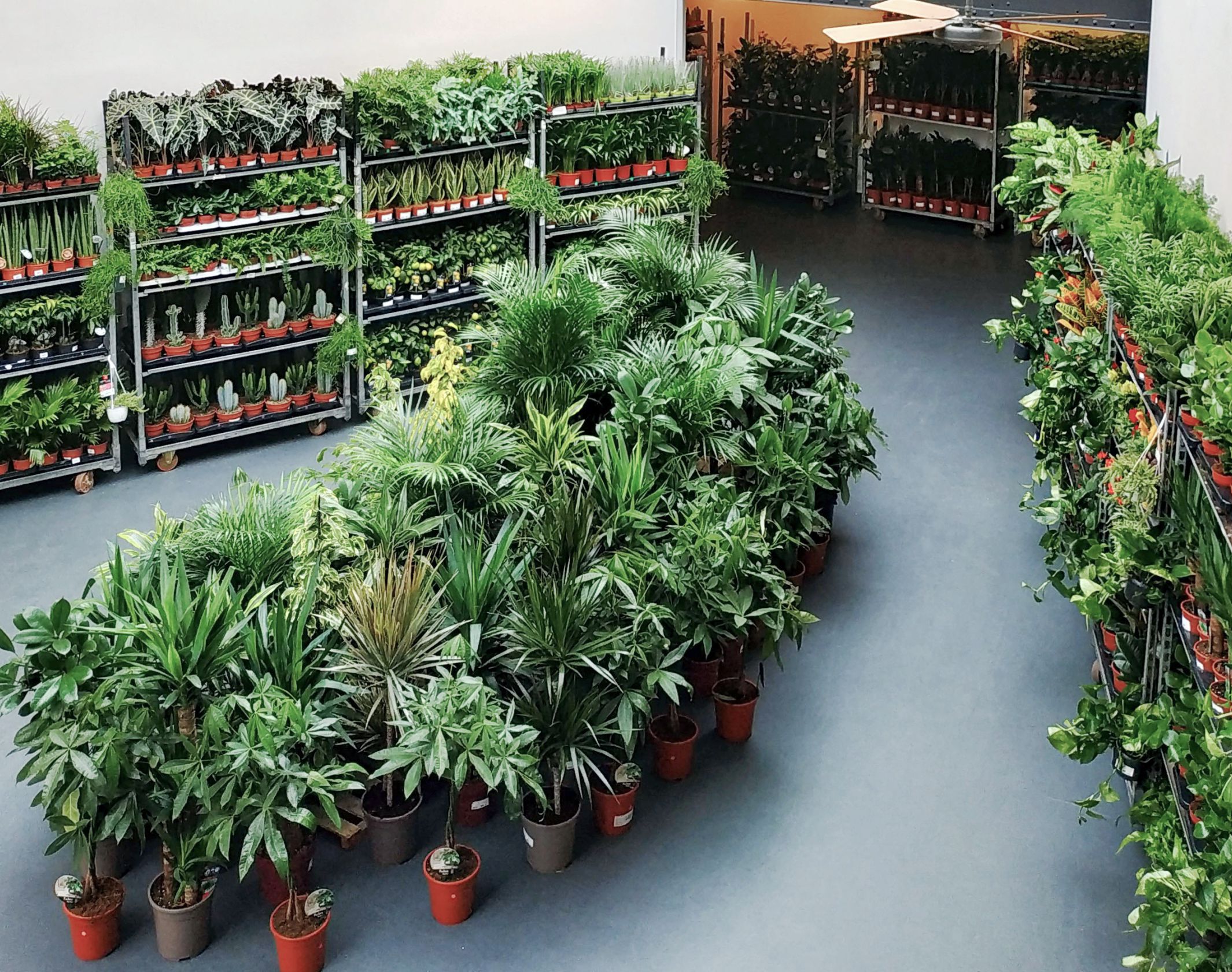
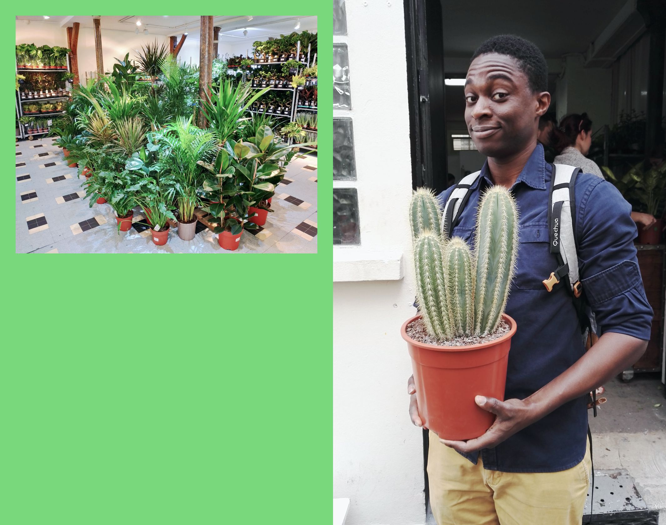
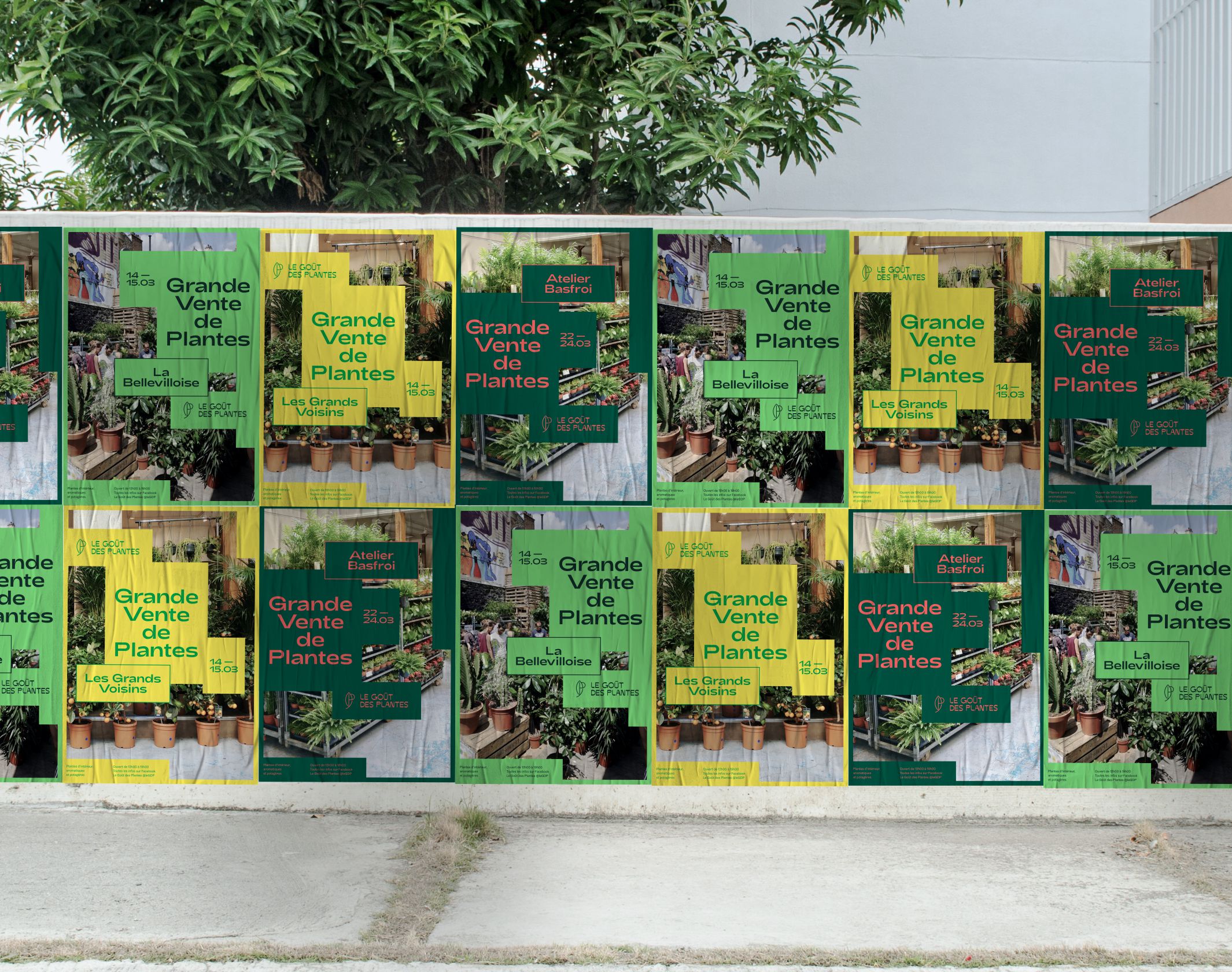
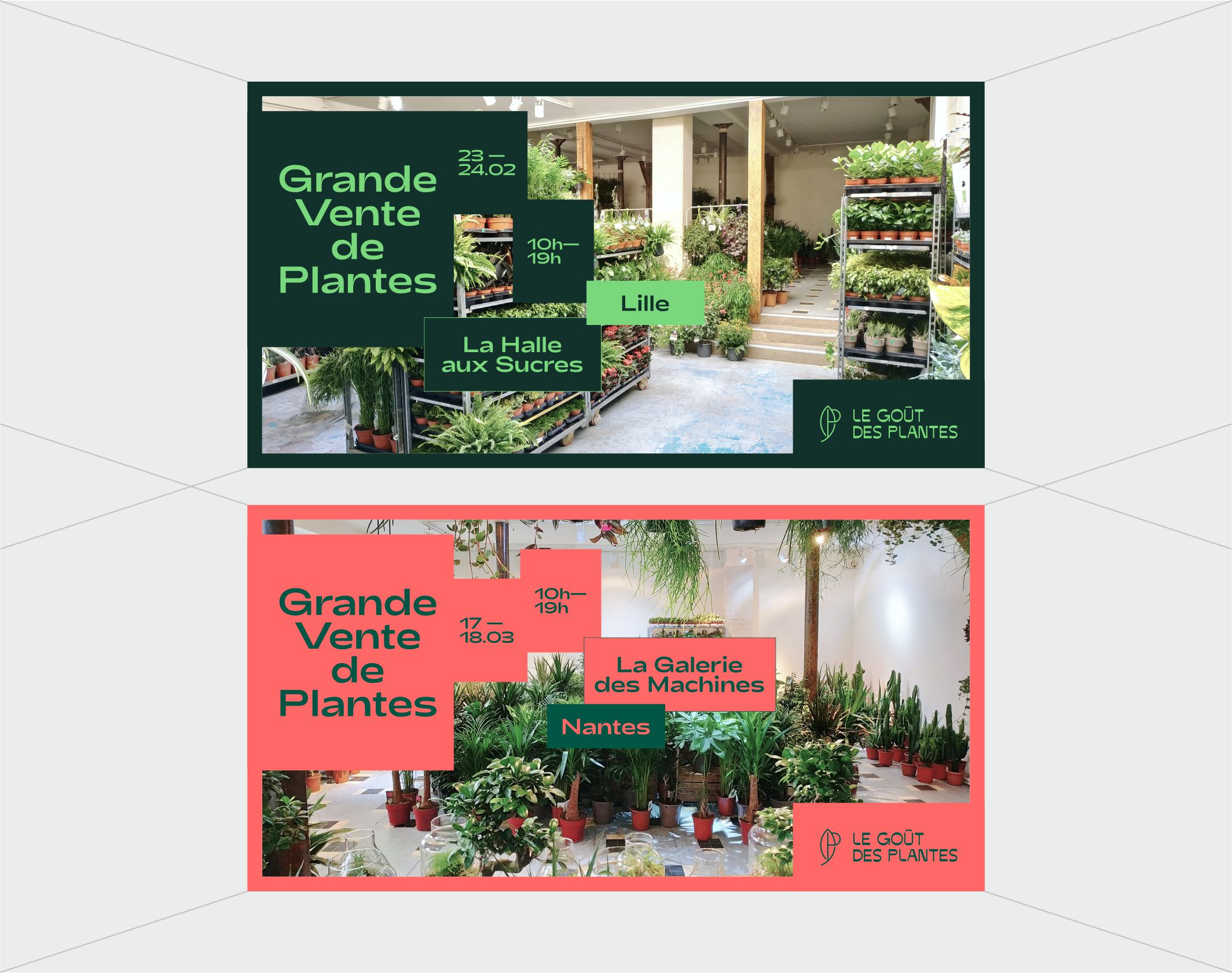
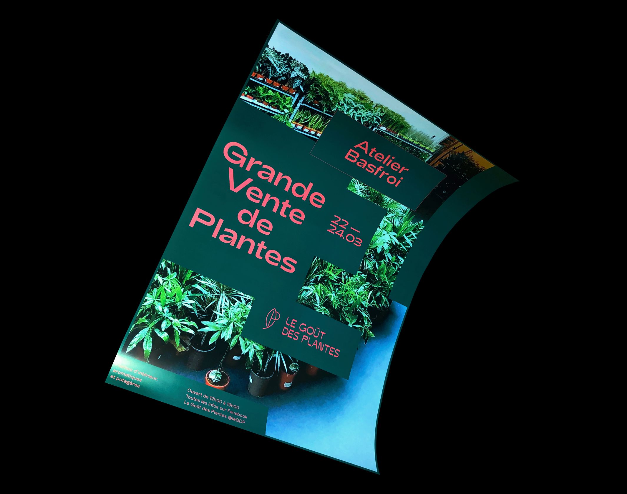
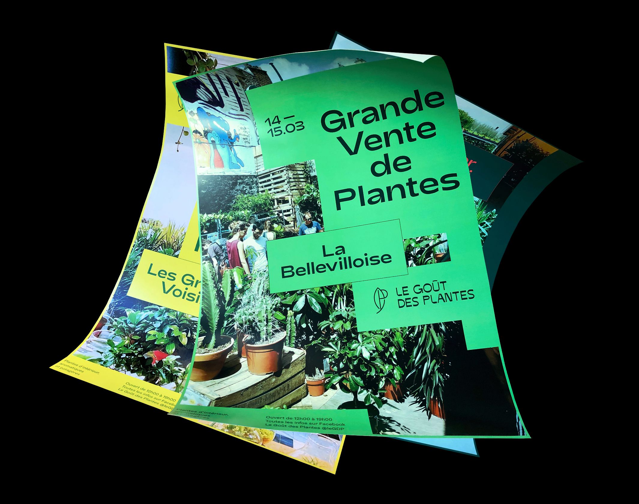
Le Goût des Plantes was created by two friends who organize large plant sales in the form of ephemeral events in the major cities of France. “Nature dealers”, who gather thousands of curious people several weekends a month in search of quality plants at low prices in unexpected places. A festive neighbourhood atmosphere, around a common passion and a sense of community, which we wanted to transcribe through a new graphic identity.
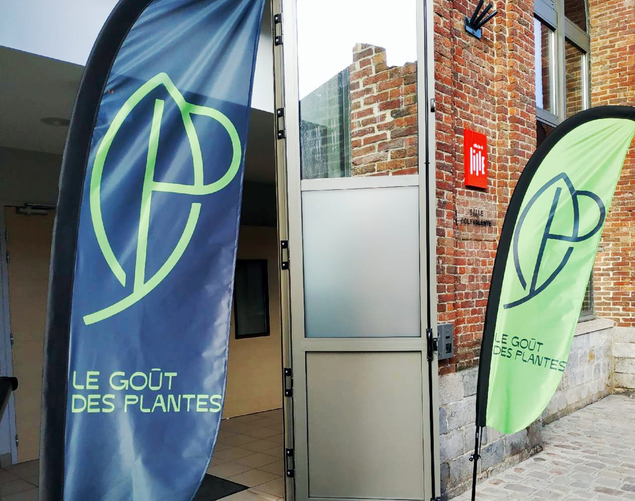
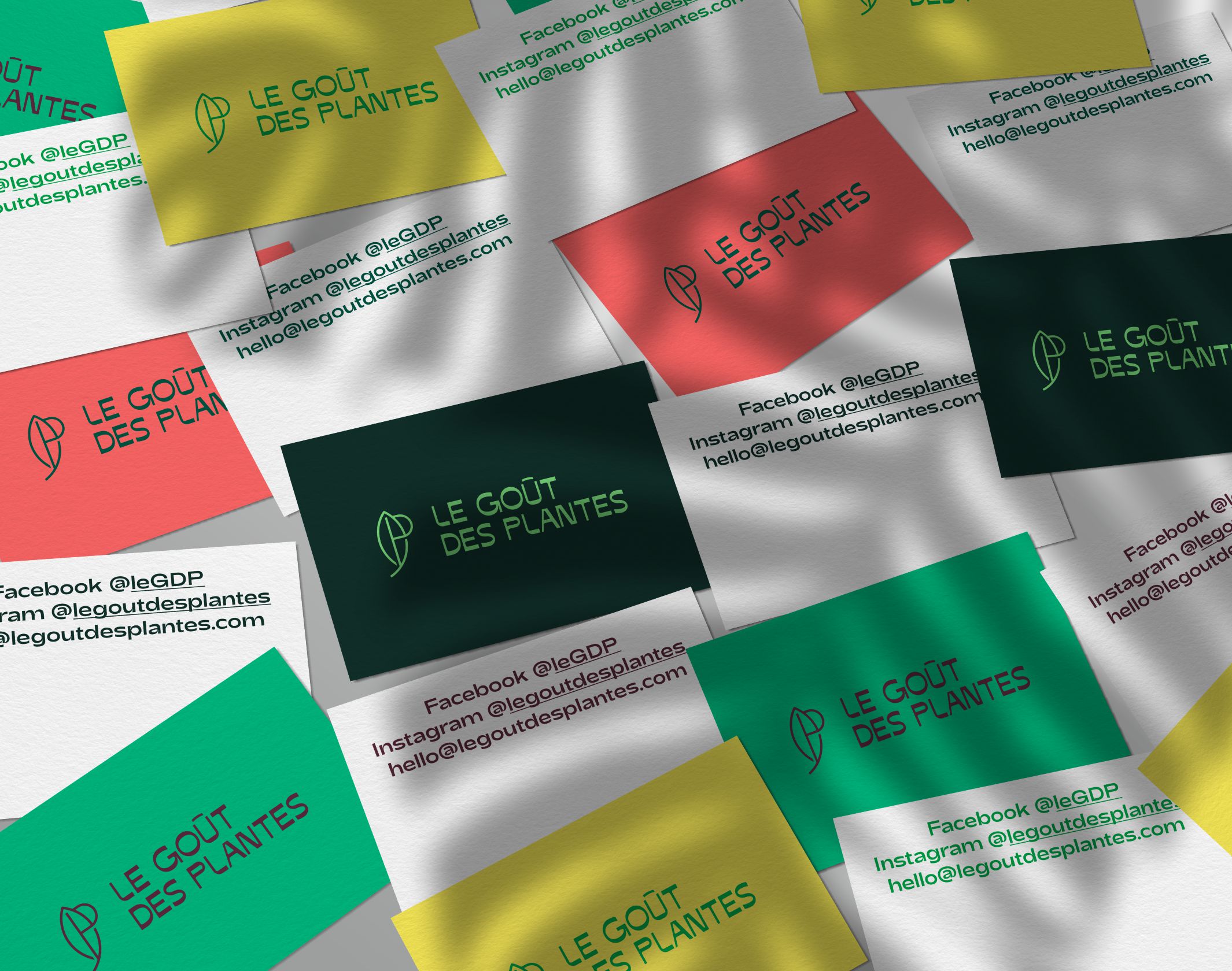
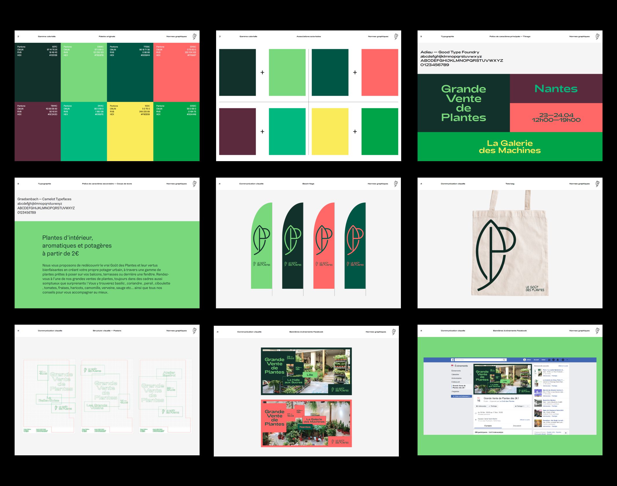
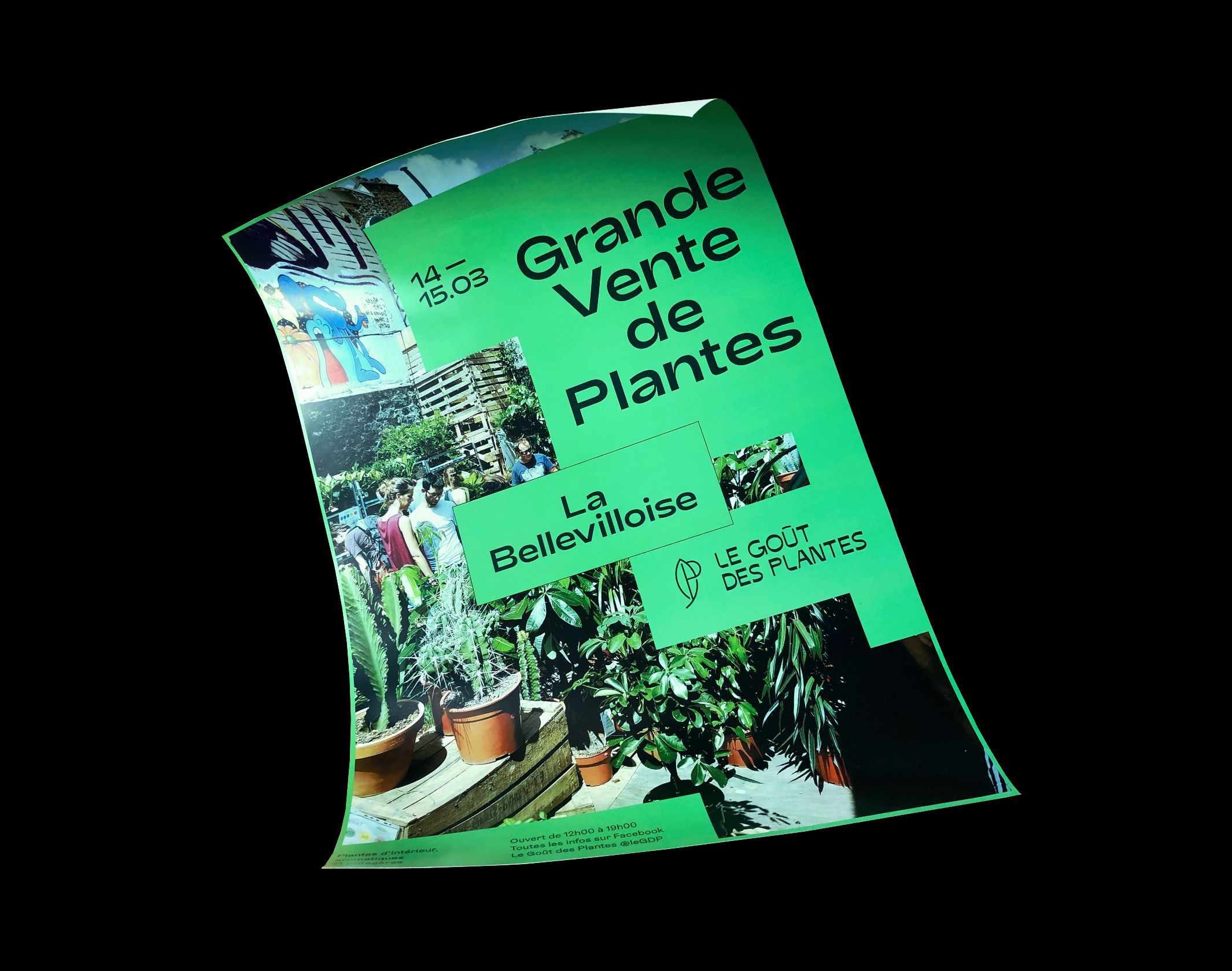
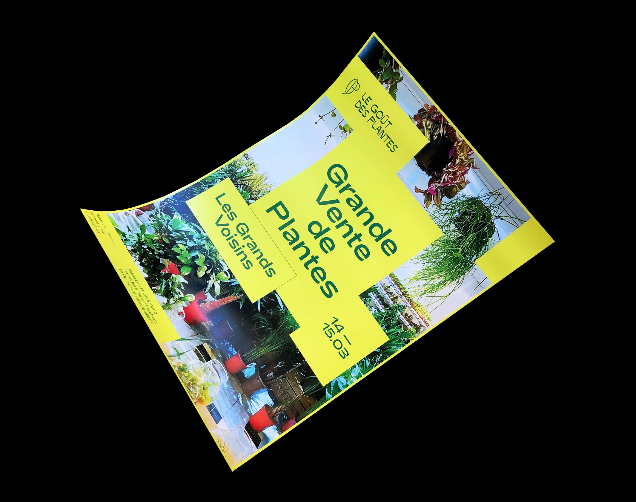
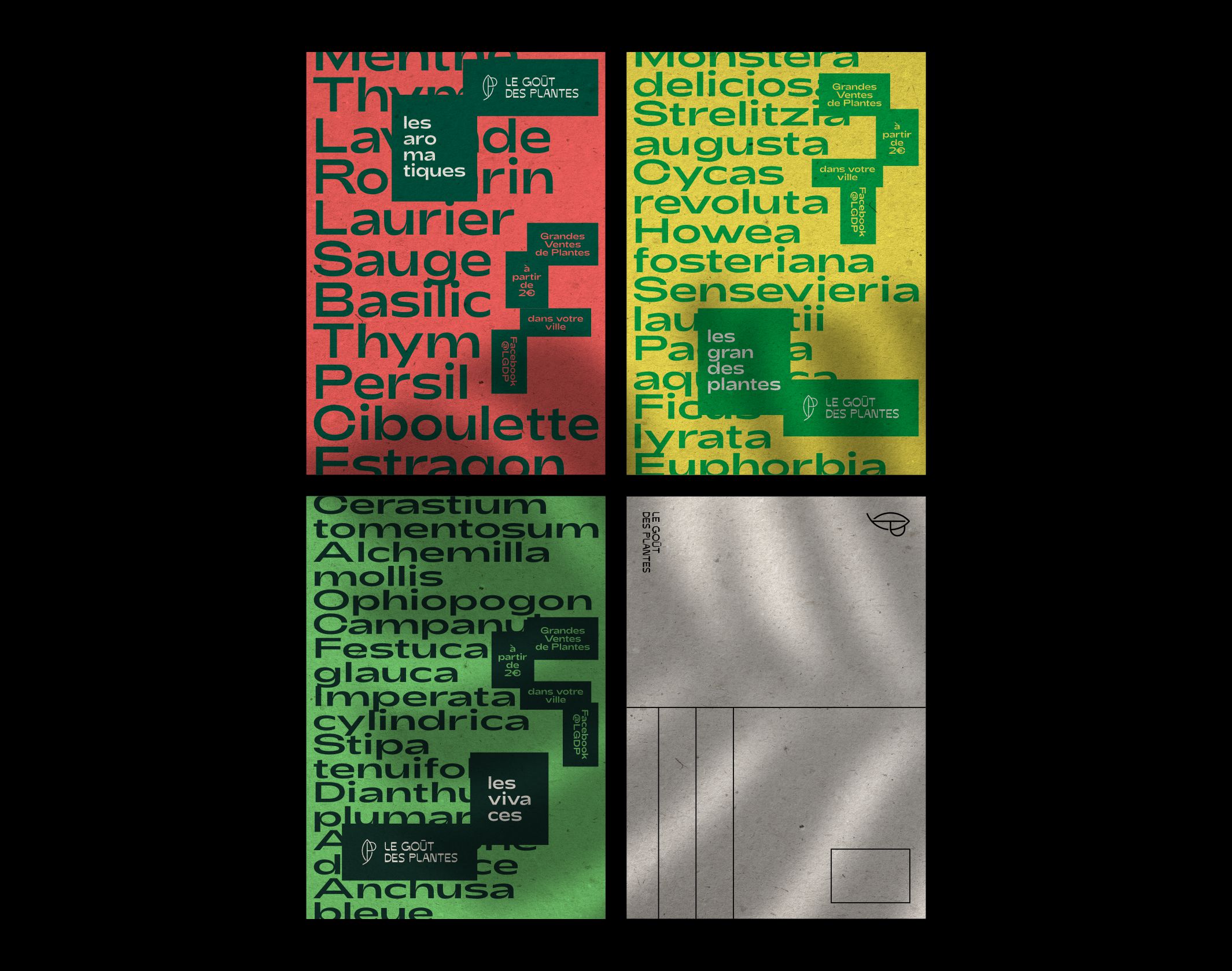
Our work focused on strengthening the collective’s visual territory and the visibility of events, without moving towards an overly polished universe. We also tried to evoke the plant world without resorting to the classic imagery of florists, garden centres and other structures of the green economy. But above all, we wanted to continue to convey the artisanal and casual side of these ephemeral sales.
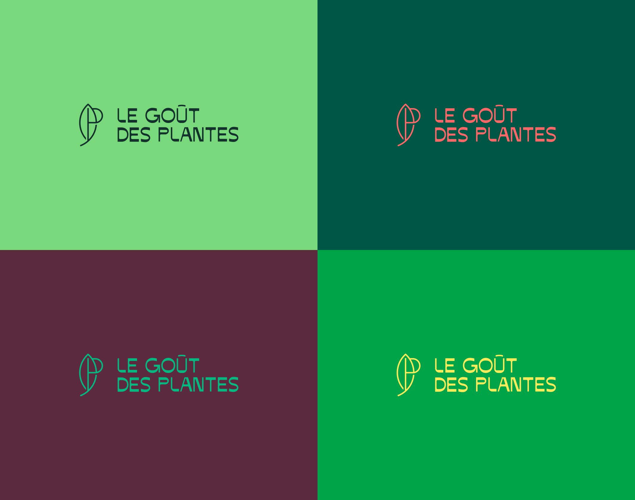
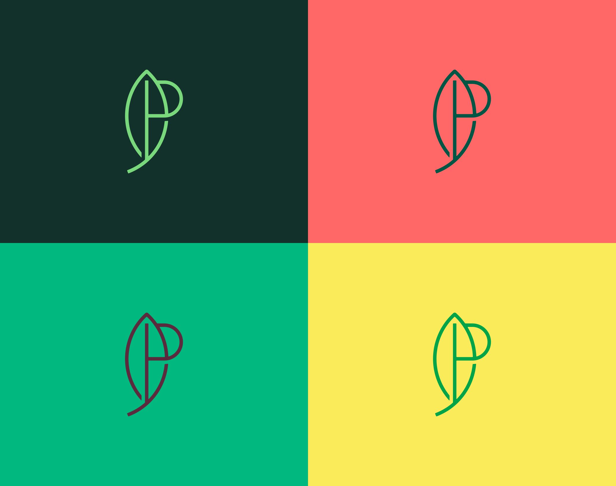
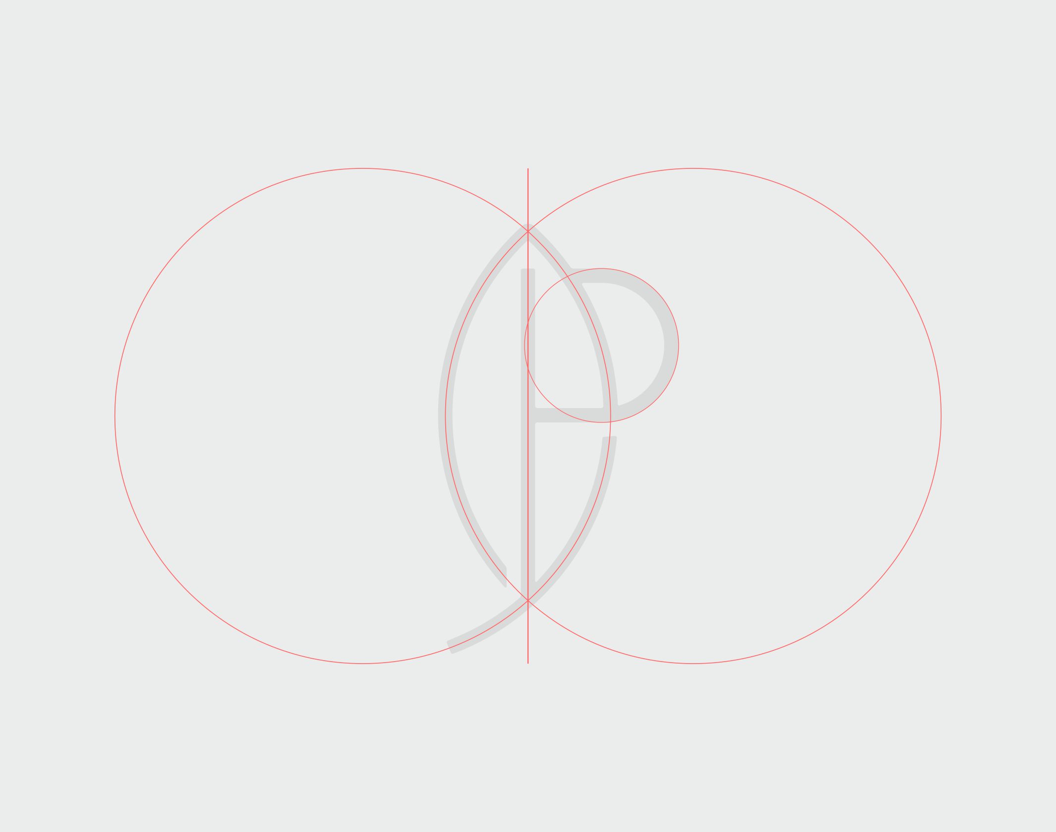
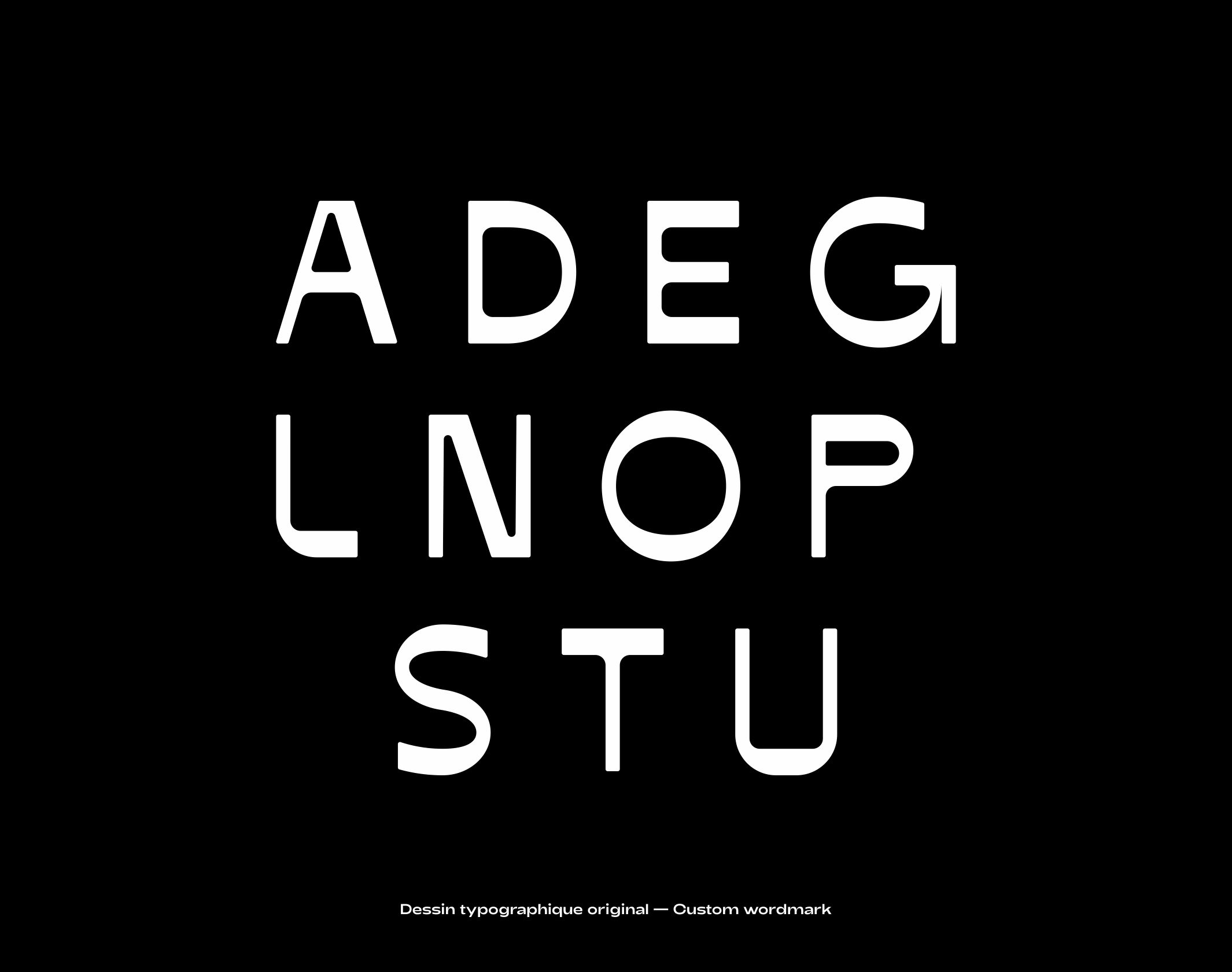
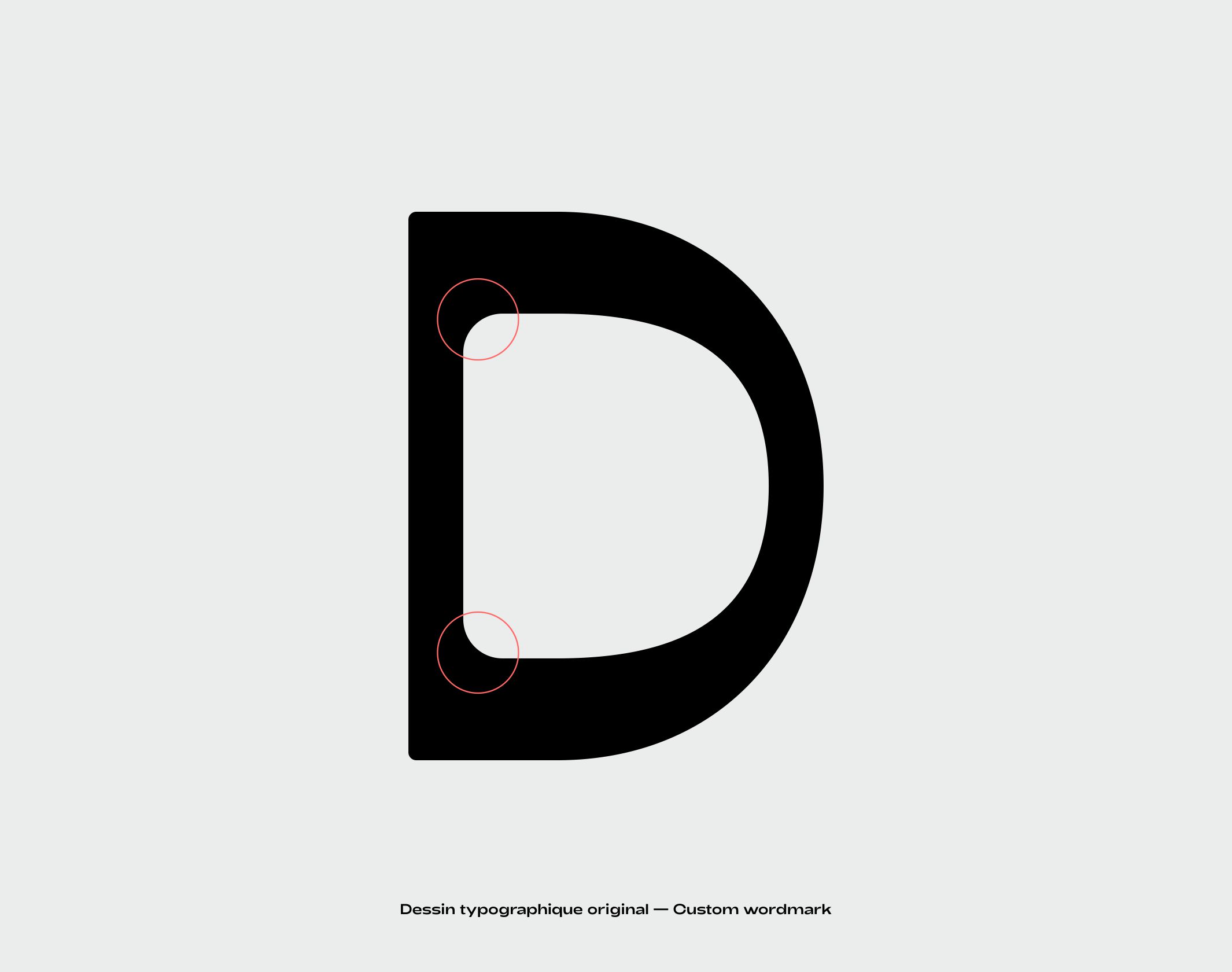
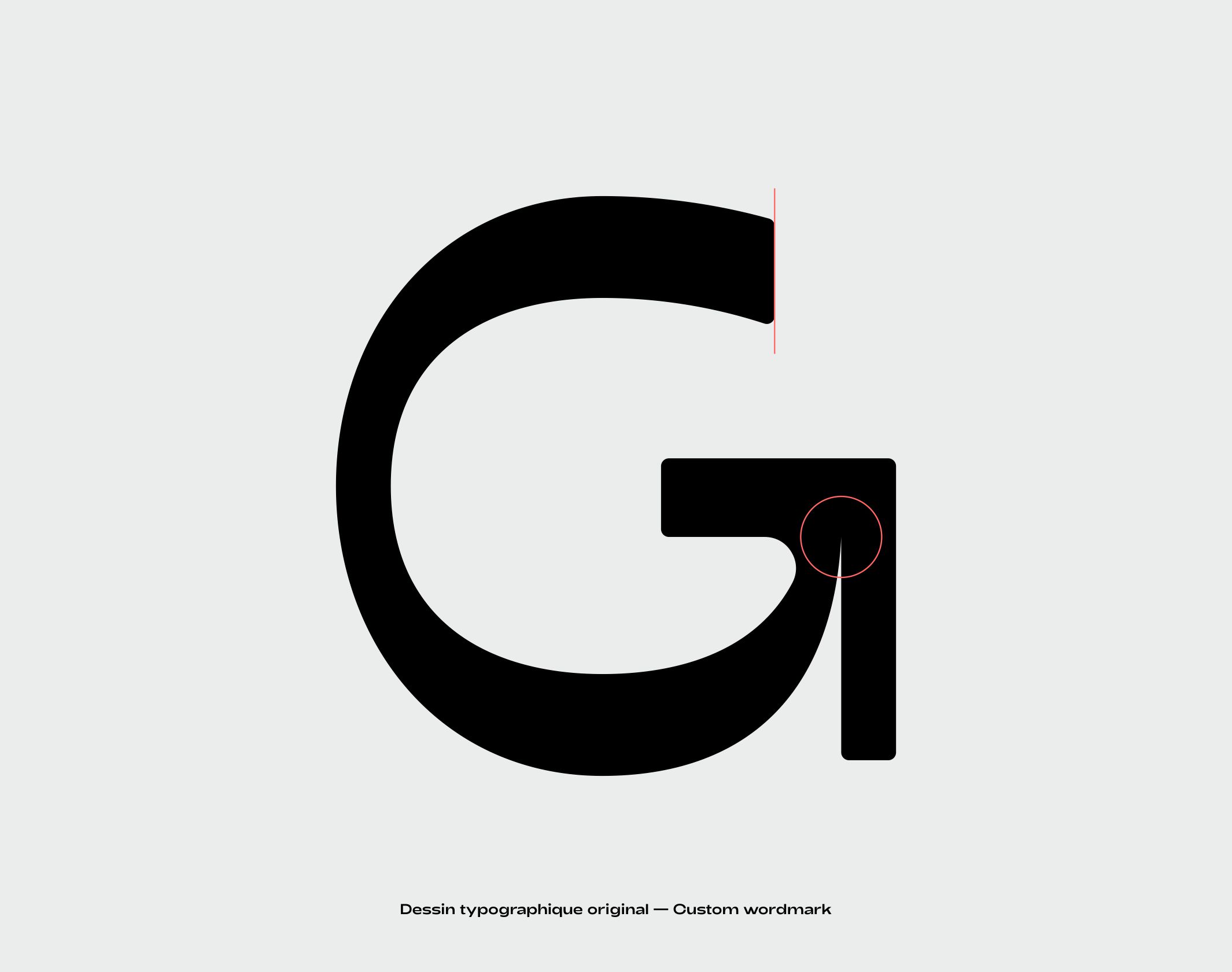
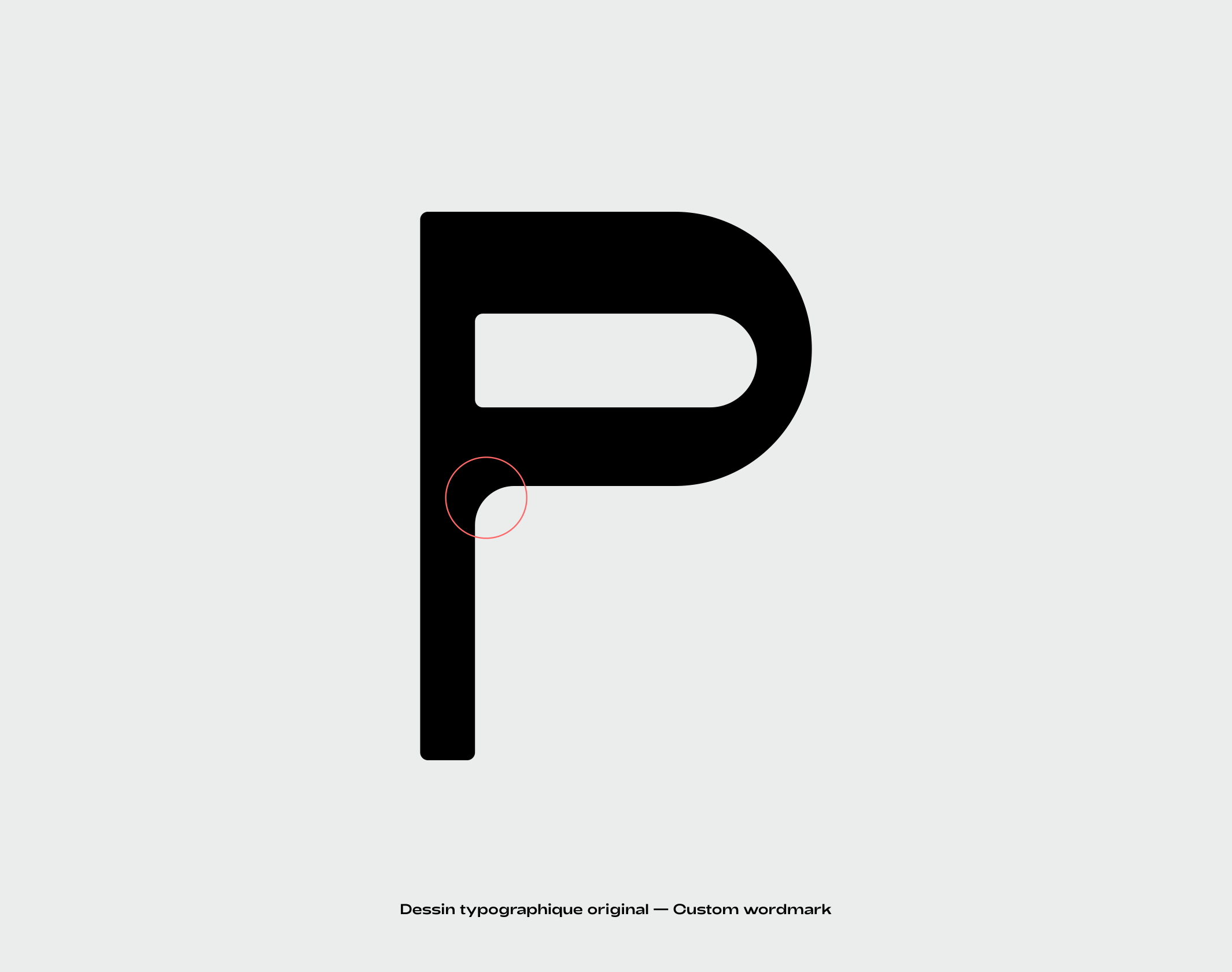
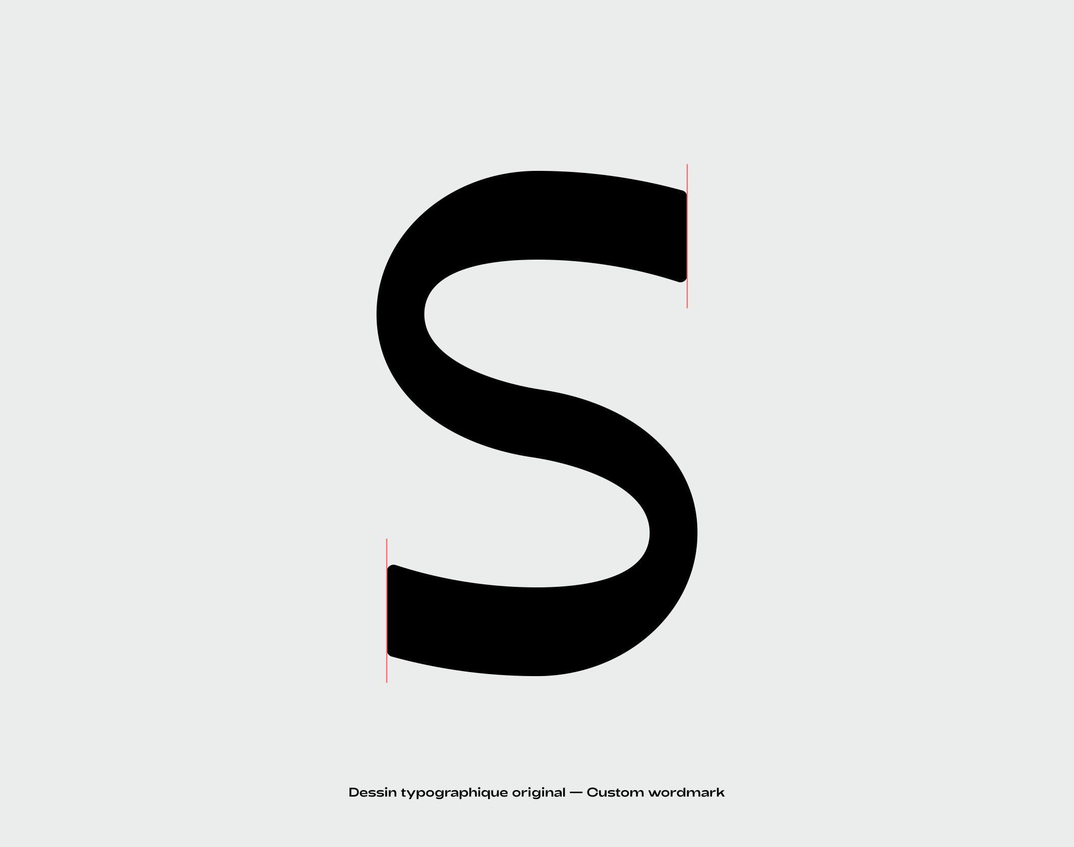
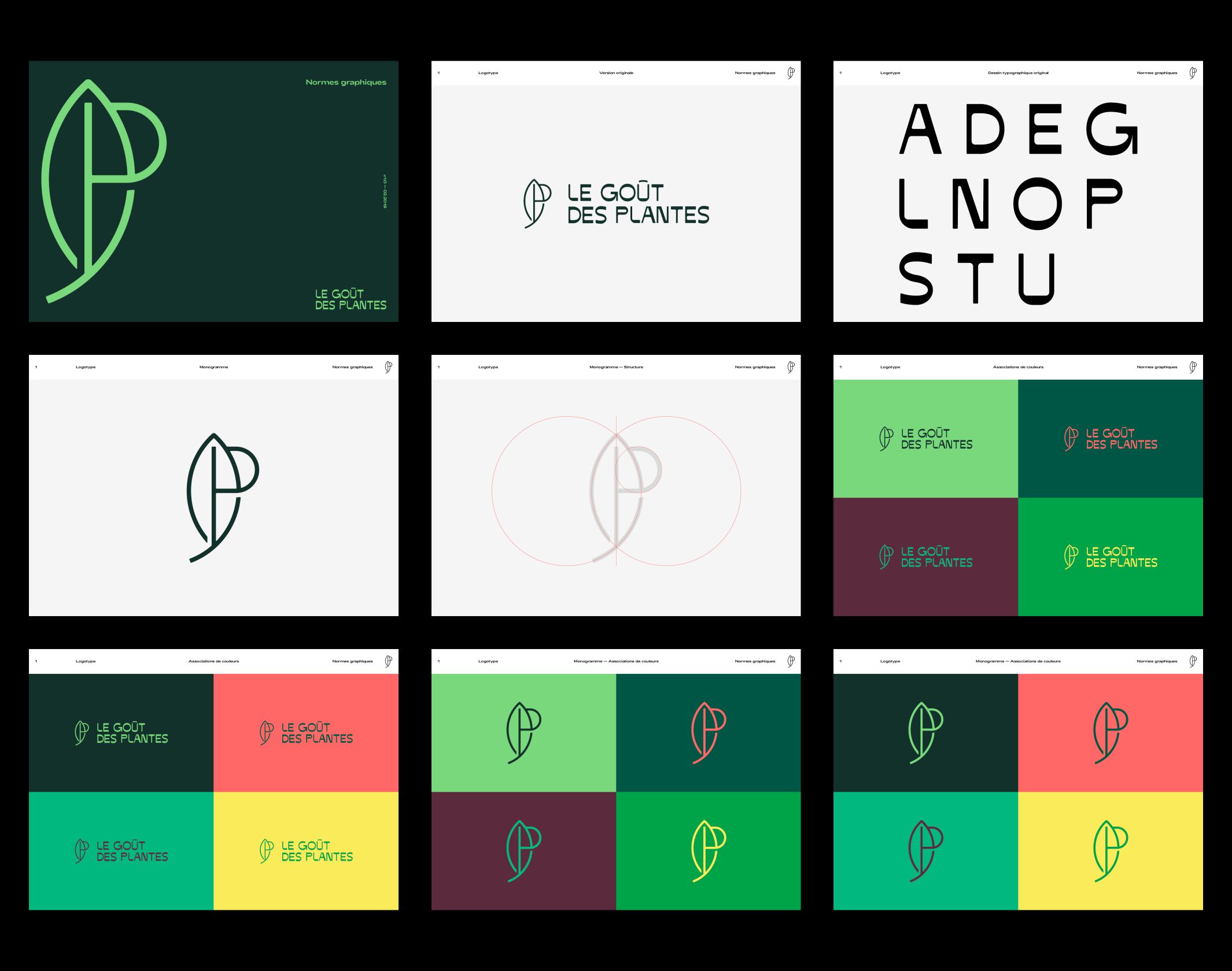
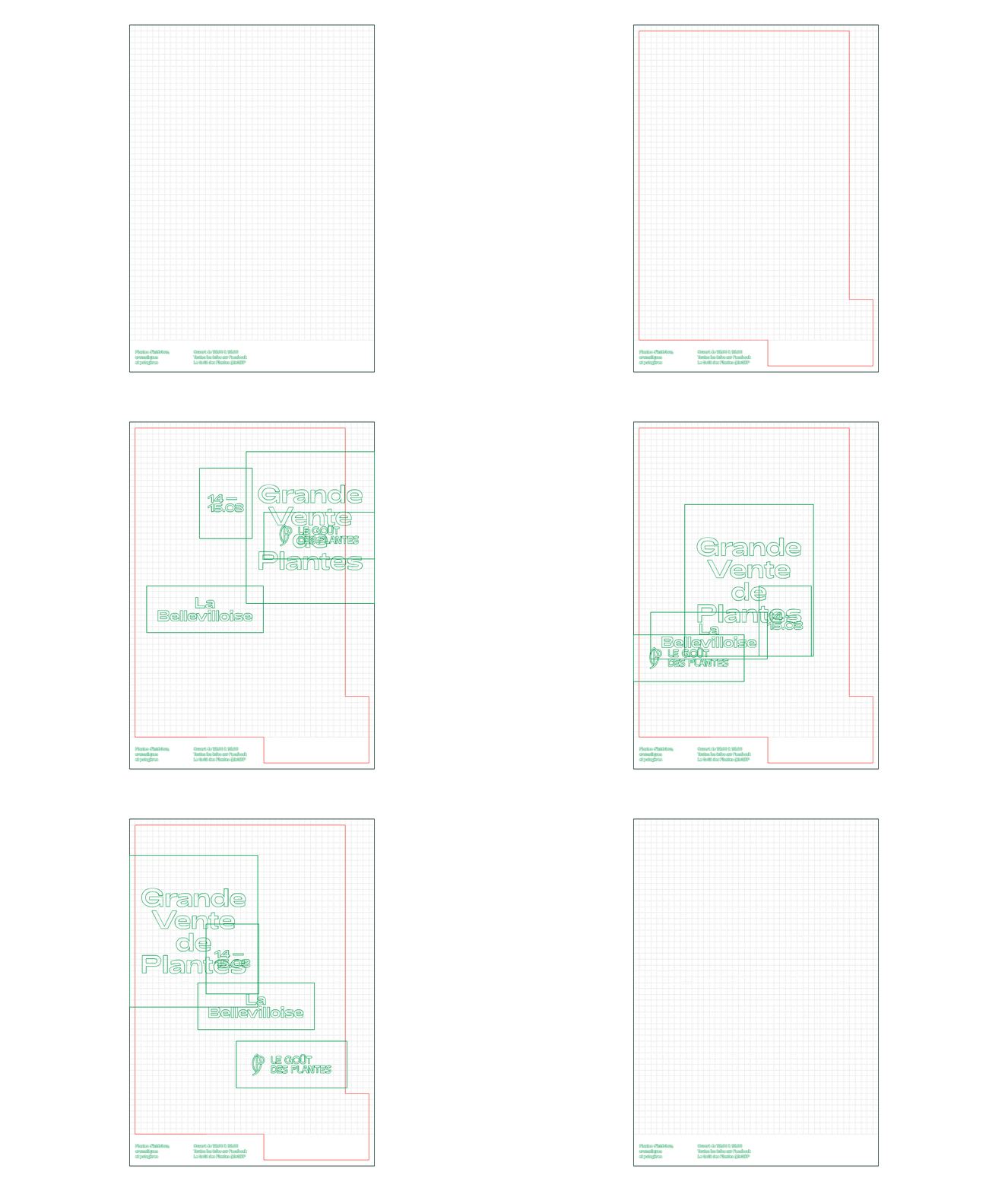
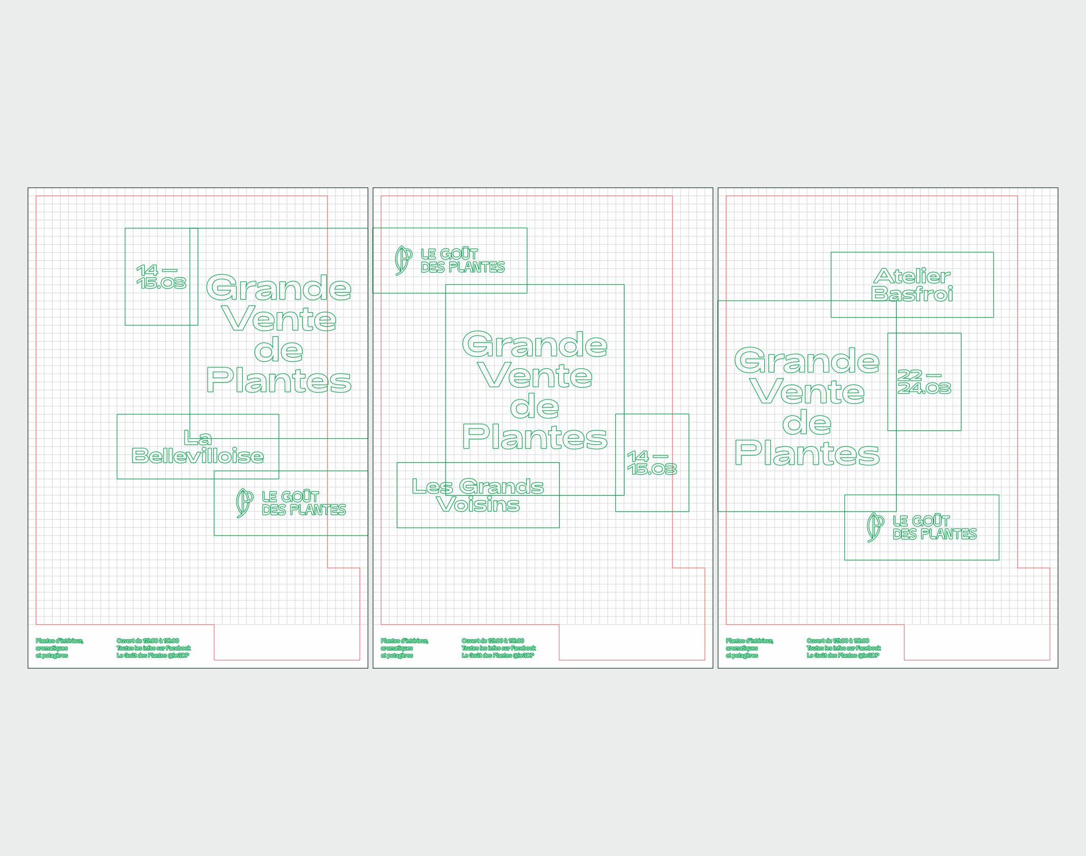
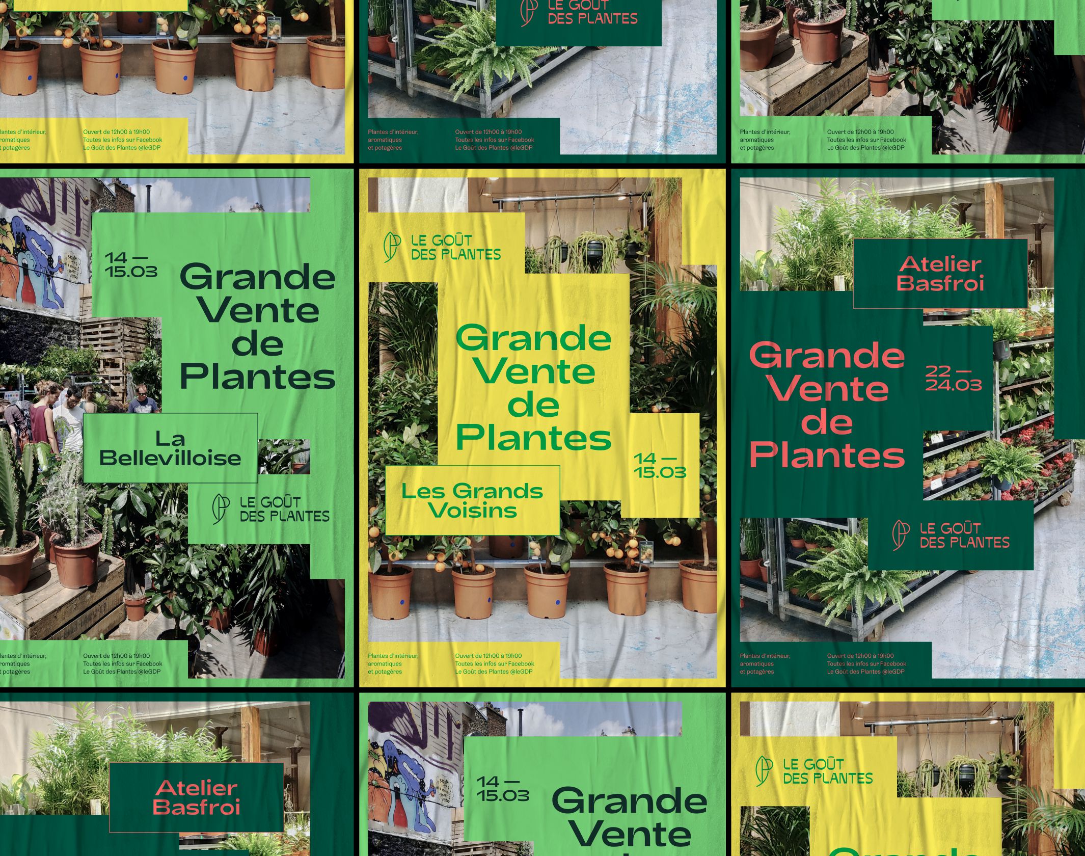
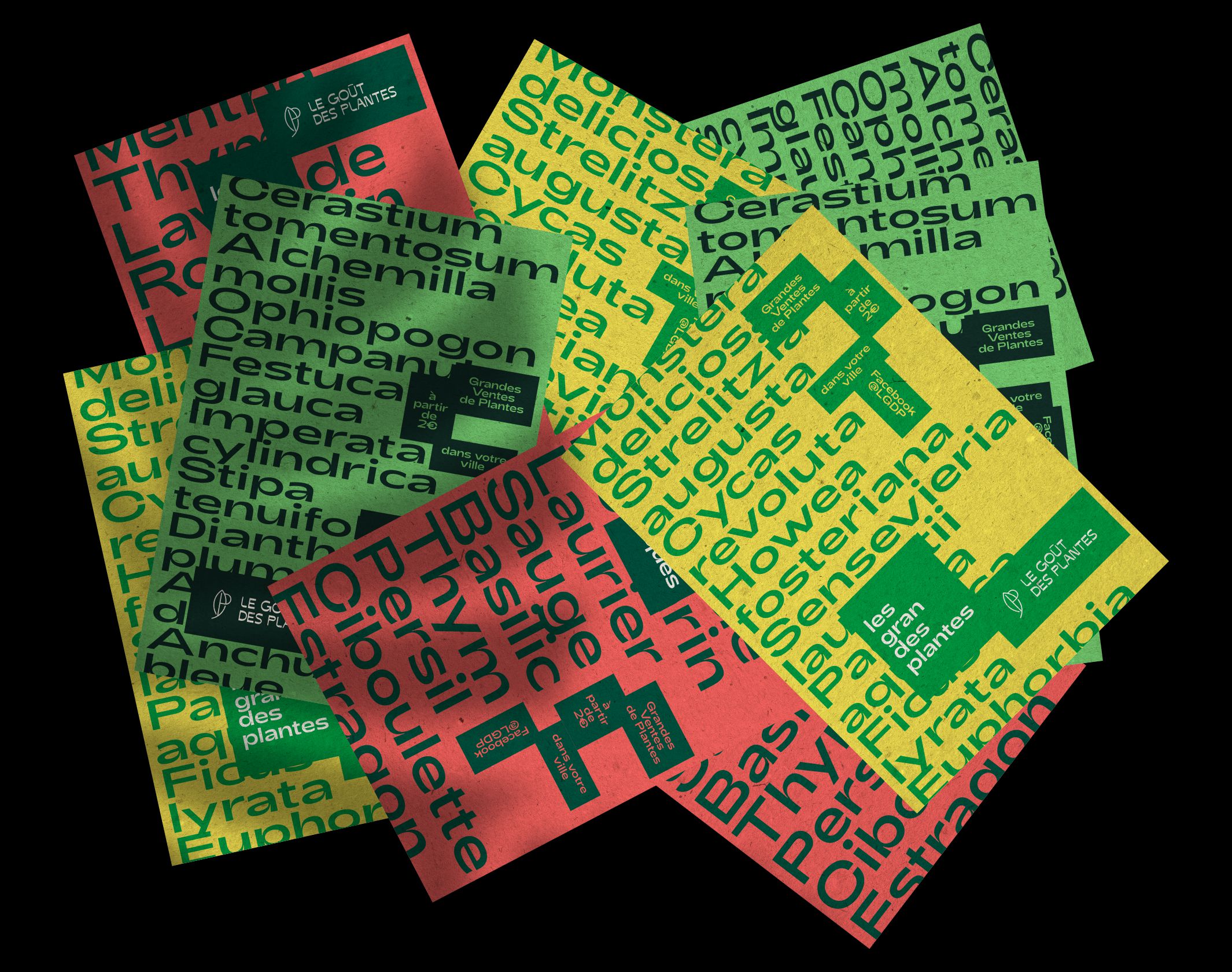
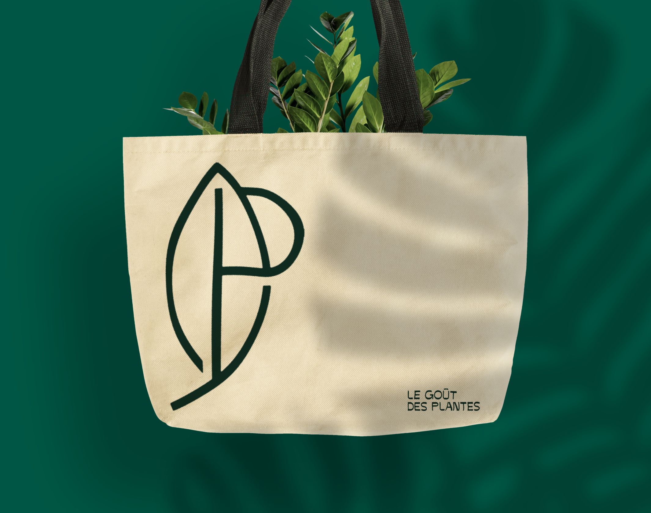
The new logo is above all a typography designed for the brand, with inverted contrasts, whose vegetal curves and curves convey a certain kindness, while maintaining a clear structure. The monogram, subtly intertwining a P and the silhouette of a leaf, completes the typographical block and gives Le Goût des Plantes a real emblem. We then designed a system of posters and publications based on a grid, which makes it easy and autonomous to generate new posters for events. The objective is to create a powerful and attractive graphic system, while offering a high degree of independence to the brand’s teams in the production of visuals.
New visuals will soon be added to the case study.
Disciplines
Brand strategy
Visual identity
Motion design
Signage
Typography
Branding
Naming / copywriting
Editorial design
Web design
