Finsecur
Finsecur is a French high-tech company founded in 2000, with more than 300 employees, dedicated to fire safety technologies. Investing heavily in research and development, the company has been able to impose a certain authority in its field on the technicality of its products, its willingness to maintain open software systems, and 100% French manufacturing.
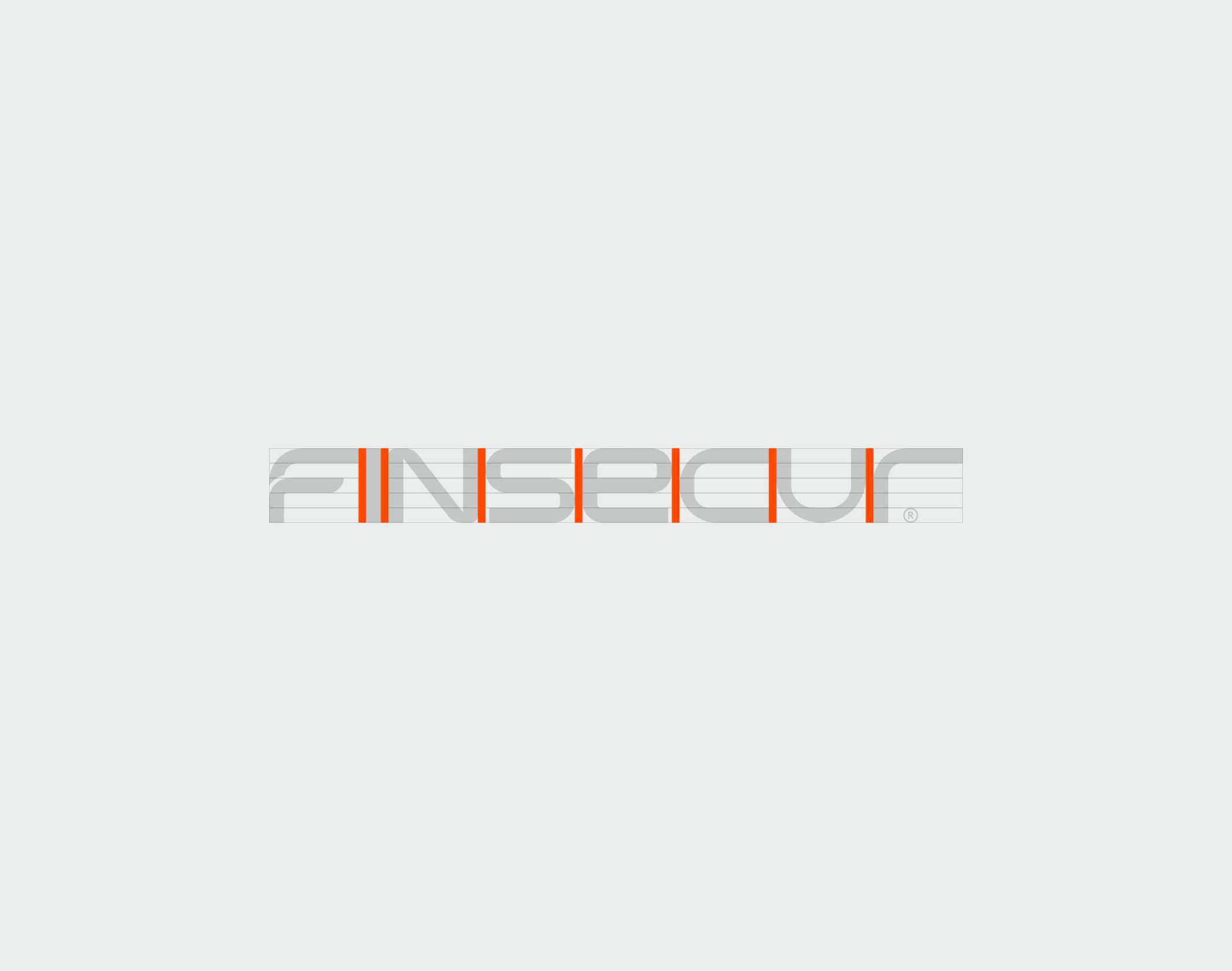
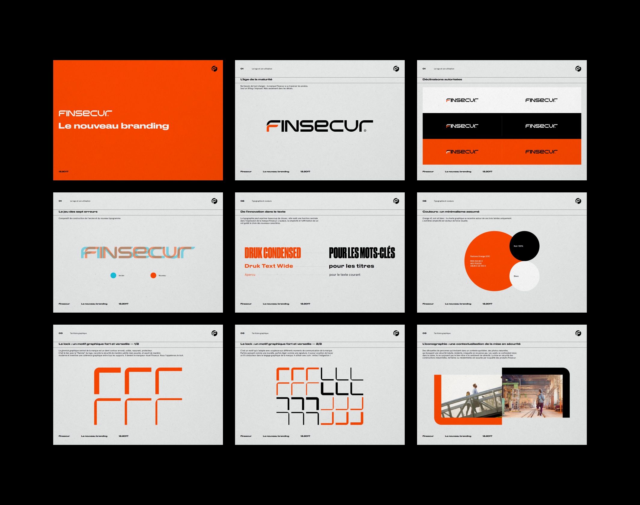
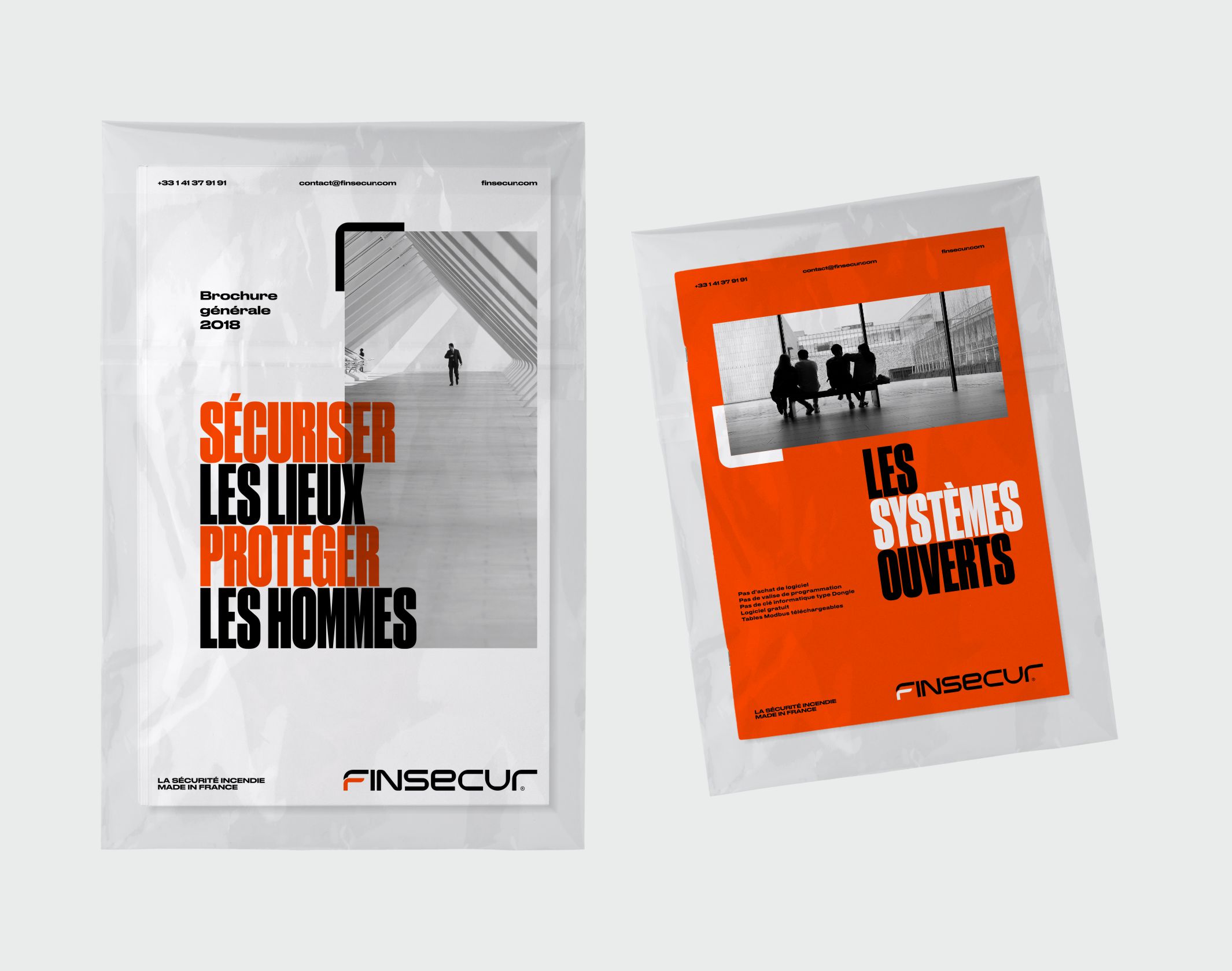
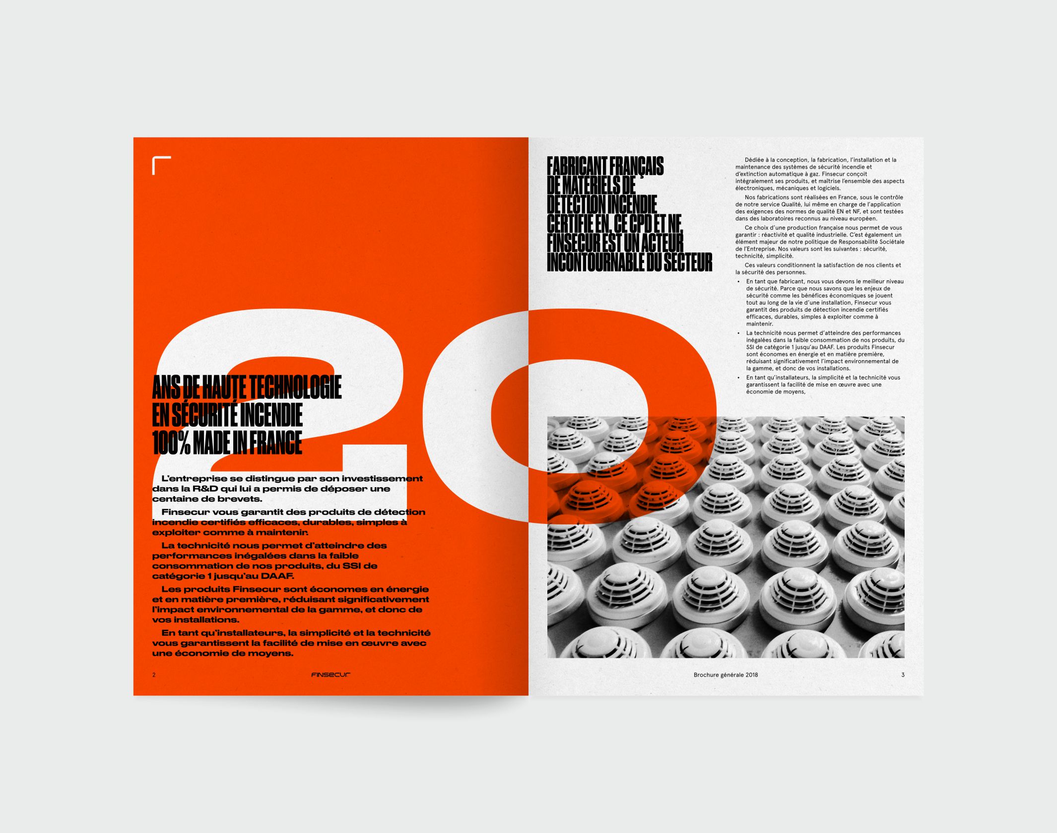
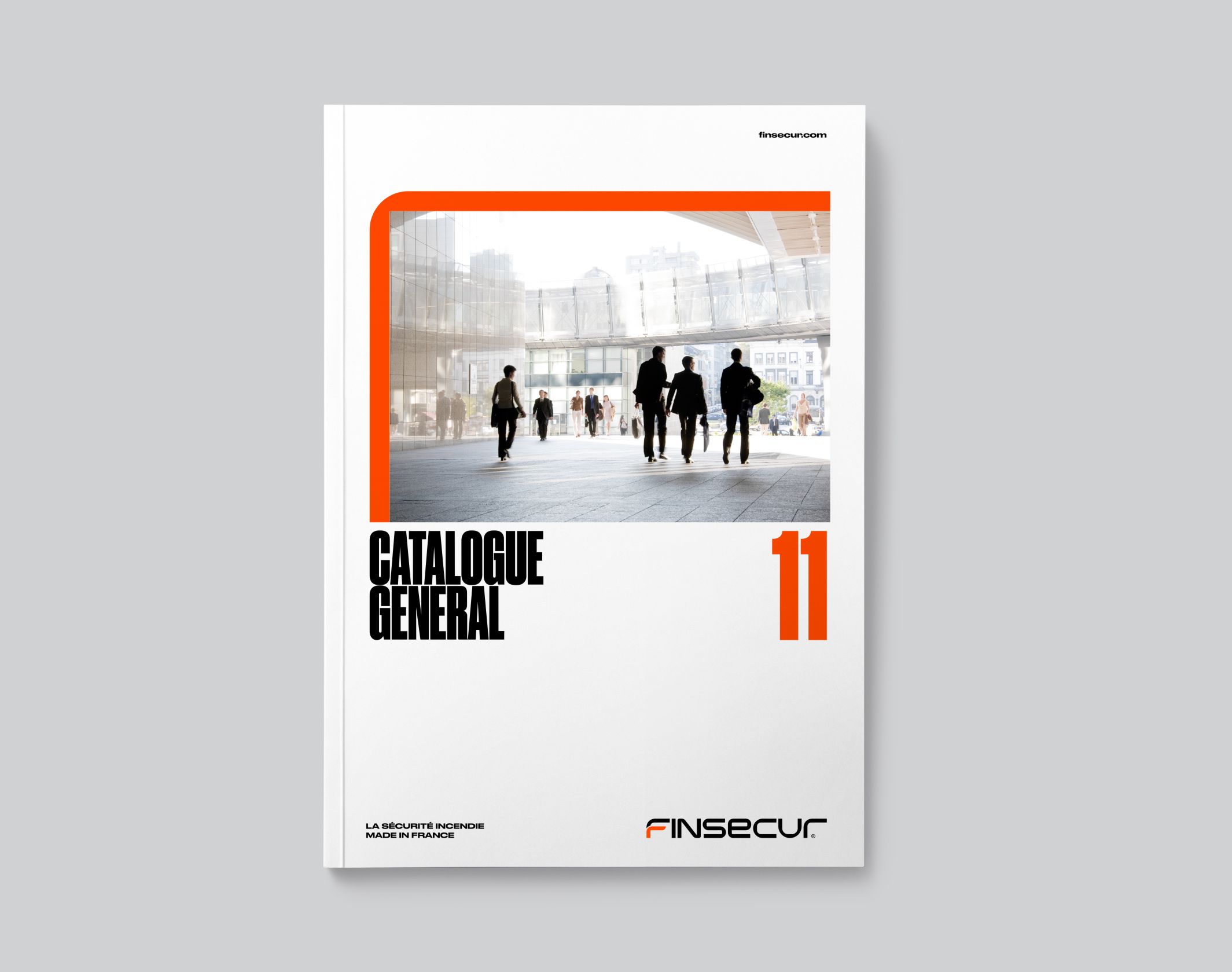
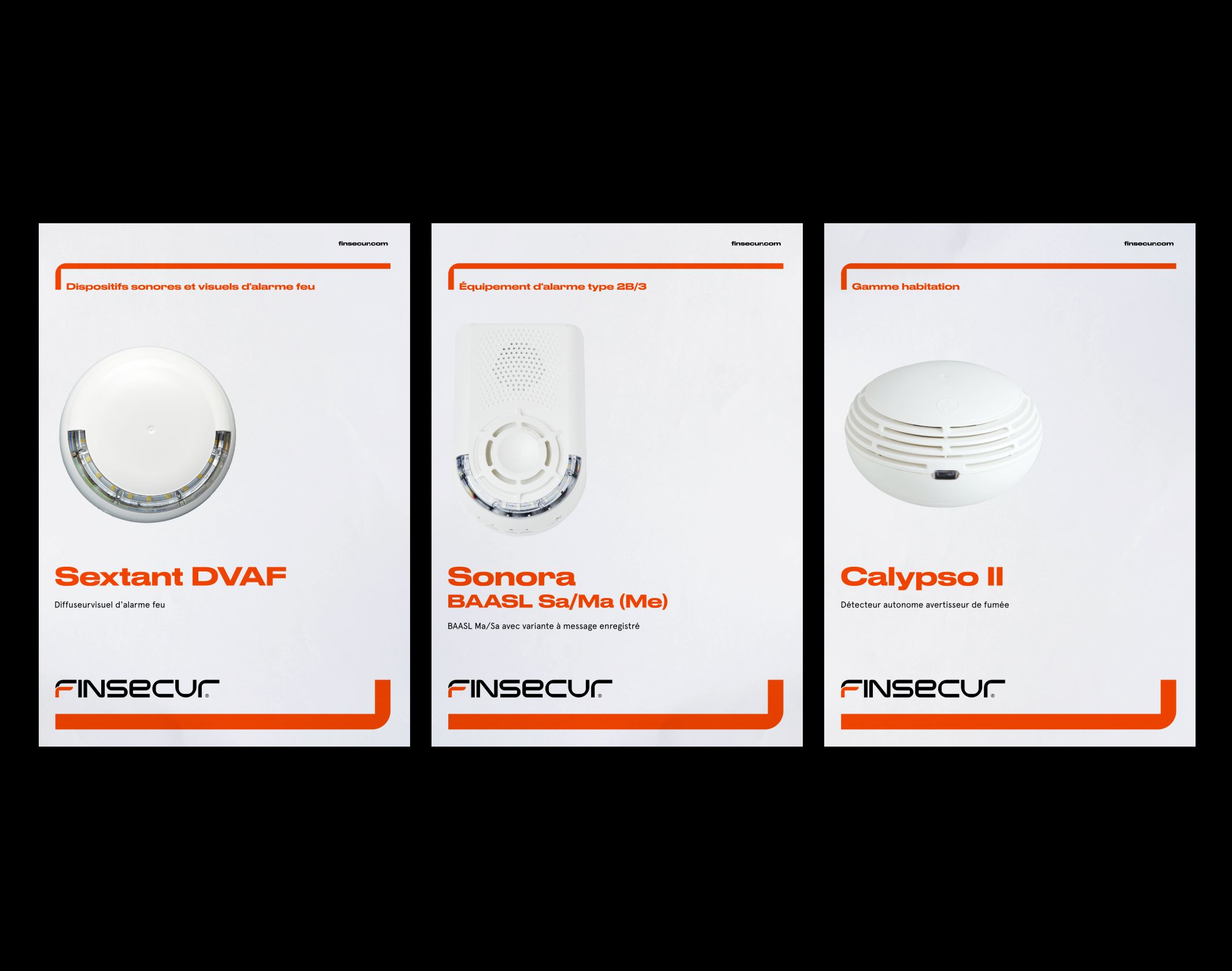
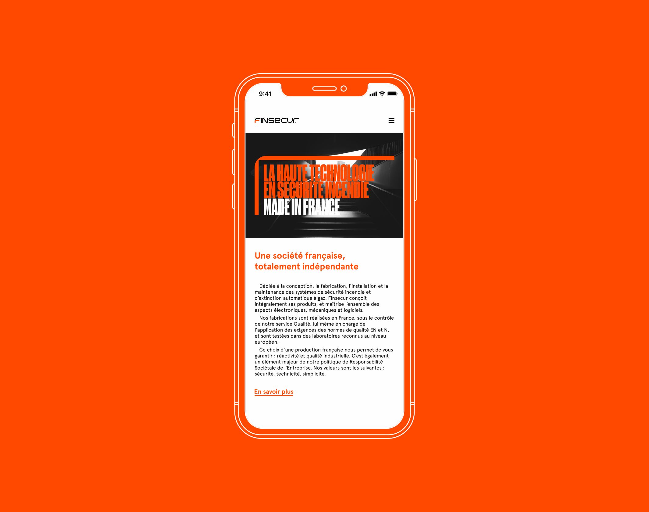
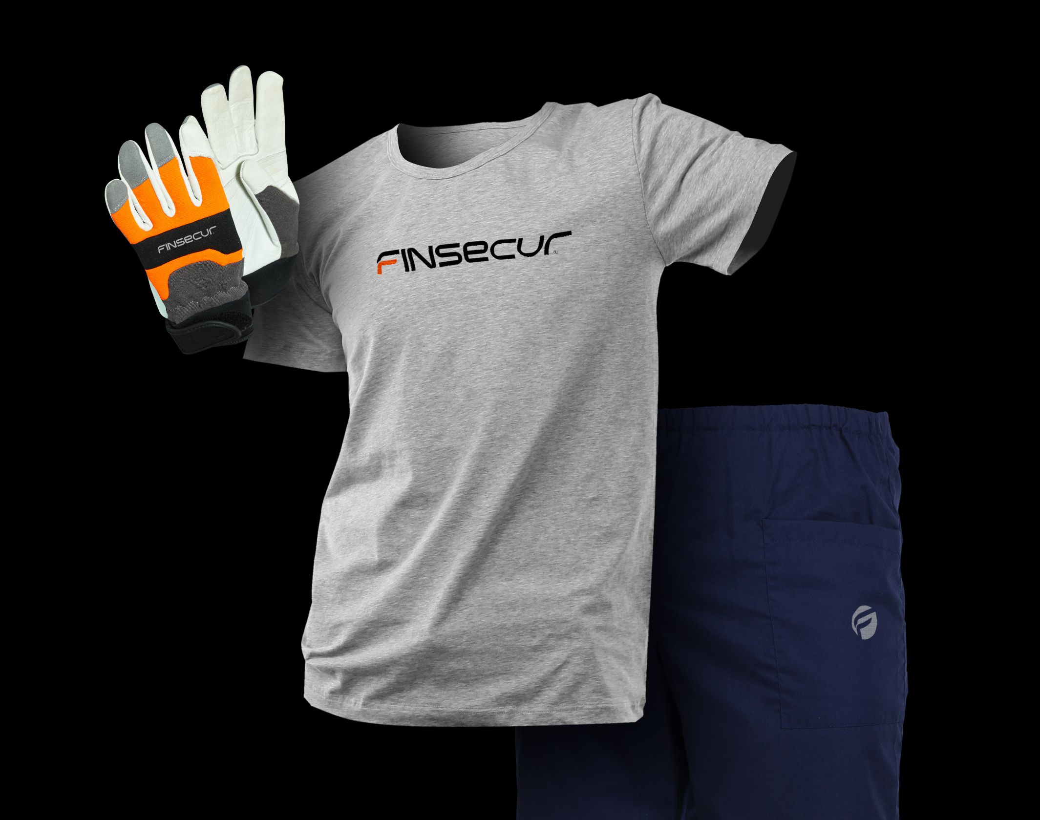
We were asked to reposition Finsecur at a turning point in its history, to place design at the heart of the brand’s development. We have directed our work in a raw, radical and visually powerful direction. Thus, the logo evolves and is structured. It is remodelled to meet a precise geometry. Based on a rigorous construction grid, it gains stability and maturity. The brand’s central graphic gimmick is a rounded, solid, reassuring, protective half contour. It links to the “flame” of the logo, narrates safety in a subtle but assured way, and assembles a graphic coherence between all the supports in a modern and inventive way. It becomes the visual marker Finsecur. It is a design that adapts flexibly to the different communication moments of the brand. Sometimes powerful as a wall, sometimes light as a signature, its vocation is to draw a thread in the graphic language of the brand.
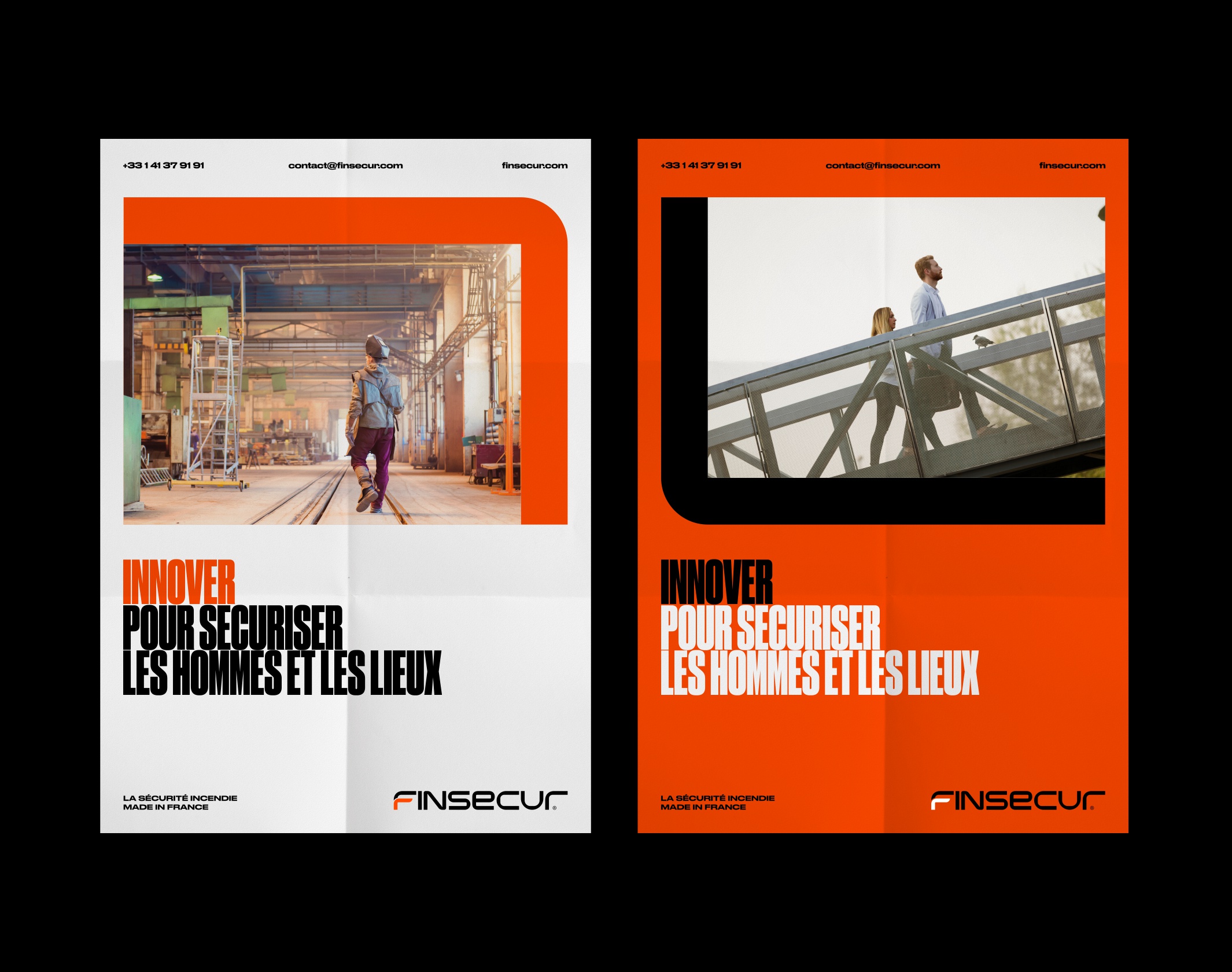
The brand’s new photographic territory evokes an obvious, induced security that we do not think about. The subjects merge into the scene, they don’t overplay well-being or the feeling of serenity. The safety of industrial, commercial and residential buildings is ensured by the quality of Finsecur products.
Disciplines


