EFET
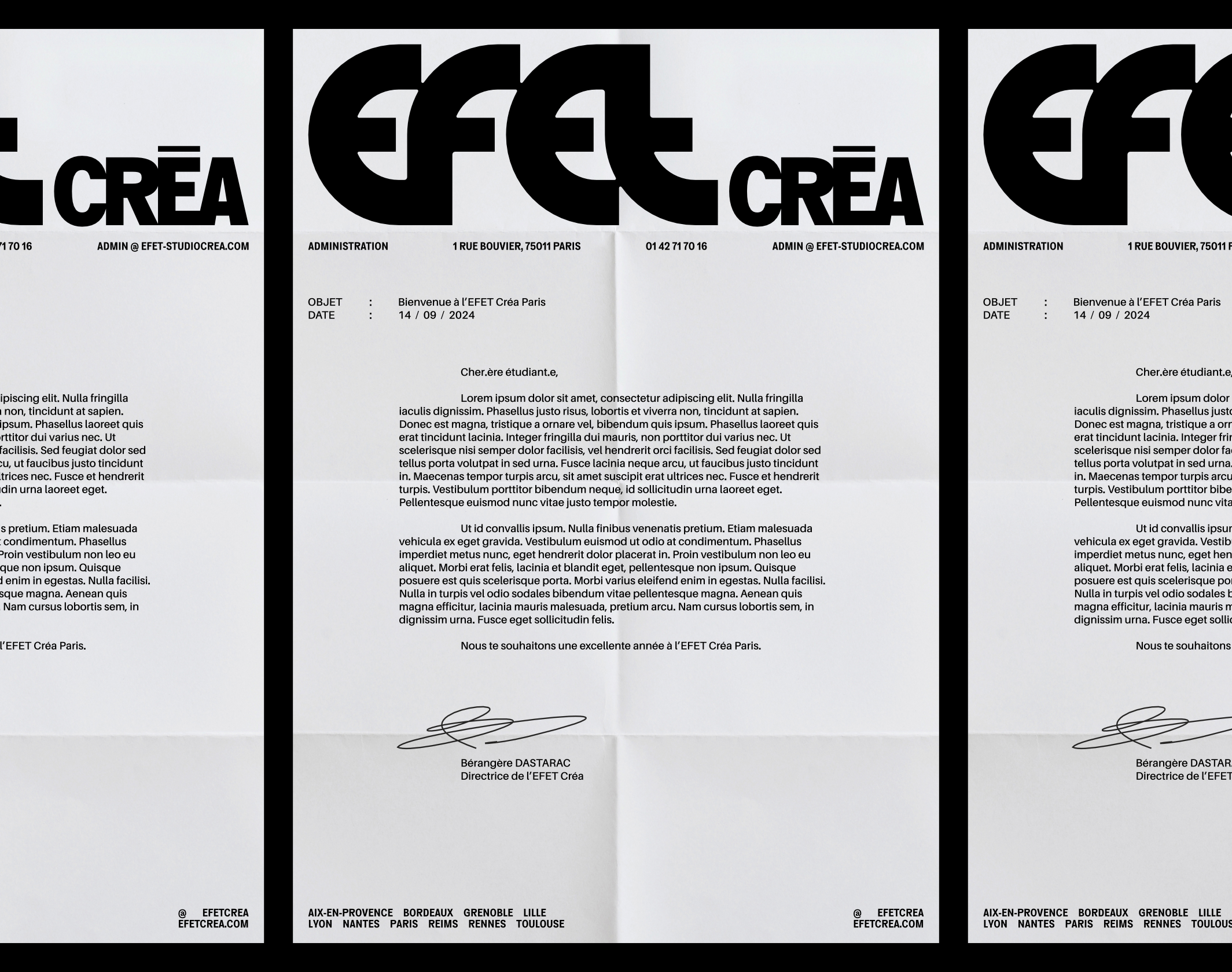
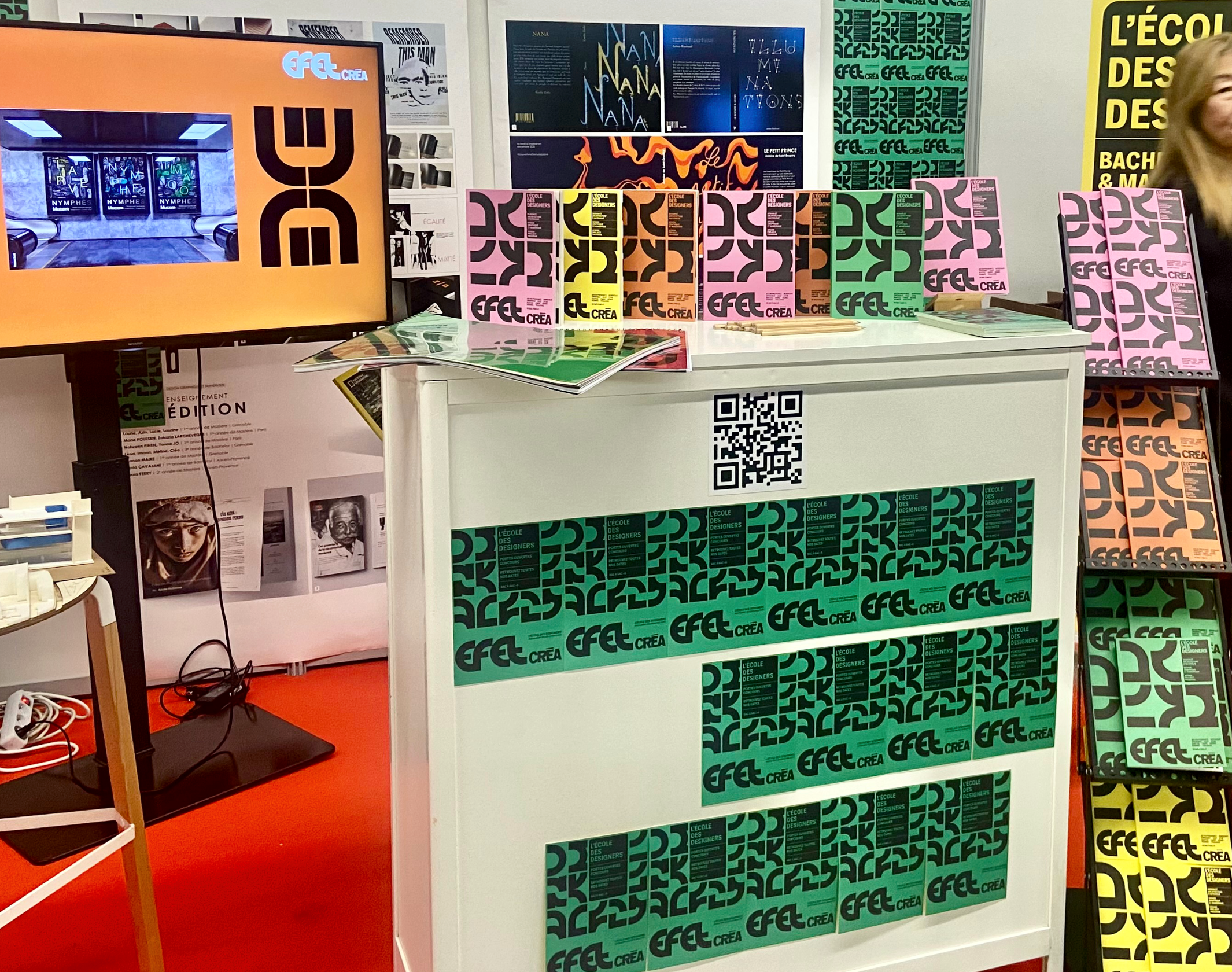
For decades, EFET Créa and EFET Photo have graduated thousands of students in graphic design, interior architecture and photography. These renowned schools (EFET Créa is the evolution of the former Maryse Eloy school), which have existed since 1981 and 1970 respectively, decided in 2024 to call on Brand Brothers to redesign and harmonize their graphic identities. With campuses in several major French cities, the EFET schools cover a broad spectrum of contemporary creative disciplines, providing a broad, practical and professional education.
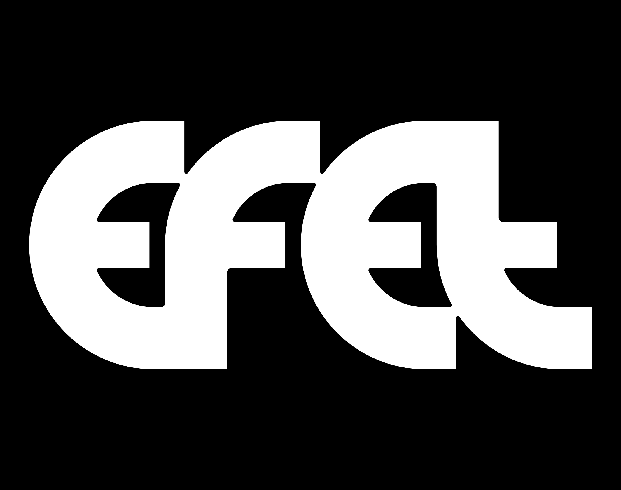
In a highly competitive environment, EFET needed to reaffirm its high standards and distinctive features, in order to make itself visible once again. In consultation with the school’s teams, we felt it was essential to develop a brave, committed and expansive approach to graphic design. We drew on the school’s long history to design a stable, balanced EFET lettering whose simple, obvious geometry gives the typogram a robust character.
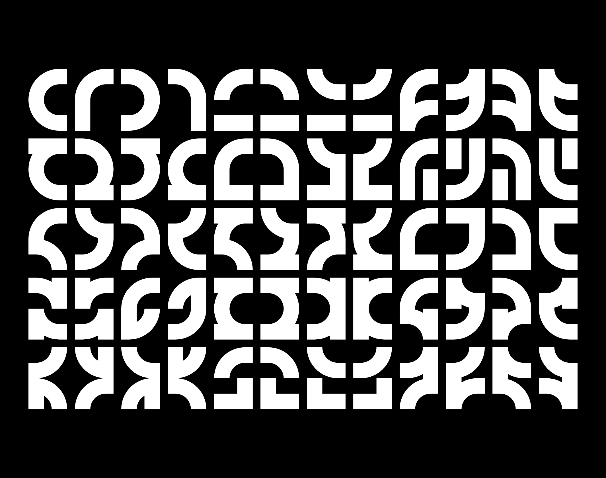
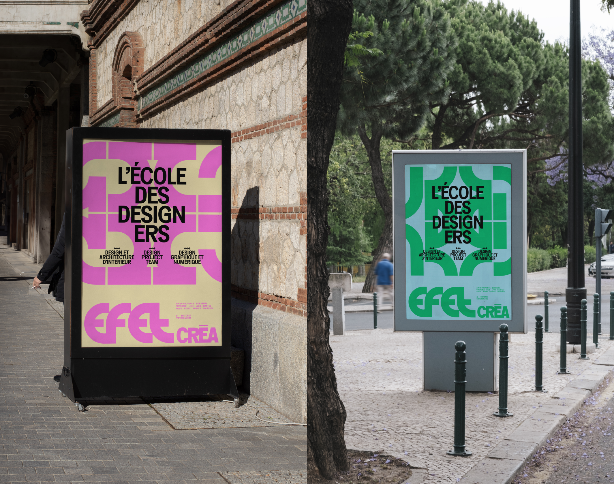
The common identity of EFET Créa and EFET Photo was then developed according to the logic of a generative graphic system. A rich, abstract vocabulary, at once minimal and expressive, capable of multiplying the brands’ territories of expression, while maintaining visual consistency at all times. This collection of components, with their highly proprietary design and EFET typeface, can be used in two distinct operating modes: the combined pattern and symmetrical totems.
EFET’s graphic grammar provides an abstract, raw, lively and generous foundation for decoding the modern challenges of creativity, as well as the intellectual mechanics behind the production of signs and images. This new identity will be gradually introduced from the start of the school year in September 2024.
Publications
1
Behance, Best of Behance
Disciplines
Brand strategy
Visual identity
Motion design
Signage
Typography
Branding
Naming / copywriting
Editorial design
Web design

