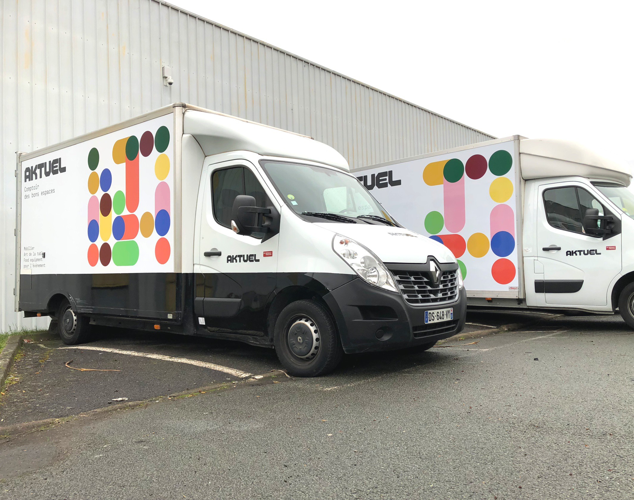
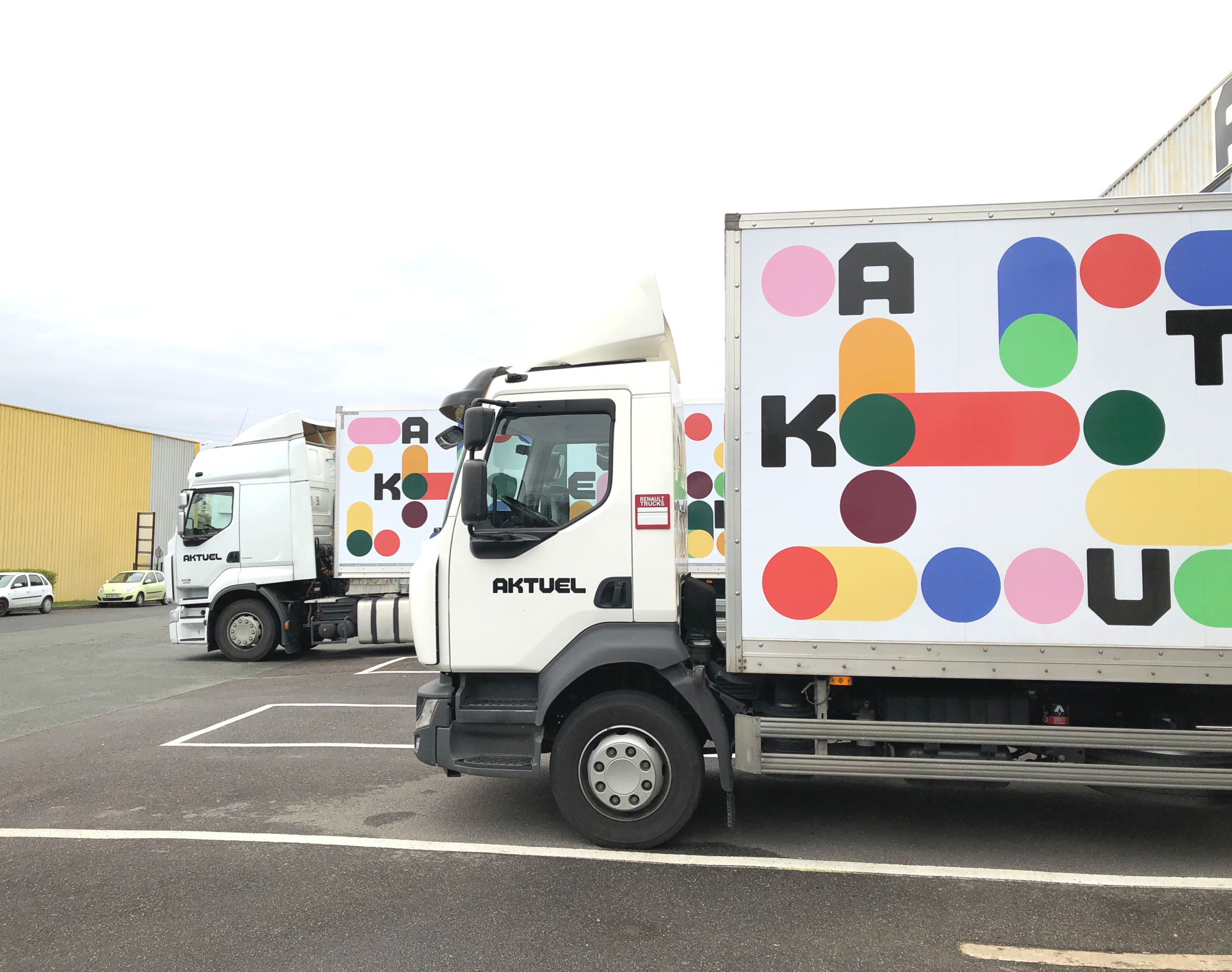
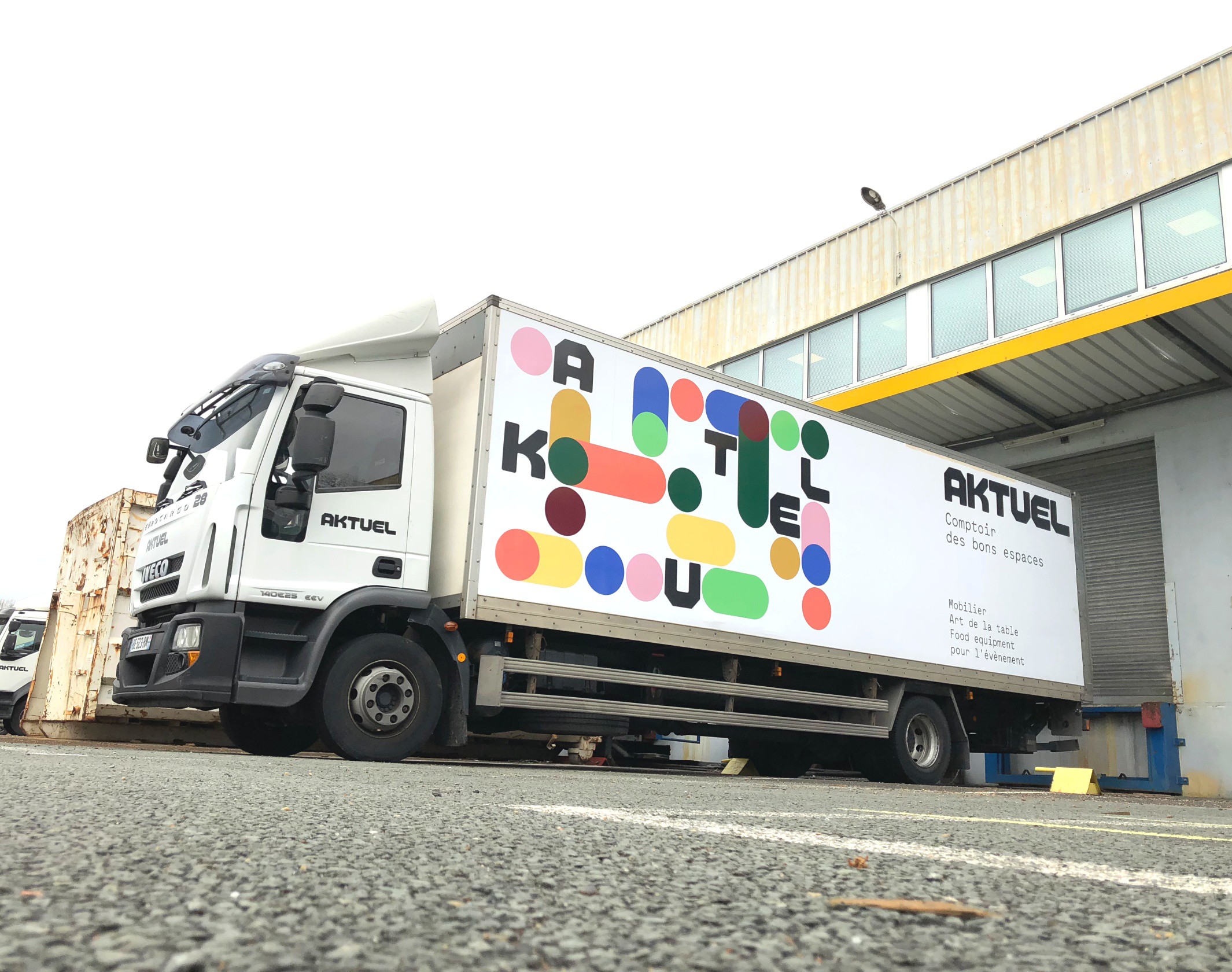
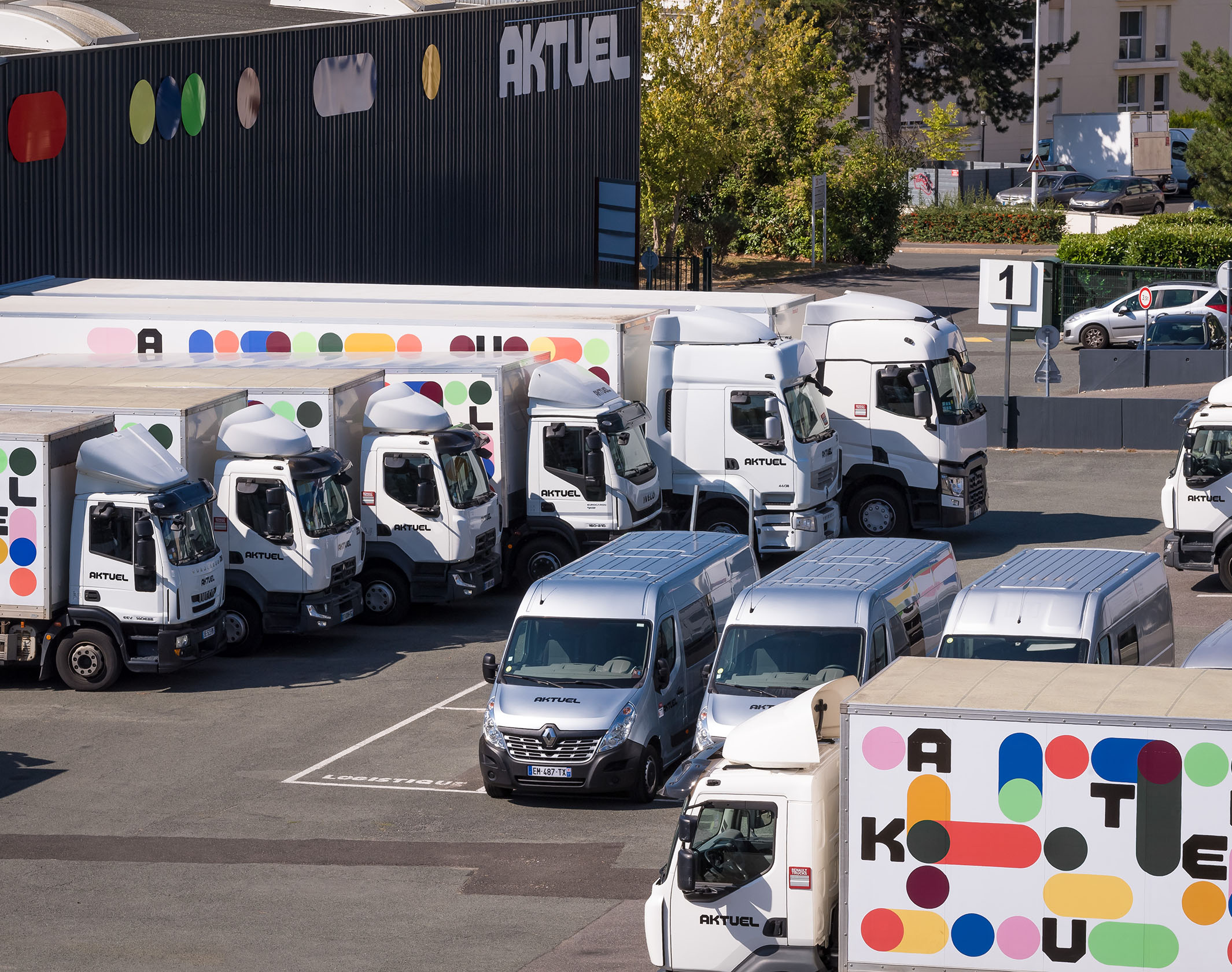
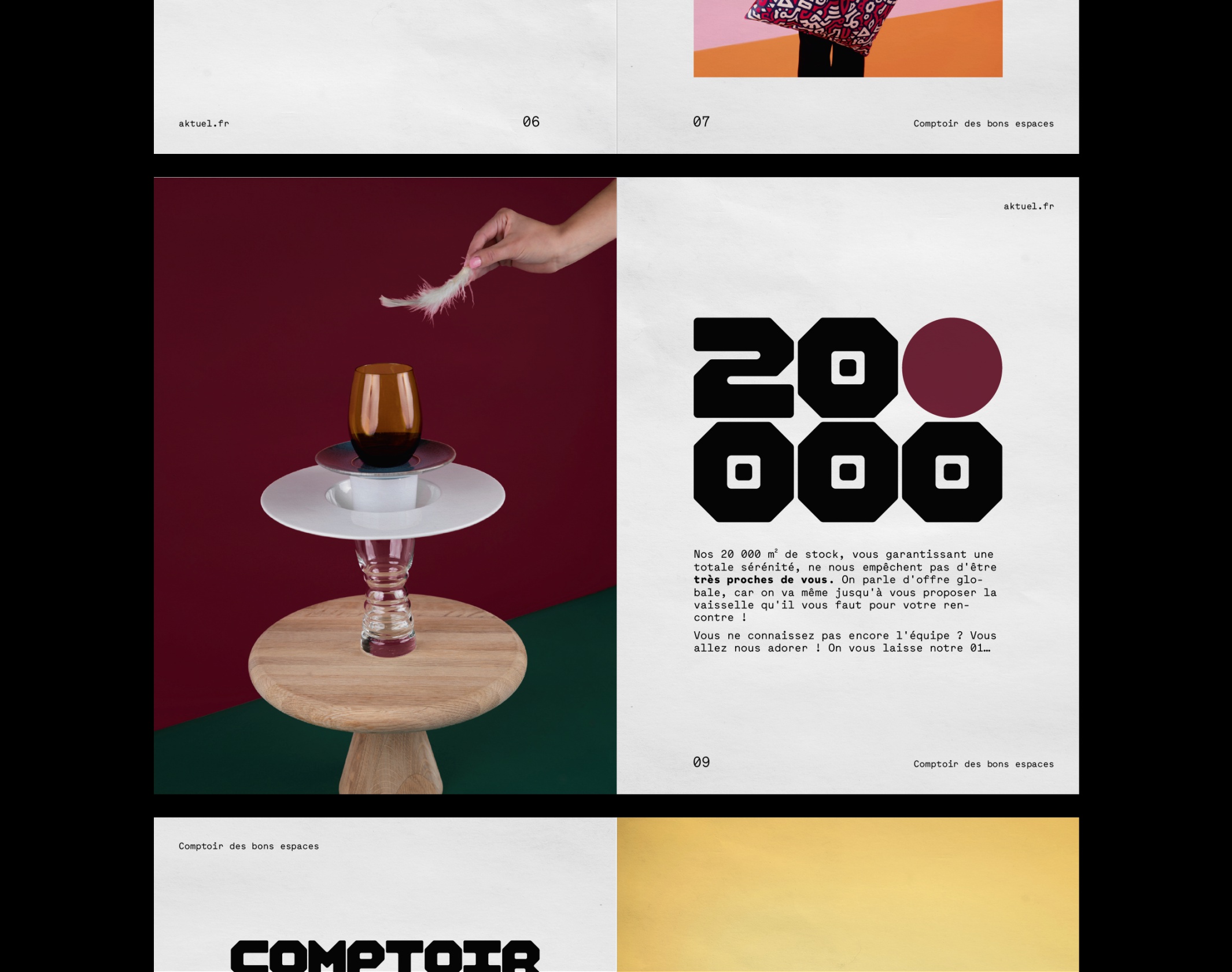
Since 1988, Aktuel has established itself as a key player in the rental of furniture, tableware and food equipment for events. The figures: 140 employees, 3 locations, 20,000m² of stock, 60 delivery vehicles, and countless equipped events, from corporate conventions to major trade shows and sporting events. But above all, Aktuel rightly boasts, beyond its logistician’s trade, a human approach, simple and pragmatic, praised by all its customers for 30 years. An “office” made up of solid, reliable and committed people, a pleasant working relationship, and consistently successful projects.
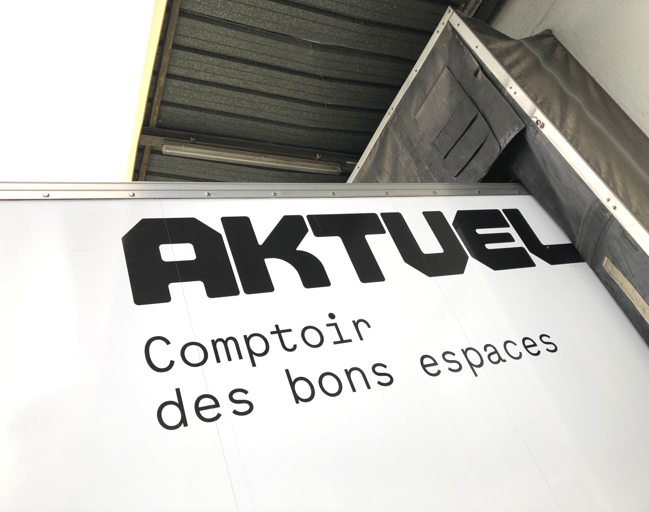
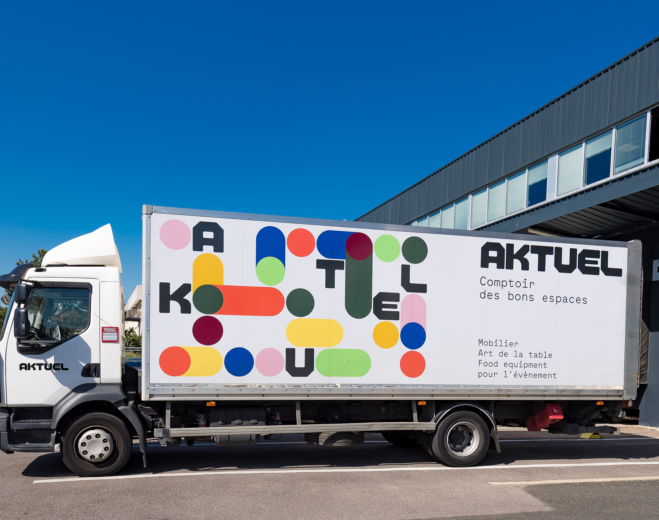
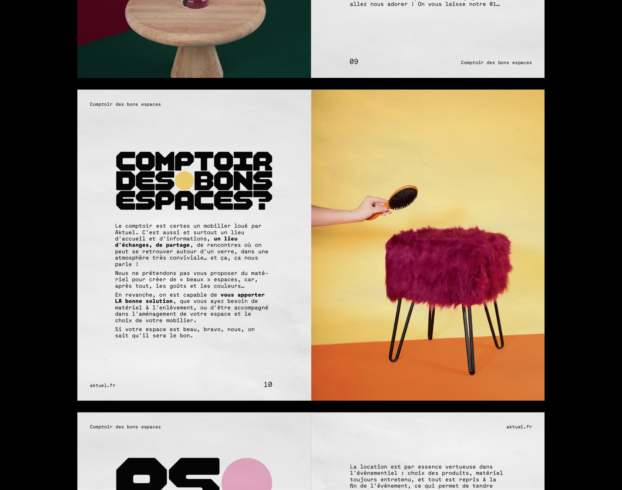
We worked on the strategic repositioning of the group, resulting in a new signature – Comptoir des bons espaces – and a graphic translation through a new visual identity.
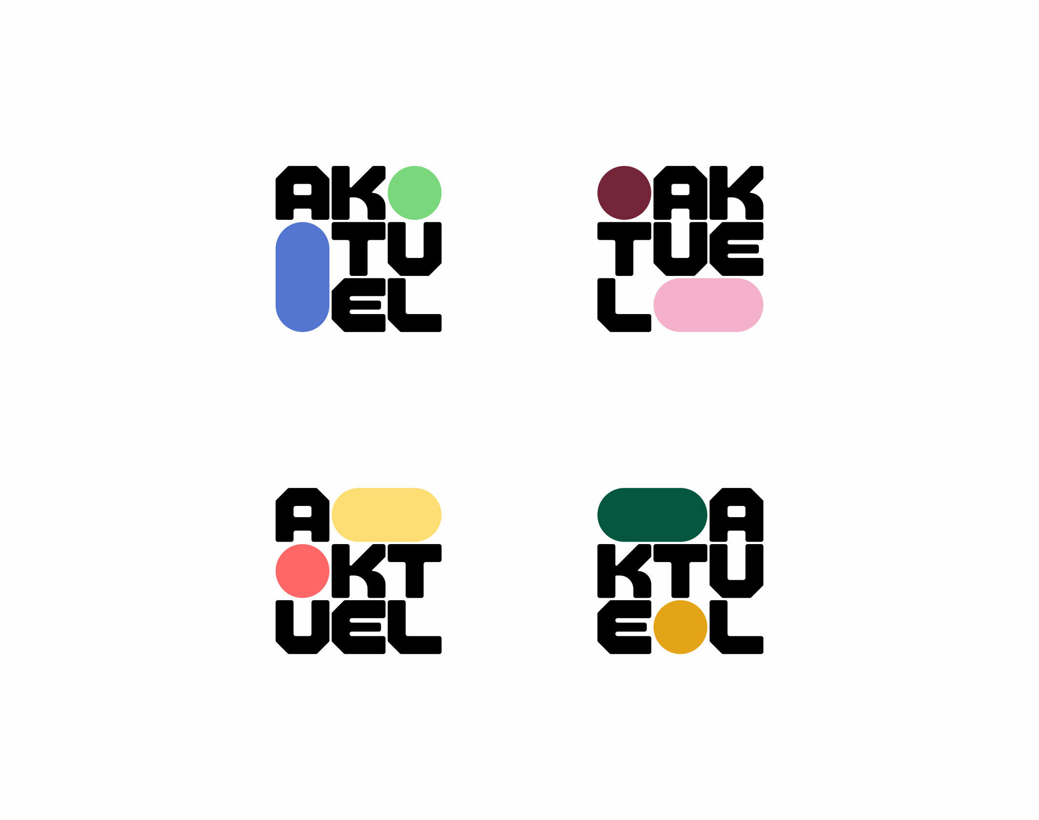
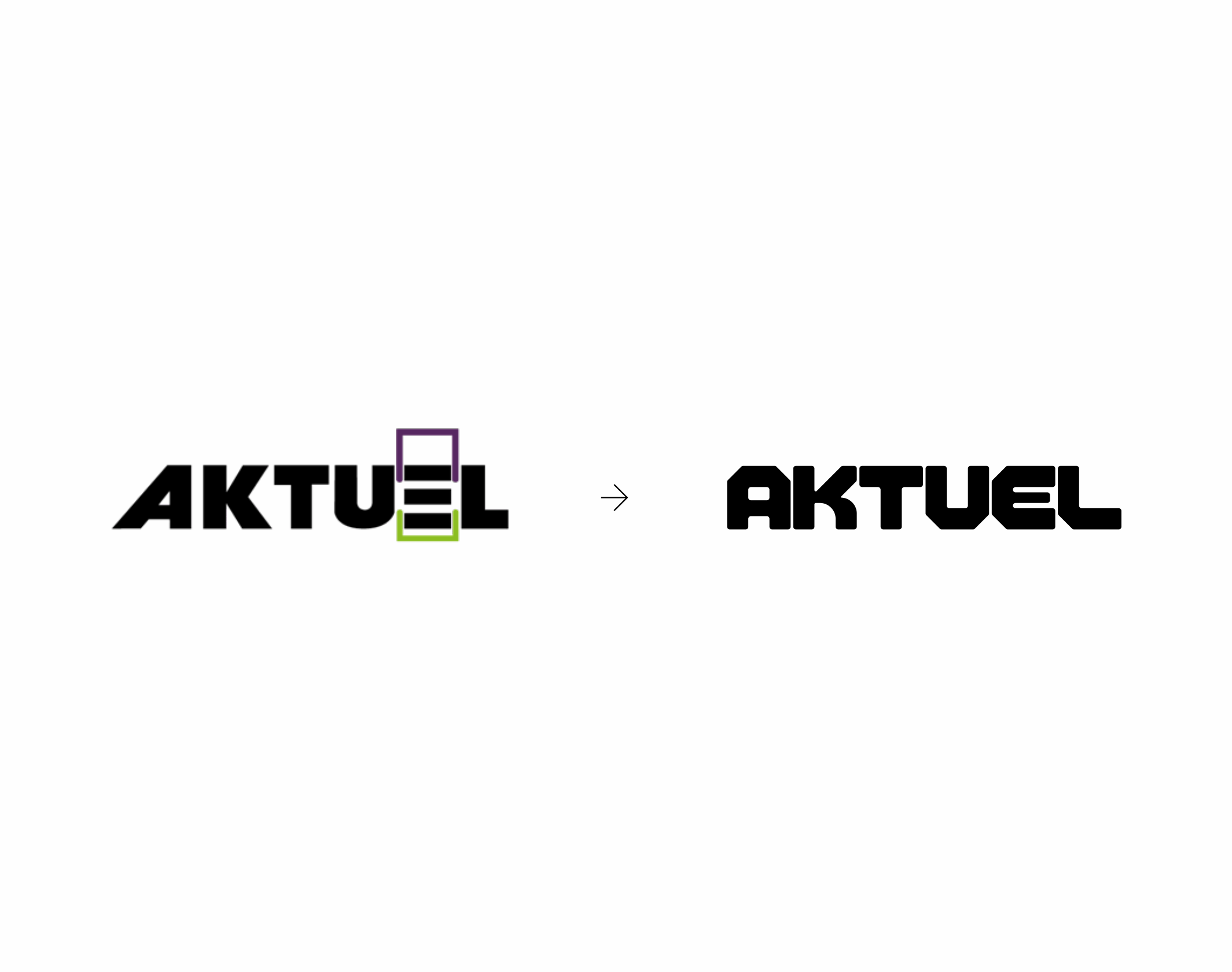
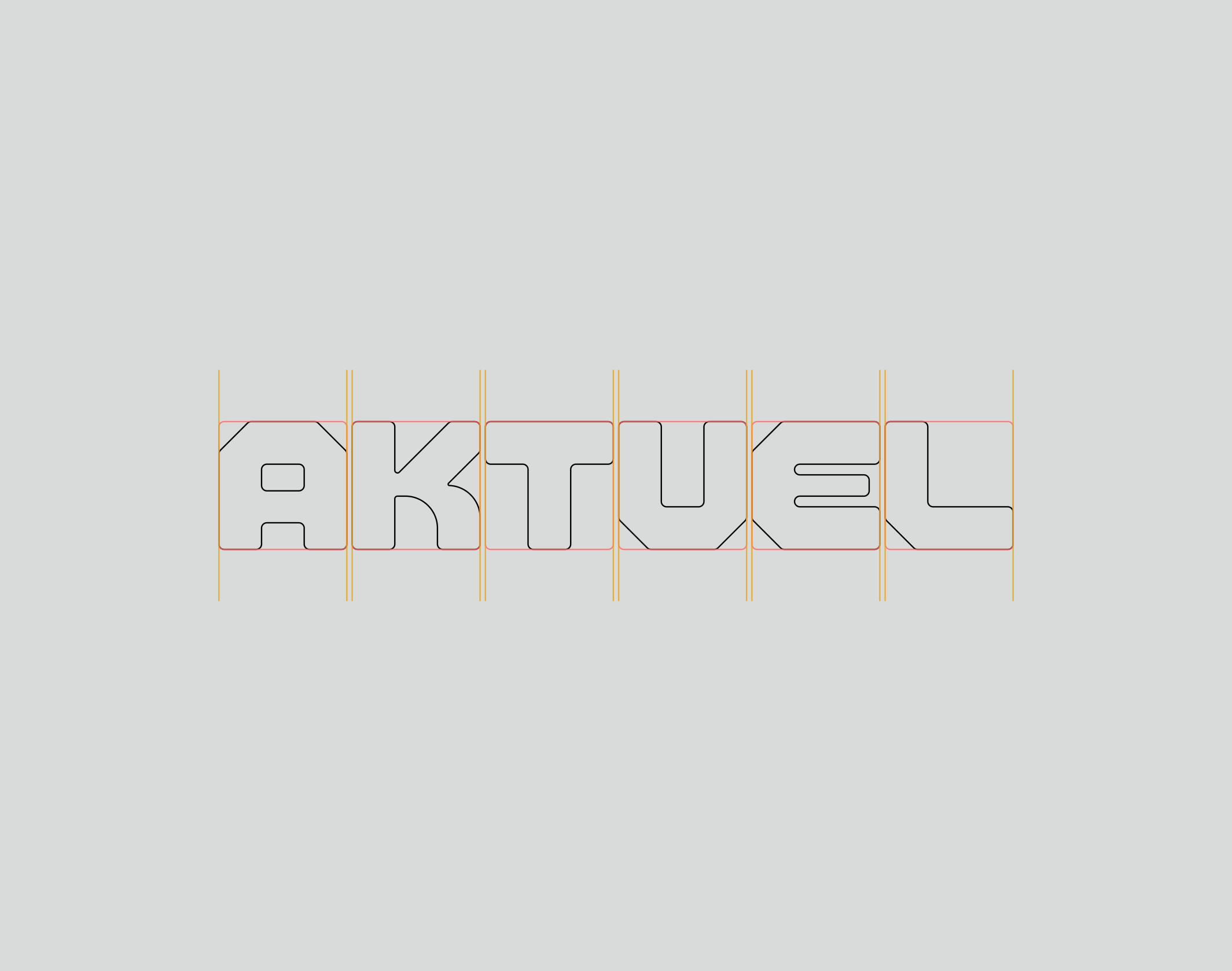
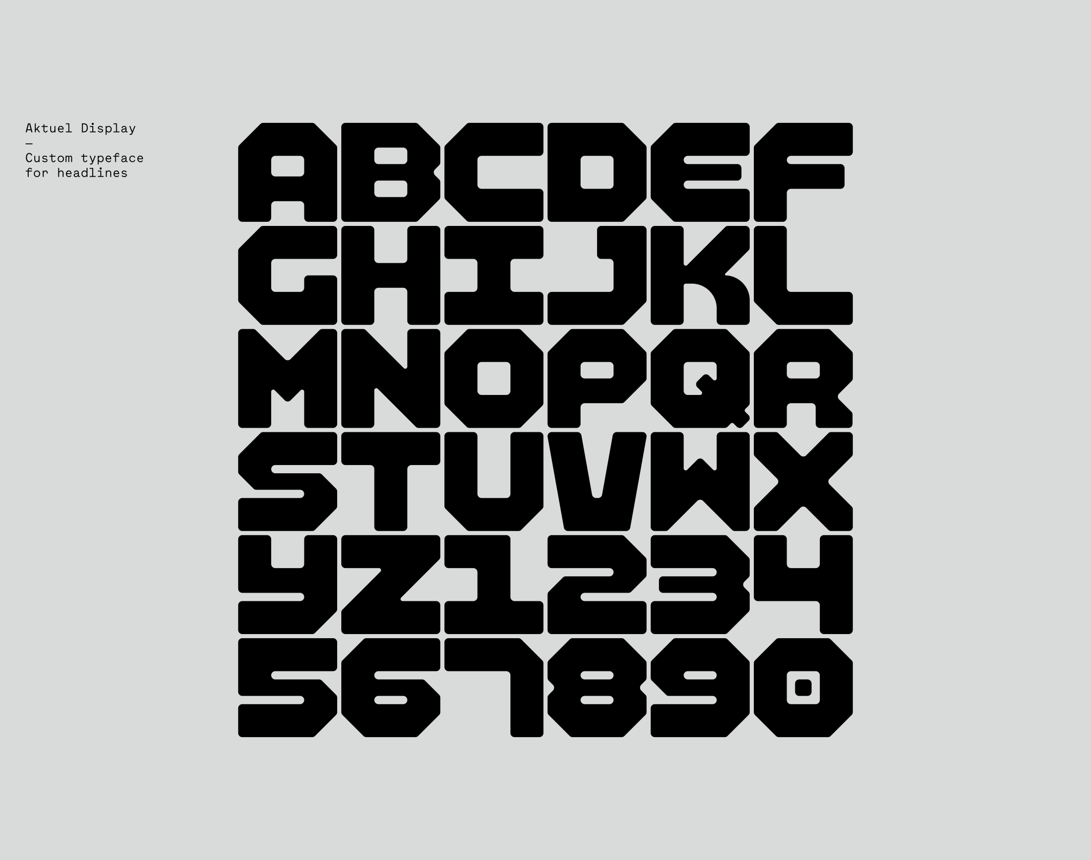
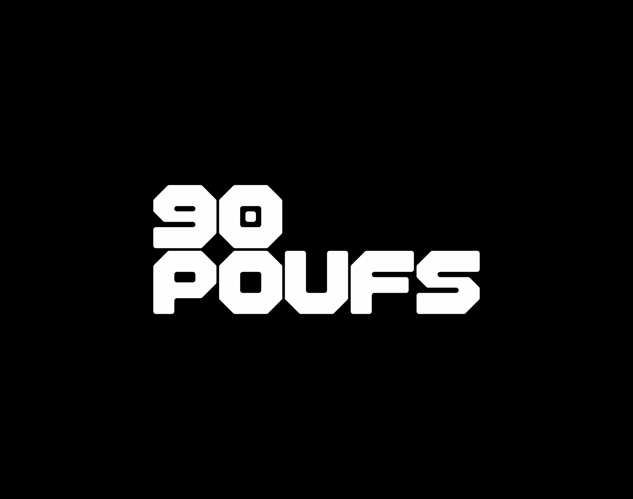
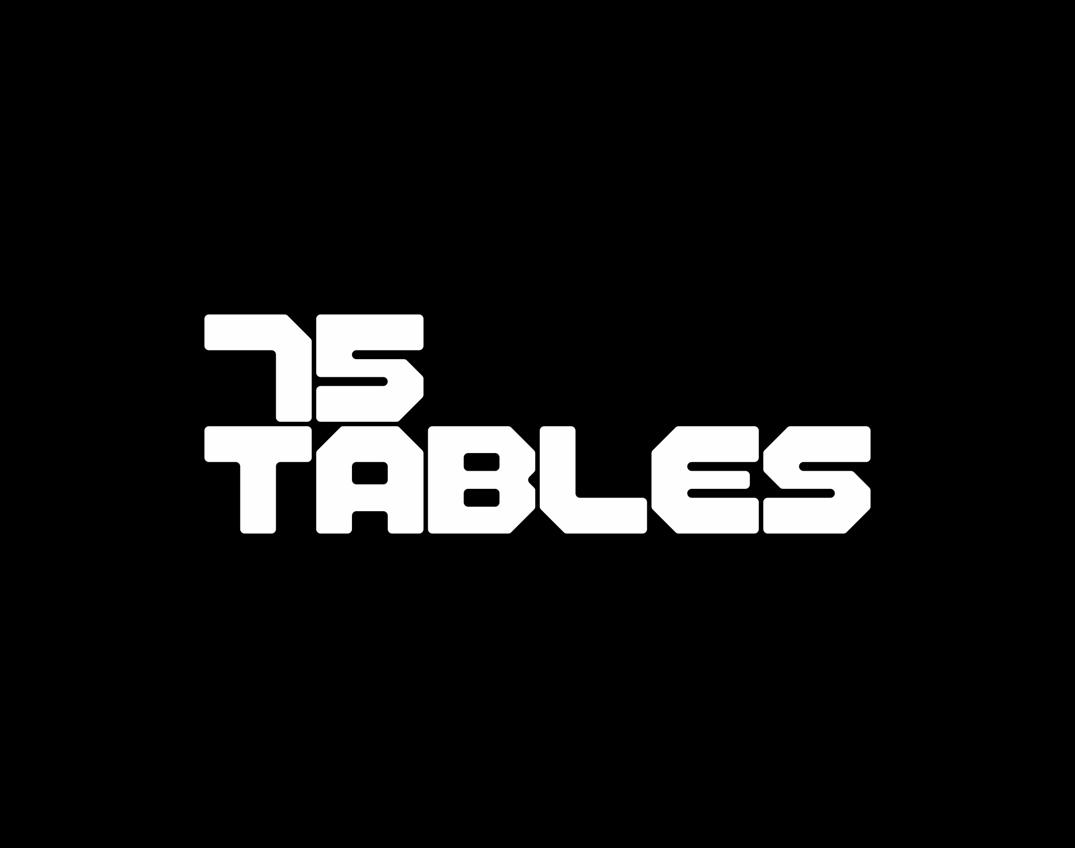
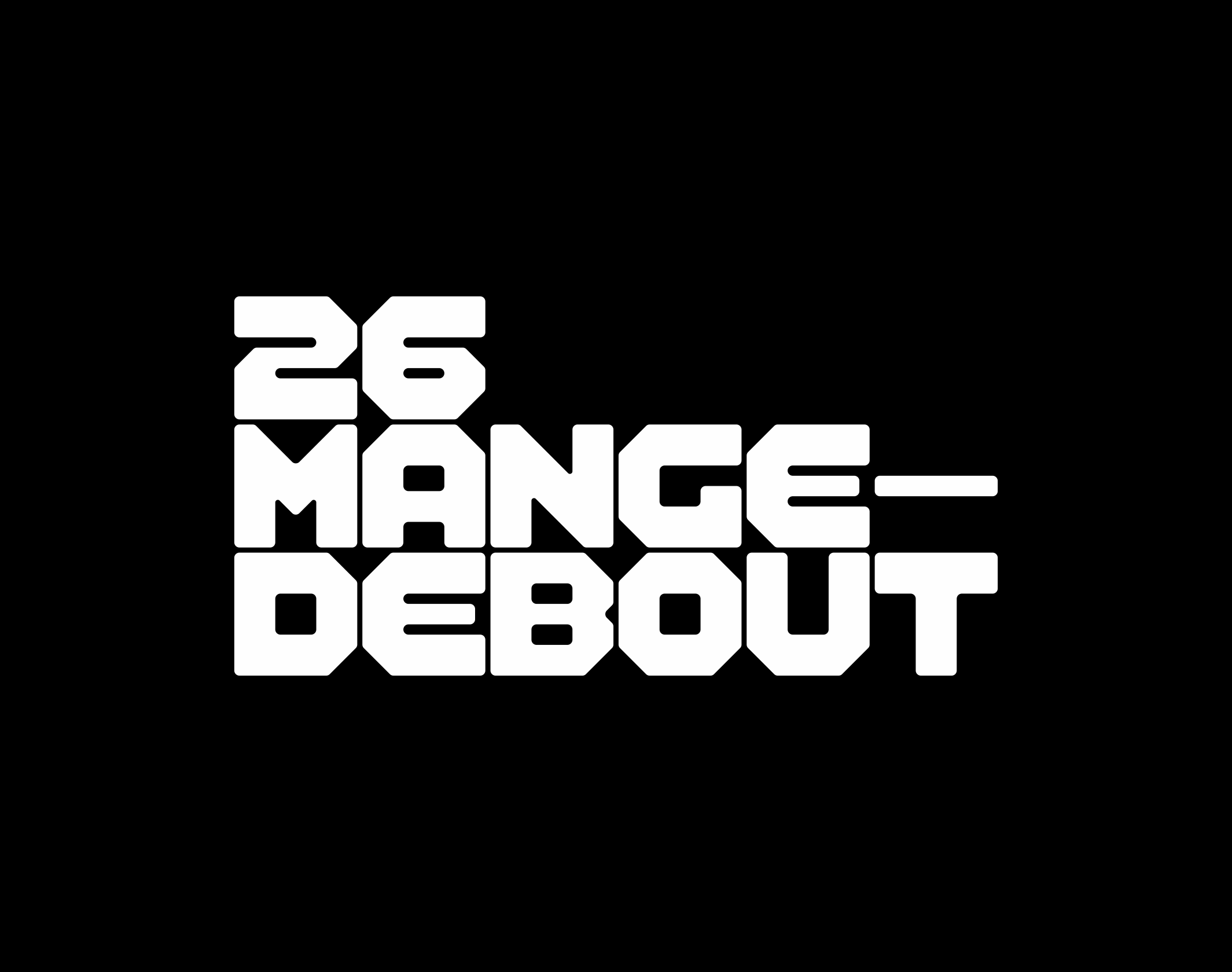
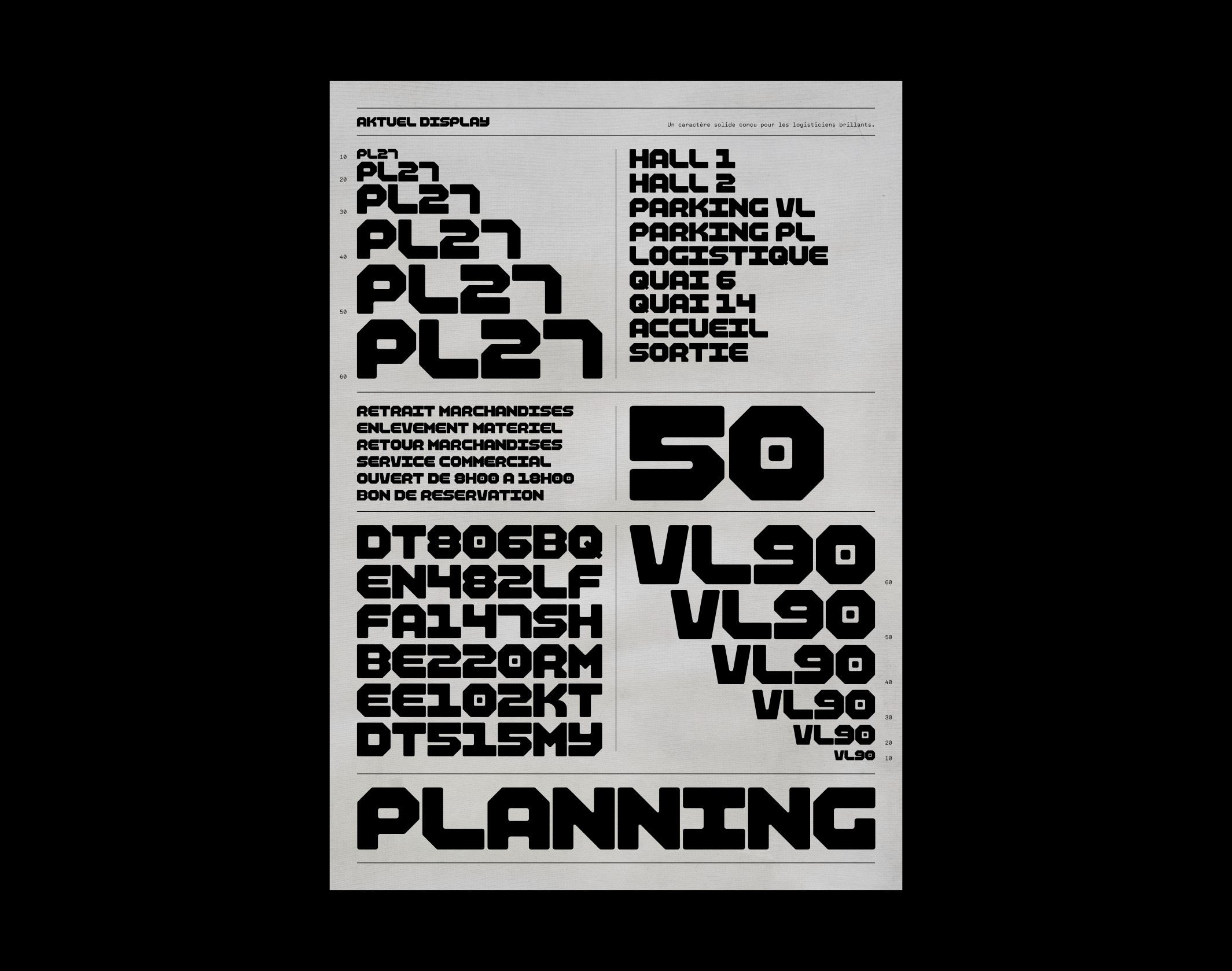
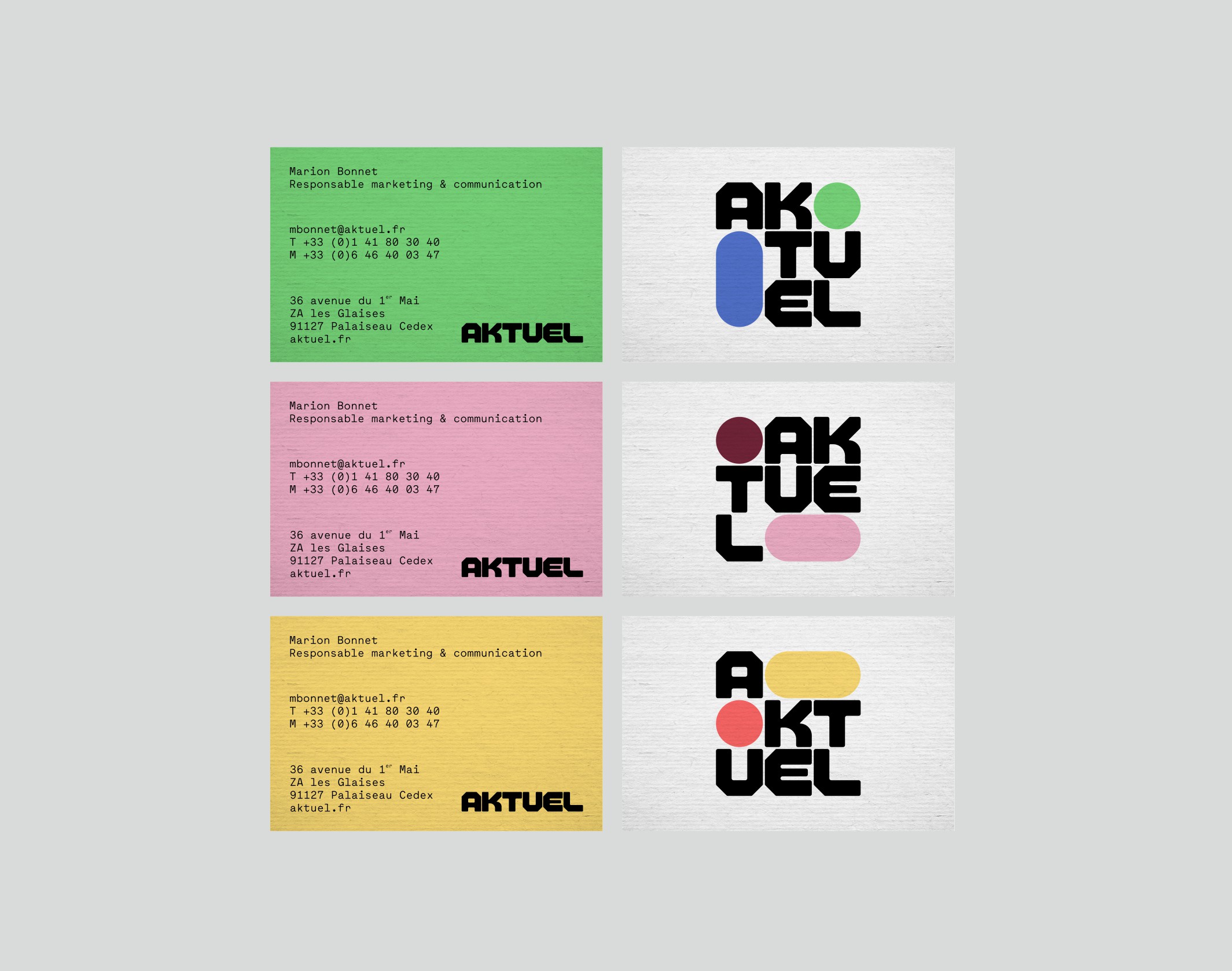
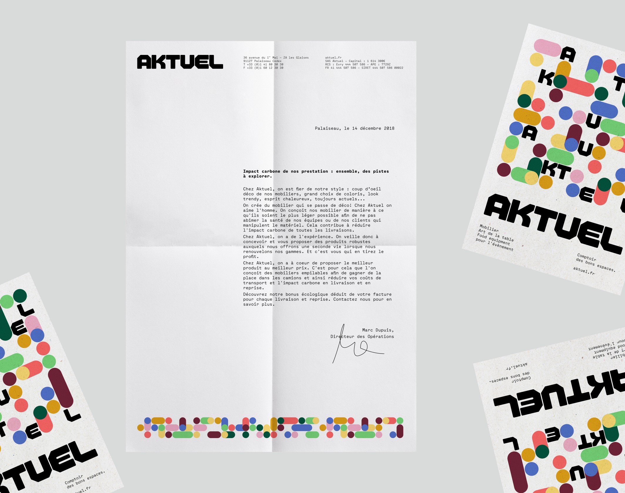
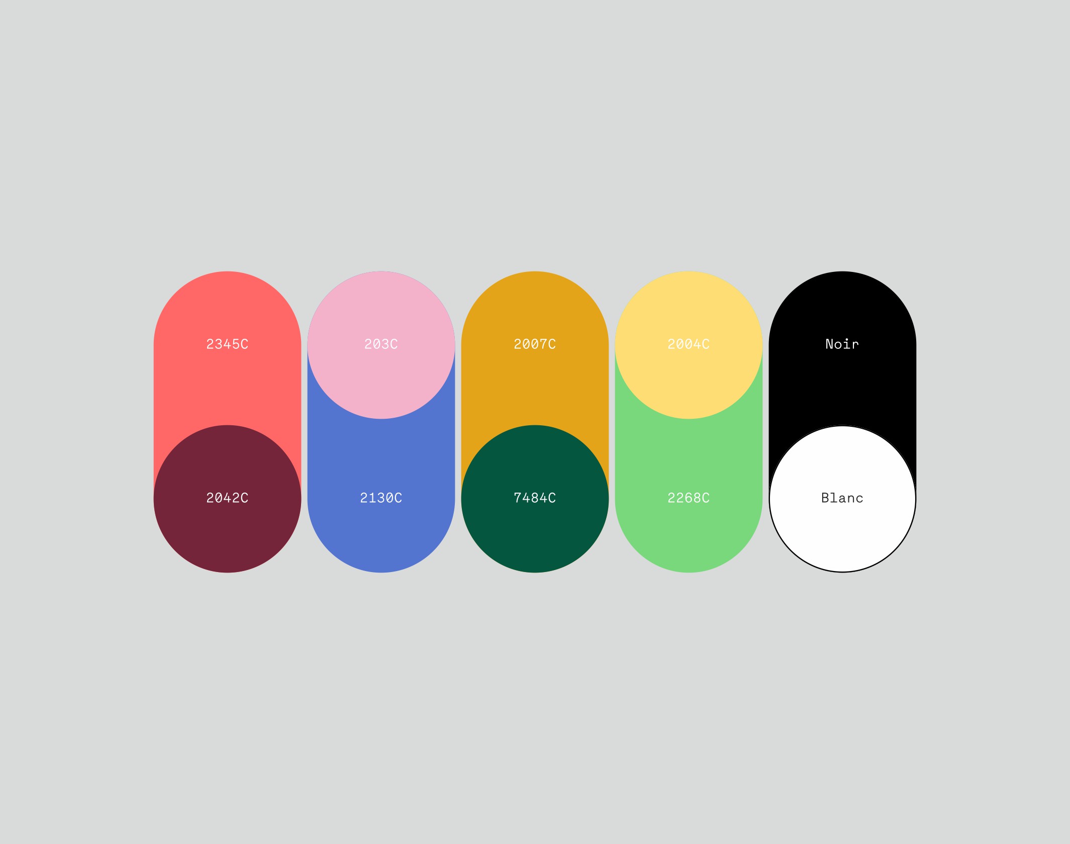
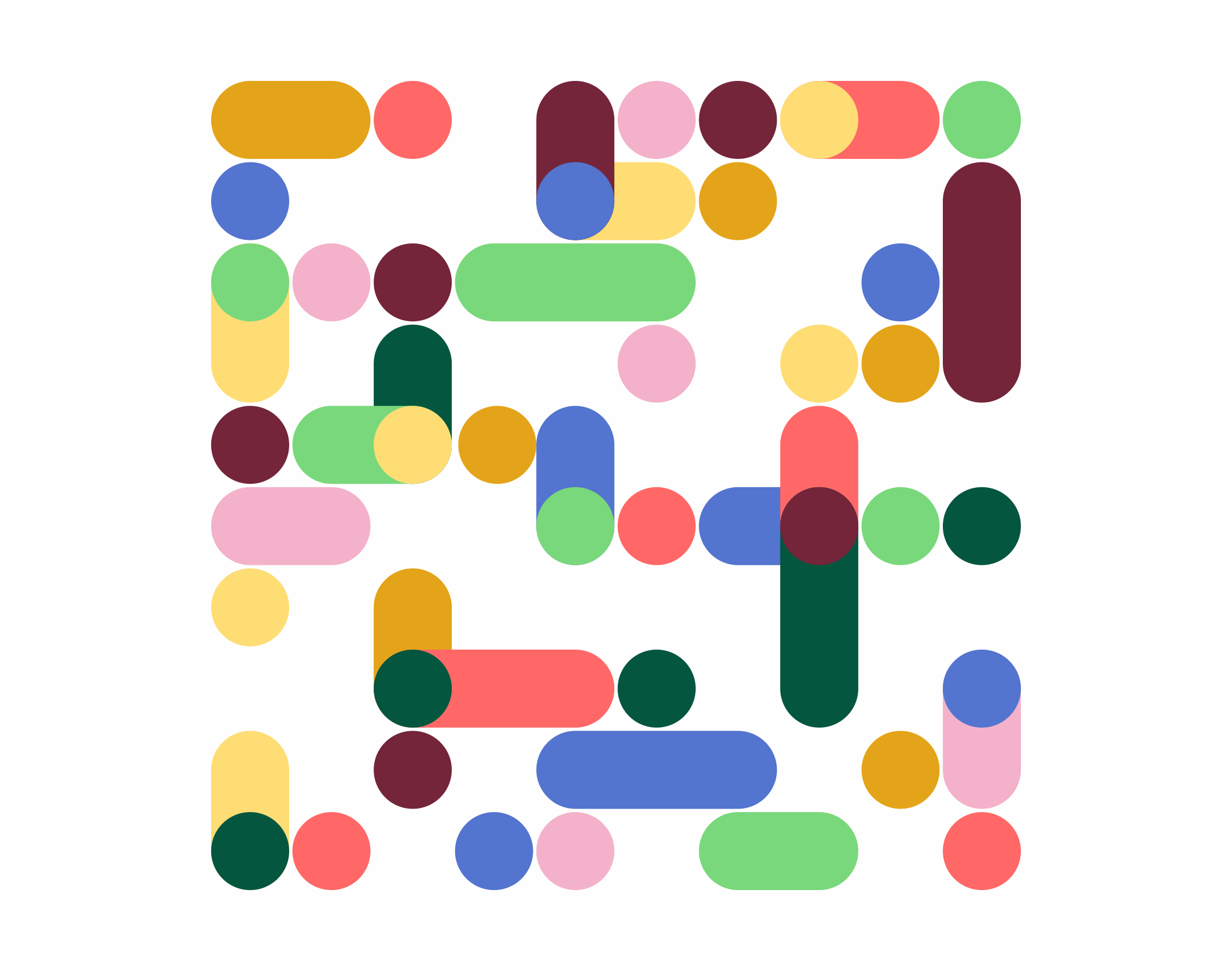
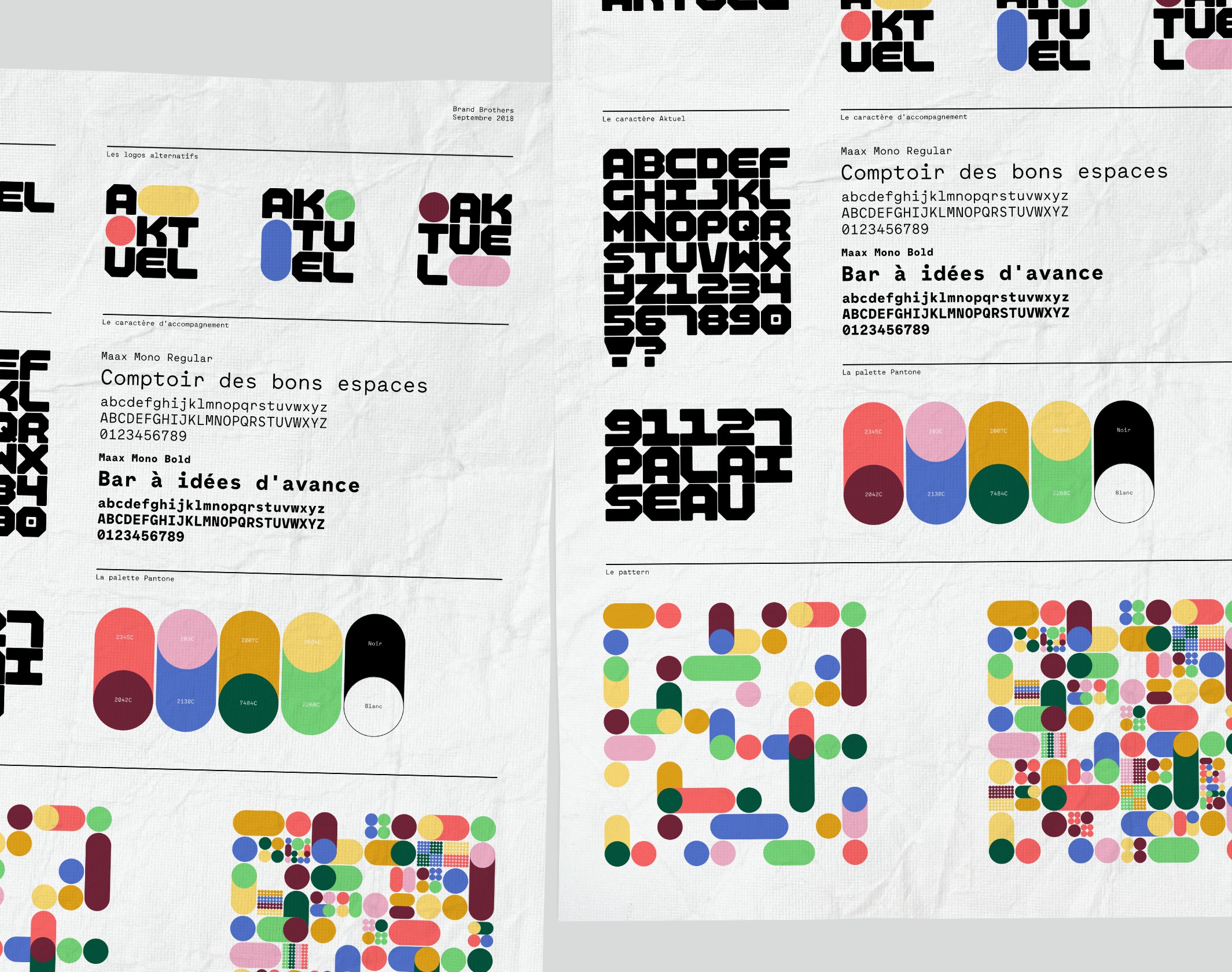
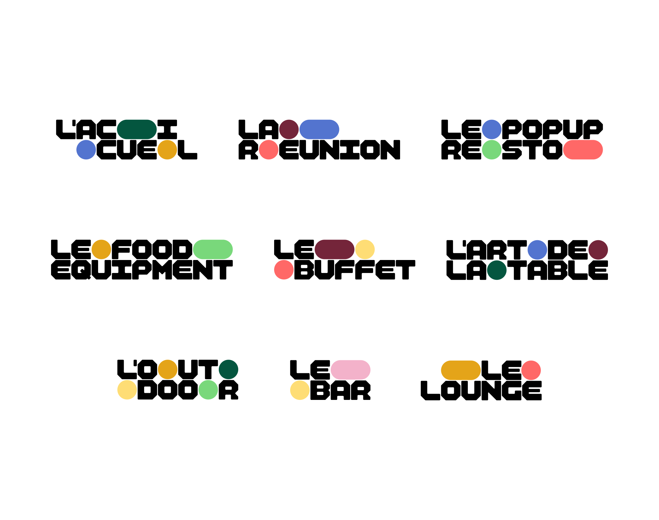
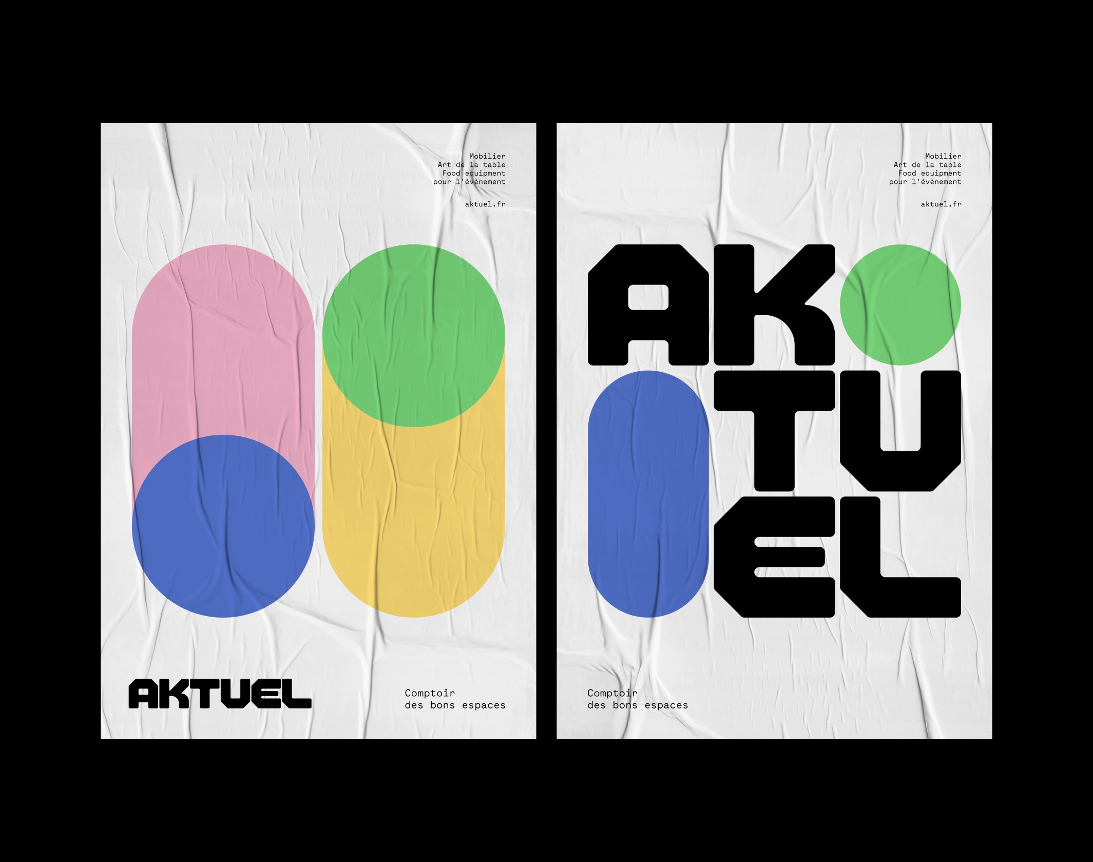
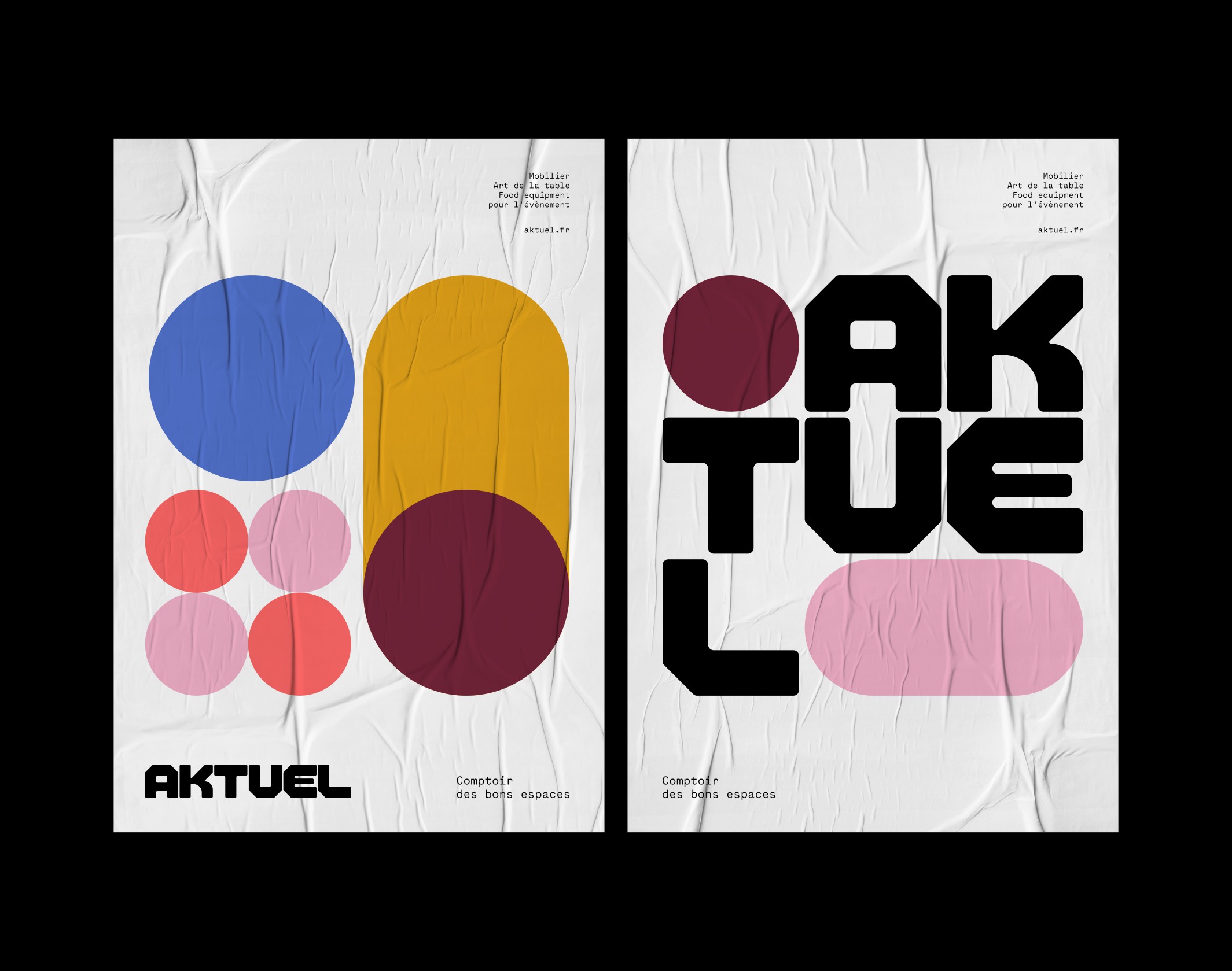
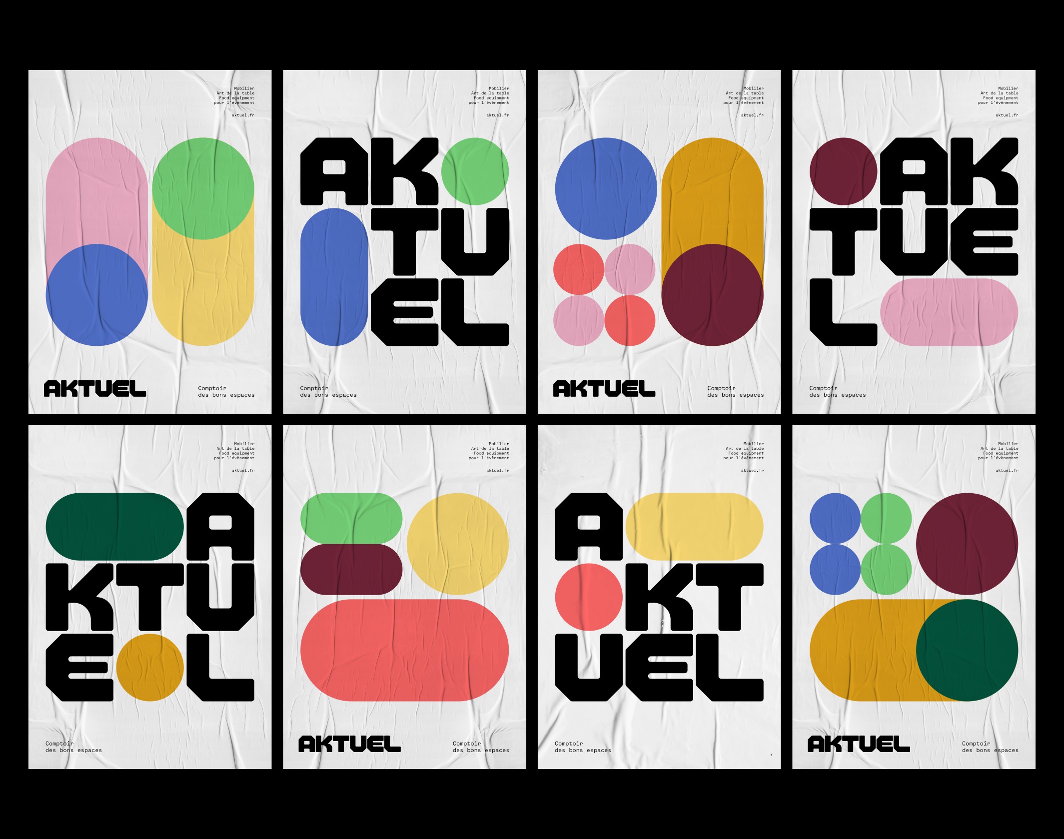
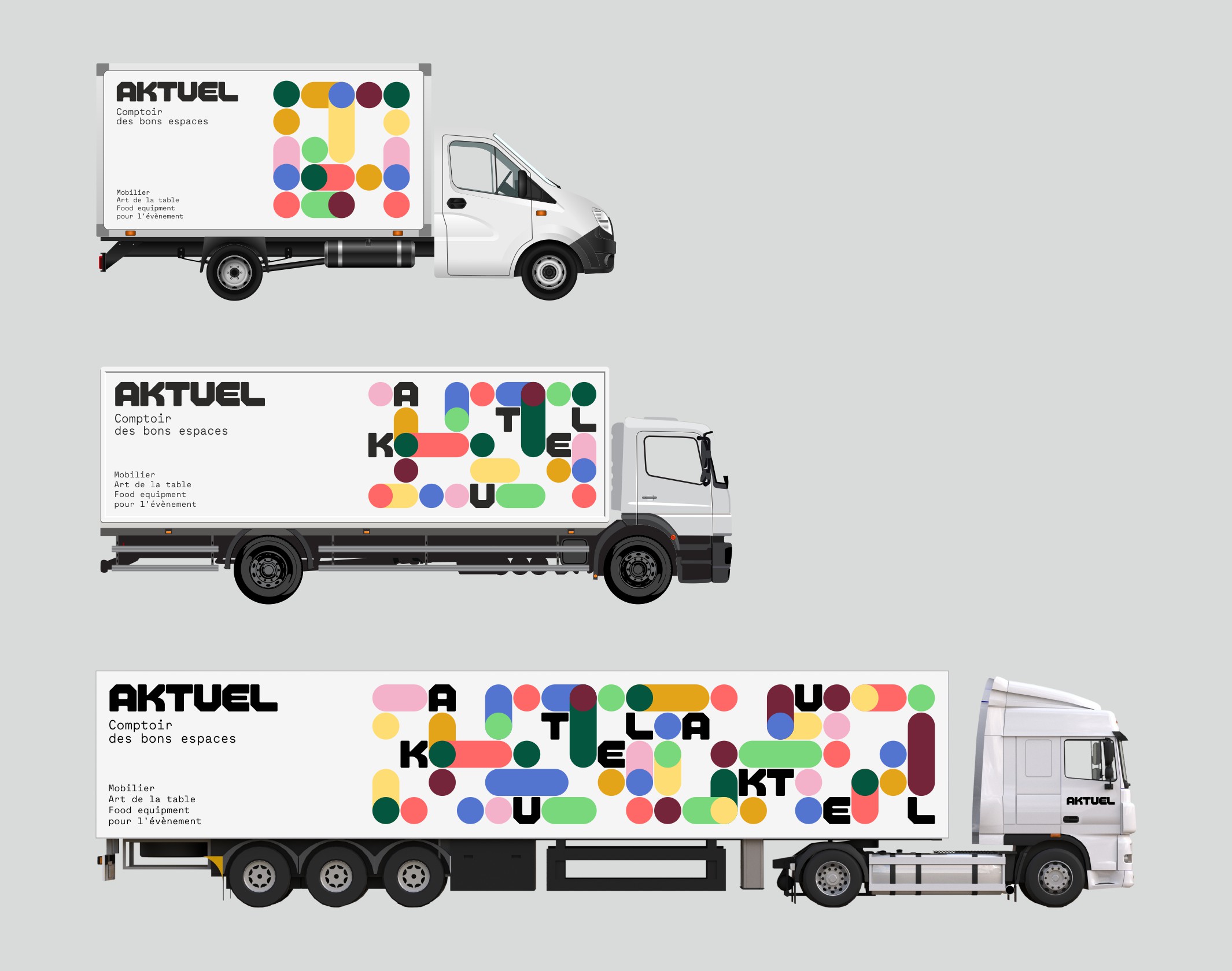
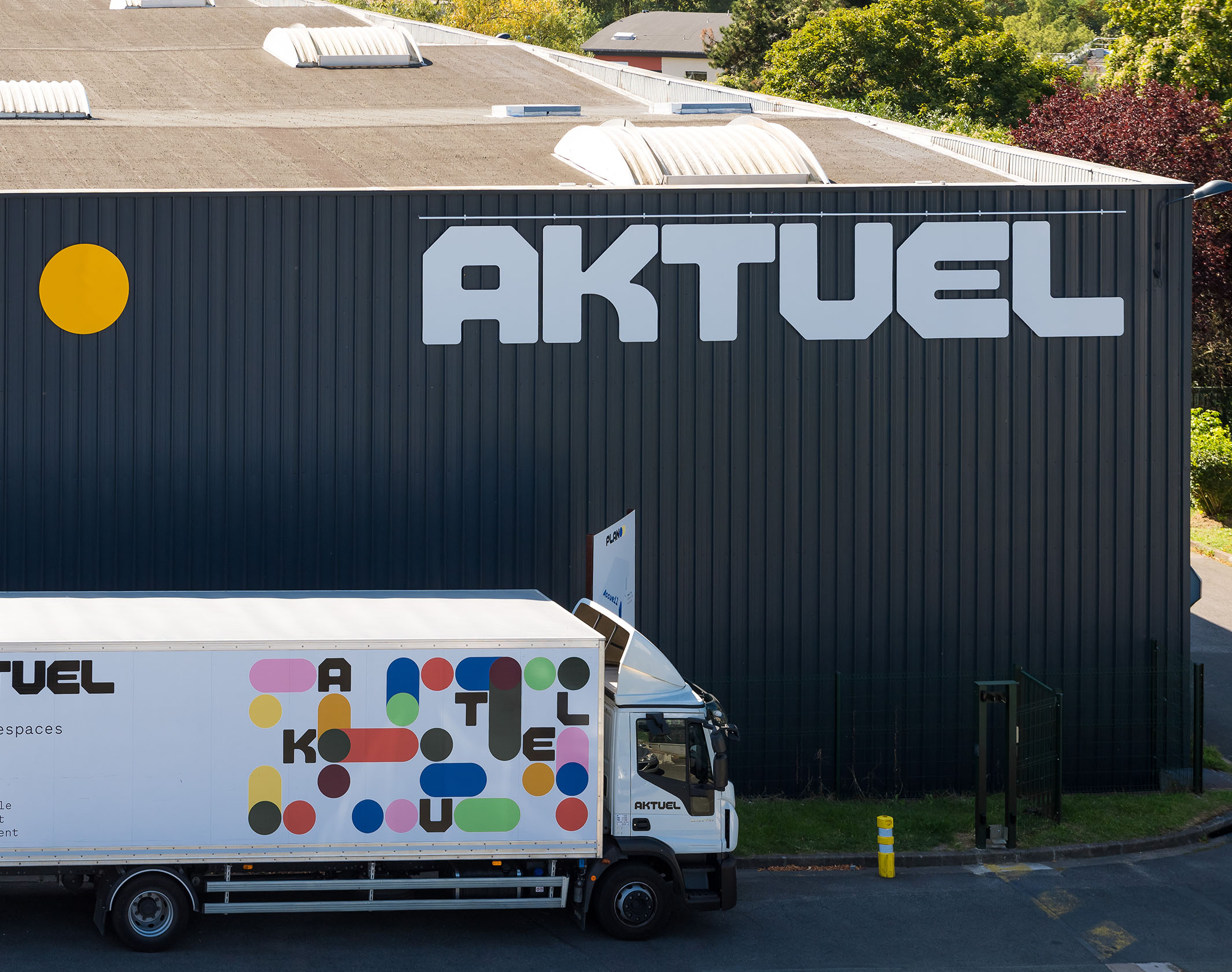
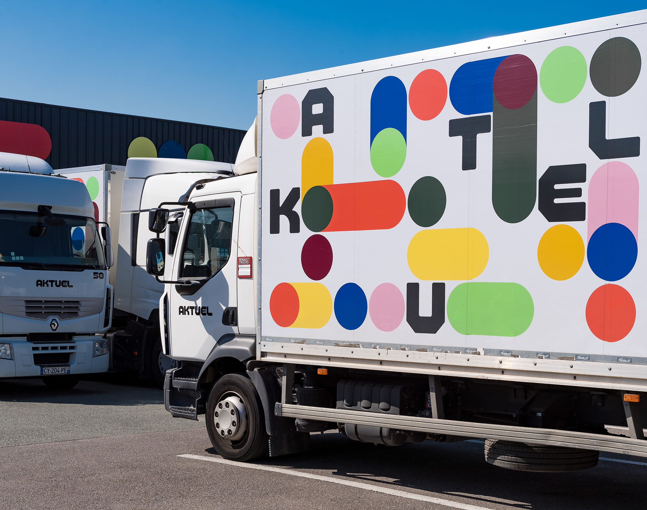
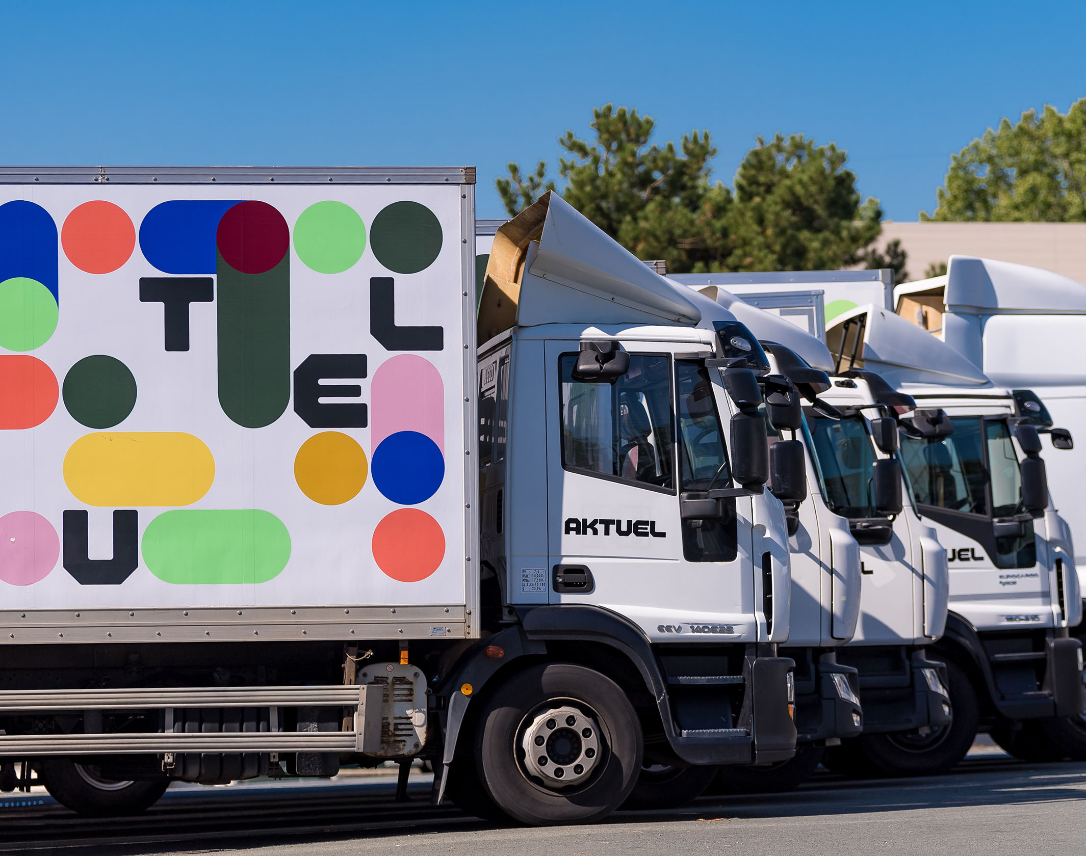
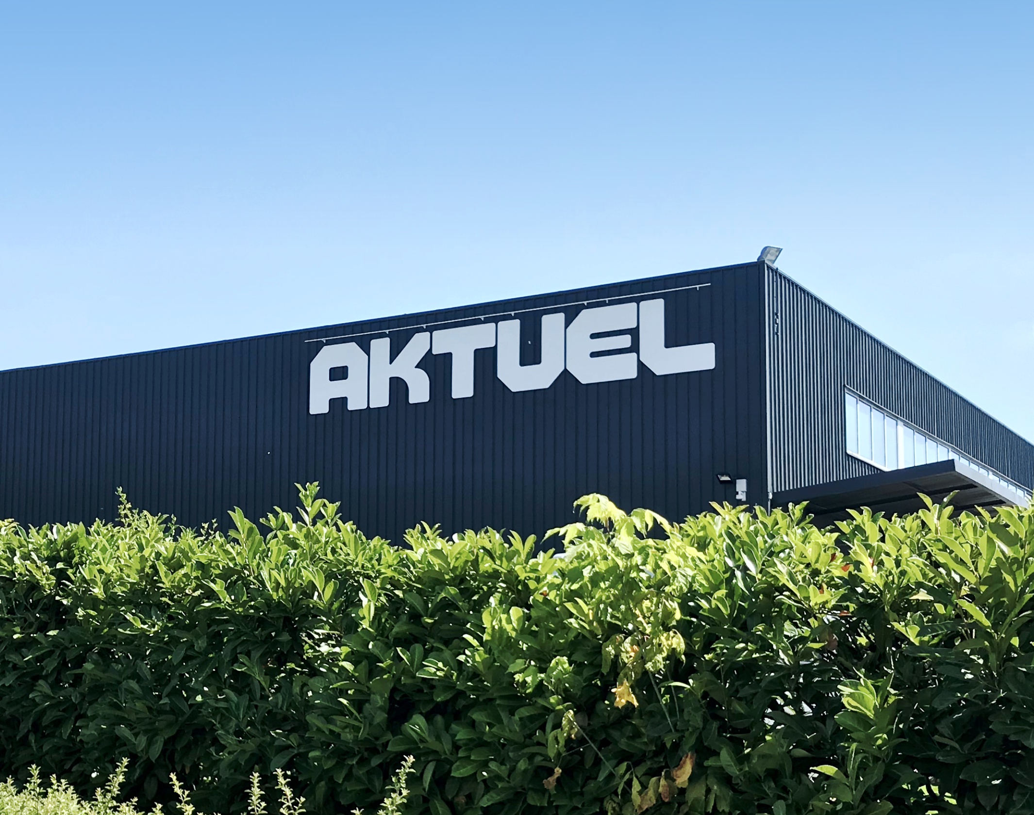
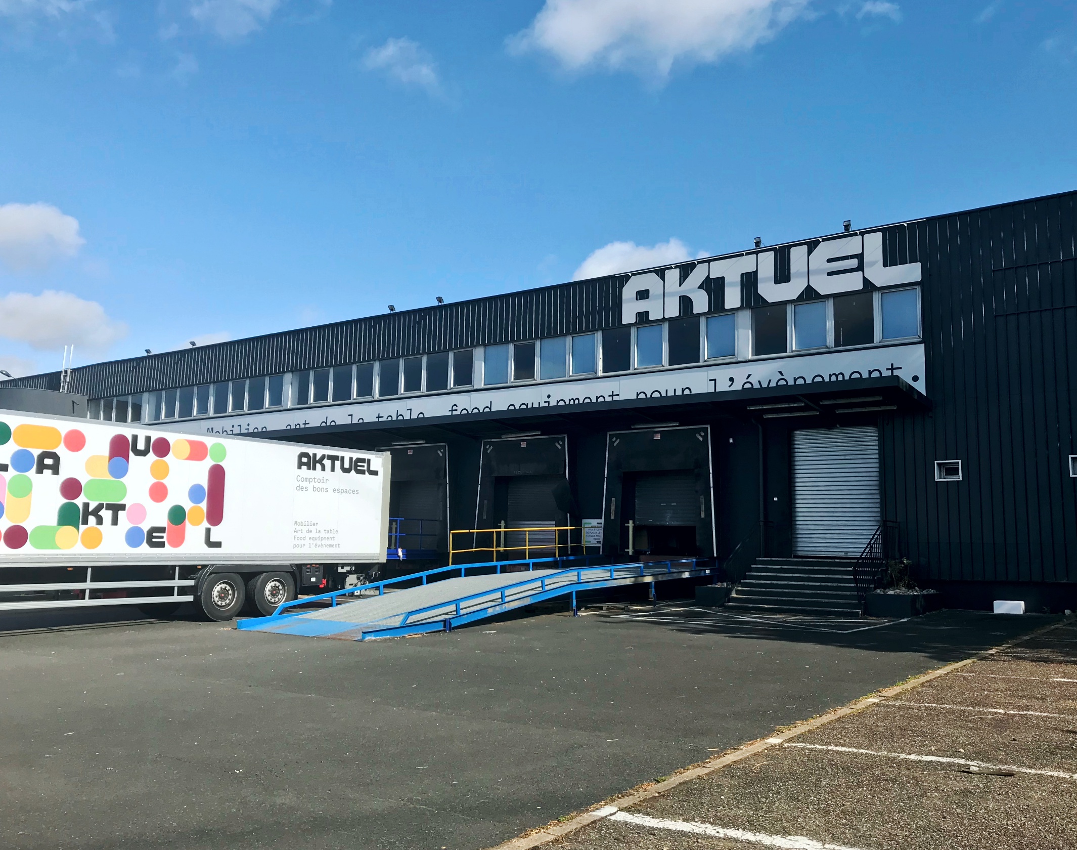
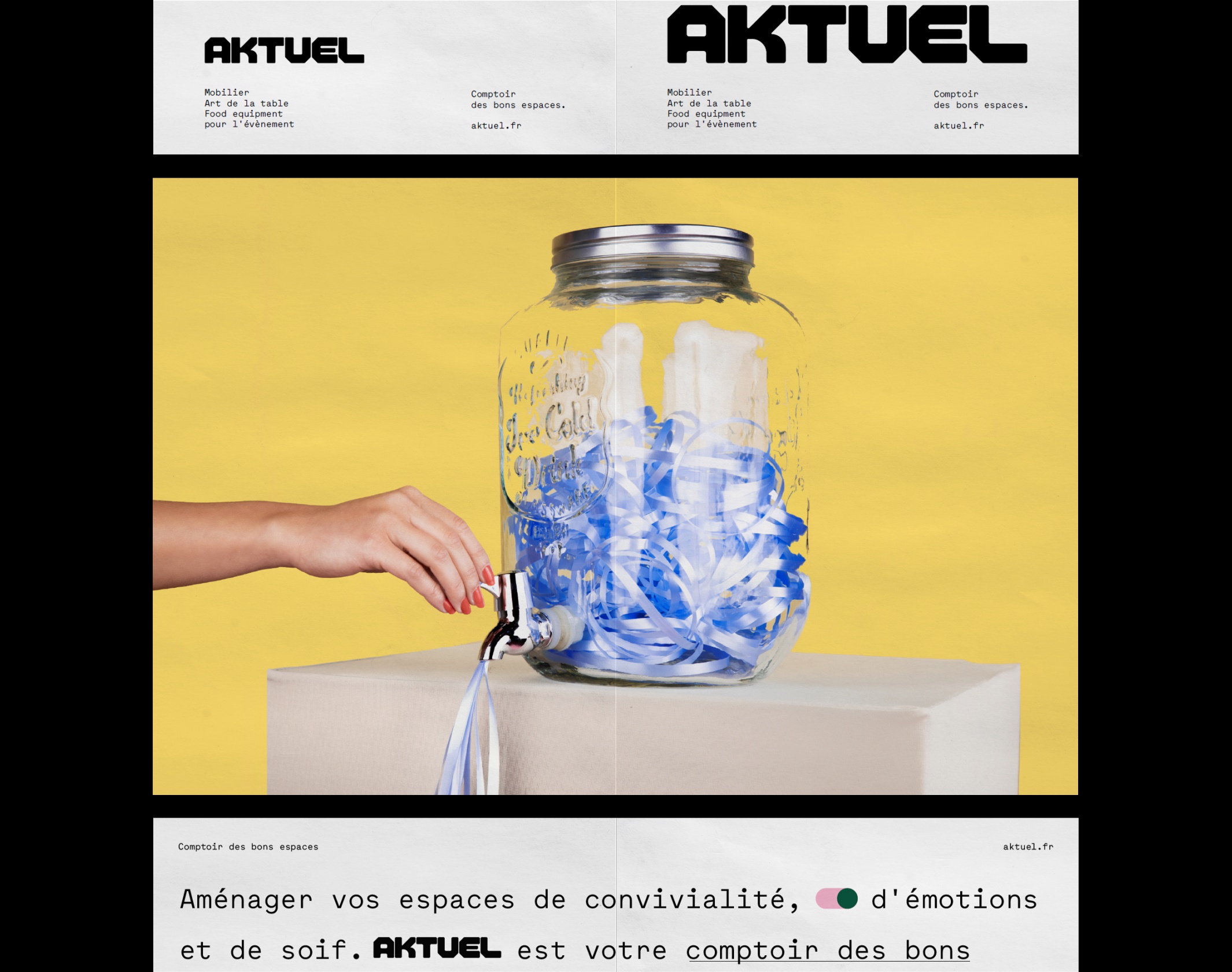
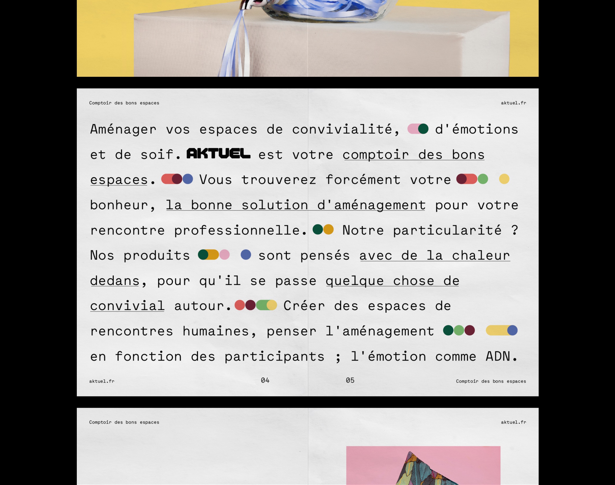
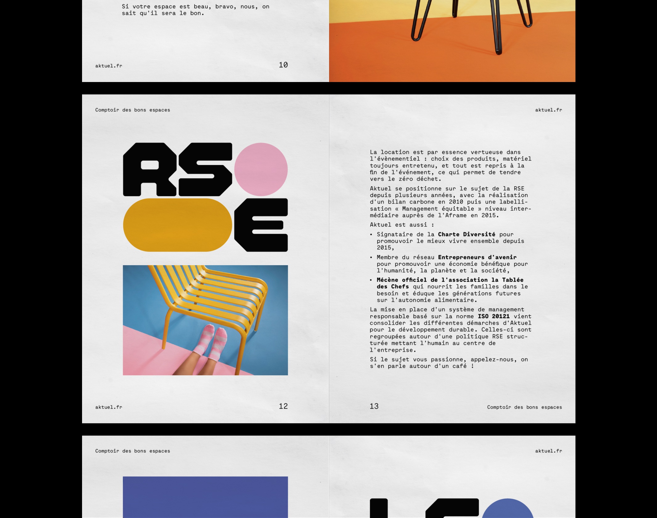
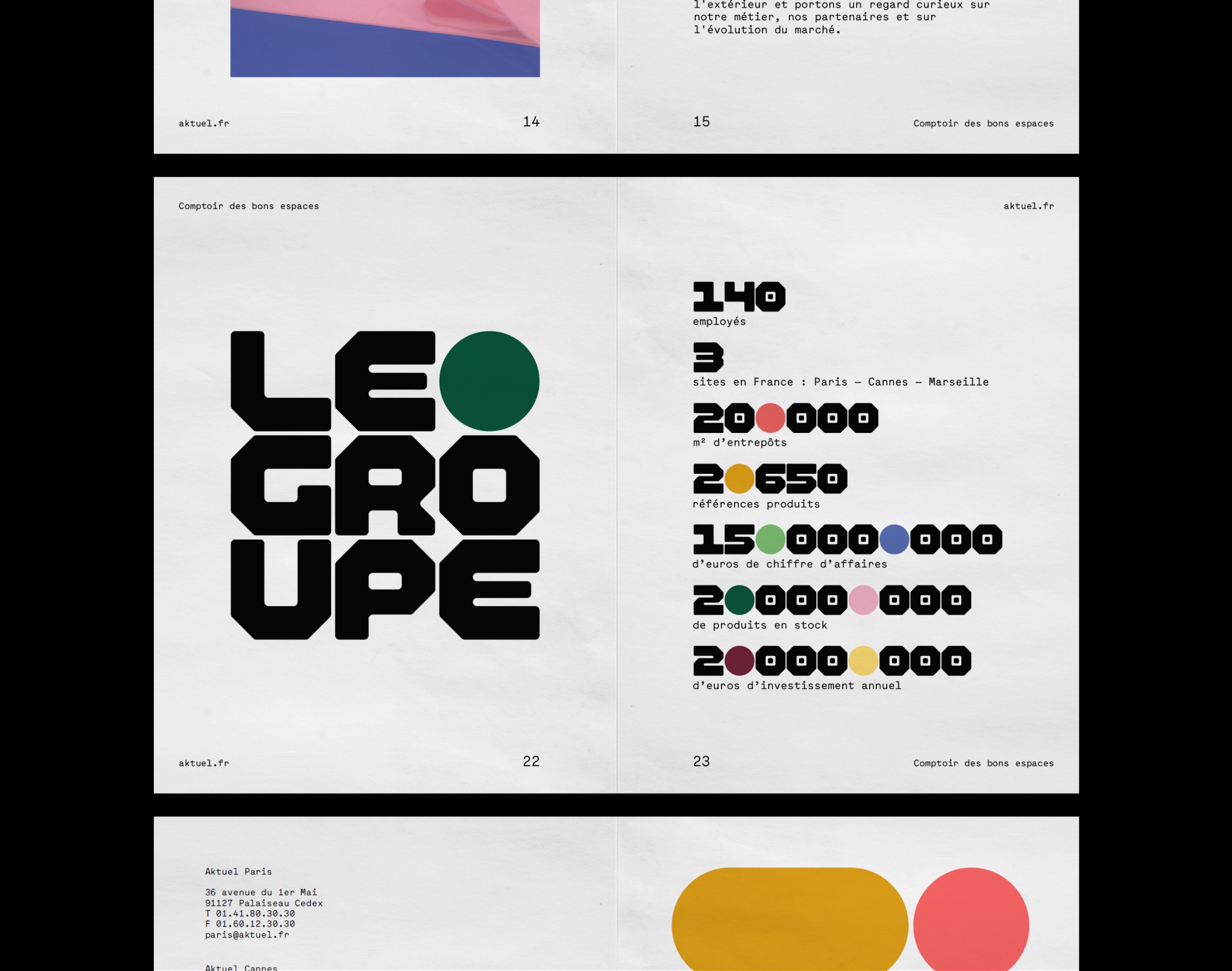
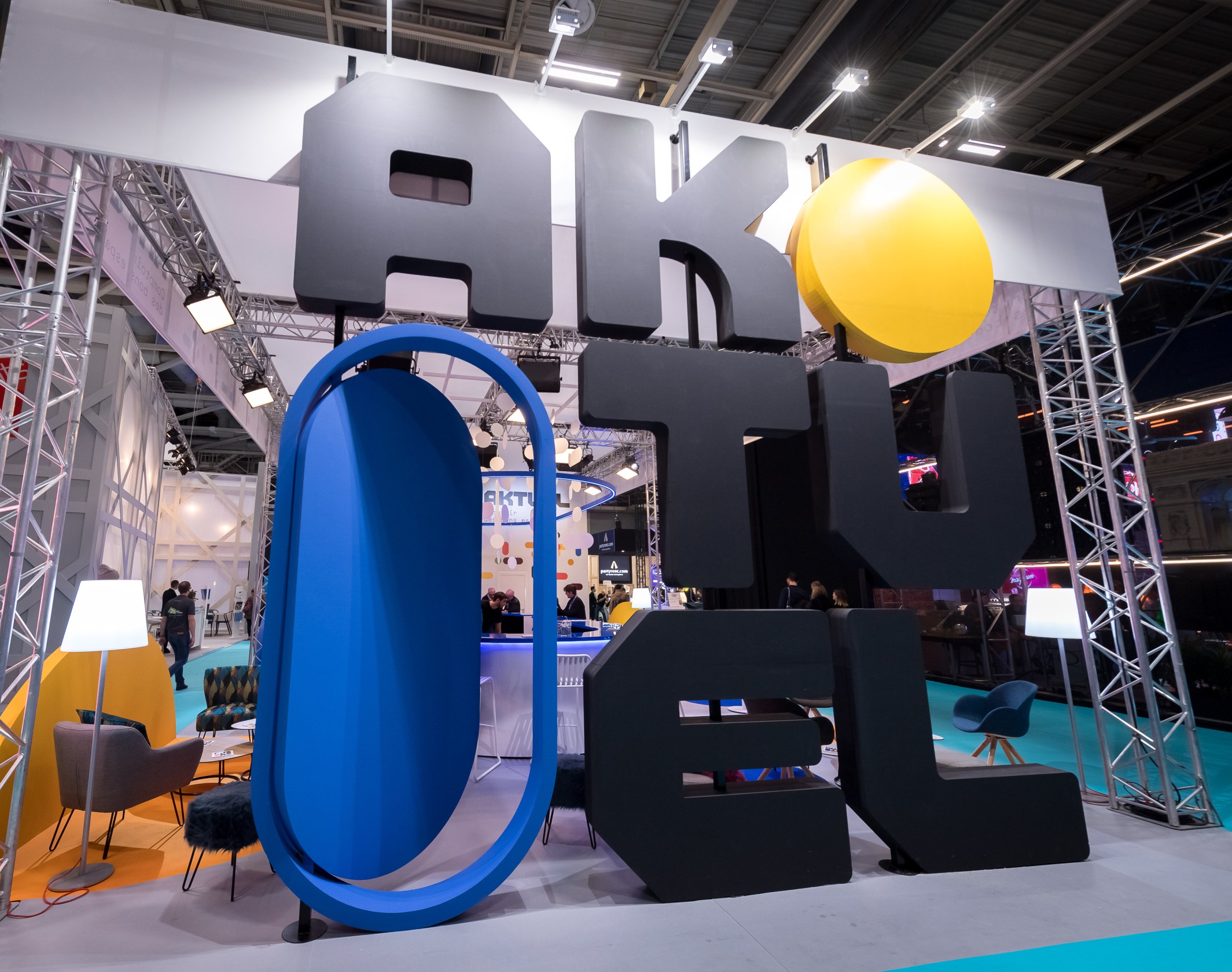
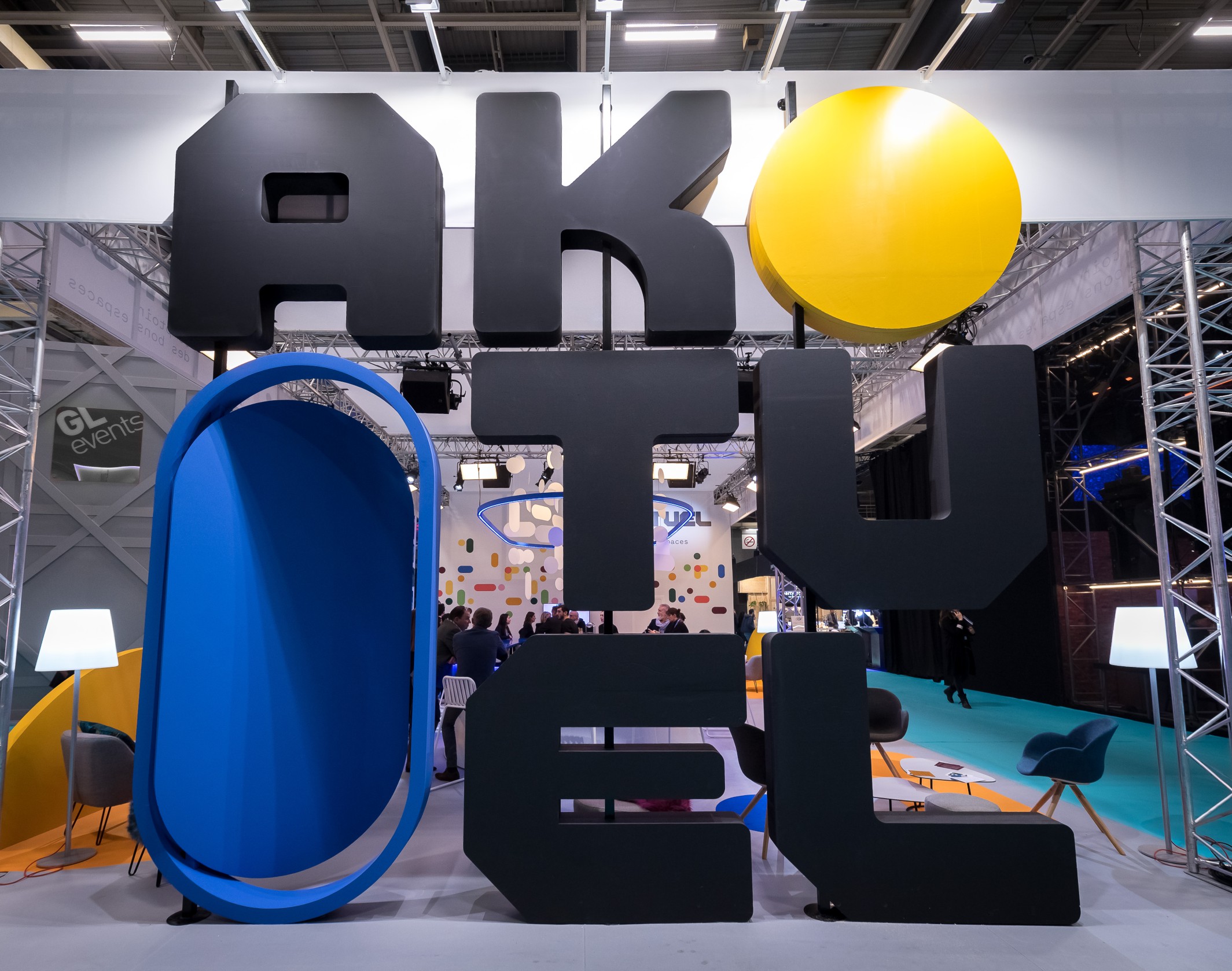
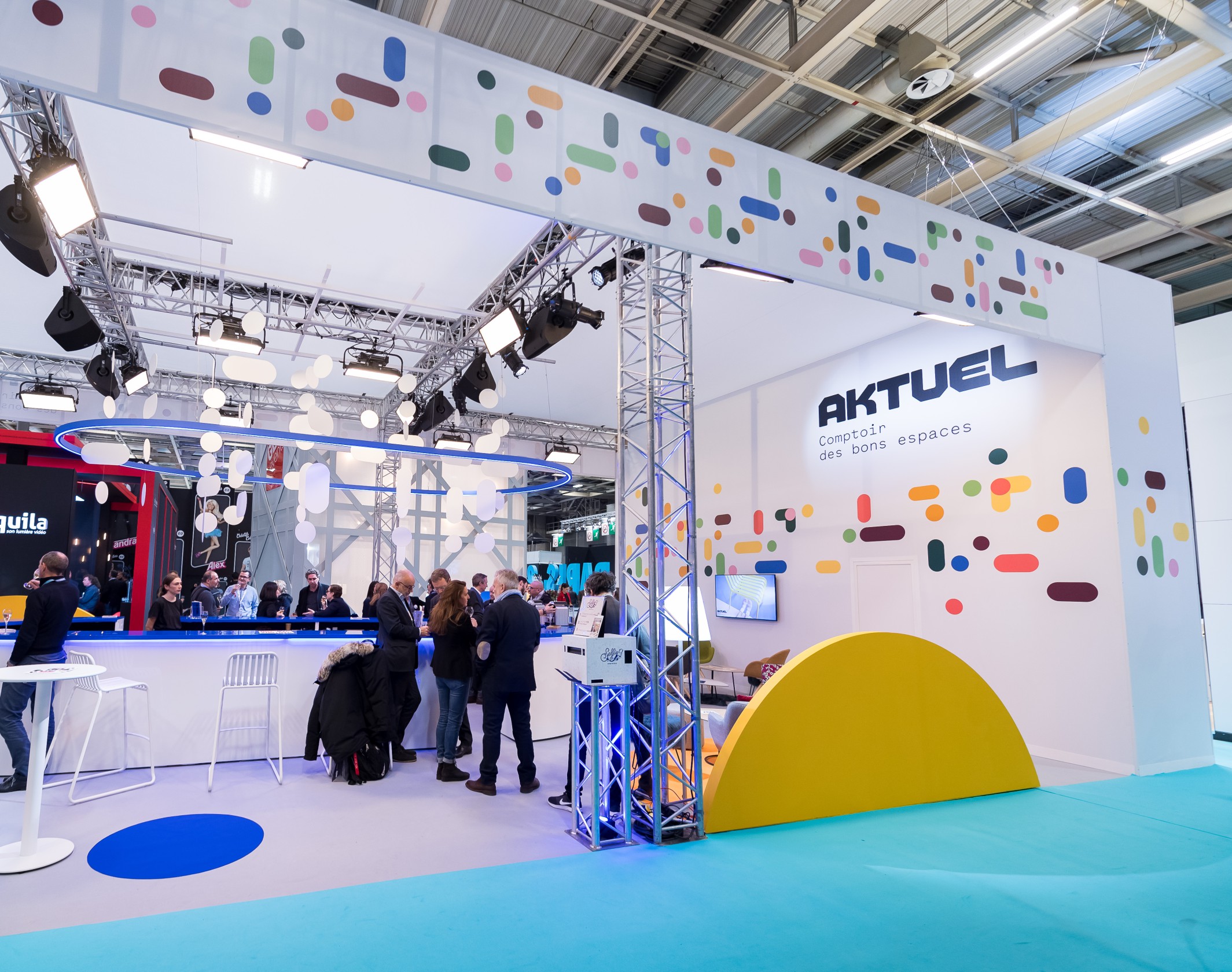
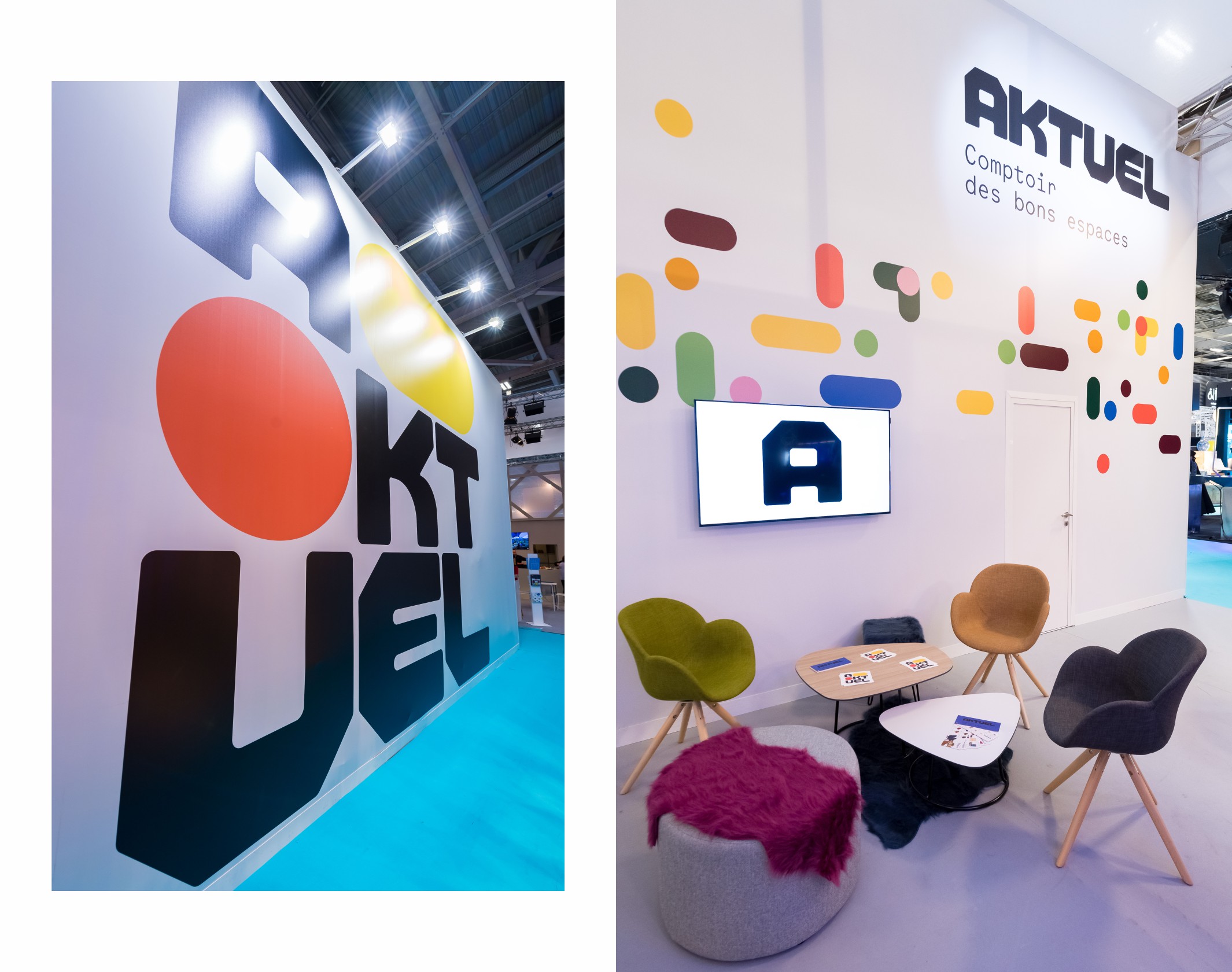
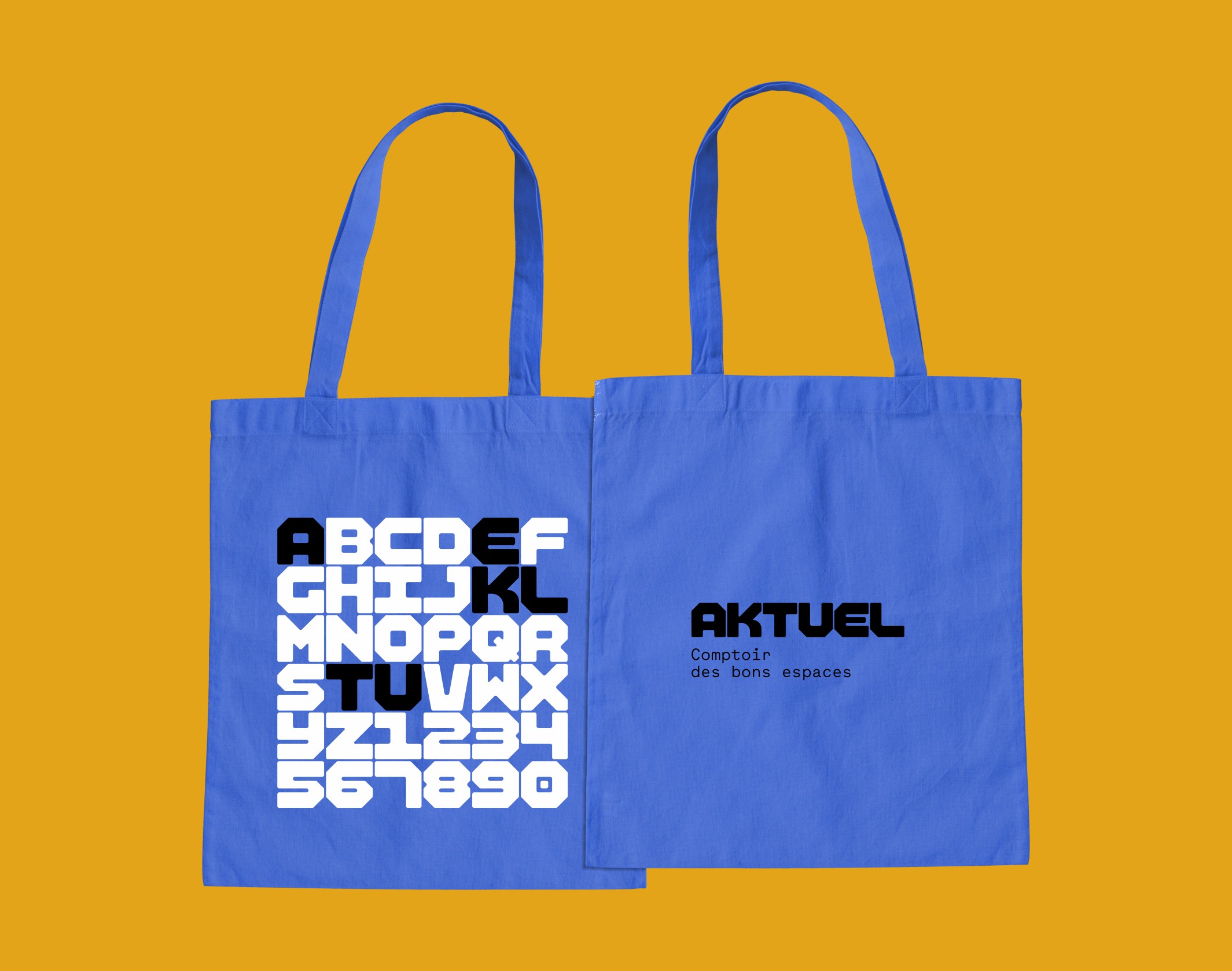
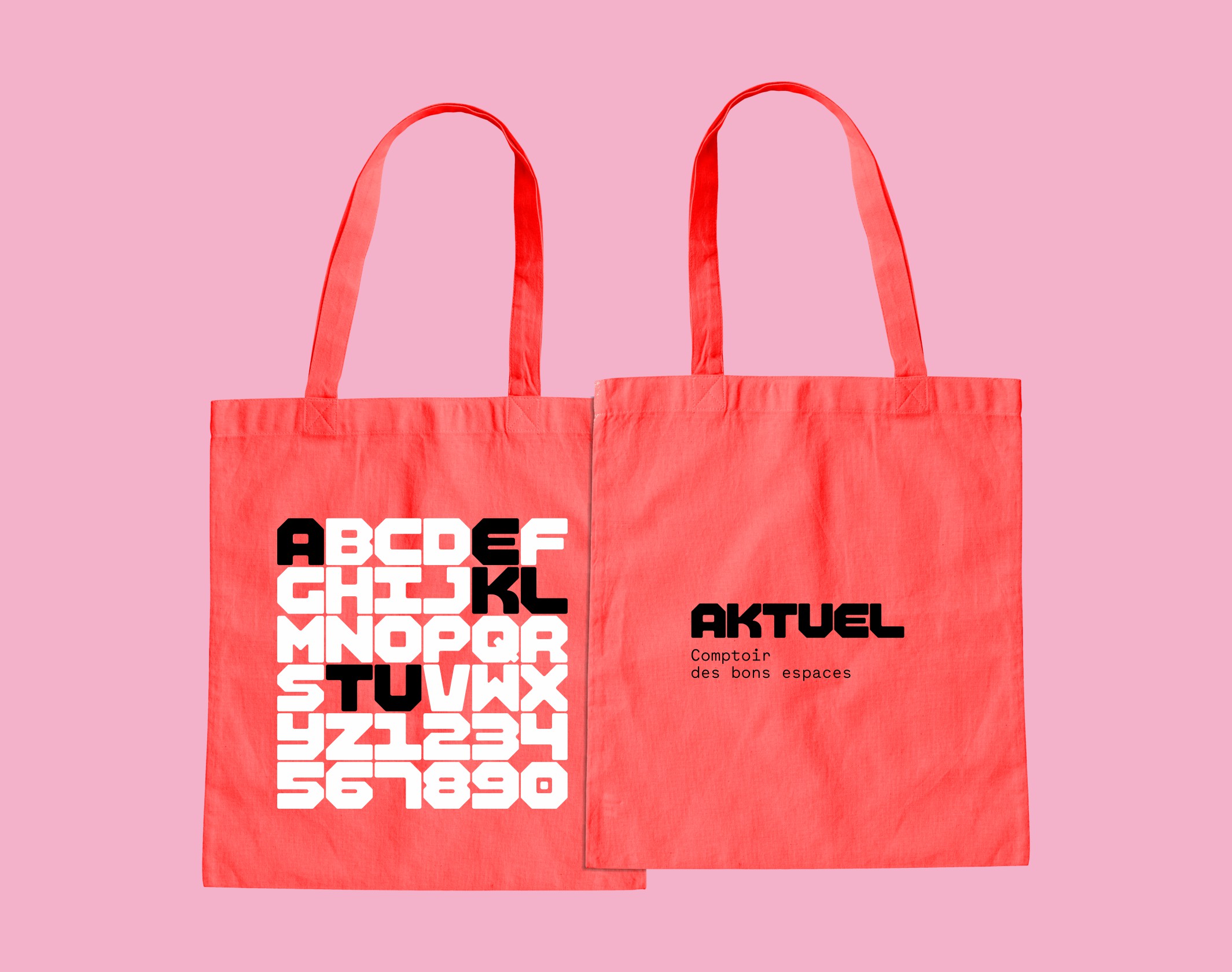
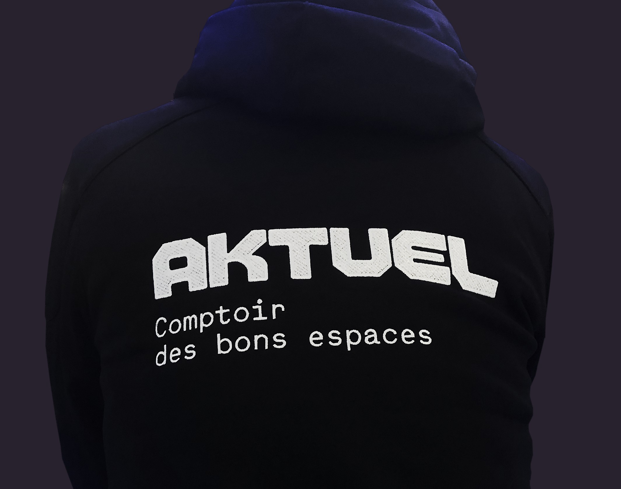
Our design work revolved around two ideas: to speak to the historic profession of space planner, while developing the new strategic vision established during the positioning work. Three major elements make up the graphic identity: a grid, a dedicated typography and a set of shapes. The new logo, a typogram designed for the brand, is solid and stable, with a complete new titling font that forms the typographic backbone of the new branding. A colorful pattern, infinitely variable, is grafted onto this typographic base.
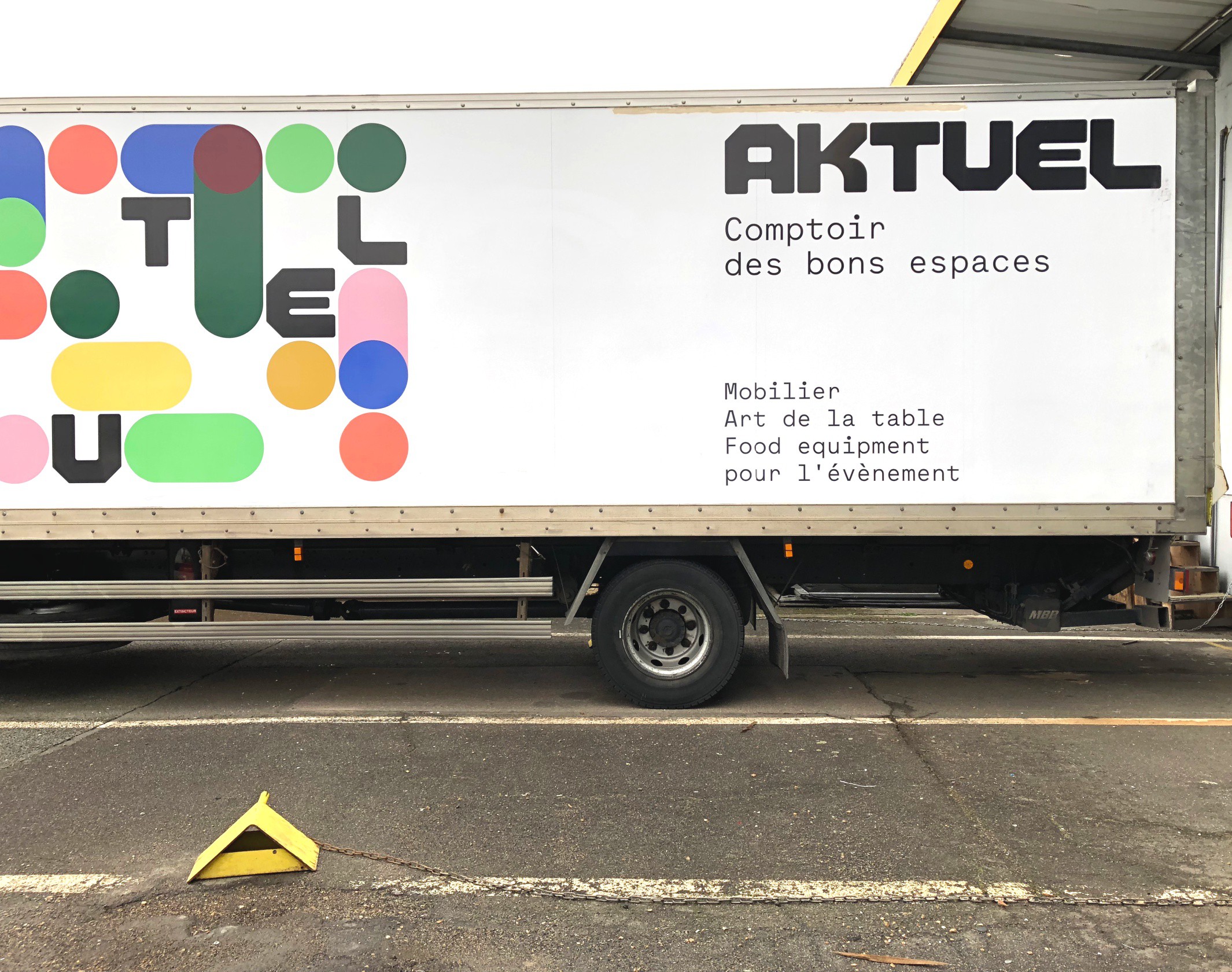
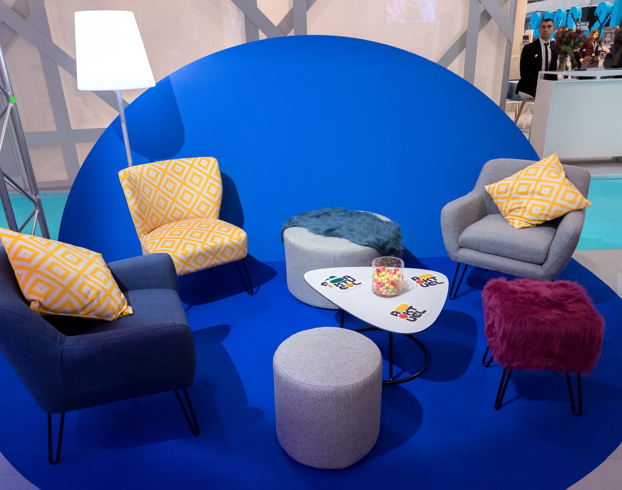
From stationery to merchandising, from a fleet of trucks to the application of the new identity on the brand’s stand at Heavent 2018, where the new branding was inaugurated, we developed a rich, flexible system that encapsulates both rigor and empathy, and sets a distinctive style in the world of events.
Photo credits: Justine Delpy and Maki Manoukian
Publications
12
Sandu Publishing, Indie Type
Viction:ary, Palette Mini-Series 2
Brand New, Review
Behance, Best of Behance
Communication Arts, Exhibit
Abduzeedo, Daily Design Inspiration
BranD Magazine
La Réclame, Tendances graphiques
Disciplines
Brand strategy
Visual identity
Motion design
Signage
Typography
Branding
Naming / copywriting
Editorial design
Web design
