Pyla, formerly Sweelo, is a startup created around a simple observation: an employee needs several dozen application resources, software and equipment to be fully operational in his company. When they arrive and when they leave, the installations and manipulations generate financial, time and energy losses, not to mention the impacts in terms of data security. Pyla designed a solution that centralizes and automates the management of all these resources.
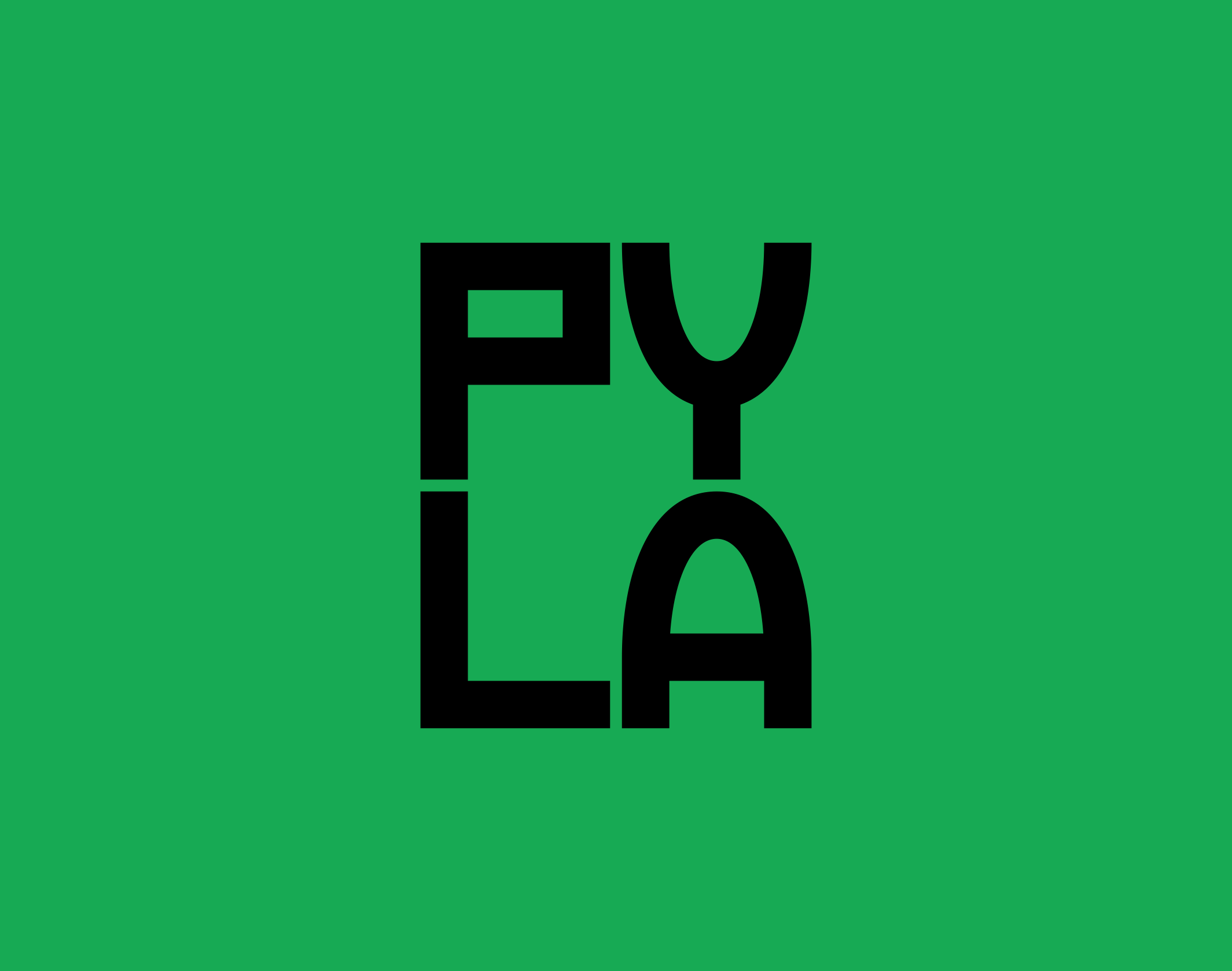
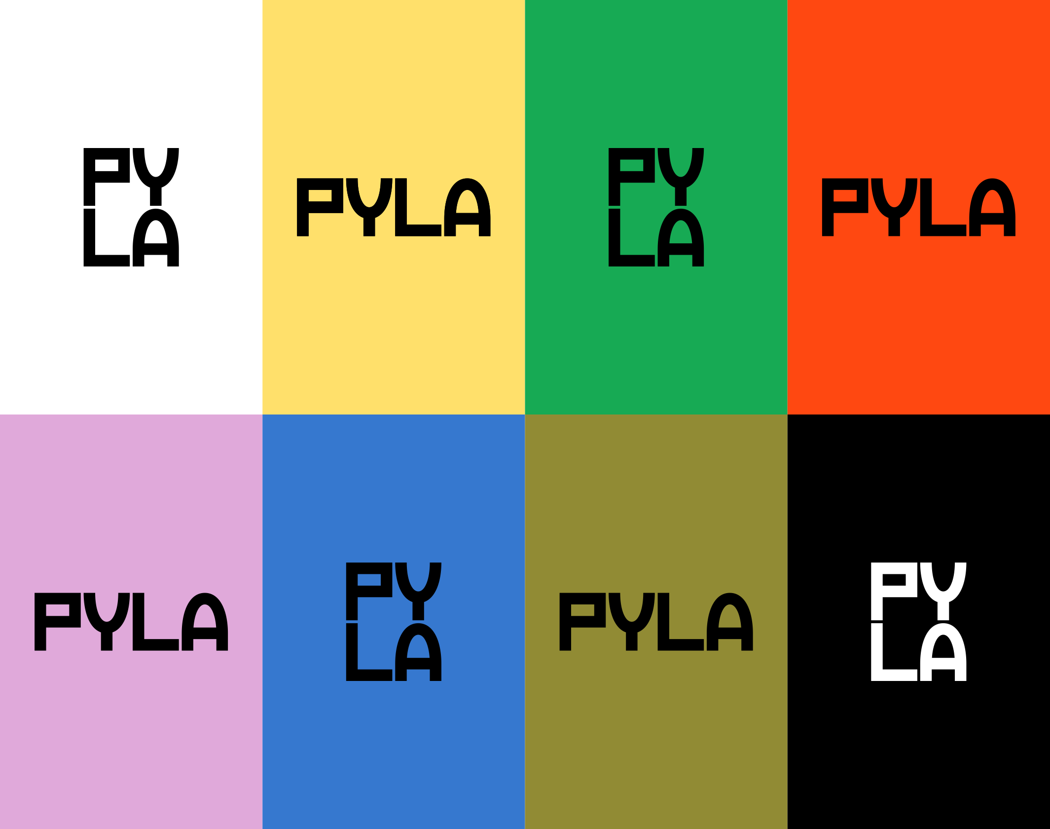
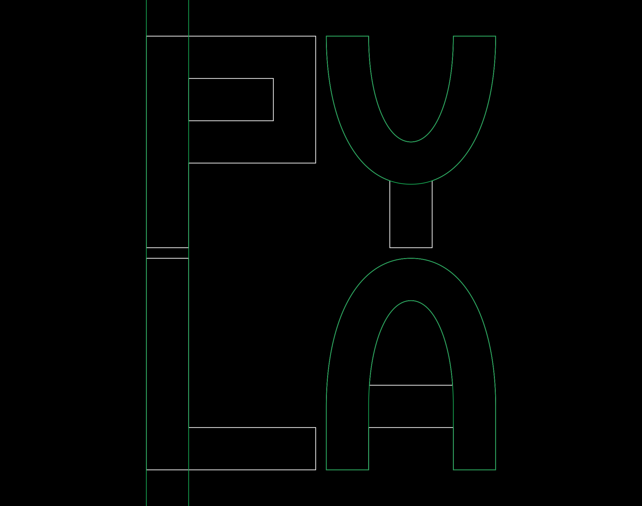
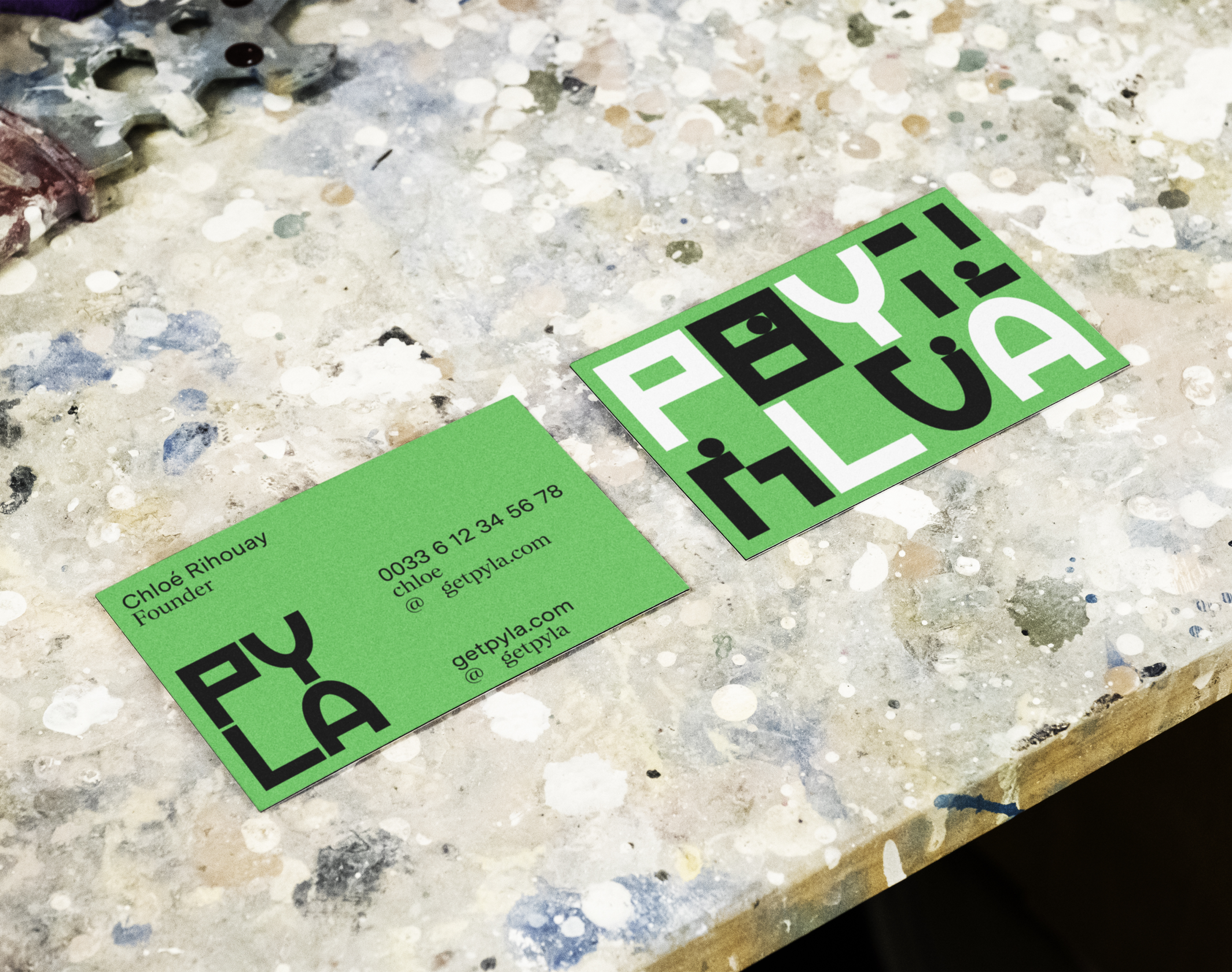
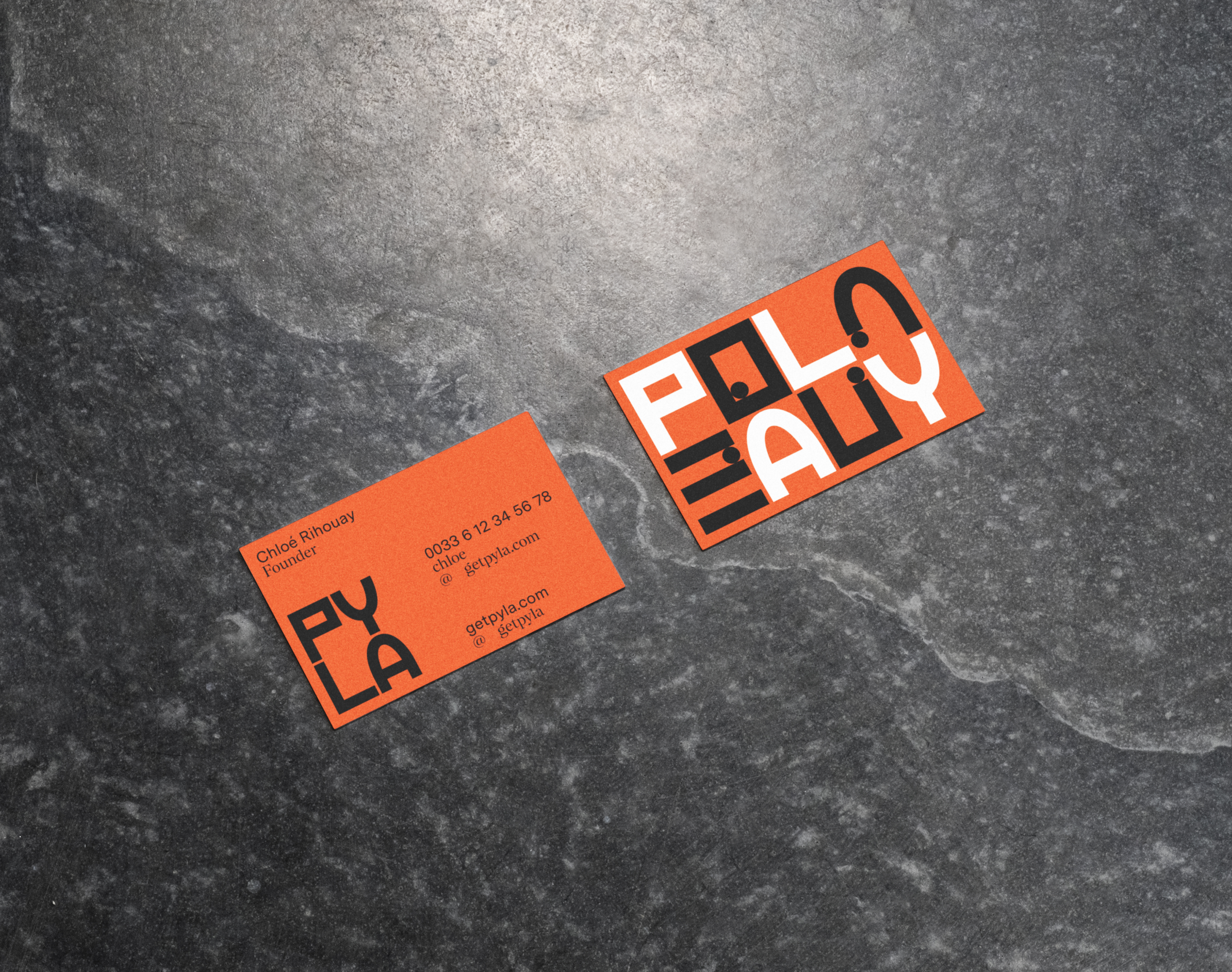
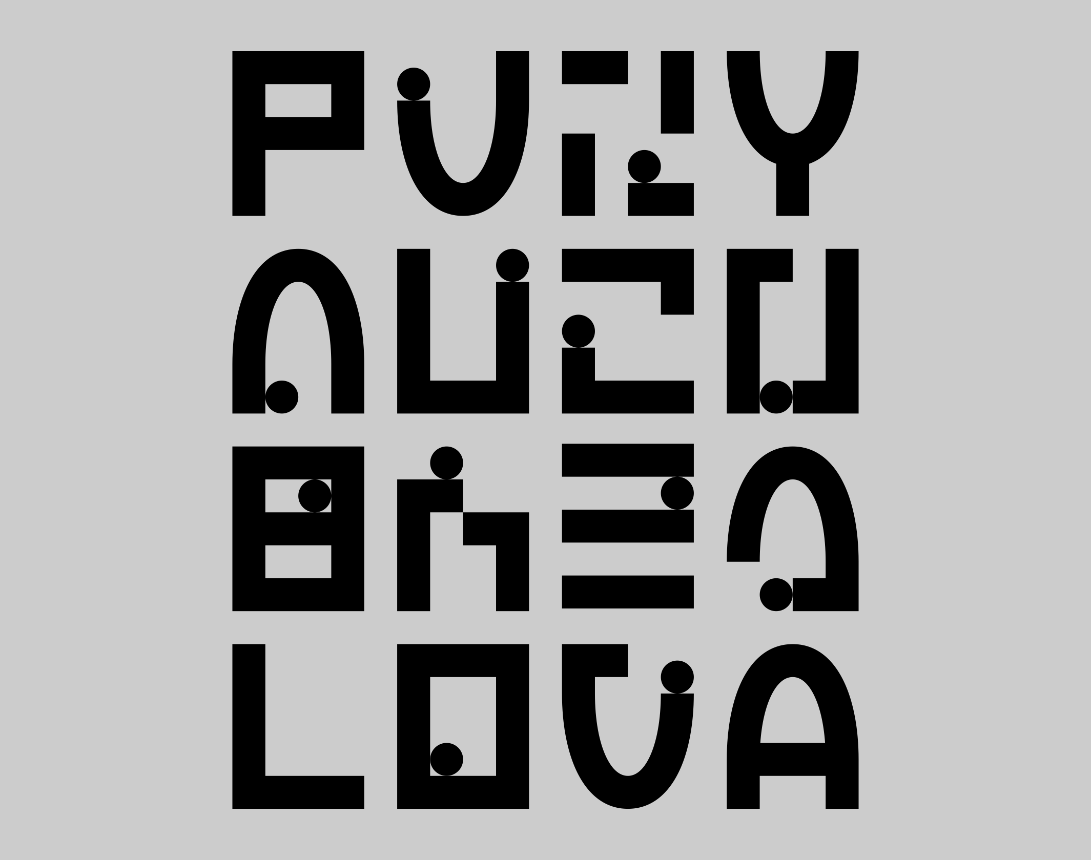
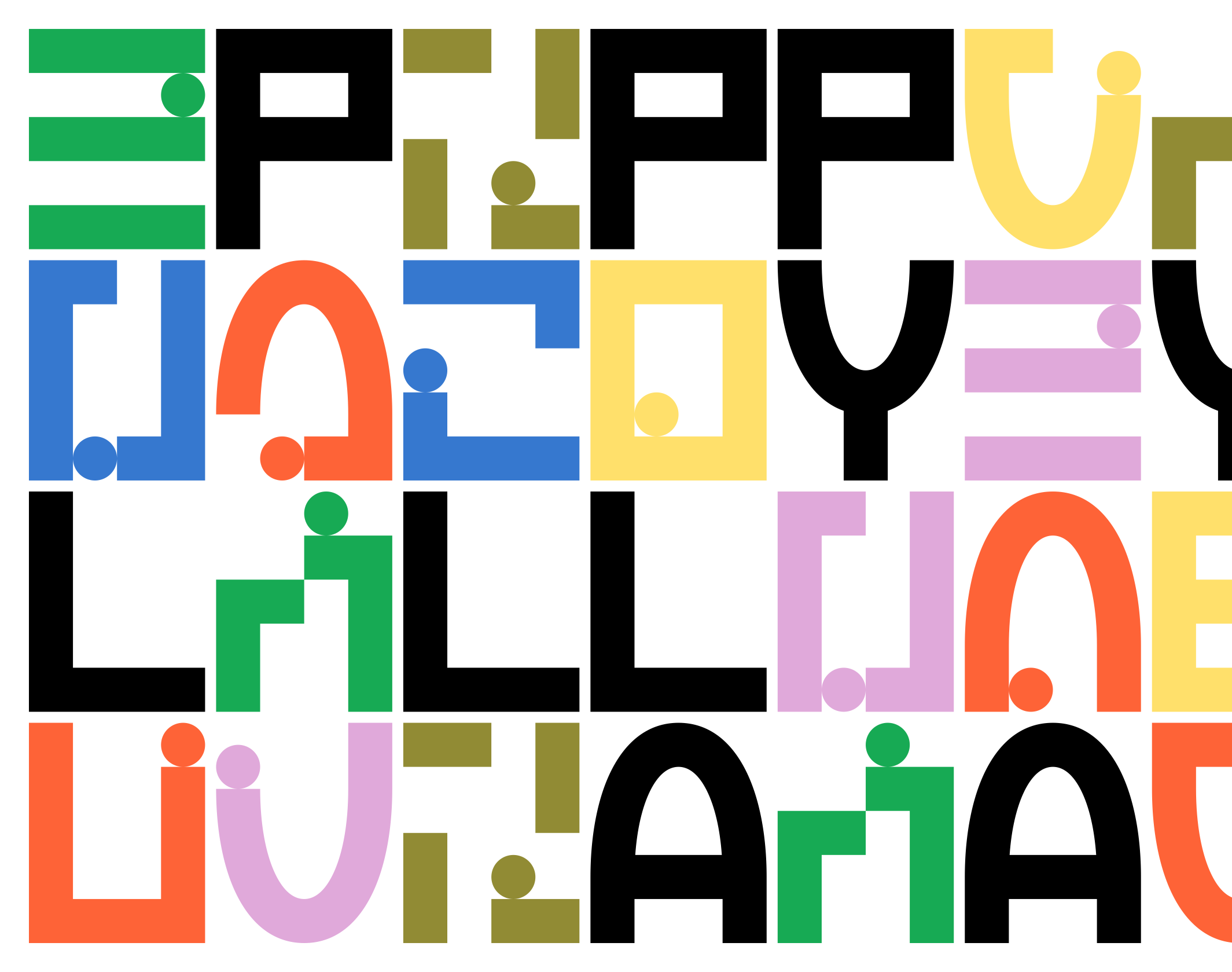
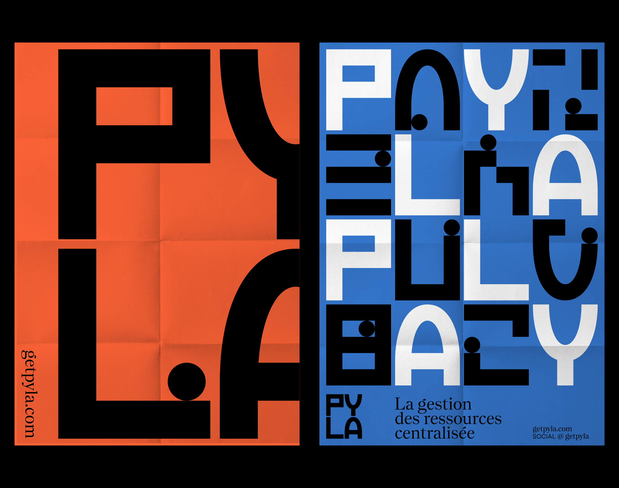
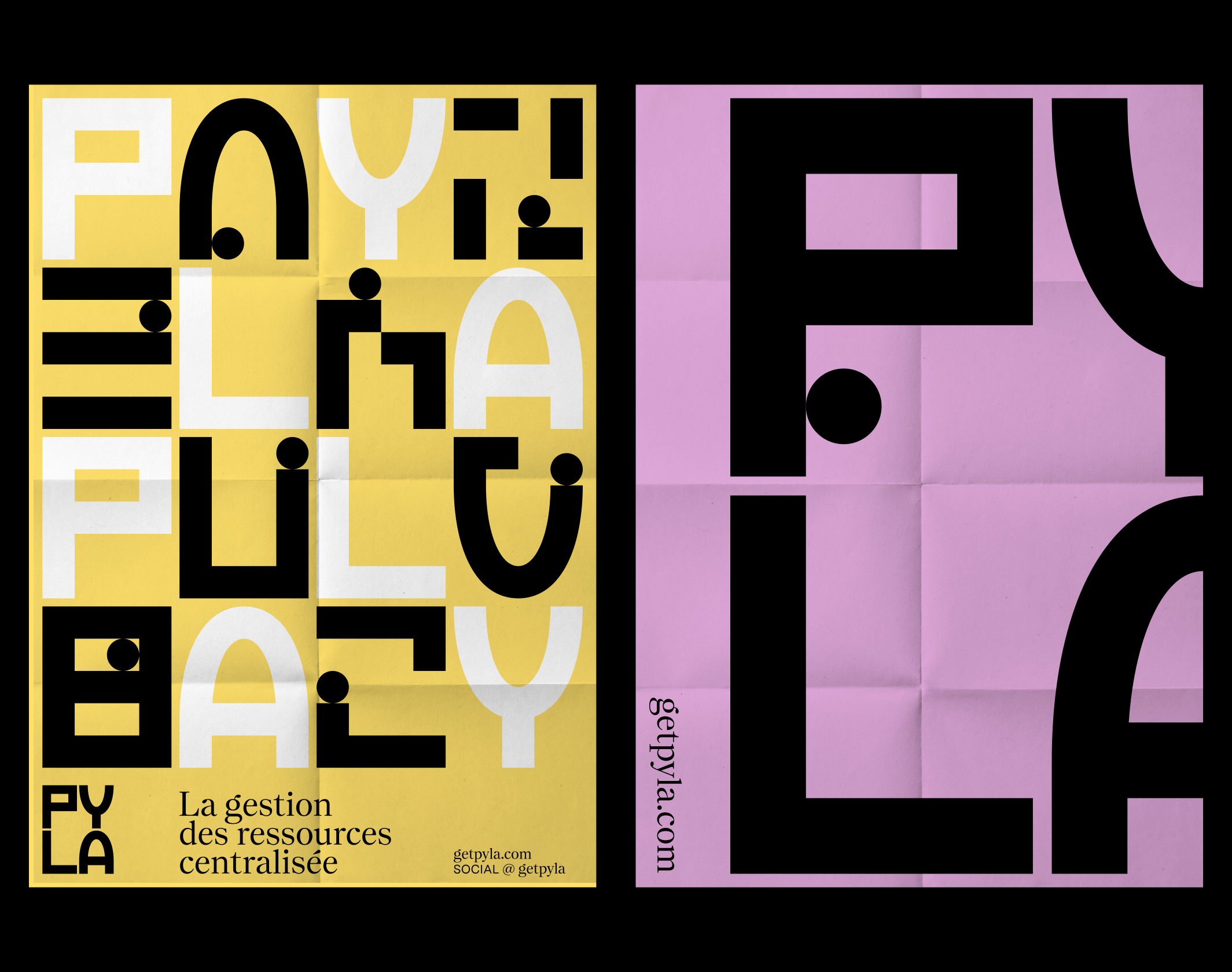
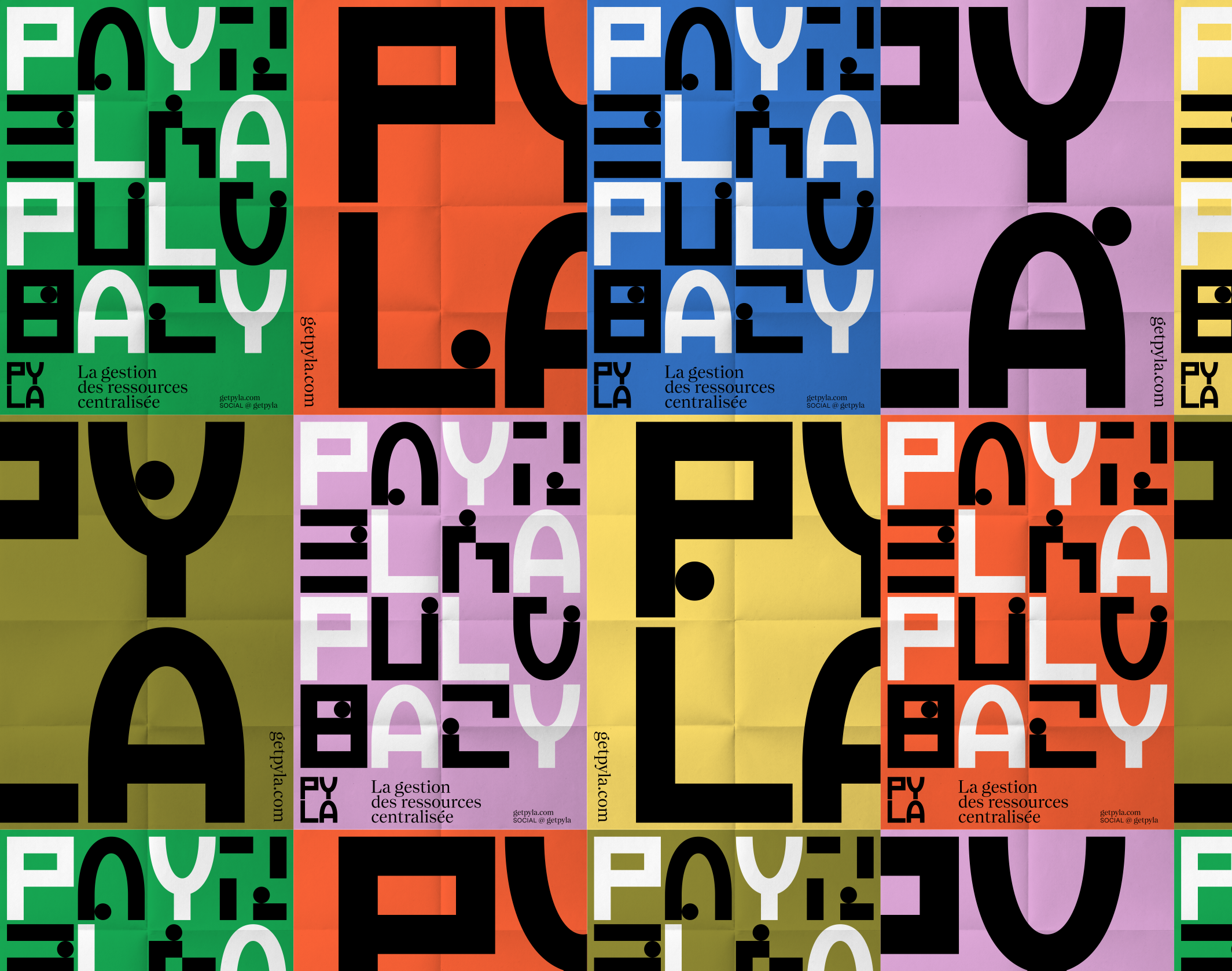
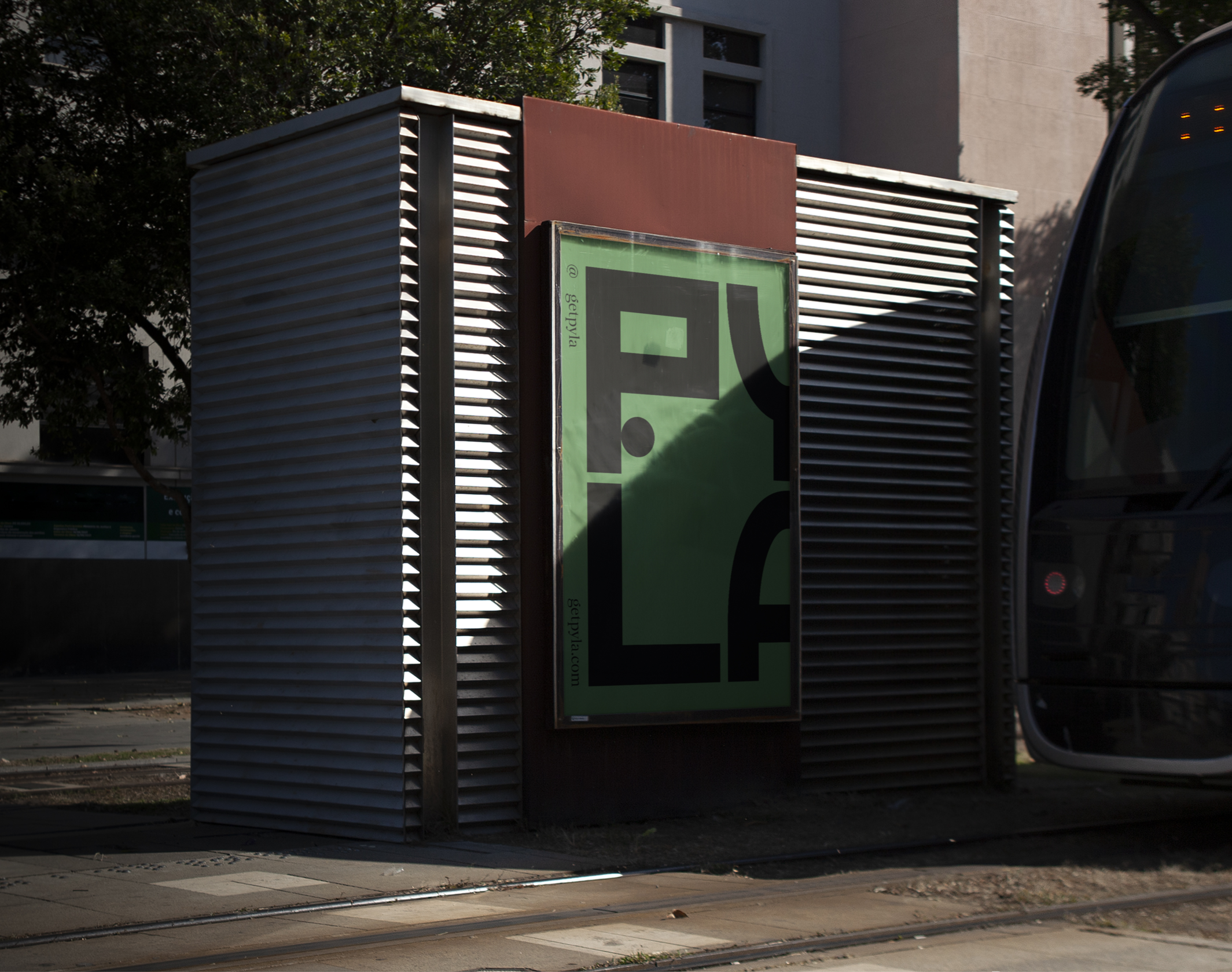
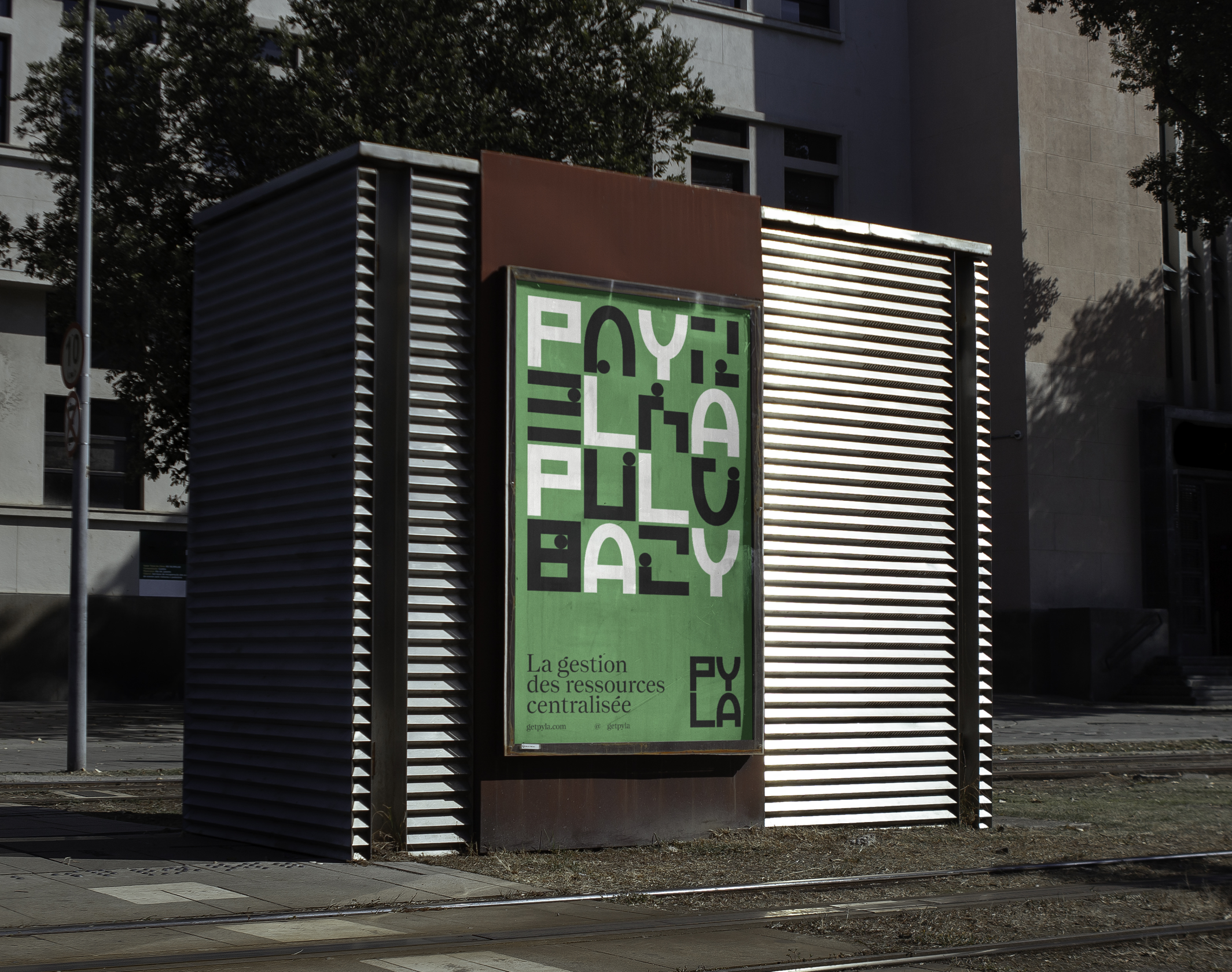
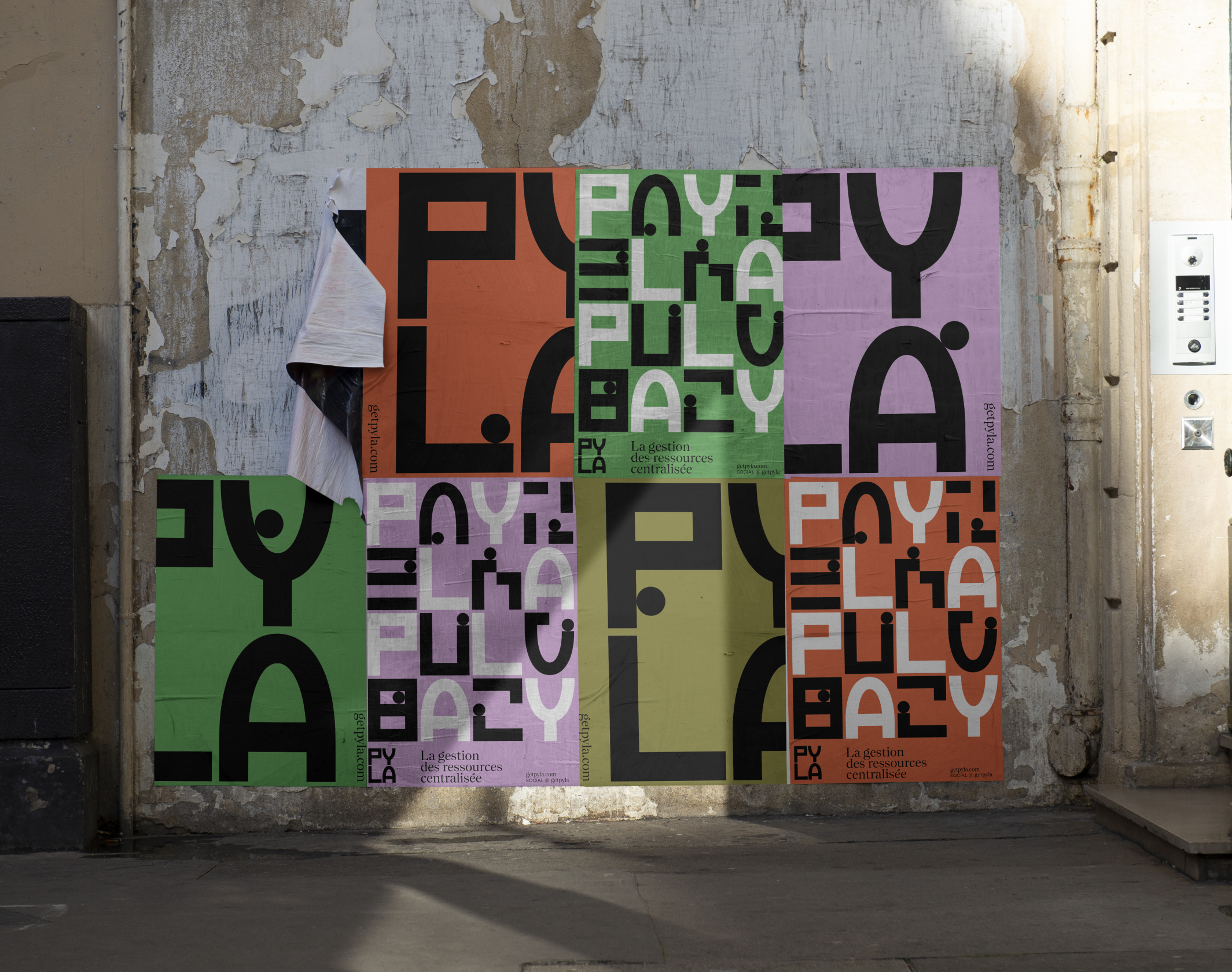
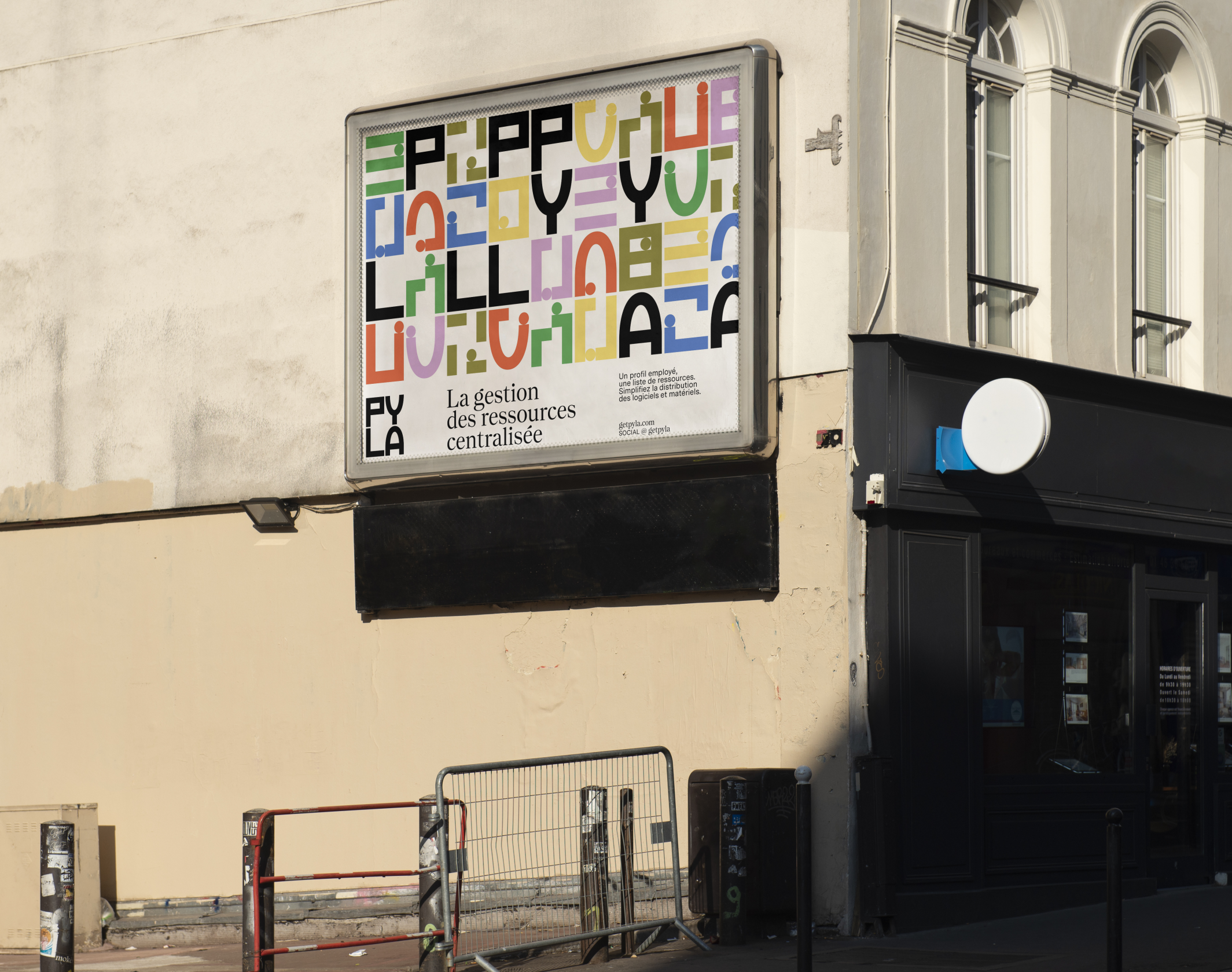
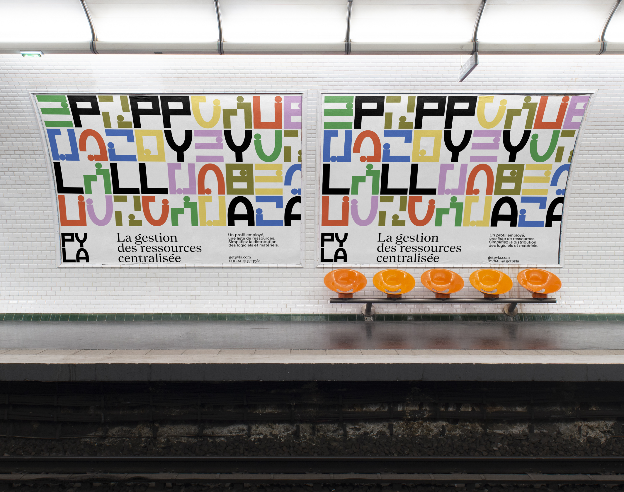
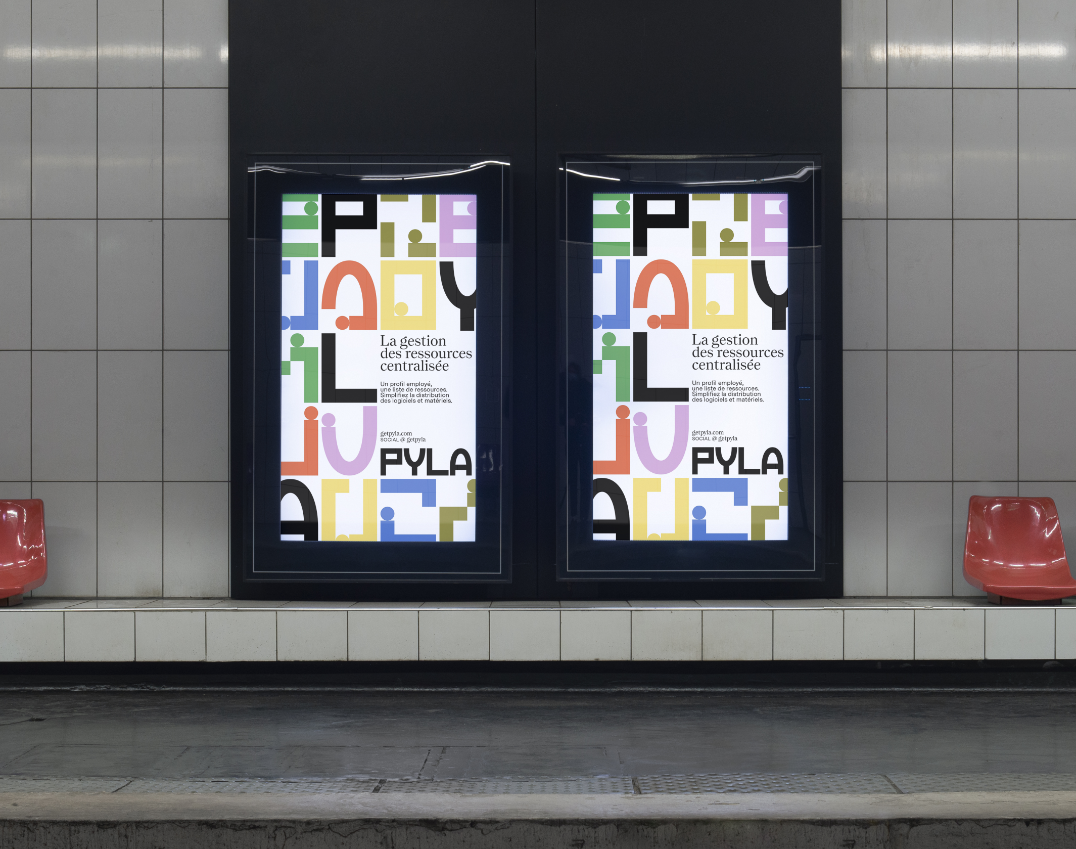
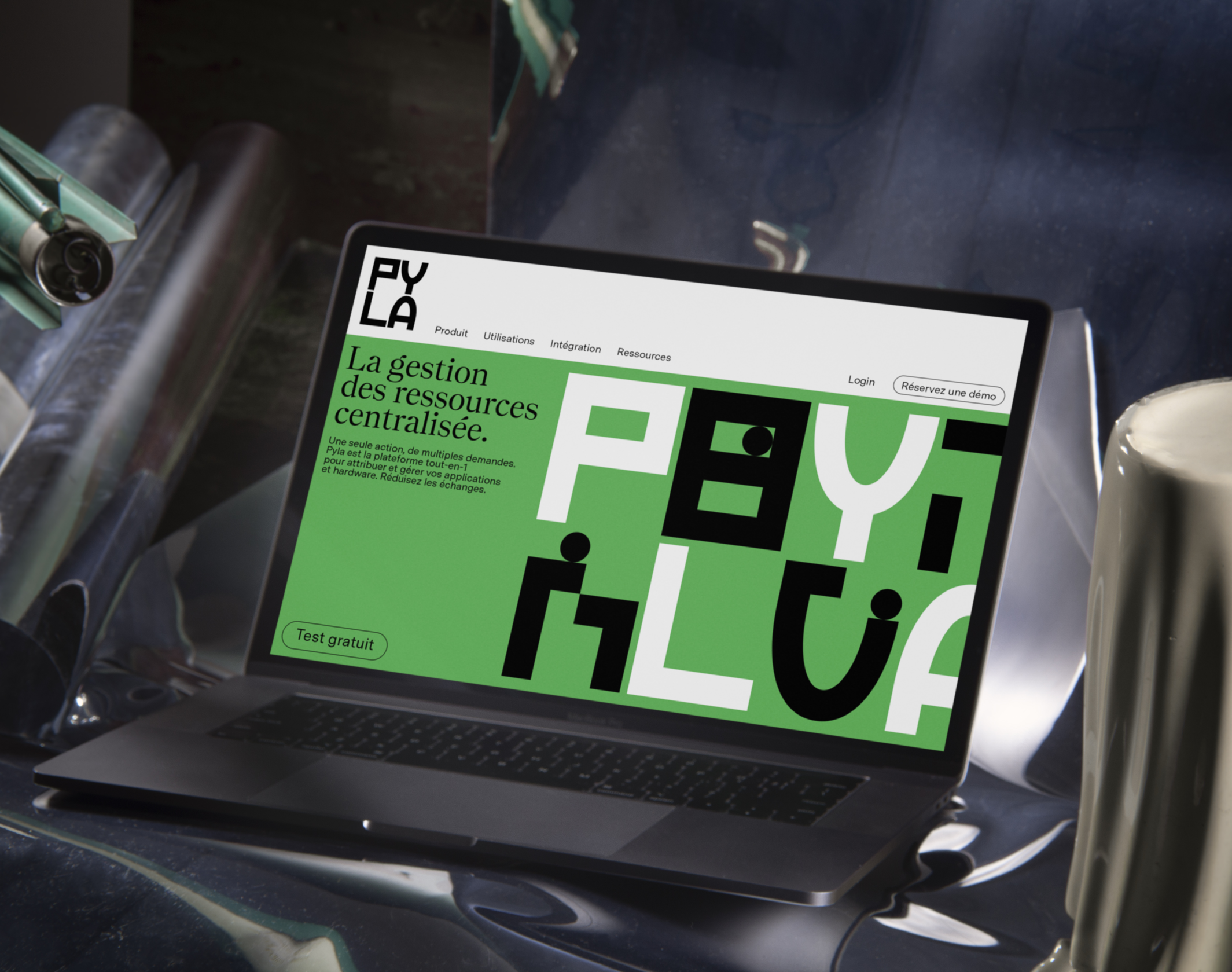
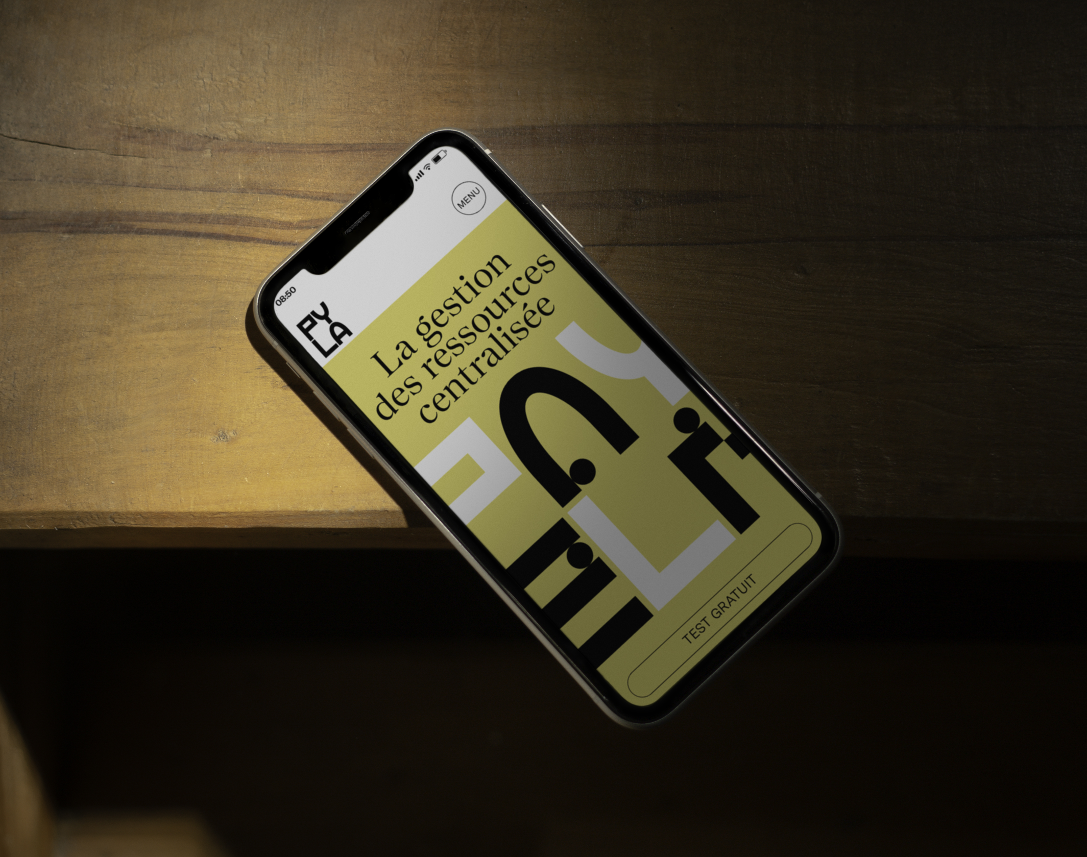
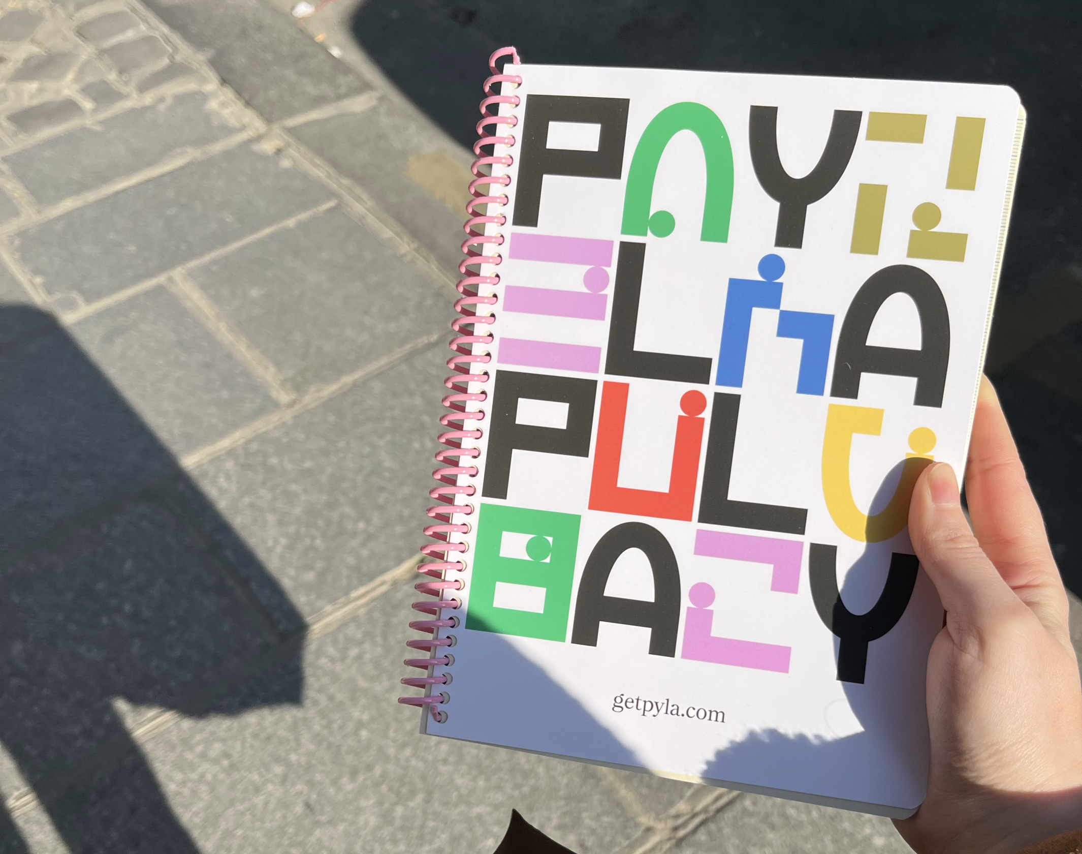
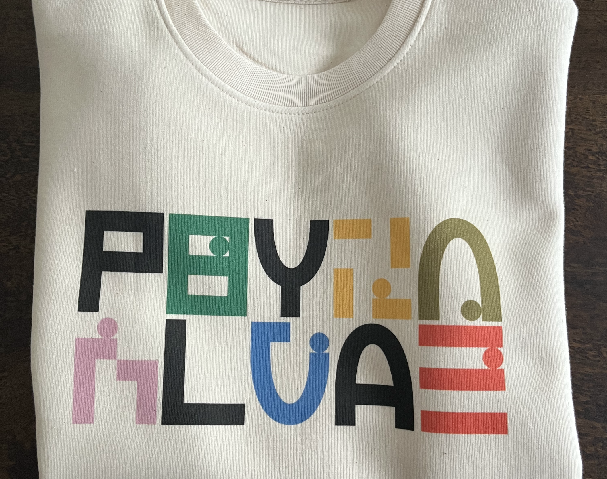
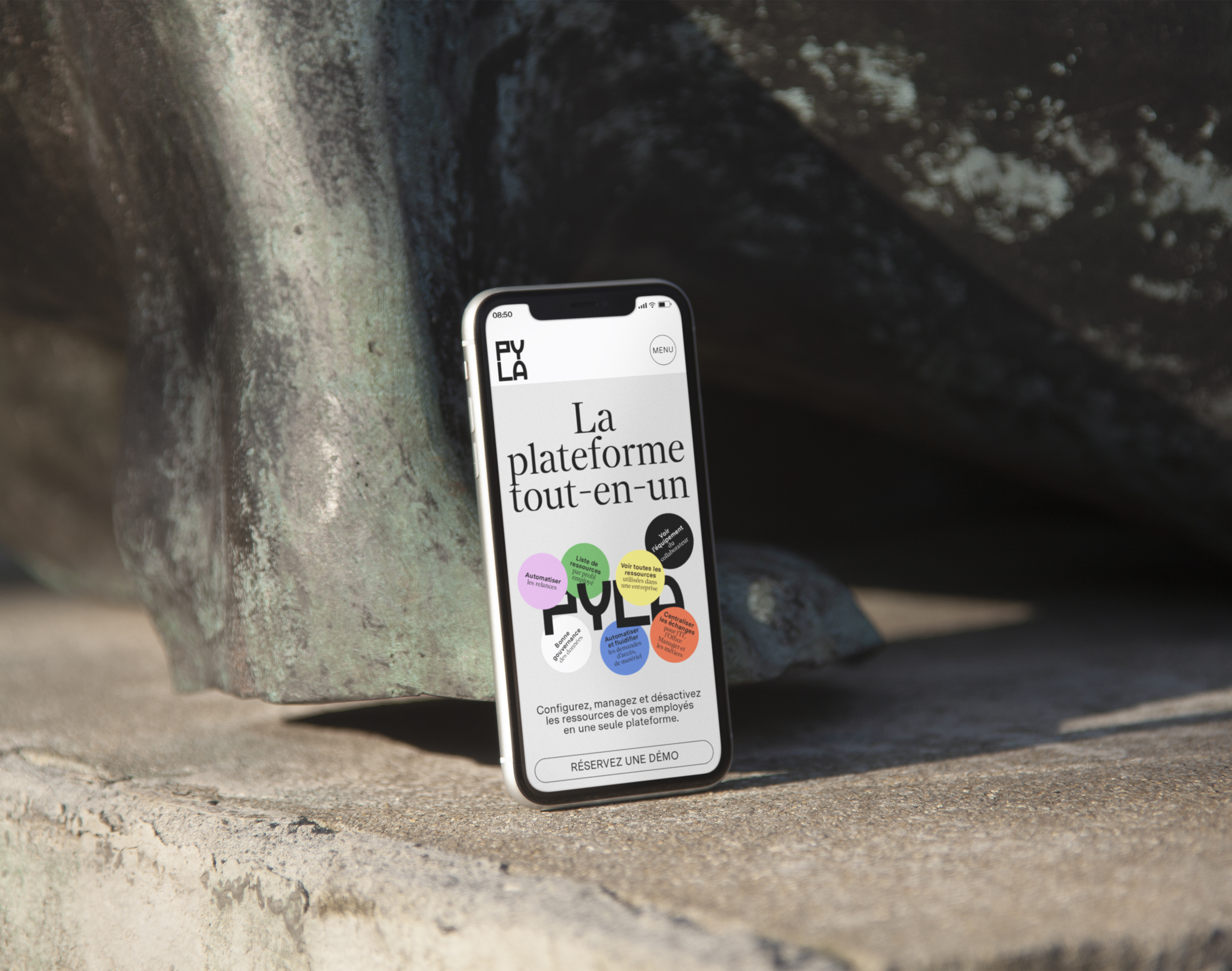
Brand Brothers developed Pyla’s identity for its name change, based on a typogram whose character design resonates with the name. Thus, the P and L form a unity around a straight line, while the Y and A, based on an oval, act as a mirror. These 4 characters serve as the basis for an abstract system composed of 12 shapes and a ball, which tell the story of the stacking of applications, the flow of data and the user experience. A clear desire to remain in the metaphor, to give Pyla a lively and playful attitude within the world of data. The graphic environment, simple and colorful, is based on the Messina Sans and Nantes typefaces (Luzi Type, Bern, CH).
Brand Brothers developed Pyla’s identity for its name change, based on a typogram whose character design resonates with the name. Thus, the P and L form a unity around a straight line, while the Y and A, based on an oval, act as a mirror. These 4 characters serve as the basis for an abstract system composed of 12 shapes and a ball, which tell the story of the stacking of applications, the flow of data and the user experience. A clear desire to remain in the metaphor, to give Pyla a lively and playful attitude within the world of data. The graphic environment, simple and colorful, is based on the Messina Sans and Nantes typefaces (Luzi Type, Bern, CH).
Disciplines
Brand strategy
Visual identity
Motion design
Signage
Typography
Branding
Naming / copywriting
Editorial design
Web design
